
Nova Tec — a promo site for a trenchless and floor-grinding equipment manufacturer
Хаб-сайт одеського виробника спецтехніки на 3 локалях (EN/PL/DE) з двома напрямами: безтраншейне обладнання для прокладання комунікацій і шліфувальні машини для обробки підлог.
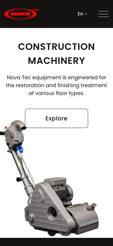
Nova Tec is an Odesa manufacturer of specialised machinery exporting to the EU and post-Soviet markets. The site novatec-machinery.com isn’t a product catalogue or a corporate one-pager — it’s a two-directional hub built for two fundamentally different audiences: flooring contractors and parquet installers looking for grinding and finishing machines, and infrastructure contractors laying trenchless utilities (cable, gas, water, replacing old pipes without digging trenches). The brand identity is minimalist: a red ellipse with the white NOVATEC lettering and nothing else; each sub-site builds its own atmosphere around it — light and technical for the grinding machines, dark and “industrial” for the trenchless equipment.
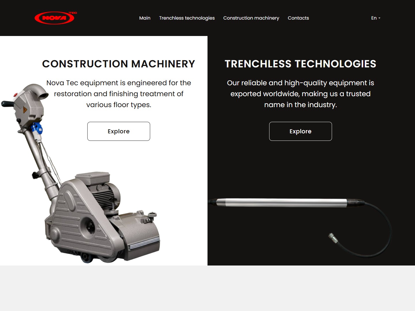
A two-directional hub — the home page as a split screen between two self-contained sub-sites
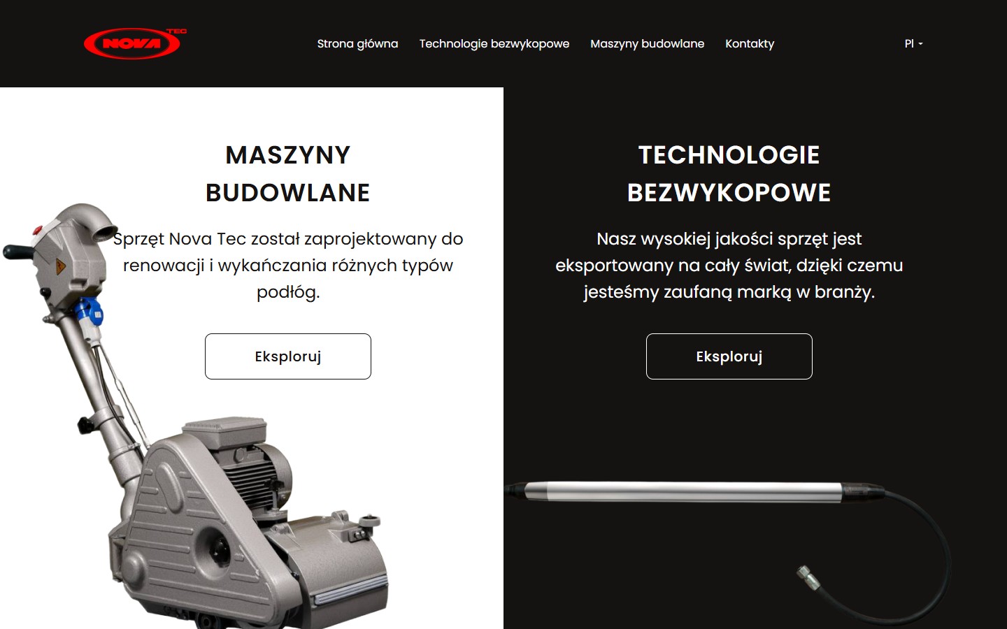
The home page is entirely given over to picking a direction: the left half has a white background with a photo of a grinding machine and an “Explore” button to Construction Machinery, the right half has a black background with a photo of trenchless equipment and the same button to Trenchless Technologies. There’s no hero headline about the company as a whole, no “about us” on the home page — a decision in favour of the principle “don’t mix b2b segments, let the customer cut straight to the right channel”. This split makes it feel less like a company website and more like a landing portal for two independent product lines that happen to share a brand and a legal entity.
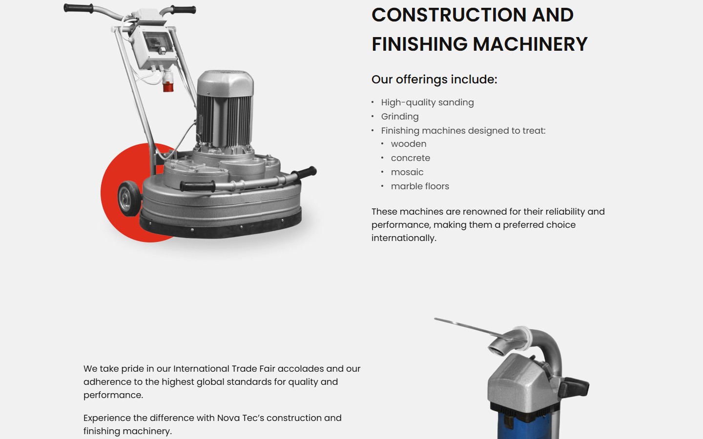
Construction Machinery — a light catalogue with a brand accent shaped as a red circle behind the machine
The grinding-equipment sub-site is styled in light grey with black typography and a red brand accent — a large disc behind the machine in the product photos. The hero has the H1 “Construction machinery”, a lead paragraph about processing different floor types, and a single CTA button, “Download catalog” (PDF), which leads not to a form but straight to a 56-page catalogue PDF with technical specs. For distributors and engineering departments this is a faster entry point: they buy on the specs in the catalogue, not on marketing copy.
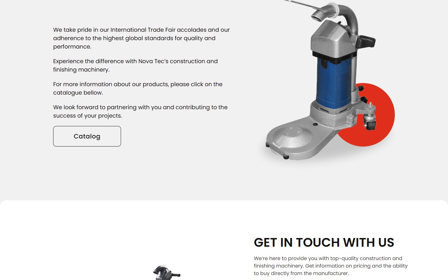
A separate “International Trade Fair” block is a short b2b social proof: participation in international trade fairs and adherence to global quality standards. The CTA — a second “Catalog” button, duplicating the hero CTA. This isn’t redundant, it’s another gate for anyone who scrolled halfway down the page but hasn’t clicked the catalogue yet — psychologically, a second chance to catch the user for the single most important action.
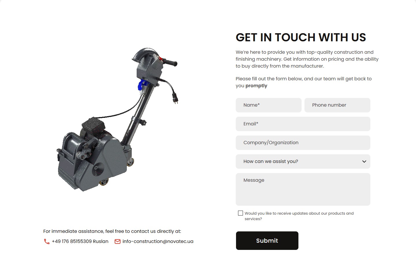
Get In Touch — a quotation form with a request-type selector and direct contact for the export manager
The contact form doesn’t sit in the footer and isn’t hidden behind a modal — it’s a full section of its own, 1010px tall. Fields: Name*, Phone, Email*, Company/Organization, a “How can we assist you?” dropdown (General Inquiry / Request for Quotation / Technical Support / Other), Message, and an opt-in checkbox for product updates. The dropdown is the funnel segmenter: “Request for Quotation” goes straight to a sales manager with “hot deal” priority; “Technical Support” goes to engineering; “General Inquiry” lands in the shared inbox. To the right of the form are the direct contacts of export manager Ruslan, with a +49 (Germany) number — meaning the sales channel is built specifically for the EU market, not the Ukrainian domestic one (which has its own +38 048 number in the footer).
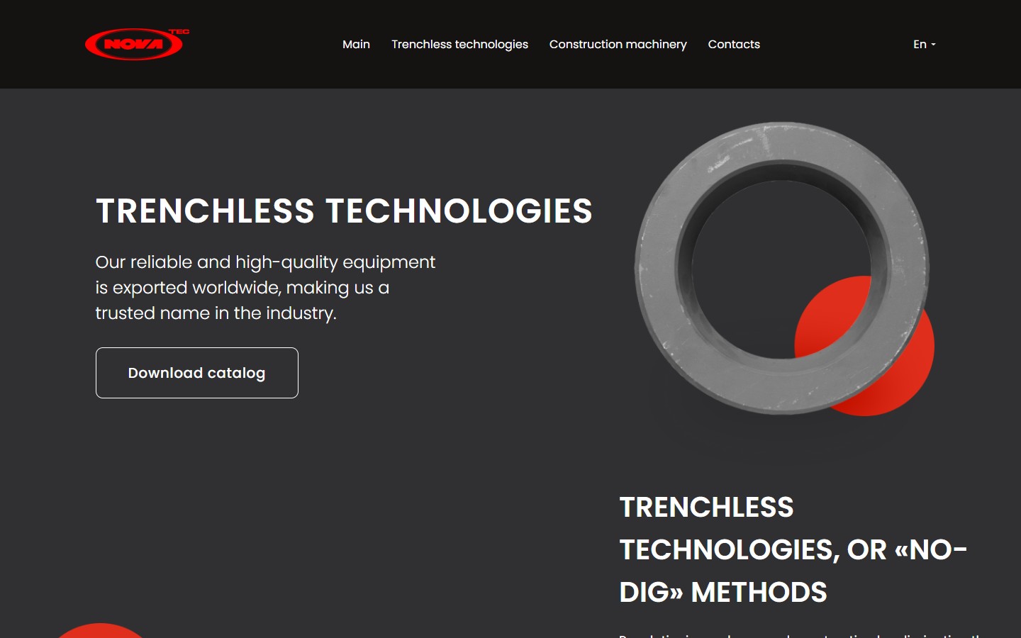
Trenchless Technologies — a dark page for the infrastructure contractor
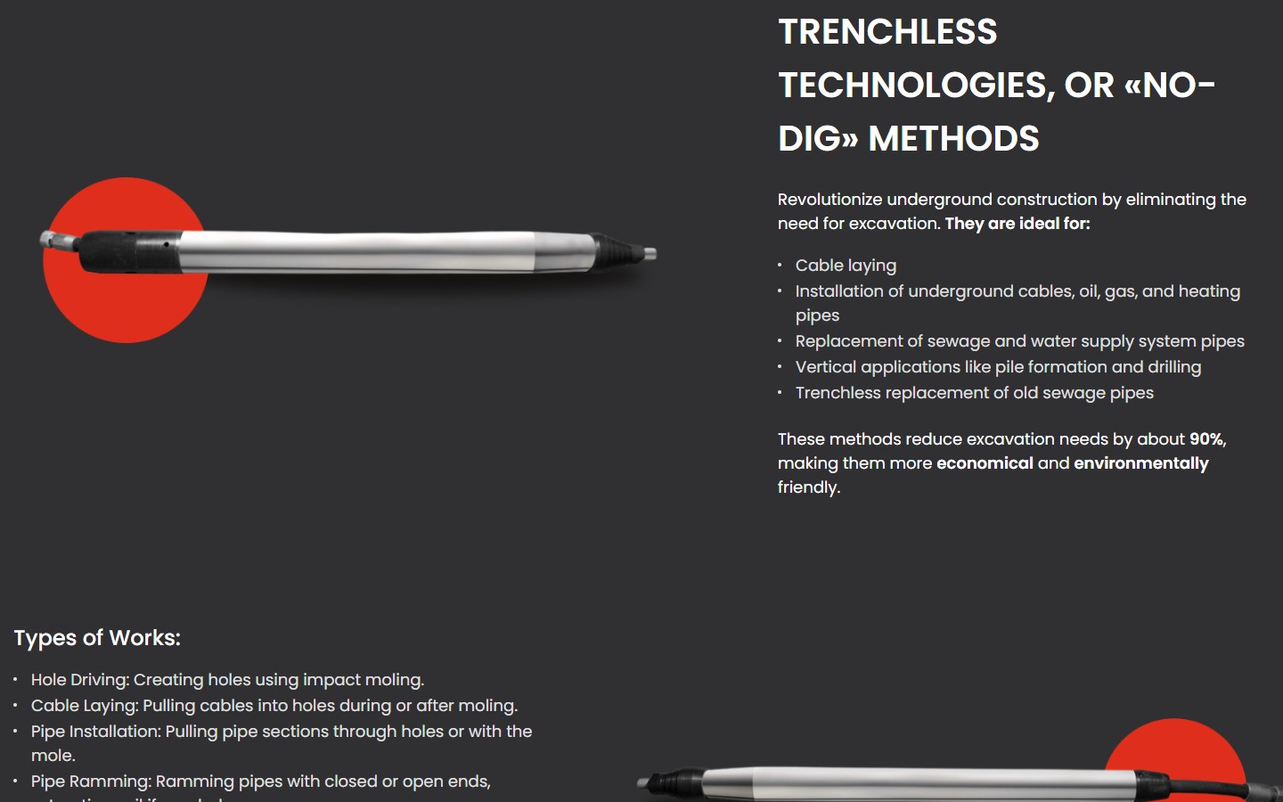
The trenchless-equipment sub-site is the full visual antithesis of Construction Machinery: a charcoal-black background, equipment photographed as “product still lifes” against black, the same red brand disc, now as an accent behind a pneumatic mole machine. This isn’t just an aesthetic choice — it’s audience segmentation too: a contractor working on a gas main or a water pipeline psychologically reads “industrial dark” as a sign of seriousness, not marketing glamour. The hero carries the same single “Download catalog” button, leading to its own 70-page catalogue PDF of trenchless equipment (separate from the CFM catalogue).
The second content block sells not a machine but a methodology — “No-Dig methods” with six ideal scenarios (cable laying, installation of underground cables/oil/gas/heating pipes, replacement of sewage and water pipes, vertical applications like pile formation, trenchless replacement of old sewage). It closes with a strong quantitative message: “These methods reduce excavation needs by about 90%, making them more economical and environmentally friendly”. 90% is both an economic argument (90% less working time and earthworks) and an environmental one (90% less dust, noise, and road closures). For tender documentation in a Ukrainian/Polish/German contract, this is a ready-made bullet a contractor can copy straight into their own submission as method justification.
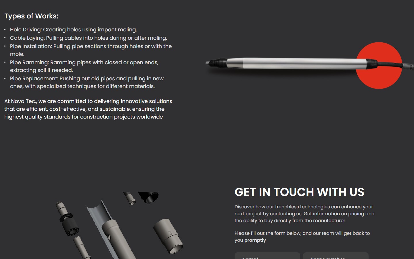
The next section, “Types of Works”, unfolds the same methodology into five specific operations/services (Hole Driving, Cable Laying, Pipe Installation, Pipe Ramming, Pipe Replacement) with a detailed description of each. This is no longer marketing, it’s engineering vocabulary: “Pipe Ramming: Ramming pipes with closed or open ends, extracting soil if needed”. The descriptions read like paragraphs from a trenchless-work manual, not ad copy — the company assumes the customer reads just as technically as they write their own spec.
Partner networks — two different distribution channels for two segments
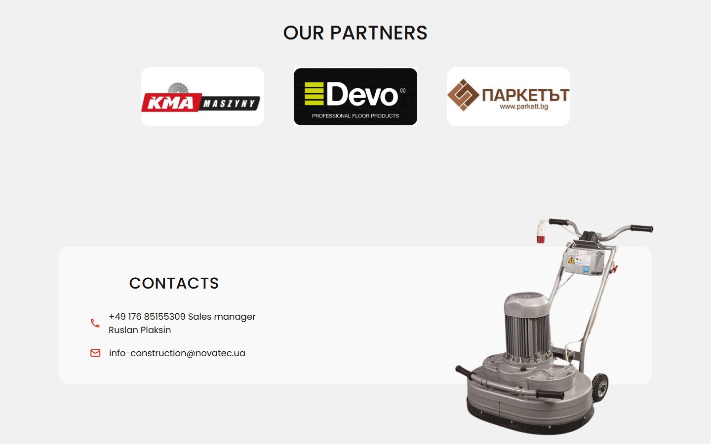
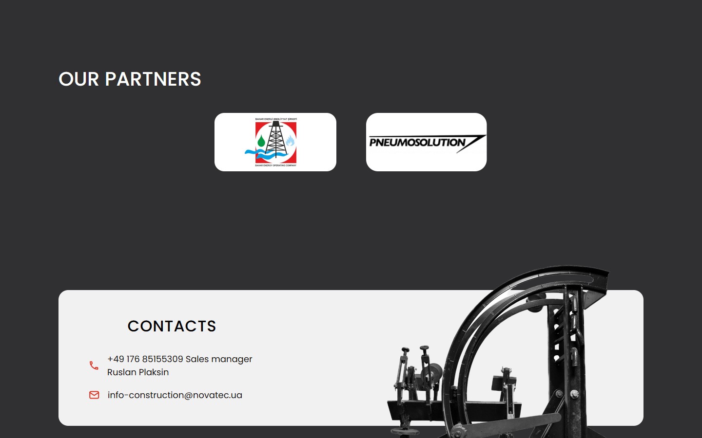
On the Construction Machinery page, “Our partners” shows three logos: KMA Maszyny (a Polish distributor of parquet equipment), Devo Professional Floor Products (a European brand of floor chemicals/abrasives) and Паркетът (a Bulgarian parquet-tool distributor, parkett.bg). This is a concrete European retail ecosystem of flooring/parquet professionals — Poland, Bulgaria + EU-wide chemicals. On the Trenchless Technologies page there’s a different set: Bahar Energy Operating Company (an Azerbaijani operator of an offshore oil-and-gas project in the Caspian Sea) and Pneumosolution (a North American pneumatic-trenchless distributor). So one corporate brand hosts two different sales channels: a European retail-distributor channel for flooring machines, and an oil-and-gas infrastructure/project channel for trenchless equipment.
Language strategy — EN by default, PL and DE as export markets
The locale switcher in the header offers three options: EN (the root domain / and /en/), PL (/pl/), DE (/de/). Polish and German aren’t a “generic European package”, they’re specific sales-target markets: German is the main one (export manager Ruslan Plaksin, with a +49 number, lives specifically under the DE market), Polish is the next priority (the KMA Maszyny partner). Ukrainian as a locale is absent — a telling choice: the site isn’t built for the Ukrainian domestic market but for export orders, where a Ukrainian customer gets a direct +38 048 number in the footer and an email at @novatec.ua, but a full UA localisation was deemed unnecessary (English works equally well as the working language for b2b machinery in Ukraine anyway).
Technical implementation — stack, tools, infrastructure
- Contact Form 7 — the “Get In Touch” section is built on a CF7 form with pattern validation on the phone field, a “How can we assist you?” dropdown switcher, required Name/Email fields, and an additional opt-in checkbox for product updates. CF7 gives a simple backend for the quotation form without needing to pull in a HubSpot or Salesforce integration.
- A custom template with no off-the-shelf builder — the page has no Elementor, WPBakery or Bricks: the markup semantics are clean (header / contentinfo / a logo list in its own container). This is a purpose-built custom theme, where the design decisions (a split-screen home page, a red brand disc on product photos, a black-vs-white sub-site atmosphere) are implemented directly in CSS, with no page-builder wizard.
- Multi-language via the
/pl/and/de/directories — not a GTranslate overlay, but a full WPML/Polylang-style directory structure with its own translated menu, hero copy and CTAs. The alternate locales appear as<link rel=alternate hreflang=...>in the head (x-default → EN, en-us → EN, pl-pl → /pl/, de → /de/). - PDF catalogues as the main product artefact — both sub-sites deliver their core product value not as an HTML catalogue with filters but as two standalone PDF files:
Machines-Catalogue-layout-26-12-ENG-1.pdf(Trenchless, ~70 pages with technical parameters for each model) andCFM-Catalogue-eng-new.pdf(Construction, ~56 pages). This is a decision in favour of “give the engineer a PDF they can drop into the project’s shared folder”, rather than “make them scroll the site”. - Dual sales channels via separate phone numbers — the footer everywhere shows
+38 (048) 777–13–89(Odesa, for the Ukrainian market and repair inquiries), while the sticky contacts section shows+49 176 85155309, export manager Ruslan Plaksin’s number (Germany, for EU orders). This isn’t “two numbers for redundancy” — it’s a deliberate engineering split: the Ukrainian number works as customer support/technical assistance, the German one as the direct entry point into the EU sales pipeline. - URL structure — separate static pages per sub-site:
/trenchless-technologies/and/construction-machinery/sit at the same level as the home page. These aren’t CPT archives, just regular WordPress pages with a custom template. There are no product CPTs, filters, or catalogue taxonomies — the company deliberately keeps the site as a promo hub, not an e-commerce catalogue. - The footer is identical on every page — a 4-item navigation (Main / Trenchless / Construction / Contacts), a repeated logo, a contact block with an email + two Ukrainian phone numbers, and a legal menu (Privacy Policy + Terms and Conditions). This is a corporate promo-site footer, not an e-commerce one: no social-media merge, no newsletter sign-up, no awards gallery.
Summary
Nova Tec is a case study in an export promo site for a specialised-equipment manufacturer, where the key decision was already made at the architecture level — don’t merge two fundamentally different b2b audiences into one shared funnel, instead branch the site into two independent sub-sites under one brand. A flooring contractor from Poland and a utilities engineer on a Caspian oil-and-gas project see two different Nova Tecs: one, a light catalogue with a red brand disc; the other, a dark industrial page about no-dig methods. The site’s content model is catalogue-driven: the core product artefact for both segments is a PDF catalogue with technical parameters, which an engineer drops into their own working folder, rather than an HTML catalogue with filters. The sales model is multi-channel: a Ukrainian repair channel via +38 048, an EU export channel via +49 and Ruslan Plaksin, a distributor ecosystem in Poland/Bulgaria for CFM, and an oil-and-gas project channel for Trenchless. Multi-language EN/PL/DE — with no Ukrainian locale — signals a clear export orientation, where UA for the manufacturer is the language of the “contact header”, not the content catalogue.




