
BACAMAG — academic help for students
Лендінг сервісу академічної допомоги студентам
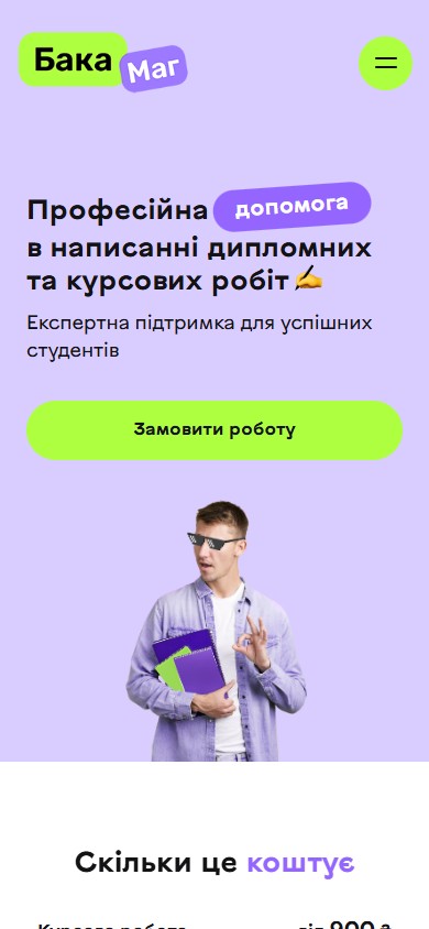
BACAMAG is a Ukrainian academic-help service for students: term papers, theses, master’s dissertations, internship reports, tests, motivation letters. The brand is built on a light, student-friendly aesthetic — the “BacaMag” logo on two pastel plates (lime and purple), a pixel-glasses icon, and a hard focus on one action, “Order a paper”. The goal was a short, honest landing page that removes the typical student fear of “they’ll ask me for a pile of extra details” and gets a request into a messenger in one step.
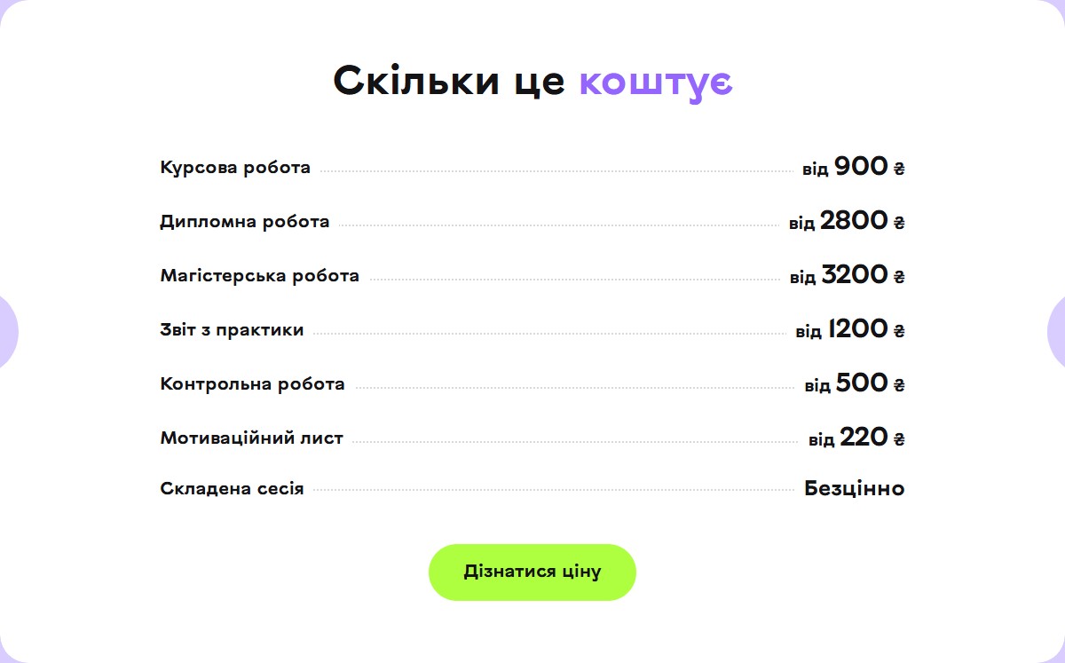
Transparent pricing — 7 types of work on one grid
Instead of separate pages for each type of work, there’s one “How much does it cost” section with a plain list: a term paper from 900 UAH, a thesis from 2,800 UAH, a master’s dissertation from 3,200 UAH, an internship report from 1,200 UAH, a test from 500 UAH, a motivation letter from 220 UAH. The seventh line — “Passing exam season — priceless” — is a MasterCard-style marketing joke that keeps the landing page’s tone light while carrying the main emotional promise to the student.
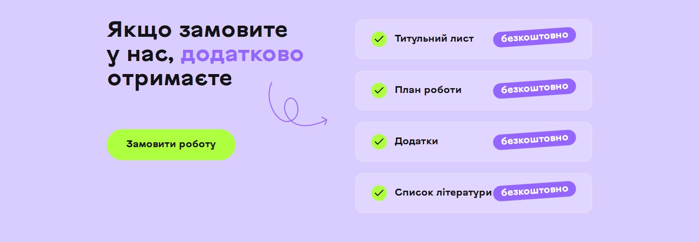
Bonus package — 4 extras for free
A separate section removes a typical student objection: “do I have to pay extra for these parts too?” Any order comes with a free title page, work plan, appendices and reference list — each item with its own checkbox and a pastel “free” plate. A large hand-drawn scribble arrow links the heading to the list — a signature illustrative device that repeats across several sections of the site.
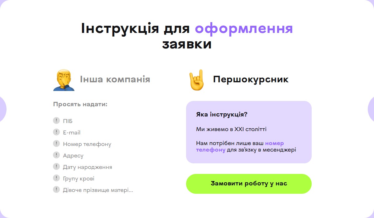
A one-step request — just a phone number to the messenger
The key conversion section — “Instructions for placing a request” — is built as a direct contrast between two columns. On the left, under a facepalm emoji: “Another company: full name, e-mail, phone number, address, date of birth, blood type, mother’s maiden name…”. On the right, under a rocker emoji: “A first-year student: we only need your phone number to reach you in a messenger”. This isn’t just a UX argument — it’s positioning: the student is promised privacy and zero unnecessary questions.
Why people recommend us — 5 signature cards
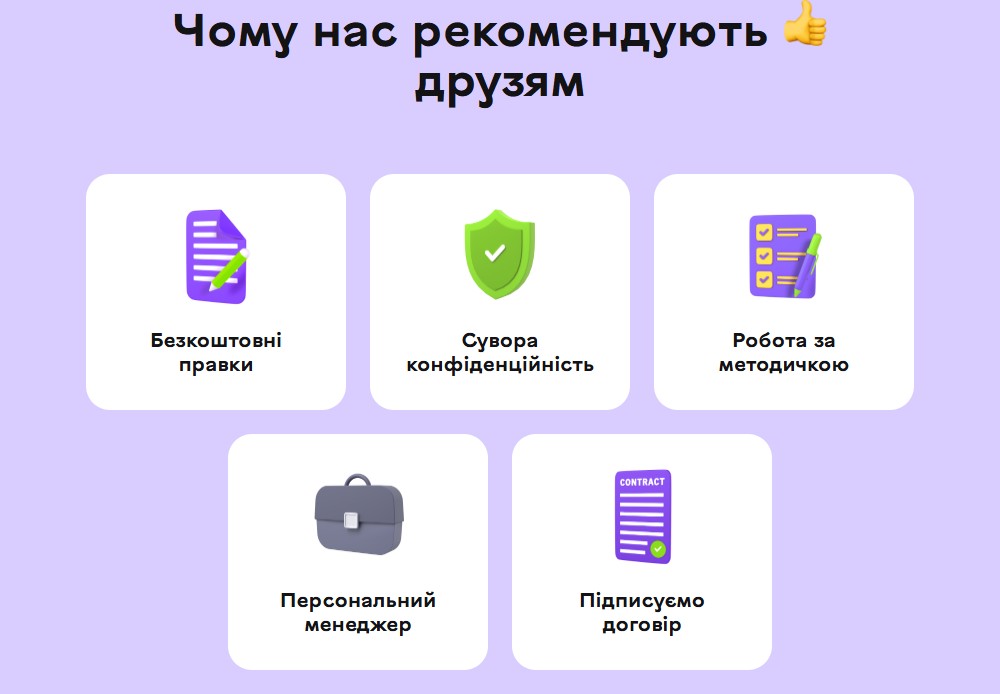
The “Why our friends recommend us” section shows 5 pastel cards with volumetric 3D icons: free revisions, strict confidentiality, work done to the assignment brief, a personal manager, a signed contract. A 3+2 grid with a centred bottom row isn’t symmetrical, but it reads as visually balanced thanks to matching icon sizes and corner radii. Each icon is a rendered 3D object rather than a flat vector — a document with a green pencil, a green-purple shield with a checkmark, a checklist with a pencil, a dark-blue satchel, a document with a signature and seal.
A conversion banner in the middle of the page
Between sections sits a full-width purple banner: “Order your paper right now / And forget about boring nights at the laptop”, with a photo of a smiling student in pixel glasses pointing toward the heading. One CTA — “Order a paper”. It’s a psychological reset point: between the rational price list and the social proof, an emotional reminder of what this is all for.

Reviews — a circular composition of coloured petals
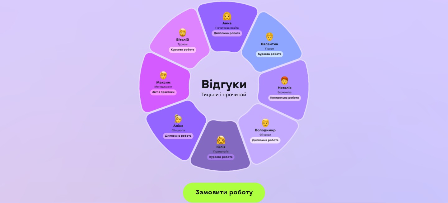
The most striking section, with an “unlike everyone else” UI solution: 8 reviews laid out as petals around a central heading, “Reviews / Tap and read”. Each petal is a separate client (Yulia / Psychology / Term paper, Alina / Philology / Thesis, Maksym / Management / Report, Vitaliy / Tourism / Term paper, Anna / Primary Education / Thesis, Valentyn / Law / Term paper, Nataliya / Economics / Test, Volodymyr / Finance / Thesis). Each petal has a different colour — purple, lilac, pink, blue — so the whole flower reads as a palette. Together they cover 8 different specialties, from the humanities to finance and economics — social proof that “we get orders from any faculty.”
Stack, marketing, integrations
- WordPress as the base — quick price-table updates with no developer needed.
- Contact Form 7 as the lead intake — a minimal one-field form (phone number) with spam protection.
- A pop-up timer, “Who gets a 20% discount? — Studak” — an interactive banner at the bottom of the screen with a real countdown to the end of the promotion.
- A promo marquee, “Secret discount code: STUDAK” — a running strip appearing twice on the page (between sections) as a second conversion-reminder layer.
- Google Tag Manager and event analytics — CTA clicks, promo-code pop-up opens, form submissions.
- Slim Stat for server-side traffic logging — no external cache or GA dependency.
- AIOSEO + sitemap.xml with “Always / High” priority on the homepage — the homepage is positioned around queries like “help with a term paper,” “order a thesis” in local search.
- Social media — Instagram, TikTok, Telegram under a single @bacamag_ handle — three channels supporting brand identity off-site.
Summary
BACAMAG isn’t a services catalogue — it’s a fast conversion landing page that sidesteps the classic pain points of a student-services brand: opaque pricing, excessive registration, fake reviews buried in an unreadable list. In their place: an honest price table, a single-field request, a circular review composition, and a couple of emotional CTA steps. Everything the brand needs in the “academic help” category — and nothing more.




