
Sportlabs — an online shop for sports nutrition
WooCommerce-магазин спортивного харчування на 200+ брендів. Кастомний single-step checkout під Нову Пошту, акційний движок з countdown і промокодами, переписані з нуля картка товару, кошик і checkout.
Context
Sportlabs is a Ukrainian online shop for sports nutrition with a catalogue of 19 product categories and over 200 world brands (Optimum Nutrition, MuscleTech, Olimp Labs, Activlab, Muscle Pharm, BSN, Dymatize, Kevin Levrone, MST Nutrition and others). The task was to build a WordPress + WooCommerce store that holds three roles at once: a brand showcase with its own identity, a fully-fledged e-commerce shop with filters and checkout, and a promo engine with sales, countdown timers and promo codes. A standard WC build can’t carry that much complexity — we rewrote the key templates (product card, cart, checkout) to match the brand’s dark-green UI.
What we built on the homepage
A hero with the core offer message
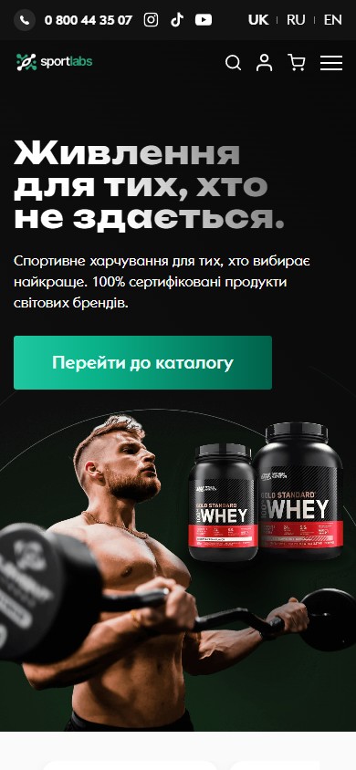
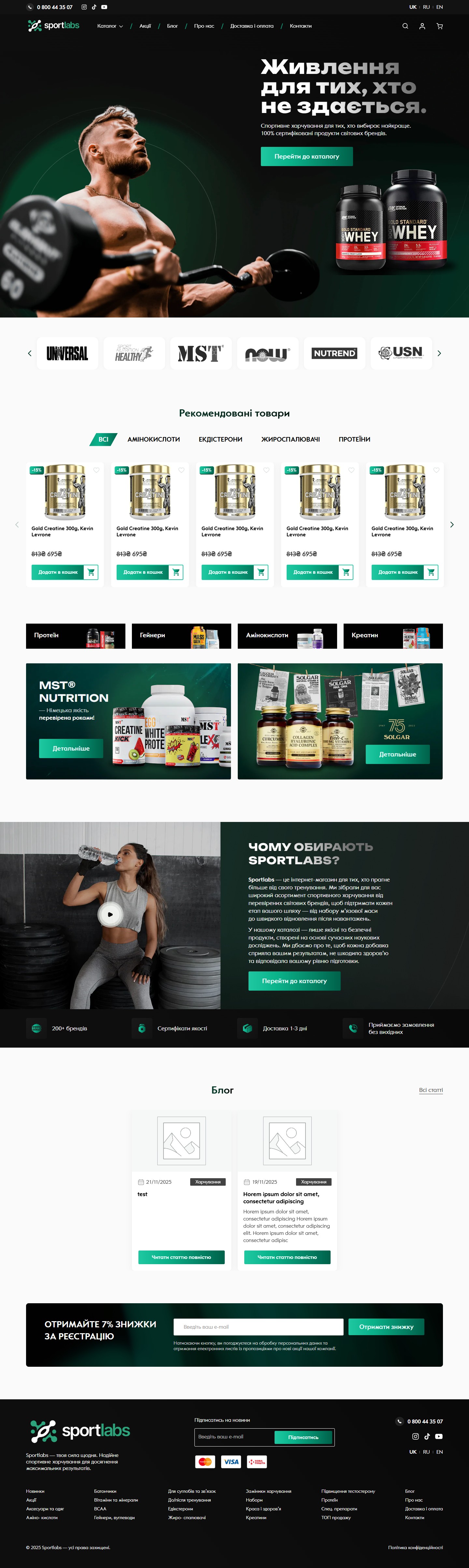
The first screen works as a brand banner: a full-screen photo of an athlete with a dumbbell on a dark-green gradient on the left, a typographic H1 “Nutrition for those who don’t give up.” mixing white and grey for emphasis, a descriptor “Sports nutrition for those who choose the best. 100% certified products from world brands”, and a single green CTA, “Go to catalogue”. On the right of the hero are two physical tubs of ON Gold Standard Whey, working both as a product teaser and as a compositional counterweight to the photo banner.
A marquee strip with 30+ brands
Below the hero is a horizontally scrolling carousel strip with the logos of 30+ brands (Universal, MST, Now Foods, Nutrend, USN, Olimp, Be First and others). The strip uses round cards on a light background that contrasts with the dark hero — both a visual breather and social proof: “these are serious brands here, not no-name products”.
A tabbed “Recommended products” block
A swiper with 4 rows of product cards and filter tabs above it: ALL / Amino acids / Ecdysterones / Fat burners / Protein. Each tab switches the card set without a page reload. Each card shows a discount badge (-15%), a product photo on a light background, a name, a struck-through old price and a new one in green, and an “Add to cart” button (AJAX, no navigation to the product page).
Quick-link category cards + the MST promo block
4 wide top-category cards (Protein, Gainers, Amino acids, Creatine) with a thematic product photo, then a two-segment promo block: on the left a large MST Nutrition card (“German quality, proven over the years”), on the right a photo of Solgar/Olimp products arranged like a quasi shop shelf. This is a separate ad inventory that can be resold to brands as preferred placement.
“Why choose Sportlabs?” with video and 4 USPs
A content section in a split layout: on the left a YouTube player overlay (“Why choose Sportlabs?”) with a custom cover, on the right a longer text about the shop’s mission with a CTA to the catalogue. Below that is a 4-card USP block with green icons: 200+ brands, quality certificates, delivery in 1-3 days, we take orders even on weekends. The homepage closes with a 7% sign-up bonus block with an email form on a dark-green tile.
The /shop/ catalogue — filters and pagination
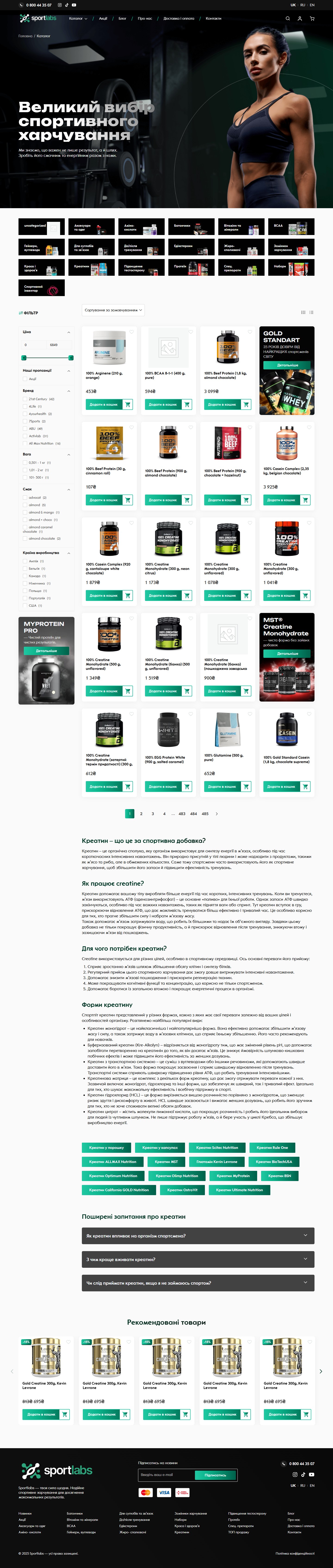
The archive is built across three tiers. At the top, a full-width hero, “A wide range of sports nutrition”, with a fitness photo. Below it, a horizontal strip of subcategory tile cards as a quick switcher. The main body is a two-column grid: on the left a sidebar with accordion filters (Categories, Brands, Price), on the right a 4-column grid of product cards with a discount badge, an ON Gold Standard promo poster acting as a “card banner”, and numbered pagination (1, 2, 3, … 240, 241). At the bottom of the archive is an SEO section with its own H1 block, “Creatine — what is this magic supplement?” (What is creatine / What is it for / Forms of creatine), internal tag cross-linking, and a “Recommended products” block with 4 cards.
Product card — a promo engine, FAQ and tabbed information
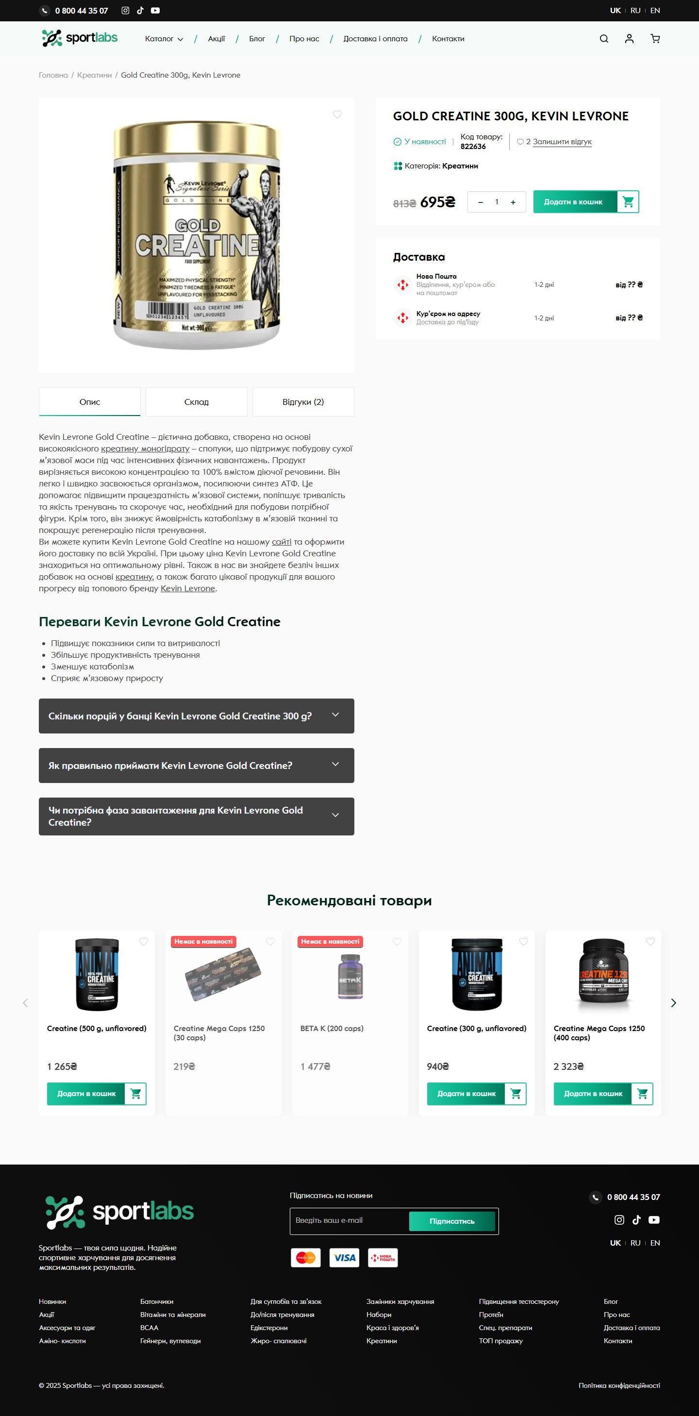
The product card was rebuilt from scratch for a branded e-commerce flow. On the left is a large product photo on a light background with a favourite-heart icon. Below the photo is a tabbed panel (Description / Composition / Reviews (2)), then a full-width prose description and an accordion FAQ with 3 questions (“How many servings are in a tub”, “How to take it correctly”, “Is a loading phase needed”). On the right is a sticky purchase block: an H1 name, an “In stock” status with a green dot, the SKU, a link to reviews, a category with an icon, old/new price, a quantity counter and a green “Add to cart” CTA. Below the CTA is a “Delivery” info card with two methods (Nova Poshta / courier to address) and an ETA of “1-2 days”. On top of the sticky block, the template also supports an optional promo banner with a promo code and a countdown timer — the admin enables it during a sale period and removes it afterwards, so it never shows an empty counter.
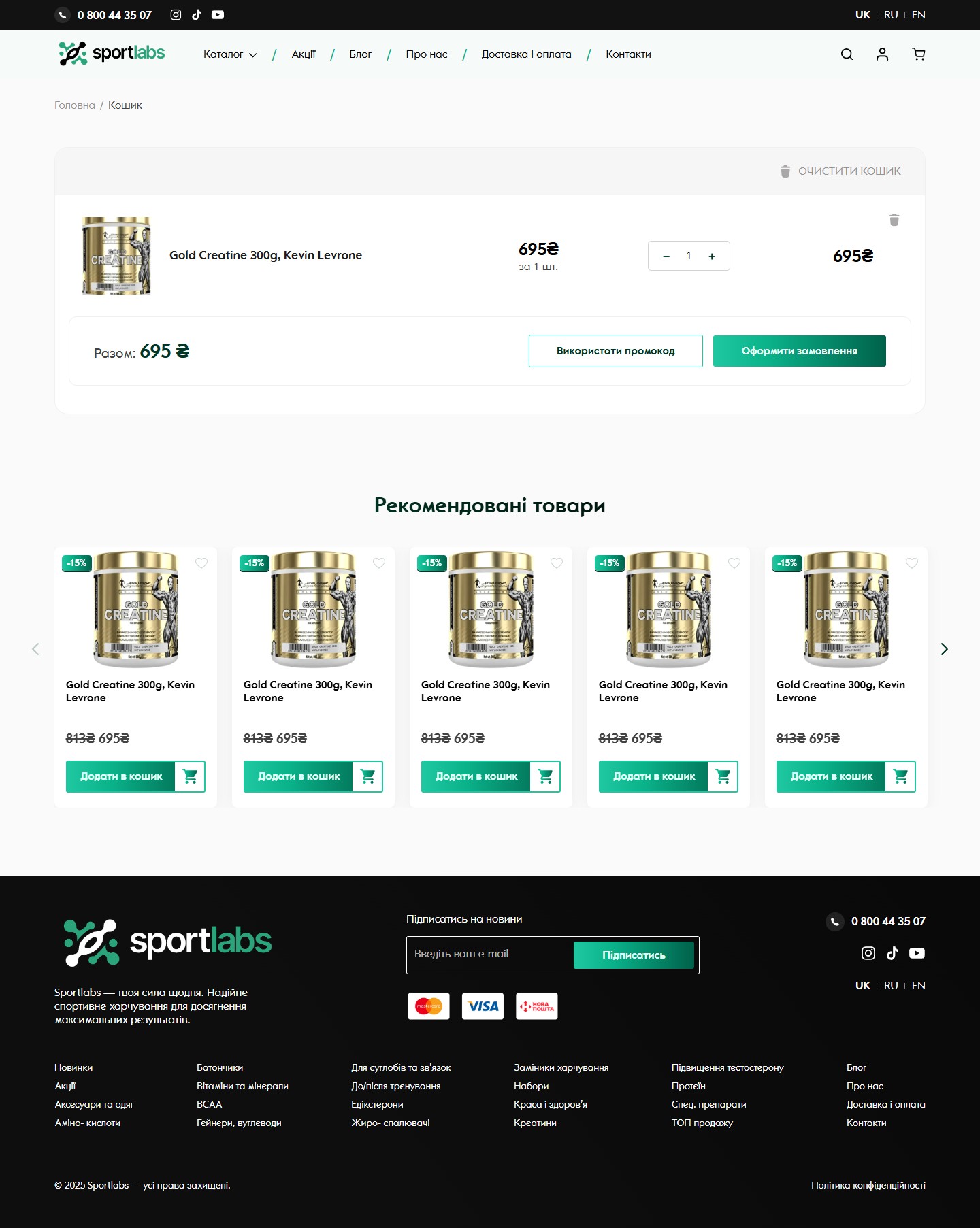
Cart — a minimalist table with a promo code
The cart is kept as lean as possible: a single full-width table card with 4 columns (product with photo and name / unit price / quantity counter / subtotal), a “Clear cart” trash button at the top right, a sticky summary at the bottom of the card with a “Total: NNN UAH” line, a secondary CTA “Apply promo code”, and a primary CTA “Proceed to checkout”. Below the cart is a “Recommended products” carousel (a 5-card cross-sell).
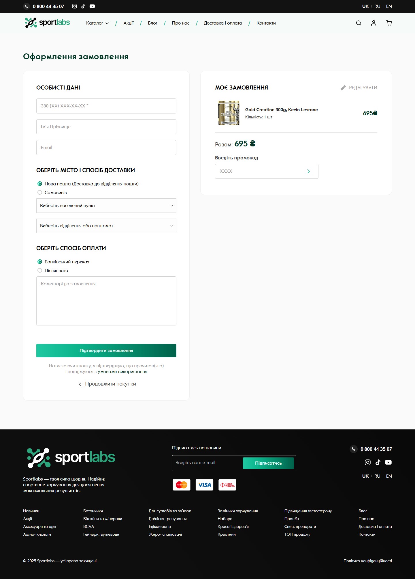
A custom single-step checkout for Nova Poshta
The standard WooCommerce checkout (multi-step, with address, state, ZIP fields, and a billing/shipping split) is friction that kills conversion for a Ukrainian sports-nutrition shop. So we rebuilt the checkout as a single step with three required fields (a phone number in the +380 format, first and last name, email) plus a “Choose your city and delivery method” block (radio buttons: Nova Poshta / pickup, two search-and-select dropdowns, “Choose a city” / “Choose a branch or parcel locker”) plus a “Choose a payment method” block (bank transfer / cash on delivery) plus a “Order notes” textarea and a full-width green “Confirm order” CTA. On the right is a sticky “My order” card with a product thumbnail, quantity, price, a “Total: NNN UAH” summary, and its own “Enter promo code” input.
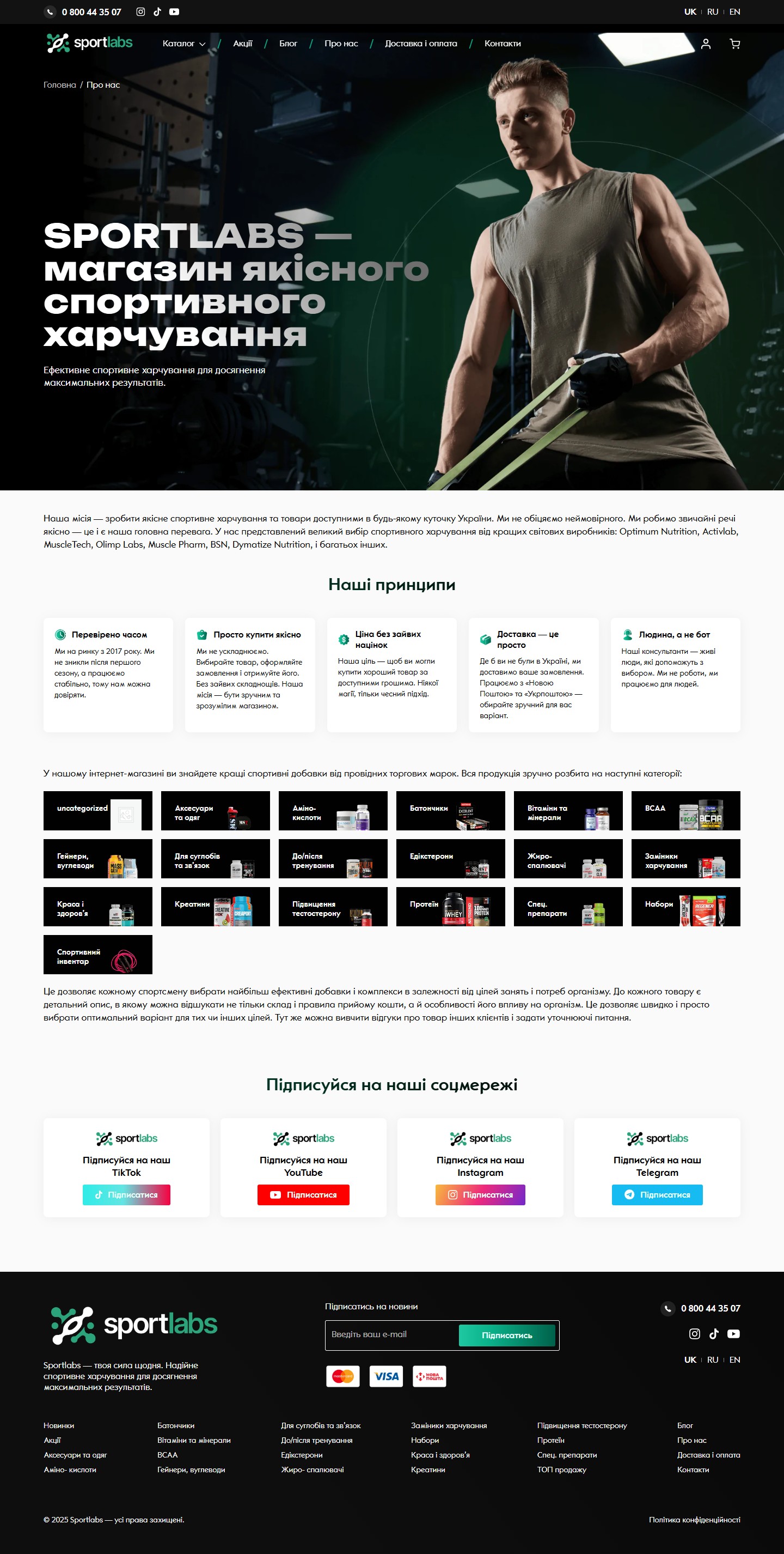
The About page — mission, principles and the full catalogue structure
Inner pages use a single template with a full-width media hero (a photo of an athlete with a resistance band plus a dark-green overlay, breadcrumbs, H1, descriptor). On the About page, that’s followed by a full-width mission text, a 5-card grid “Our principles” (Time-tested / Simple, quality purchasing / No unnecessary markups / Delivery made simple / A human, not a bot) with a green icon on each card. Below that is a full tile grid of all 19 catalogue categories (Accessories, Amino acids, Bars, Vitamins, BCAA, Gainers, For joints, Pre/post-workout, Ecdysterones, Fat burners, Meal replacements, Beauty and health, Creatine, Testosterone boosters, Protein, Special supplements, Bundles, Sports equipment), acting as secondary navigation plus an SEO block. The page closes with a “Follow us on social media” section, 4 square CTA cards (TikTok / YouTube / Instagram / Telegram) in each network’s brand colours.
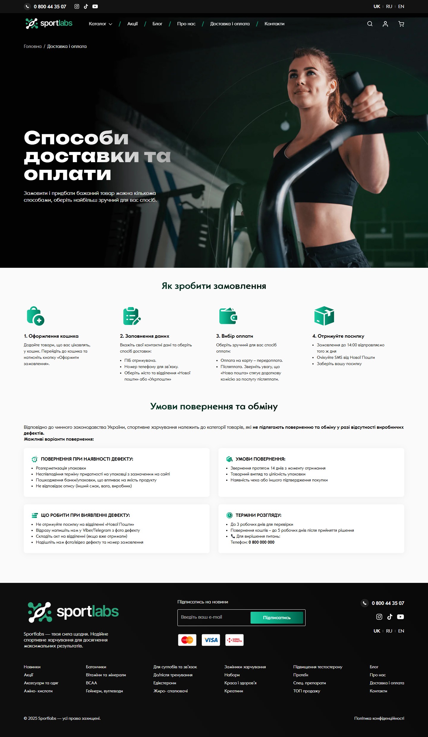
“Delivery and payment” — a 4-step stepper and a returns block
A separate LP built as a “How to place an order” stepper with 4 illustrated cards (1. Fill the cart / 2. Enter your details / 3. Choose payment / 4. Receive your parcel). Below is a “Returns and exchange terms” section with a legal disclaimer (sports nutrition is non-returnable) and a 4-card grid (Return in case of a defect / Return conditions / What to do if a defect is found / Processing timeframes). Each card is a checklist of 3-5 bullet points. This closes 80% of typical pre-order questions and reduces the load on the hotline.
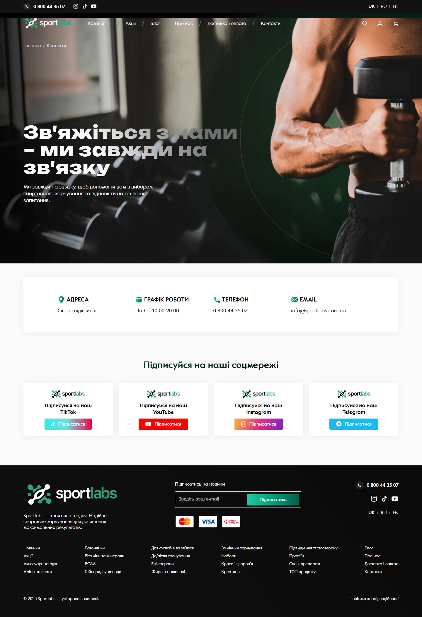
Contacts — a minimalist info card
The contacts page is a single full-width 4-column info card (Address / Working hours / Phone / Email) with green icons, without a contact form (leads are handled through the 0 800 hotline and social media). Below it is the same 4-card follow block for TikTok / YouTube / Instagram / Telegram as on the About page — to lock the visitor into some channel of contact.
Result
Sportlabs launched as a fully-fledged WordPress + WooCommerce shop with 19 product categories × 200+ brands × ~240 catalogue pages. All the key transactional pages (product card, cart, checkout) were rewritten from scratch for the brand’s dark-green UI and the logic of the Ukrainian market: a promo engine with countdowns and promo codes, a custom single-step checkout for Nova Poshta and Ukrposhta in place of WC’s default multi-step flow, and an accordion FAQ running through every product card. The inner pages (About, Delivery and payment, Contacts) are designed as inline LPs with content that removes typical pre-order questions and reduces the load on the 0 800 hotline.




