
Royal Flowers — a flower-shop chain and online store
Мережа квіткових магазинів на WooCommerce: 4 міста, окремі склади, спільний бренд, доставка за 2 години.
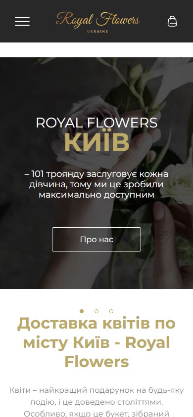
Royal Flowers is a chain of flower shops across four Ukrainian cities: Kyiv, Dnipro, Odesa, Kharkiv. The task was to build a single online storefront where a client first picks their city, then sees the current range, prices, and delivery times specific to it. Technically, this is WordPress + WooCommerce on a multisite architecture across subdomains (kyiv./odesa./kharkiv./the main domain for Dnipro), sharing one design and brand but with separate stock and pricing for each city.
Homepage and brand presentation
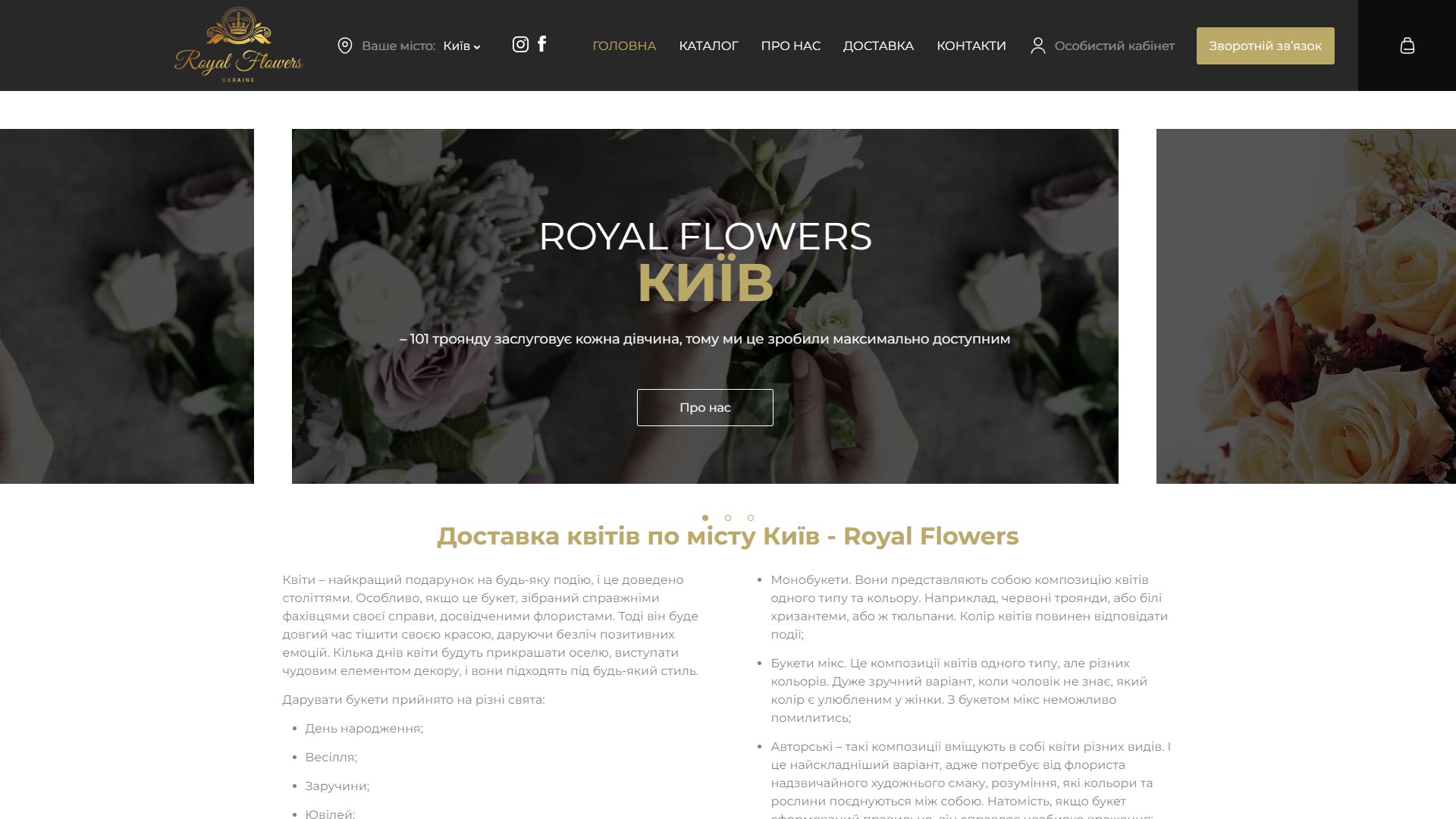
The first screen is a centred slick slider with three frames: “Royal Flowers Kyiv — 101 roses that every girl deserves”, a promise of delivery within 2 hours, and a claim of fresh flowers straight from the greenhouse. The neighbouring slides partly “peek” in from the sides — a classic hint that there’s more to scroll through, without extra arrows. Below the hero sits a “Browse the catalogue” CTA and a long SEO block ranking for regional queries like “flower delivery Kyiv” / “buy roses Kyiv”.
Catalogue and filtering
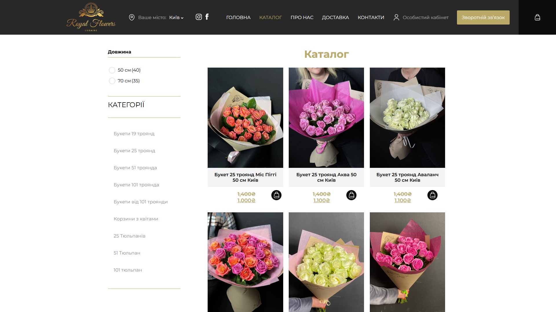
The catalogue is a two-column WooCommerce shop: filters on the left (stem length 50 / 70 cm and categories with thumbnails), a three-across card grid on the right. Each card shows a photo, title, price in hryvnia, a crossed-out “old” price for items on sale, and a quick “add to cart” button in the bottom-right corner so a client can buy without ever opening the product page.
Category structure
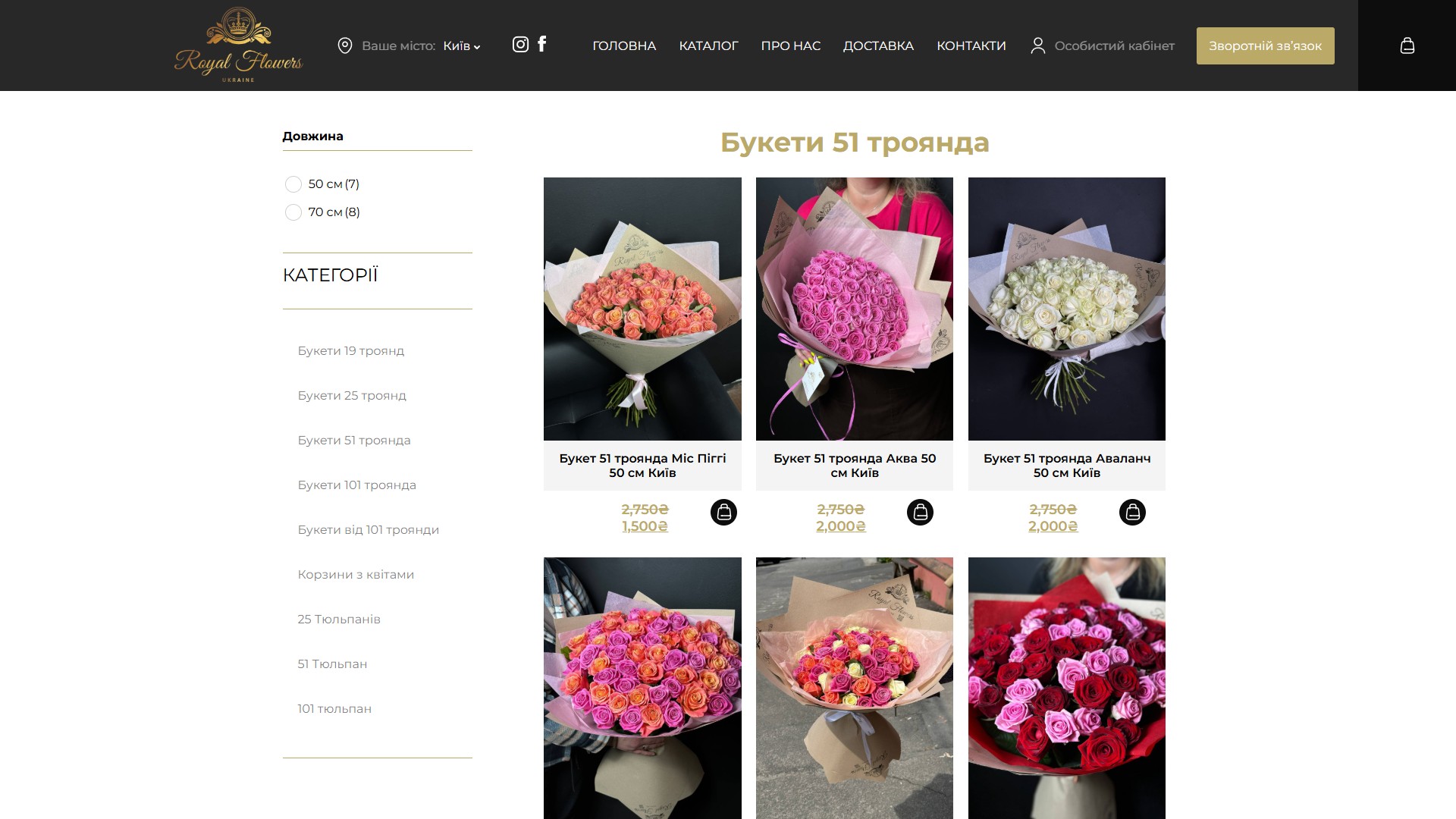
- Bouquets of 19, 25, 51, 101 roses and “101+ roses” — a dedicated taxonomy by flower count per bouquet;
- Separate tulip categories: bunches of 25 / 51 / 101 tulips;
- Flower baskets — a category for arrangements in a wicker basket;
- A stem-length filter (50 and 70 cm) — the most important parameter for roses, the one clients typically use to search for a bouquet within a specific budget.
The product page
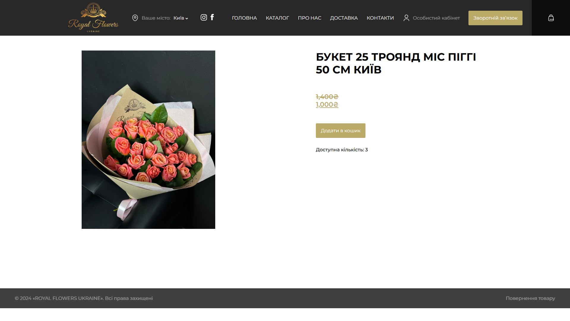
The product page is as lean as possible: a large bouquet photo on the left; on the right, the title, current and old price (if a discount applies), an “Add to cart” button, and a live stock counter (“Available quantity: 3”). The counter pulls straight from WooCommerce stock and gives the client a sense that the bouquet is real and physically in stock today.
A cart drawer instead of a separate cart page
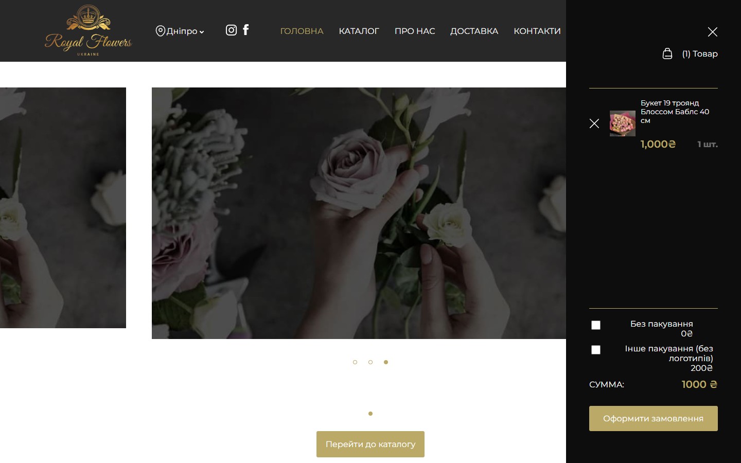
Instead of a traditional /cart/ page, there’s a persistent right-hand side panel present on every page of the site. Click “add to cart” on a card, and the drawer slides smoothly open with the item photo, title, price, quantity, checkboxes for extra wrapping (“No wrapping 0₴” / “Alternative wrapping 200₴”), and the total. At the bottom, a single “Place order” CTA leads straight to checkout. One click from the catalogue to checkout, with no intermediate cart-page load.
Checkout: pickup vs. delivery with a slot picker
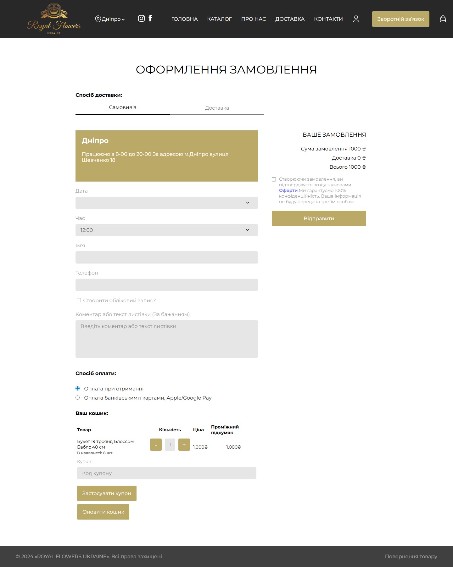
The /checkout/ page has two tabs up top: Pickup (the shop’s city address: Dnipro, 18 Shevchenko St; open 8-20) and Delivery. A chosen date plus a dropdown list of slots every 30 minutes (11:00–21:00). Name + Phone fields, a “Create an account” toggle, and a “Comment or card message” field — critical for a flower business, where the bouquet is often a surprise. Two payment methods: on receipt, or card/Apple Pay/Google Pay. On the right, a sticky summary shows the total, delivery cost, a checkbox agreeing to the Terms, and a “Submit” CTA. In the table cart below, a stock counter (“In stock: 8 pcs.”) plus a coupon field.
Delivery and slot logic
The brand’s own courier service is a key argument, which we surfaced in several places across the site. Base hours are 09:00–21:00, with early (07:00) and late (23:00) slots at extra cost — clear time windows rather than “whenever we manage it.” There’s a field for the recipient’s phone number (if the bouquet is a surprise, the courier agrees the drop-off location directly with them) and a private note to the florist.
The account page — login and registration on one screen
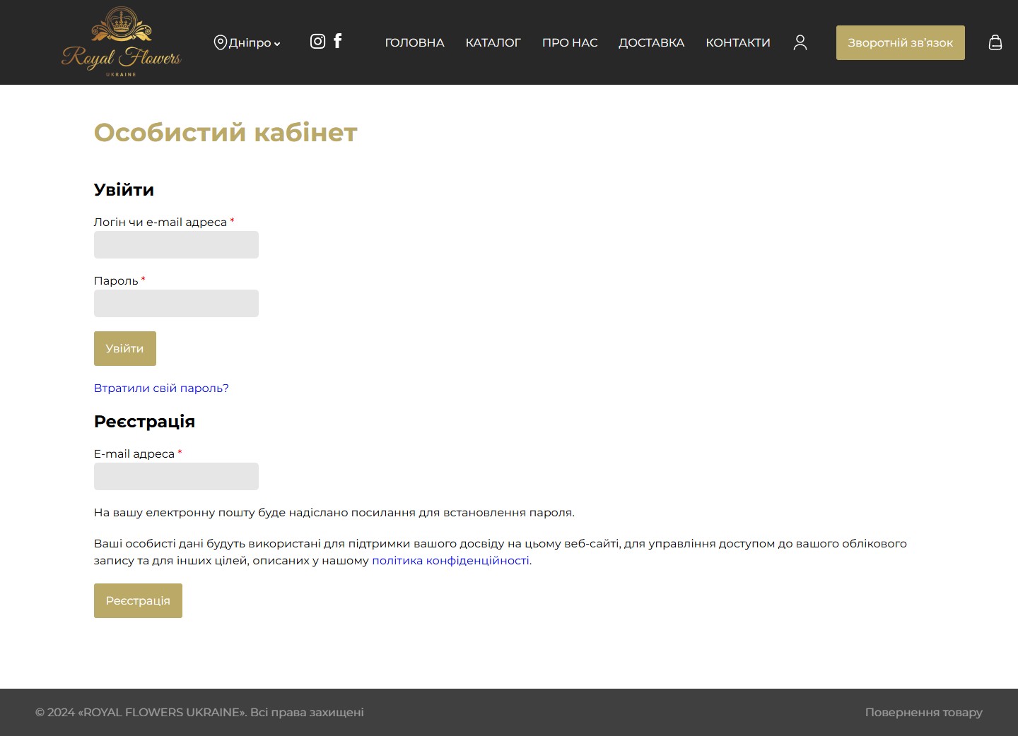
The account page (/my-account/) combines two actions on a single screen: a login form on the left (login/email + password + “Forgot your password?”) and email-based registration on the right — the customer gets a link by email to set a password. It works the same on desktop and mobile. For repeat orders, WooCommerce order history offers one-click reordering.
Content pages
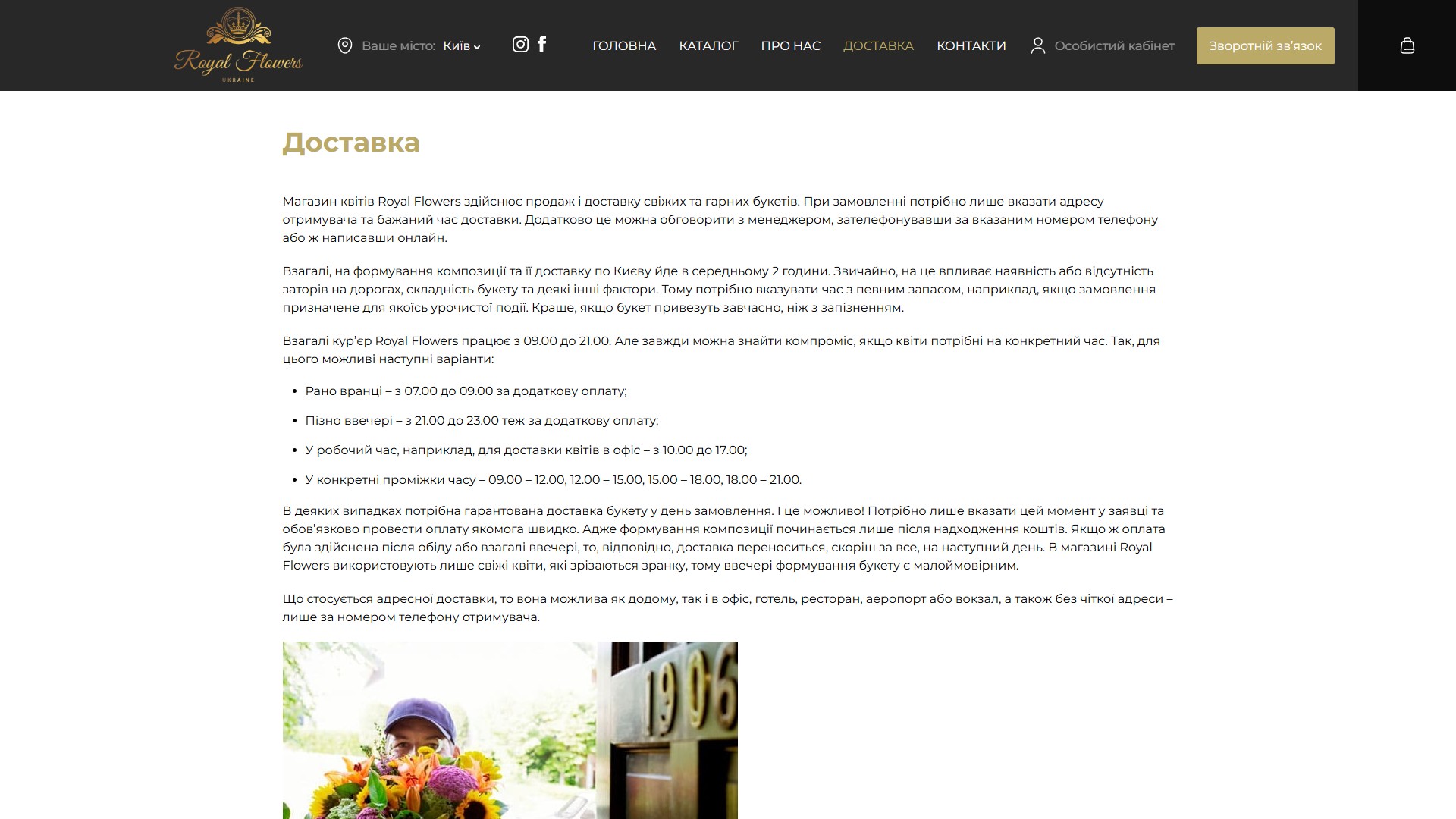
“About” and “Delivery” aren’t just SEO filler — they’re structured pages with illustrations, subheadings and lists. Content work was done so that the same page could rank correctly for regional queries — each of the four subdomains had its pages rewritten around its own city.
Contacts with a map and three physical locations
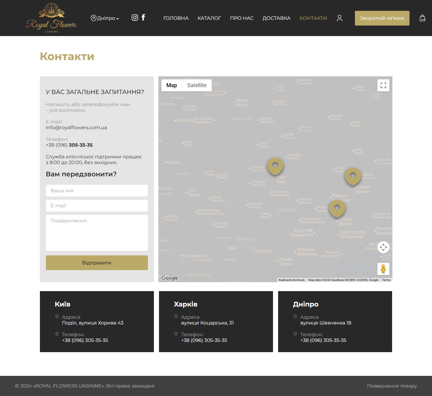
The /contacts/ page shows a “Have a general question?” card on the left with info@, the service line phone number (open 8:00–20:00), and a compact contact form (name + email + message). On the right, an interactive Google Maps view with pins across three cities. Below that, three location cards: Kyiv (Podil, 43 Khoryva St), Kharkiv (31 Kotsarska St), Dnipro (18 Shevchenko St). Each carries its address and a click-to-call phone link. There’s one shared service line across the whole chain.
Responsive layout
Mobile is the main ordering channel. The hero is compact, running through three “screens”-slides with different ad copy, navigation lives in a burger menu, and the cart is an icon in the top-right corner. The catalogue switches to a single-column grid.
Stack and integrations
- WordPress + WooCommerce as the base — standard CPTs for products, categories, attribute filters;
- Multisite on subdomains — one code template, separate pricing and stock for each city;
- Slick for the centred hero slider;
- Instagram and Facebook integration in the header — these channels bring the chain most of its organic traffic;
- A customer account area on top of WC My Account, with order history and one-click reordering.




