
ManyLeads — B2B lead-gen agency with a hero form and double social proof
B2B lead-gen агенція з лід-формою на першому екрані і подвійним соц-доказом (Trustpilot + Google Reviews)
ManyLeads (legal brand — B2Blead.com) is a B2B lead-generation agency with a New York phone line +1 (212) 578-1208 and mailbox sales@b2blead.com. The site manyleads.net is not a blog wrapper around a lead magnet and not a default agency template. It’s a single-page promo with 7 sections, where every section has the same conversion goal — a request for a free consultation or callback. The stack is WordPress + a custom theme + Yoast SEO + jQuery with several hand-rolled sliders. The content model is a separate CPT cases (rather than the WP default post) for the client-story portfolio, which keeps the blog and the case studies in different URL namespaces.
Hero: a lead form on the first screen, not below the fold
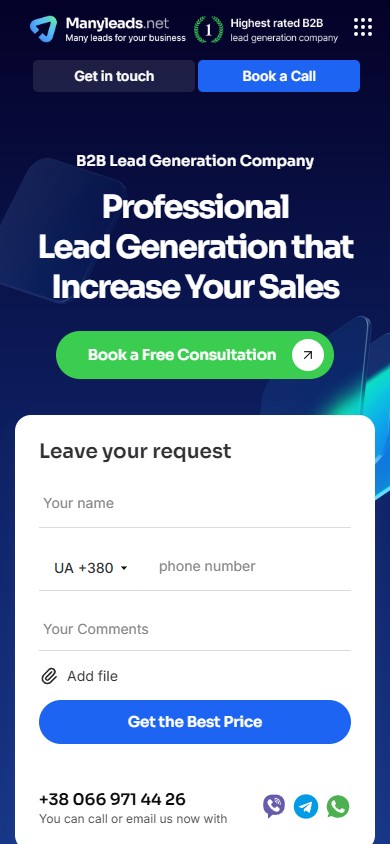
The first screen is a split layout: on the left, a headline “Professional Lead Generation that Increase Your Sales” with a sub-tag “B2B Lead Generation Company”, a lead paragraph about “one of best-in-class lead gen firm”, a green CTA “Book a Free Consultation”, and a Trustpilot badge rated 4.8/5 from 87 reviews. On the right — a full lead-form card “Leave your request” with 5 fields: name, phone with a multi-country dropdown (76 country codes with flags), comment, a file upload “Add file”, a blue CTA “Get the Best Price”, and below it a clickable phone number and three messenger icons (Viber, Telegram, WhatsApp). Above the nav is a thin dark promo bar “Get a special offer, Save up to 30%” with a CTA pill “Leave free request now”, dismissible with an “×” icon. This isn’t a banner that flashes once — it’s a session-scoped discount with a personal dismiss.
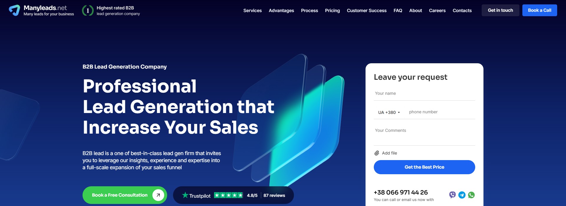
/contact page or in a modal. Here it’s on the homepage, on the very first screen — the user shouldn’t have to scroll or click to submit a request. This is a deliberate decision: CPL in the B2B lead-gen vertical sits in the $50–$200 range, and a form one scroll below the fold loses 30–40% of submissions. The multi-country dropdown with 76 codes (from US/UA to Kosovo XK+383) reflects the fact that ManyLeads is a global agency, not a local US provider: leads come from all over the world, and the form shouldn’t force a client to type a full international code by hand. The “Add file” upload is for attaching a client’s own target list or brief documents straight into the initial request.Results ribbon — below the hero, as a bridge to social proof
Right under the hero is a horizontal ribbon of three metrics: 36.1K Client leads generated, $7.6M Client revenue generated, $87M Сlient pipeline generated. Each figure has a colored icon in the left column and a two-line caption on the right. The numbers aren’t “approx” — they’re specific: 36.1 (not “36+”), $7.6 (not “$7M+”), $87 (not “$80M+”). It’s a deliberate precision signal — the agency keeps records and doesn’t round.
“Why choose our service from the rest?” — KPI bullets + 3 trust cards
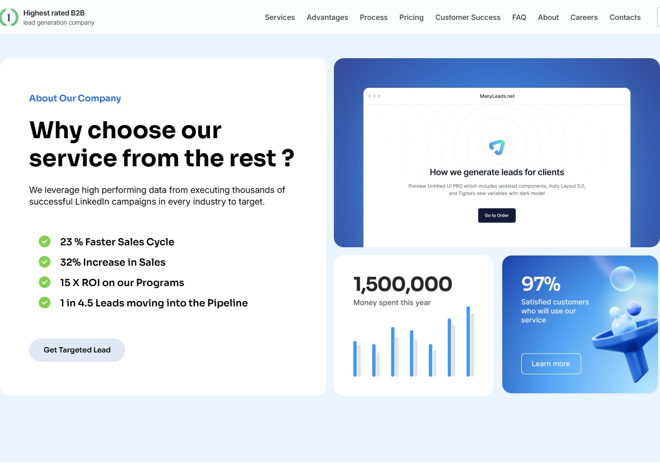
The “About Our Company” section is also a split layout. On the left: an “About Our Company” tag pill, a rhetorical-question headline, a paragraph about “high performing data from executing thousands of successful LinkedIn campaigns”, 4 KPI bullets with green checkbox markers (23% Faster Sales Cycle, 32% Increase in Sales, 15X ROI on our Programs, 1 in 4.5 Leads moving into the Pipeline) and an outline CTA “Get Targeted Lead”. On the right — three composite cards: (1) a product mockup “How we generate leads for clients” with a browser frame and a “Go to Order” CTA, (2) a headline figure “1,500,000 Money spent this year” with a bar-chart visual, (3) “97% Satisfied customers” with a funnel illustration and a “Learn more” CTA.
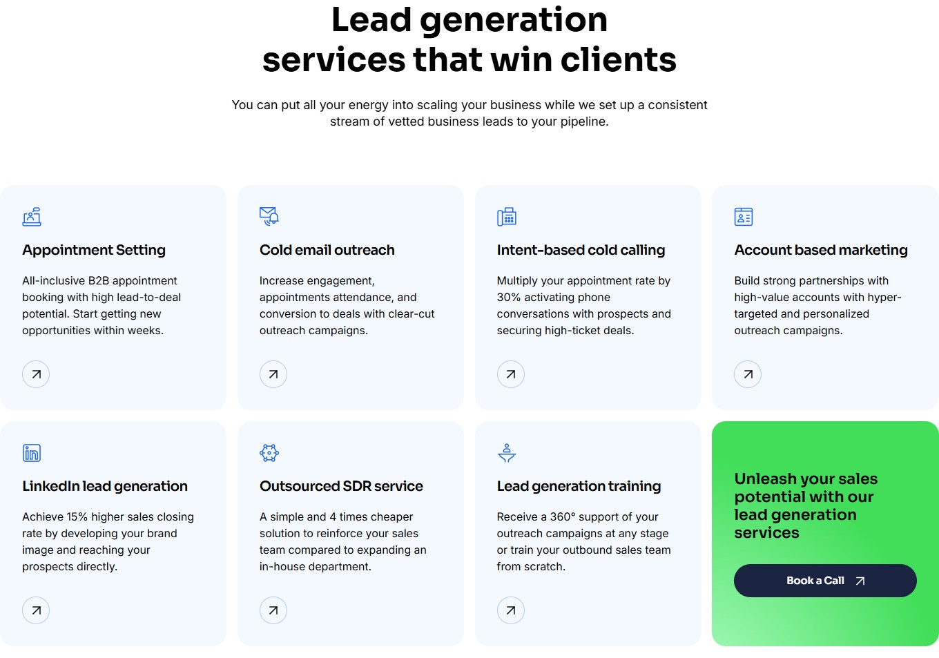
“Lead generation services that win clients” — 7 services + a green CTA card as the eighth tile
The services section is a 4×2 grid of 8 tiles: Appointment Setting, Cold email outreach, Intent-based cold calling, Account based marketing, LinkedIn lead generation, Outsourced SDR service, Lead generation training + an eighth tile — a saturated green card “Unleash your sales potential with our lead generation services” with a dark CTA button “Book a Call”. Every service tile is a light-blue card with an SVG icon on top, a heading, a short description, and an outline arrow-up-right button in the bottom-left corner (an intuitive “read more” pattern). Each tile’s copy is short and specific, with a baked-in number-benefit: “Multiply your appointment rate by 30%”, “4 times cheaper than expanding an in-house department”, “15% higher sales closing rate”.
“Our Process” — a 4-step methodology in a zigzag layout
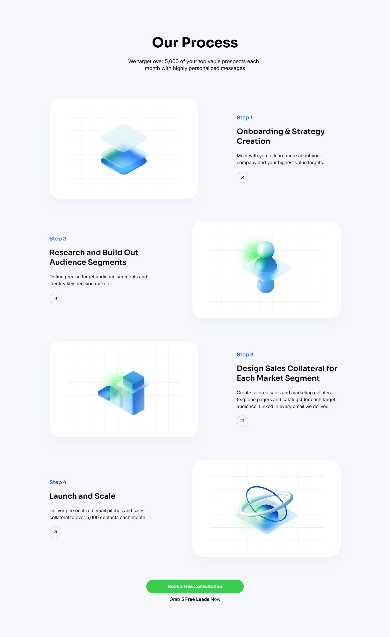
The “Our Process” section lays out 4 steps in a mirrored zigzag arrangement: Step 1 Onboarding & Strategy Creation, Step 2 Research and Build Out Audience Segments, Step 3 Design Sales Collateral for Each Market Segment, Step 4 Launch and Scale. Each step pairs a square 3D illustration block (isometric geometric shapes on a grid background) with a text column (blue “Step N” tag, black heading, grey description, outline arrow). The first step has the illustration on the left and the text on the right; the second flips it; and so on. At the bottom of the section — a green “Book a Free Consultation” CTA with the caption “Grab 5 Free Leads Now”.
“Book a Free Consultation Now!” — a full-width form between the services and the social proof
A separate section titled “Book a Free Consultation Now!” has a full-width form card with 7 fields in two columns: First name, Last name, Work email, Work phone (with a country dropdown), Mobile (with its own country dropdown), a full-width Comments textarea, and a blue CTA “Book now”. This isn’t the same form as the hero — it’s a second, expanded one, with full business info instead of a minimal quote request. The strategy: a user who didn’t submit the hero form (because they weren’t convinced yet) reaches this point after three sections of social proof and submits it “already ready to convert”.
Double social proof: a Trustpilot slider and a 3-column Google Reviews masonry
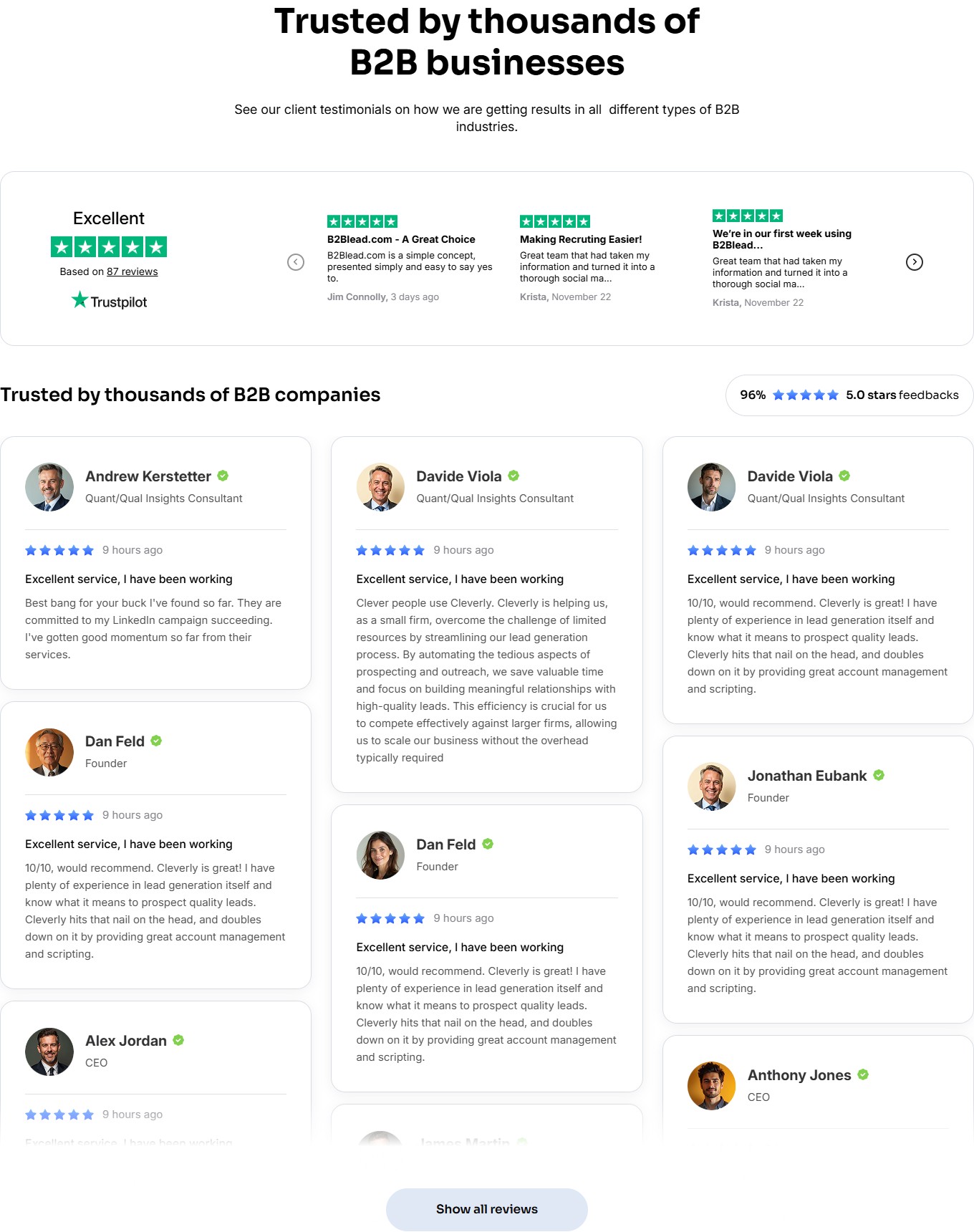
The social-proof section “Trusted by thousands of B2B businesses” has two distinct review formats. At the top — a wide Trustpilot slider card: on the left, the official Trustpilot badge “Excellent ★★★★★ Based on 87 reviews” with the Trustpilot logo, on the right a horizontal slider with 4 visible cards (headline phrase + quote + name + date) and round arrow navigation. Below — a headline “Trusted by thousands of B2B companies” with a tag pill 96% ★★★★★ 5.0 stars feedbacks and a 3-column masonry of 9+ Google-style review cards: each card carries the author’s avatar photo with a verified checkmark, their title (CEO / Founder / Consultant), a 5-star rating, a “9 hours ago” timestamp, a short headline phrase, and the full text. At the bottom of the section — an outline button “Show all reviews”.
Final CTA + footer with a 4-column nav and social buttons
Before the footer — a minimalist CTA section “Ready to start getting clients?” with a caption about a “brief meeting with Belkins experts to facilitate your business growth” (Belkins — a partner/reference mention) and a dark button “Schedule 30-min call”. The footer sits on a dark background: a left column with the logo, positioning copy, sales email and a US phone number; then 4 nav columns (Services / Company / B2BData / Services duplicate) with 5–6 items each; below that, a divider line with ©B2Blead.com 2024, a legal menu (Terms of Use / Privacy Notice / Cookie Notice / Cookie settings / Trust Center) and 4 social buttons.
Responsive: 8 sections collapse into a single column without losing conversion points
On mobile (≤768px) all sections flow into a single column: hero — heading on top, form card below the “Book a Free Consultation” CTA; the 4×2 service grid becomes a 1×8 stack; the process zigzag becomes a linear 1→4 sequence; the nav collapses into a burger plus 2 buttons (Get in touch + Book a Call). The “Save up to 30%” promo bar is hidden on mobile (it takes up too much header height). The iPhone telephone keyboard activates automatically for the phone input in the form.
Stack and technical decisions
- WordPress + a custom theme (not Elementor, not Astra, not WPBakery). Markup is semantic HTML5 with prefixed section classes (
main,about,services,process,book,reviews,start). - Yoast SEO — generates 6 sitemap indexes (post-sitemap, page-sitemap, cases-sitemap, category-sitemap, case-category-sitemap, author-sitemap), meaning separate indexing for the blog, pages and the
casesCPT with its owncase-categorytaxonomy. - Custom CPT
cases— a separate URL namespace/cases/<slug>/for the success-story portfolio (at index time — nomadesk-case-study and e-commerce-solutions-provider). Kept separate from blog posts, letting Yoast maintain its own breadcrumb structure and Article schema for the two different content types. - jQuery 3.x + jquery-migrate 3.4.1 — the standard WP bundle for CF forms and sliders.
- Custom phone input with a 76-country dropdown — likely intl-tel-input or an in-house build on top of a native <select>, with emoji flags instead of SVG images (a lighter bundle).
- File-upload field in the hero form — a native CF-like input with a drag zone “Add file”, with no cap on count (built for sending multi-target-list briefs).
- Trustpilot embed widget — the official third-party widget with a horizontal slider of 4 visible cards + a click on the badge leads to the trustpilot.com profile.
- Google Reviews integration — a 3-column masonry grid, likely via the Google Places API with caching (not realtime — otherwise there’d be layout shift on the first scrolls).
- Floating contact buttons in the hero (Viber/Telegram/WhatsApp) — native
tel:,viber://,https://t.me/,https://wa.me/handler URIs.
The architectural essence of the project is a conversion-driven single-page agency site where every one of the 8 visible sections carries either a form or a CTA button to book a consultation. The content model (Cases CPT, Yoast indexing) is factored into a separate workstream for SEO growth, while the theme stays monolithic (one theme package) so template logic isn’t fragmented across small modules.




