
Legislant — legal support for Ukrainians in Poland
Юридичний супровід і легалізація українців у Польщі — карти побиту, лізинг авто, US-візи та реєстрація бізнесу: лендінг + 4 спецсторінки під кожну послугу.
Context
Legislant is a Polish law firm with 15 years of experience specialising in legalisation for Ukrainians in Poland: residence cards (karta pobytu), car leasing, US visas, business registration, and a full set of related administrative services (from EORI and EKUZ to agency and transport licences). The task for the site was to bring four different funnels together into one clear resource: quickly explain what situations the company handles, give an entry point for each service, and lower the trust barrier for someone who has just relocated and is afraid of “ending up in the wrong place”. So this isn’t a single landing page but a homepage plus separate pages for each service area, all built on the same trust pattern: a zero-friction lead form, a USP block with facts (15+ years, 1,000+ positive outcomes, 200+ registered businesses), a 5-step process, and video testimonials from real clients.
What we built on the homepage
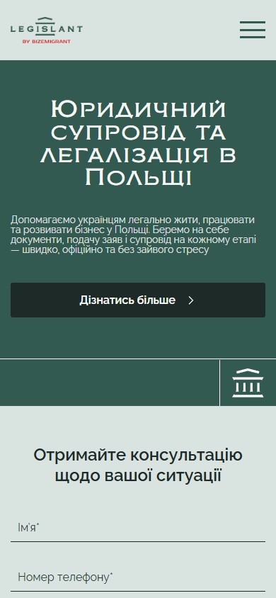
A hero with direct positioning
The first screen doesn’t try to sell — it names the category right away (“Legal support and legalisation in Poland”) and defuses fear with the line beneath it: “fast, official, and without unnecessary stress”. The visual is a black-and-white photo of a legal consultant with a green overlay, which sets the primary palette for the whole site (dark green as the colour of trust, plus the brick-red accent of the Bizemigrant logo). A single “Learn more” CTA leads to the “Who we are” anchor section, not straight to the form — a soft entry point for someone still in the research stage.
A quick form that segments the enquiry
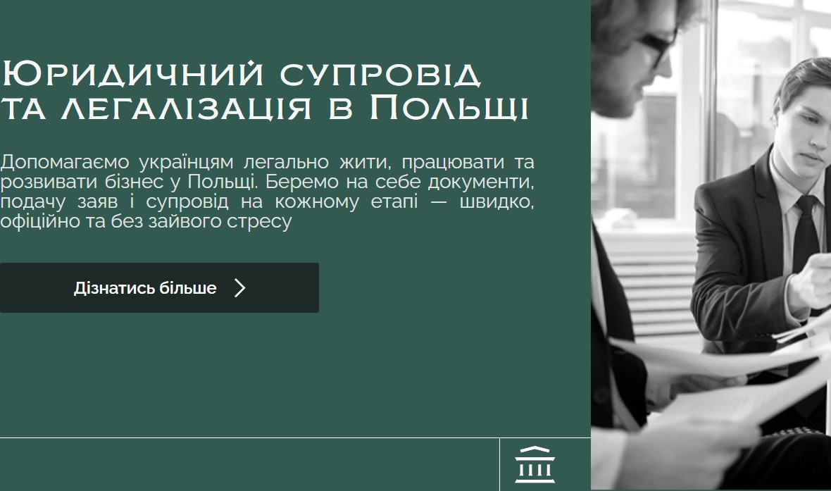
Right below the hero is a horizontal consultation form with three fields: Name, Phone number, and a select, “Choose your type of enquiry”, with options “Starting a business in Poland / Residence card / US visas / Leasing / Other”. The select isn’t just cosmetic — it routes the enquiry to the right lawyer before the first call even happens. The “Get a consultation” button is the single call to action, with no consent checkboxes or extra tick boxes, removing friction on mobile.
“Who we are” — 4 facts instead of slogans
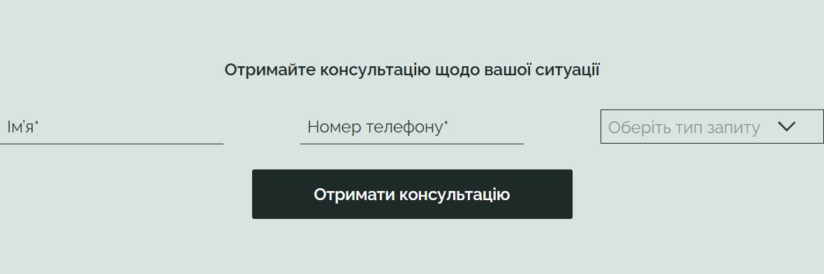
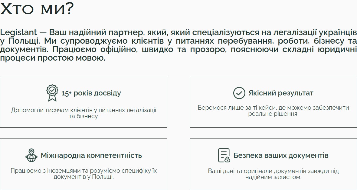
“About us” isn’t built on corporate generalities but on 4 concrete USP cards with icons: 15+ years of experience (captioned “we’ve helped thousands of clients”), a quality-driven outcome (“we only take on cases where we can secure a real result”), international expertise (“we work with foreign nationals and understand the specifics of their documents”), and document security. This defuses the fear of “handing my passport to strangers” — the main barrier for someone who has just relocated.
A service catalogue — 5 core services plus 15 additional ones in an accordion
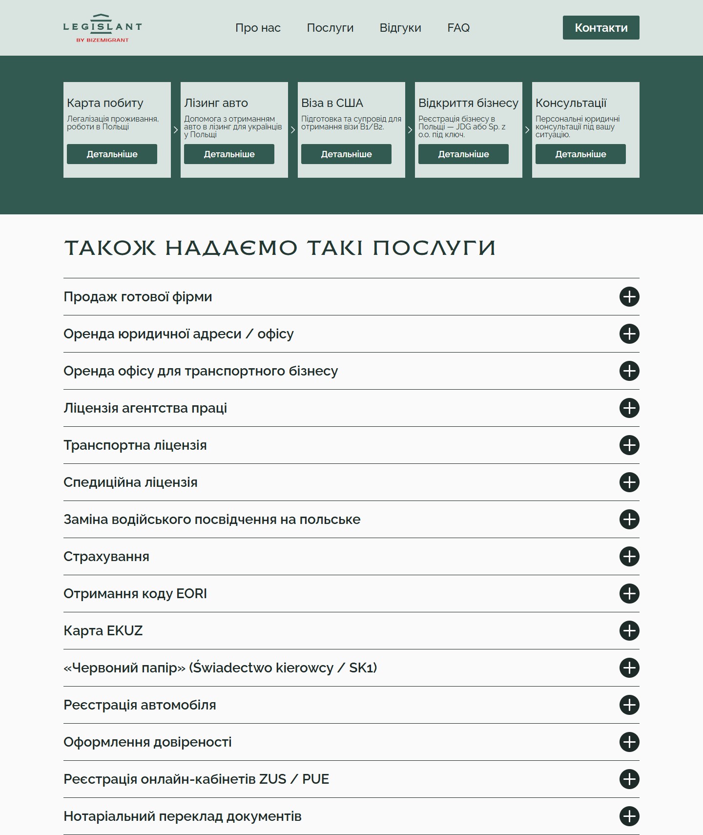
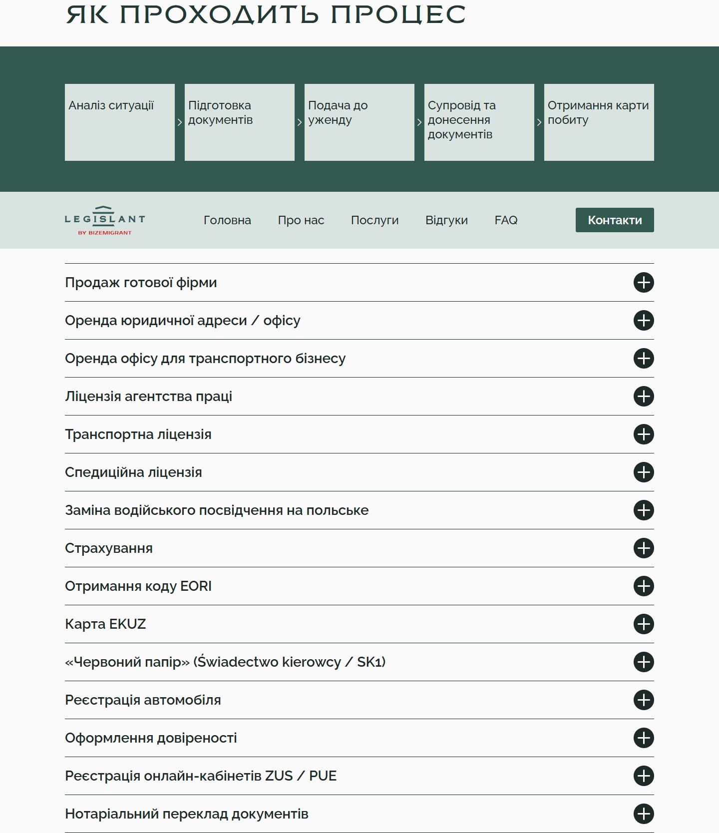
Services are split into two groups. The first is 5 core areas in a horizontal row of cards (Residence card, Car leasing, US visa, Business registration, Consultations), each with a “Learn more” button that leads to a dedicated landing page for that area (the anchor #form scrolls straight to that page’s form). The second is a section, “We also provide these services”, with 15 additional services in an accordion: selling a ready-made company, renting a legal address and office for a transport business, a labour agency licence, transport and forwarding licences, replacing a driver’s licence, insurance, EORI, EKUZ, the “red paper” (Świadectwo kierowcy / SK1), vehicle registration, powers of attorney, ZUS/PUE portal access, notarised translation. This covers the entire range of a Polish migrant’s administrative needs — from “buy a truck” to “get a document translated”.
Video testimonials — social proof through real faces
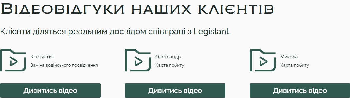
Instead of text quotes, a section with 3 video testimonials from real clients (Kostiantyn — replacing a driver’s licence; Oleksandr and Mykola — residence cards). Each card shows the client’s name, the service they came for, and a “Watch video” CTA that opens an mp4 clip. This turns the “1,000+ positive outcomes” figure from the “Who we are” block into concrete faces, not just a number on a slide.
FAQ — quick answers to the barriers
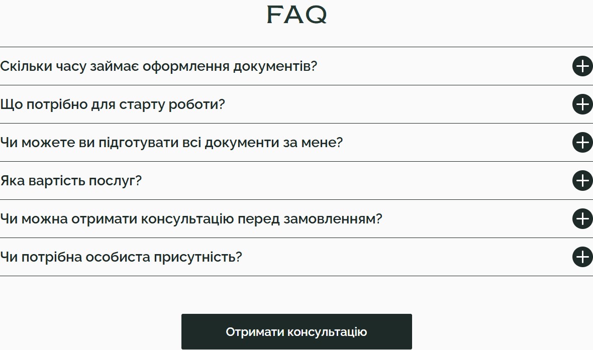
The FAQ closes 6 typical questions that arise before a client submits an enquiry: “How long will it take?”, “What do I need to get started?”, “Can you handle everything for me?”, “What’s the cost?”, “Can I get a consultation before ordering?”, “Is my personal presence required?”. The answers are short and free of legal jargon: “timelines depend on the type of service, and we always give realistic estimates”. At the bottom is a repeated CTA to the form, so the person doesn’t need to scroll back up.
Dedicated landing pages for each area
Residence card — a hero plus a 5-step process
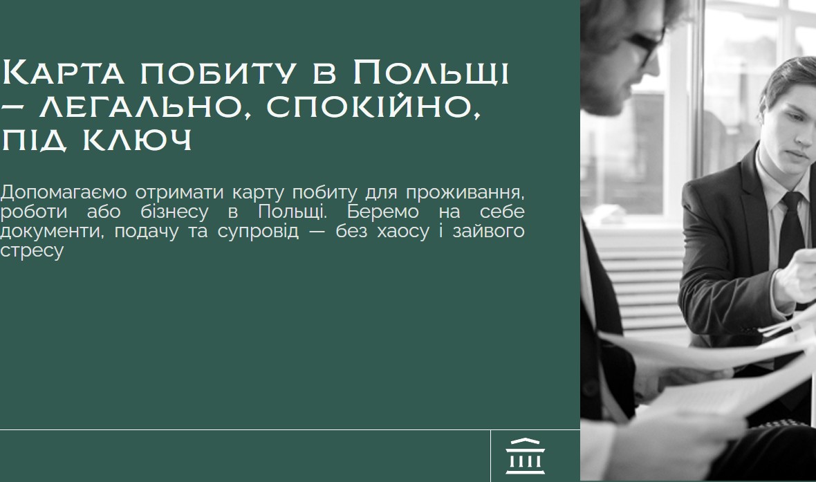
The residence card landing page opens with its own hero (a more precise message, “A residence card in Poland — legal, calm, turnkey”), a short description of scenarios (living / working / running a business), and a shortened 2-field form (no select — the enquiry type is already known). This page’s unique block is “How the process works”, with 5 steps: Situation analysis → Document preparation → Submission to the office → Follow-up and additional documents → Receiving the residence card. This removes the main uncertainty: the client sees exactly how many touchpoints there’ll be with the company and where their own role ends.
Car leasing — a focus on non-standard status
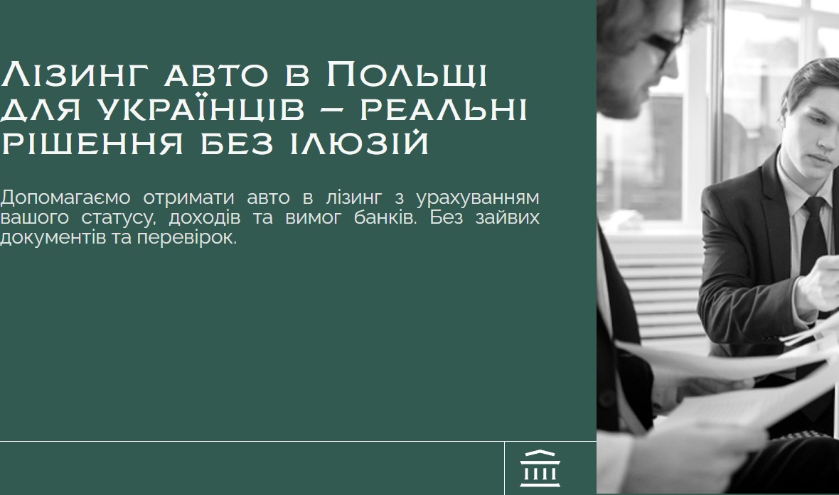
The leasing landing page is positioned around the target audience’s pain point: “real solutions, no illusions”. The USP block here is different — it directly names the advantages for a non-standard client: “working with Ukrainians and their statuses”, “no unnecessary paperwork or checks”, “our own network of leasing companies and partners”, “support all the way through to receiving the car”. This defuses a Ukrainian client’s biggest fear in the Polish banking system — “I’ll get turned down because of my status” — and immediately offers its own positioning through “our own partner network”, hinting that a bank’s rejection doesn’t mean a leasing rejection.
US visa — positioned as a “case”, not “filling in a form”
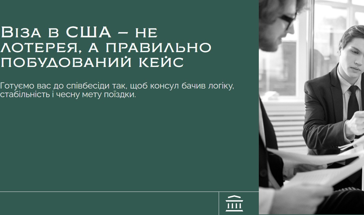
The B1/B2 visa landing page has the most differentiated message: “A US visa isn’t a lottery, it’s a properly built case”. The subheading: “we prepare you for the interview so the consul sees logic, stability, and an honest purpose for the trip”. This framing matters: it explains why paid support beats a self-filed application — the client isn’t buying a DS-160 form-filling service, but a well-built case logic plus interview coaching. The process here is 5 steps: Situation analysis → Building the case → Preparing answers → Filling in the DS-160 → Support through to receiving the visa.
Business registration — JDG vs Sp. z o.o., turnkey
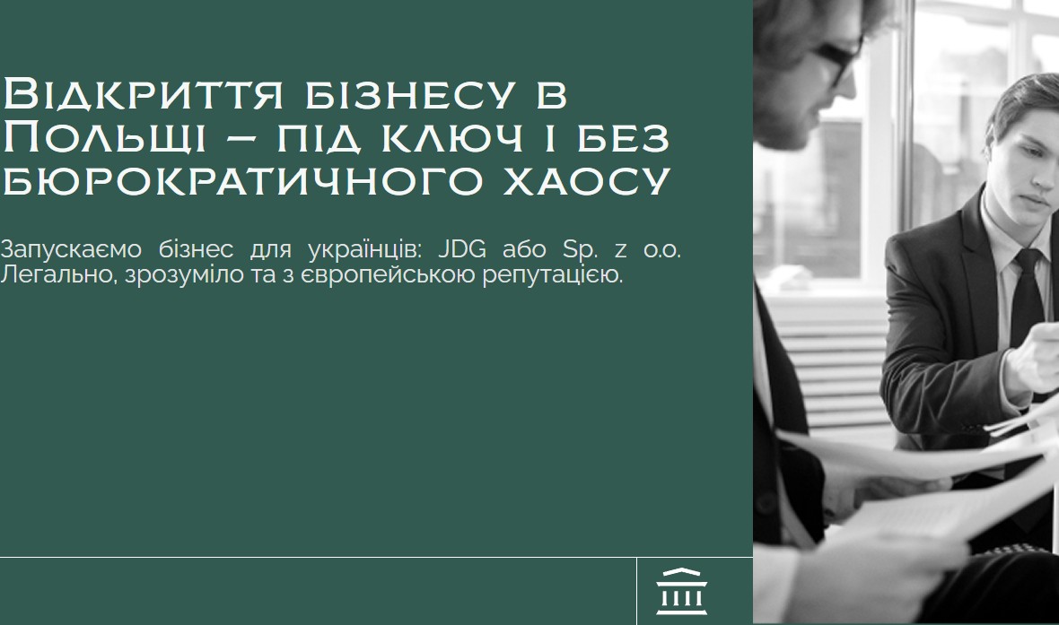
The business landing page immediately names the two most common Polish business structures for a Ukrainian (JDG — sole proprietorship, and Sp. z o.o. — a limited liability company) and positions itself as “no bureaucratic chaos”. The USP block here is the most concrete in terms of numbers: “200+ registered businesses”, “full turnkey support”, “a well-thought-out tax strategy”, “support after launch”. This addresses a first-time entrepreneur’s biggest fear: “I’ll register — then what about ZUS, CRBR, the bank?” The 5-step process covers every touchpoint: Consultation and choosing a structure → PESEL and an electronic signature → Company registration → Tax office, ZUS and CRBR → Opening a bank account. In other words, the company supports the client all the way to the point where they can actually accept payments.
Result
Legislant is not a single landing page, but a homepage plus 4 specialised pages for each area (residence card, car leasing, B1/B2 visa, business registration), all built on the same trust pattern: a positioning hero, a shortened entry form, a USP block with numbers, a 5-step process, video testimonials and an FAQ. The homepage aggregates all four areas into a single select-based form and adds a catalogue of 15 additional services in an accordion (from EORI to a forwarding licence), turning the site from a landing page into a full entry point for a Ukrainian deciding to legalise their status in Poland. A shared visual language — dark green as the colour of legal trust, black-and-white consultant photography, the brick-red accent of the Bizemigrant logo — makes the transitions between pages seamless, even if someone lands directly on a specific service page from an ad.




