
LaserBrno — a laser hair-removal and body-aesthetics salon in Brno
CZ/EN-сайт салону лазерної епіляції у Брно на WordPress 6.9 + кастомній темі laserwp: моно-hero під головну послугу, асиметричний блок Služby, багаторівневий прайс із табами, SVG-мапа Чехії, бронювання через Altegio.
LaserBrno is a laser hair-removal and body-aesthetics salon in Brno (Czech Republic), at Milady Horákové 25. The site launched in 2024 on WordPress 6.9 with a custom laserwp theme. It’s bilingual (CZ / EN, via WP-Multilang), with booking through an external CRM, Altegio, direct WhatsApp/Instagram/Facebook channels, and its own lead flow through Contact Form 7.
The hero as a showcase for the core service, not a catalogue
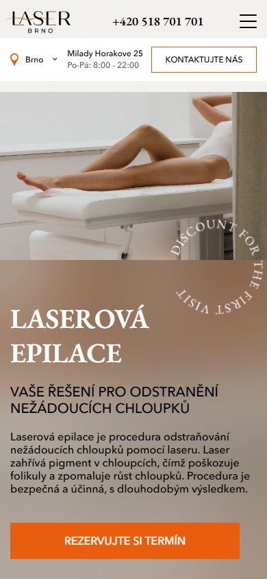
The first screen isn’t a carousel of services or “pick what you need”. It’s a single-focus hero: “LASEROVÁ EPILACE — Vaše řešení pro odstranění nežádoucích chloupků”, with a round “DISCOUNT FOR THE FIRST VISIT” stamp, an explanatory paragraph about how the treatment works, and one orange CTA, “Rezervujte si termín”, which leads to the external Altegio booking system (n1220038.alteg.io). The other services sit further down, but the hero acts as a targeted entry point: 90% of traffic is looking specifically for laser hair removal, and the site doesn’t get in the way of them clicking straight through to it.
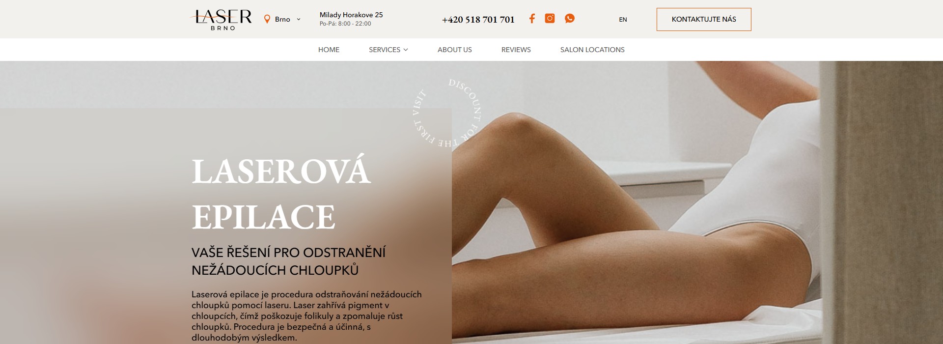
+420 518 701 701) and social icons (FB, IG, WhatsApp), is all visible on desktop with no scrolling. The “KONTAKTUJTE NÁS” button on the right also leads to Altegio, meaning there are two parallel paths to booking right from the first screen.Asymmetric “Služby” — 4 numbered cards in a broken grid
The services block isn’t a symmetric 2×2 grid — it’s deliberately “broken”: three cards, 01 Laserová epilace / 02 Ruční a přístrojová masáž / 03 Elevate Contours, in the top row, and a fourth card, 04 Kosmetologie, shifted down and to the left (under “02”). On the left is a vertical, near-transparent “SLUŽBY” title acting as a watermark. This is an editorial device — the asymmetry signals “we’re not a clinical price list, we’re a salon with character”, which fits the beauty niche and echoes the visual language of competing premium salons.

/service/laser-epilation/, /service/hand-massages/, /service/cavitation/, /service/endosphere/). The whole card is clickable, not just the button — a typical card-as-link UX pattern.A “Jak fungují naše procedury” video section — a carousel of 7 tiles
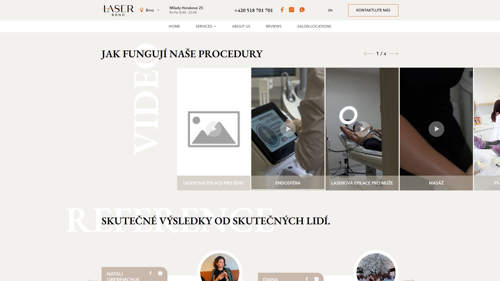
Rather than tucking videos away in a YouTube playlist or building an autoplay background, the “Jak fungují naše procedury” section is a slick carousel of 7 square tiles with a play overlay: Laserová epilace pro ženy, Endosféra, Laserová epilace pro muže, Masáž, Pressoterapie, ELEVATE CONTOURS, Kosmetologie. Each tile links to the same YouTube video (youtu.be/va1oiojnGrA), which opens in a Fancybox lightbox over the page. A “1 / 4” counter and paging arrows follow standard slick navigation.
Reviews as round portrait cards linking to social media
The “Reference: skutečné výsledky od skutečných lidí” section is a slick review slider. Each card is a round photo of a client + a name + two small icons (Facebook, Instagram) linking straight to the salon’s own profile (not the client’s profile), a “5/5” badge with 5 stars, and the review text in a speech bubble. The home page shows 5 rotating cards (Natali Oberemchuk, Diana, Mariia, Viktoriya, Olena), with a “Zobrazit více recenzí” button below leading to the full /what-our-clients-say/ page.
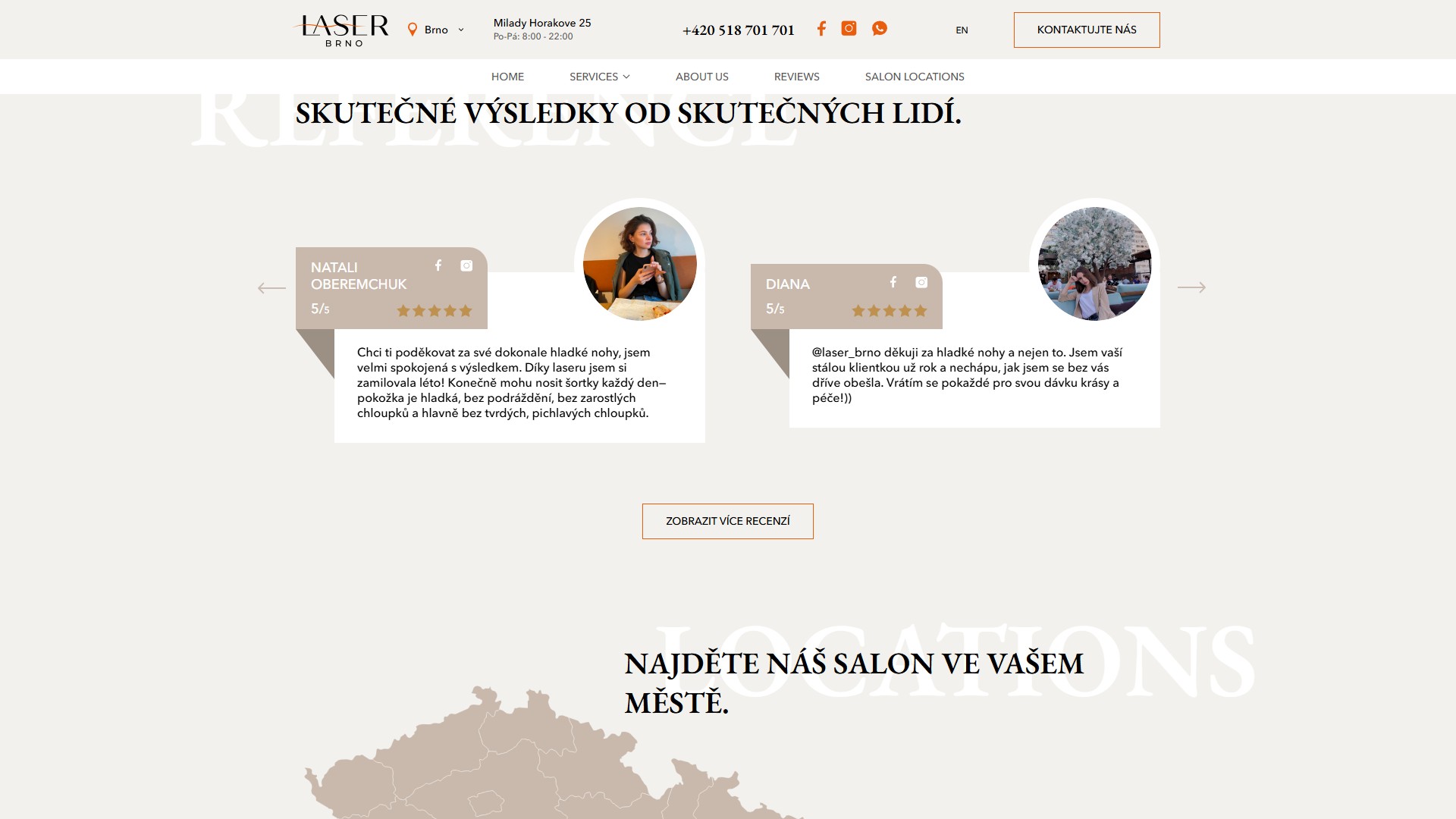
@laser_brno_cz account. This isn’t a bug, it’s a conversion substitution: a reader who trusts the review clicks “see more from this person” and lands on the salon’s official Instagram, which then shows more video content and photo case studies. Social media here is part of the funnel, not author attribution.Locations — an interactive map of the Czech Republic with a highlighted region and a pin pill
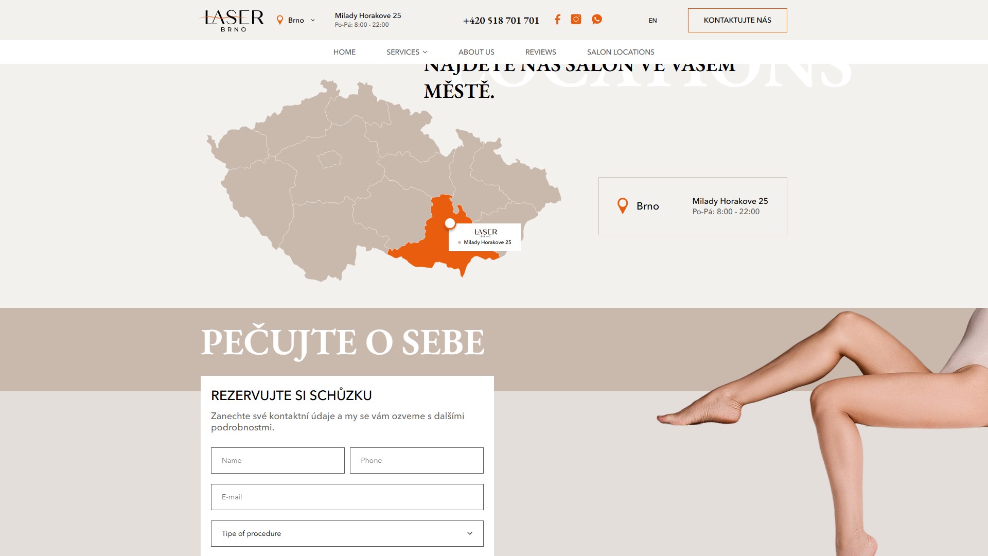
The “Najděte náš salon ve vašem městě” section is an SVG map of the Czech Republic with all 14 regions, where Jihomoravský kraj is highlighted in orange (the brand colour), and a pin pill with a LASER BRNO micro-logo and the caption “Milady Horakove 25” sits over Brno. On the right is a card version of the same address, with opening hours Po–Pá 8:00–22:00 and a “Brno” pin icon. This is ready-made infrastructure for multi-location growth: when a second salon opens, all that’s needed is to highlight another region and add one more card.
The service-detail page — a full standalone landing page for each service
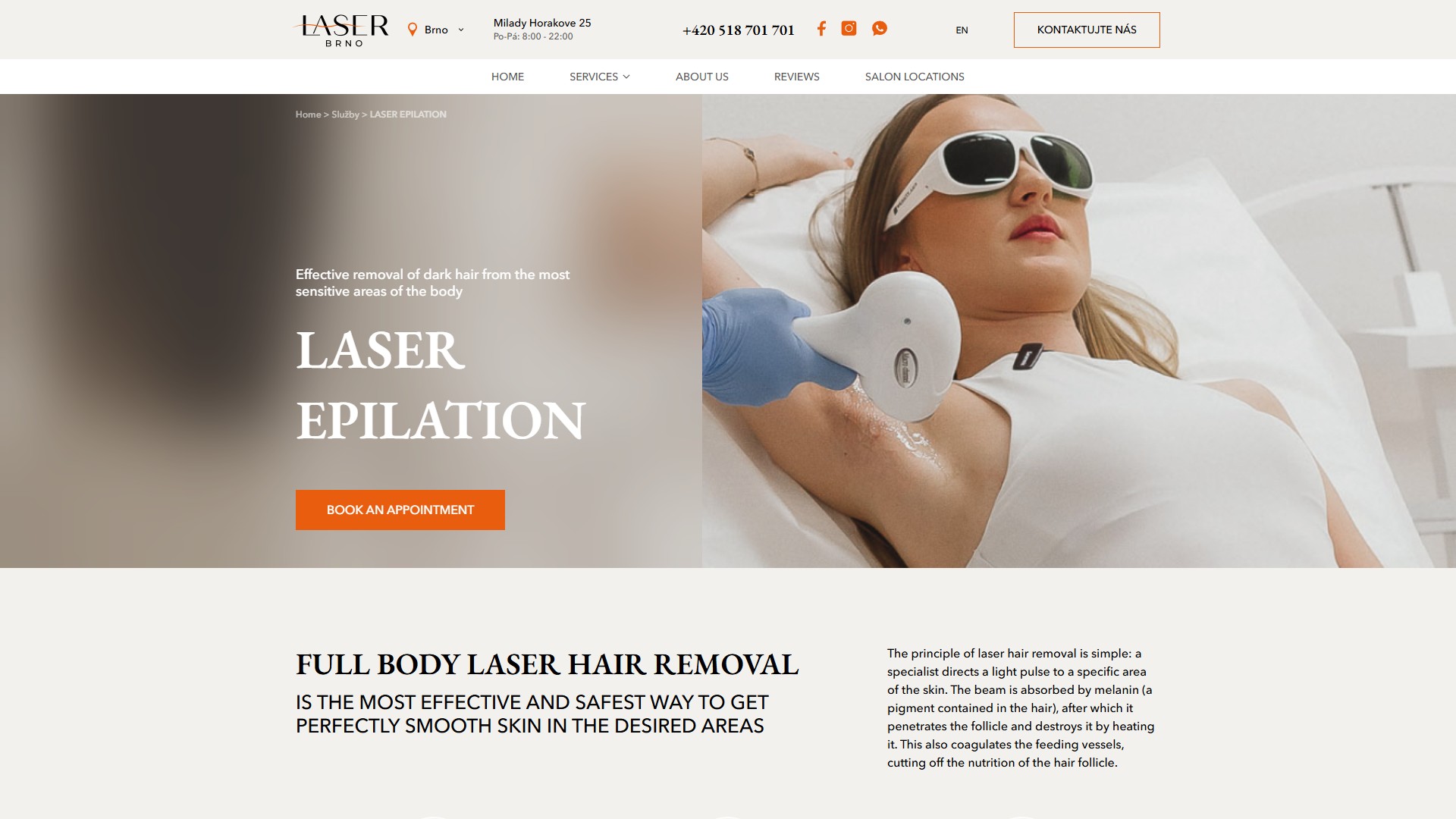
A single service page (for instance /service/laser-epilation/) isn’t “text + price” — it’s a full multi-section landing page: a breadcrumb “Home › Služby › LASER EPILATION”, a hero with a tag description, a giant H1 and an orange “Book an appointment” CTA, then a paragraph on how the treatment works, a grid of 6 benefits (Noticeable result, No ingrown hairs, Minimal painful sensations, Safety, Ability to remove hair from the most sensitive areas, Availability), and a horizontal photo strip of 7 salon photos in a Fancybox lightbox.
n1220038.alteg.io/company/759960/personal/menu) as the button in the header. Every booking path converges on the same point — the user doesn’t run into different forms depending on where they came in from.Specialists — portrait cards with a qualifications list
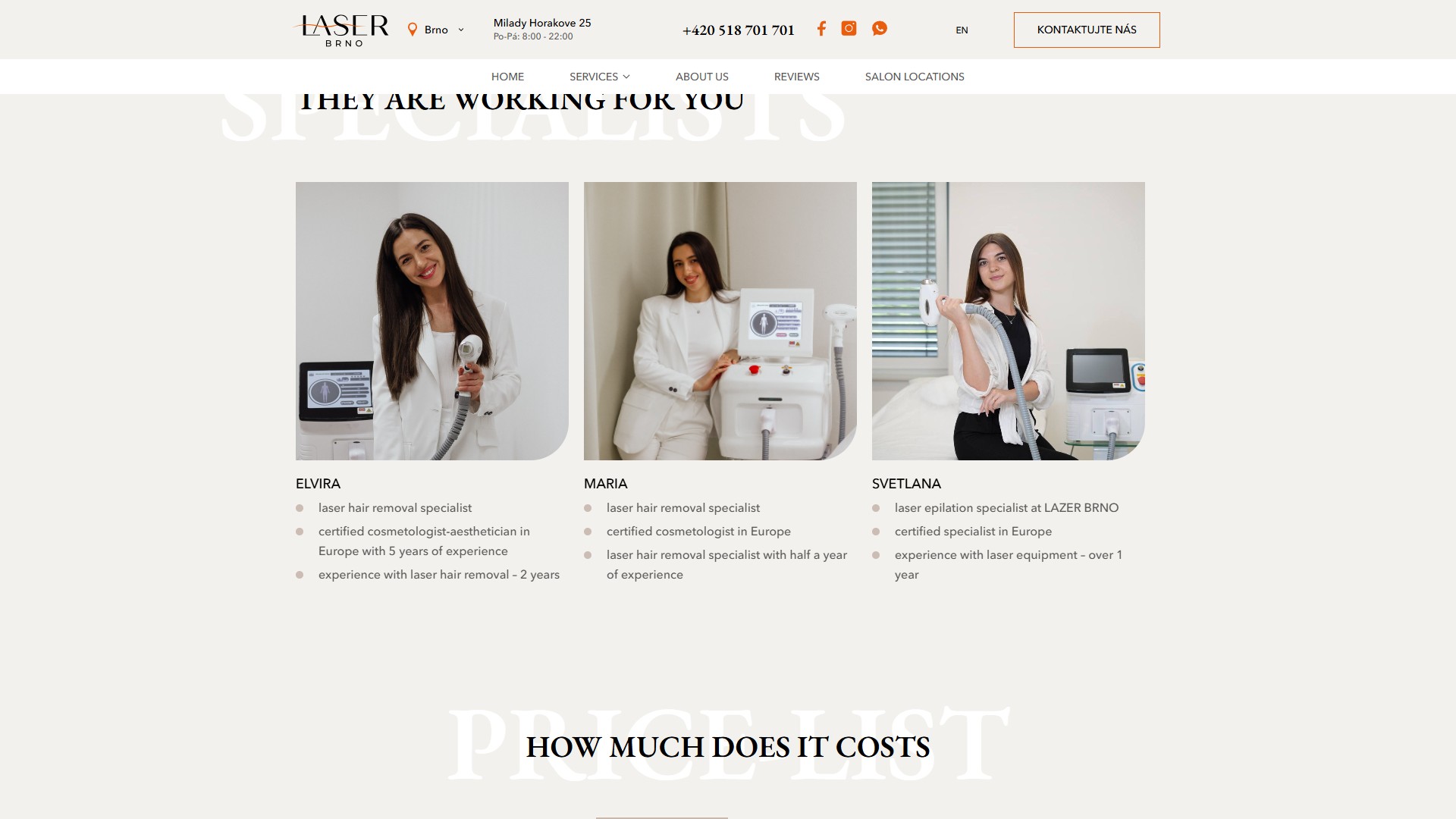
Further down the single-service page is a “They are working for you / specialists” block: three cards with a 4×5 portrait photo of a specialist in a white coat next to her equipment + her name + a bullet list of qualifications (laser hair removal specialist · certified cosmetologist-aesthetician in Europe with 5 years of experience · experience with laser hair removal – 2 years). This isn’t “the team” formatted as “pretty face + job title” — it’s maximally concrete trust-building: a specific device, a specific certification, specific years of experience.
Pricing — a multi-level tab structure, Women/Men × 6 body zones
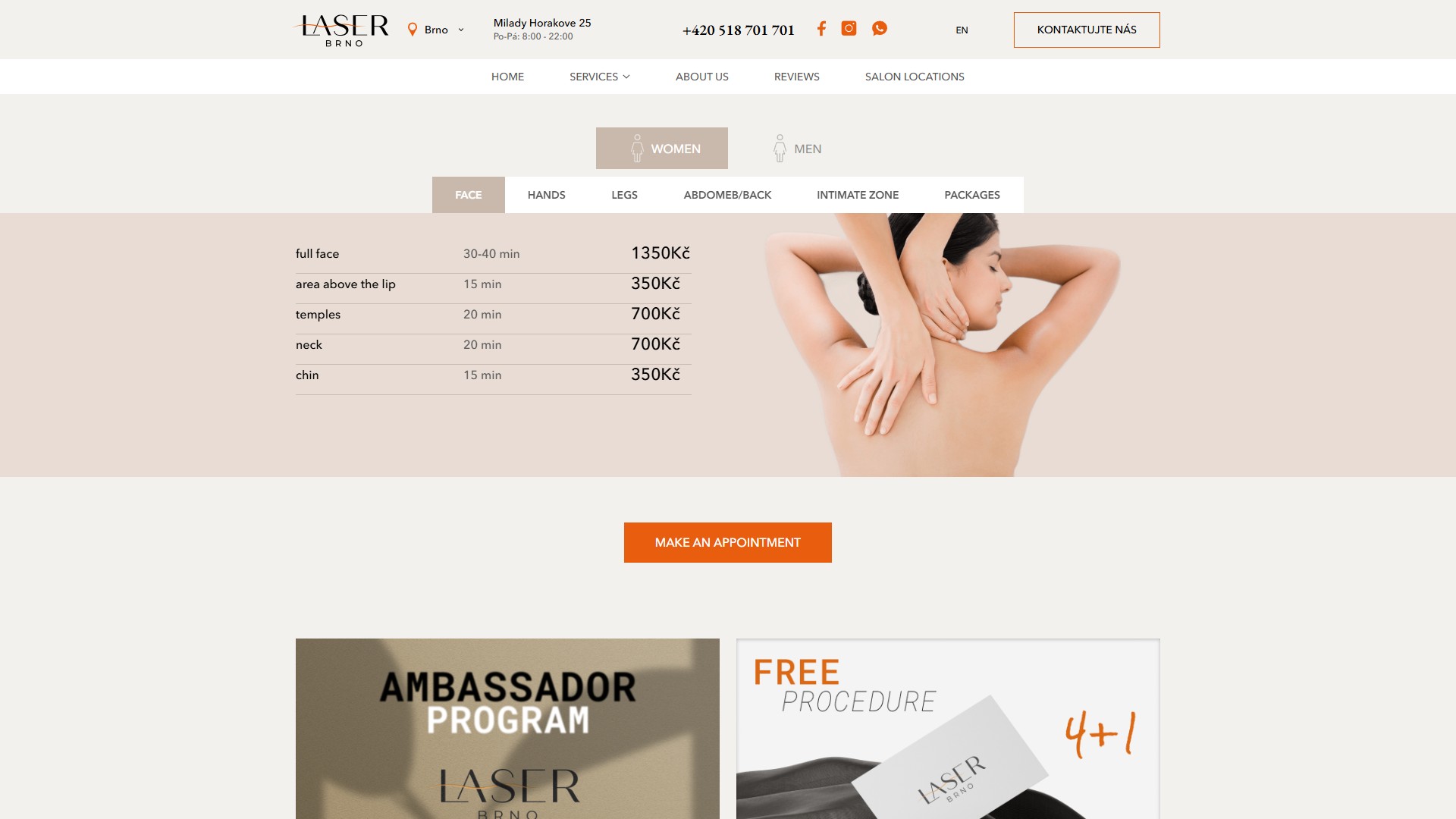
The “How much does it costs / price-list” section is a multi-level tab structure: the top level is WOMEN / MEN with gender icons, the bottom level is FACE / HANDS / LEGS / ABDOMEB/BACK / INTIMATE ZONE / PACKAGES. Each item shows the duration in minutes and the price in CZK (for example, “full face — 30-40 min — 1350Kč”, “area above the lip — 15 min — 350Kč”). A photo illustration of the relevant body zone sits on the right. The pricing is transparent, with no “price on request”, no hidden upsells — a direct contract between the site and the client, reducing post-click friction in the Altegio form.
Two promo mechanics below the price list — an Ambassador Program and 4+1 Free
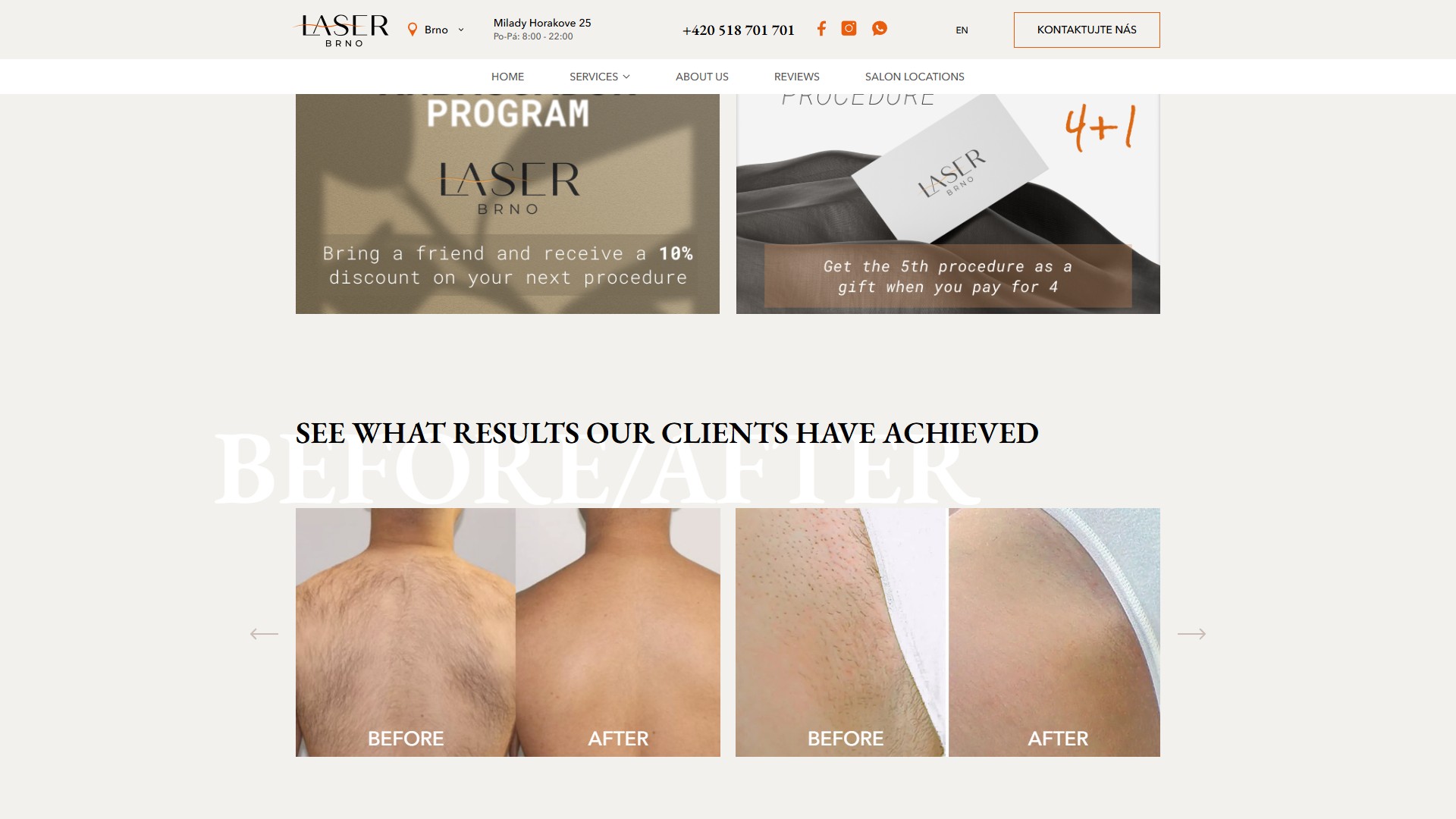
Right below the price list are two wide promo cards: “AMBASSADOR PROGRAM” on an olive-green background (“Bring a friend and receive a 10% discount on your next procedure”) and “FREE PROCEDURE 4+1” with a photo of a LASER BRNO gift card (“Get the 5th procedure as a gift when you pay for 4”). This is a classic beauty-salon retention loop: one mechanic drives the part that’s uncomfortable for the salon (bringing in a new client), the other drives the part that’s comfortable but costly for the salon (repeat visits). Both cards are placed in a visually distinct block, not tucked away in a text FAQ.
Stack, integrations, marketing
- WordPress 6.9.4 on nginx, with its own
laserwptheme (not a page builder) — full control over markup and animations, with no Elementor/Divi layer on top. - WP-Multilang 2.4.27 — CZ/EN bilingual support with URL prefixes (
/cz/...) and an automatic switcher in the header. - Contact Form 7 — three instances of the lead form (the hero on the home page, the “Pečujte o sebe” CTA further down, and the footer newsletter); each has Name/Phone/Email fields + a treatment select with 6 options.
- Altegio (Yclients) —
n1220038.alteg.io— an external CRM for online booking; every “Book / Rezervujte” CTA leads there, with no in-house scheduling in WP. - Slick 1.8.1 + Fancybox 3.5.7 — the video-preview/review/before-after carousel and a lightbox for photos and YouTube players with no iframe embed in the DOM.
- WhatsApp Click-to-Chat (
wa.me/420773279785) + Facebook + Instagram (@laser_brno_cz) — in the header, the footer, and next to every review card. - Cookiebot (
consent.cookiebot.com) — GDPR consent for EU users; loads as the first script and governs which trackers are enabled. - GTM4WP + Google Tag Manager 1.22.3 — analytics with a CF7 conversion tracker (form submission → GA4 event).
- A self-hosted SVG map of the Czech Republic with interactive regions — no Google Maps API and no OpenStreetMap iframe.
Summary
LaserBrno is an example of a niche beauty site on WordPress + a custom theme that doesn’t reinvent the wheel: booking is handed off to a specialised CRM (Altegio), consent to Cookiebot, analytics run through GTM, and translations through WP-Multilang. The theme carries exactly as much custom code as its editorial presentation needs: asymmetric service grids, a multi-level tabbed price list, an SVG map with a highlighted region, a round “Discount for the first visit” stamp in the hero. Everything else is a standard WP stack that the salon and its content manager can maintain without a developer. The site has been running for its second year in two languages, serves one physical location in Brno, and is ready to scale to additional cities through the same interactive map locator.




