
Joanna — a wholesale and retail clothing store for the whole family
A wholesale-and-retail clothing store on OpenCart 4.1: 4,200+ products, wholesale and retail in one storefront (wholesale price from 2 different models), faceted filters, a single-screen checkout, GA4/Ads with a server-side purchase event.

Joanna (joanna-od.com) is a wholesale-and-retail clothing store for the whole family, running since 2018. The catalogue holds over 4,200 products in almost a hundred categories across four lines: women’s clothing 42–46, women’s sizes 48+, men’s and children’s clothing, plus the site-wide “New arrivals” and “Sale”. The defining feature of the business model is wholesale and retail in one shop: every card shows the retail price and, separately, the wholesale price “from 2 items”, and the discount switches on automatically as soon as two different models are in the cart. The site was migrated from an ageing OpenCart 2.3 build to OpenCart 4.1 with a fully rewritten theme — keeping every URL, the whole catalogue and the accumulated SEO weight.
Technology stack
OpenCart 4.1 with a custom theme — not a stock marketplace build. The shop is bilingual (Ukrainian and Russian) and dual-currency (hryvnia, dollar). Product photos are served from a dedicated CDN subdomain, assets.joanna-od.com, and the cards support hover images and short video reviews of each model. Orders are placed on a single screen through a custom quick-checkout module; payment goes through LiqPay (Visa/Mastercard) or is arranged with a manager, and delivery is by Nova Poshta. The analytics layer was built separately: a custom GA4 and Google Ads event module, feeds for Google Merchant Center and a server-side duplicate of the purchase event. The layout is responsive: product grids rebuild themselves, the menu collapses into a burger, and on mobile a bottom tab bar with the cart and the wishlist appears.
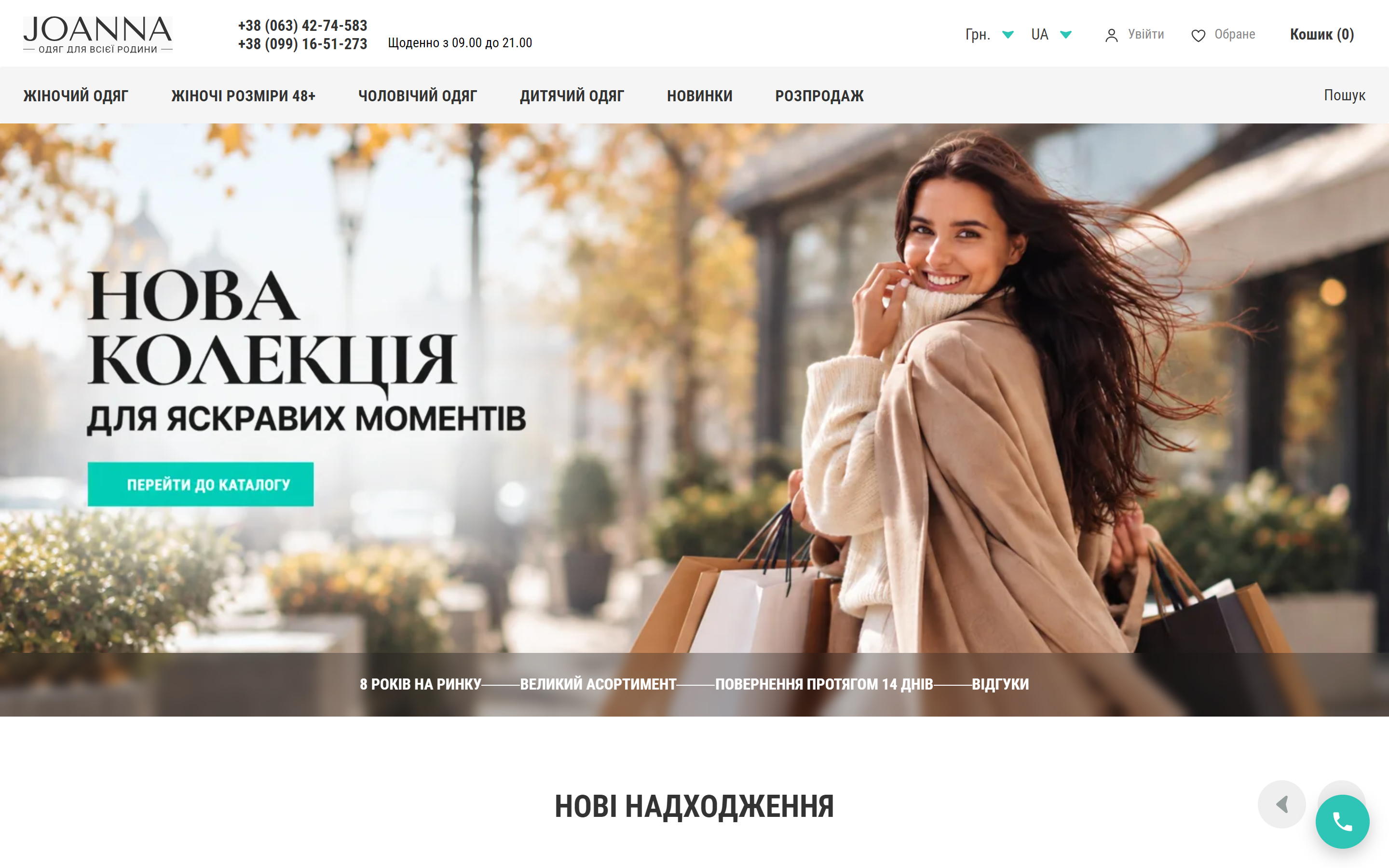
Site structure
The main menu is the four product lines (Women’s clothing 42-46, Women’s sizes 48+, Men’s clothing, Children’s clothing) plus New arrivals and Sale; each line opens into a multi-level dropdown that goes down to the third tier (Dresses → Short and midi → Summer). The header carries the phone numbers, the working hours, the language and currency switchers, the account link, the wishlist and the cart. The home page is assembled as a shop window: hero → new arrivals → top models of the week → top categories → three entry scenarios (wholesale, retail, dropshipping) → an SEO block about the shop.
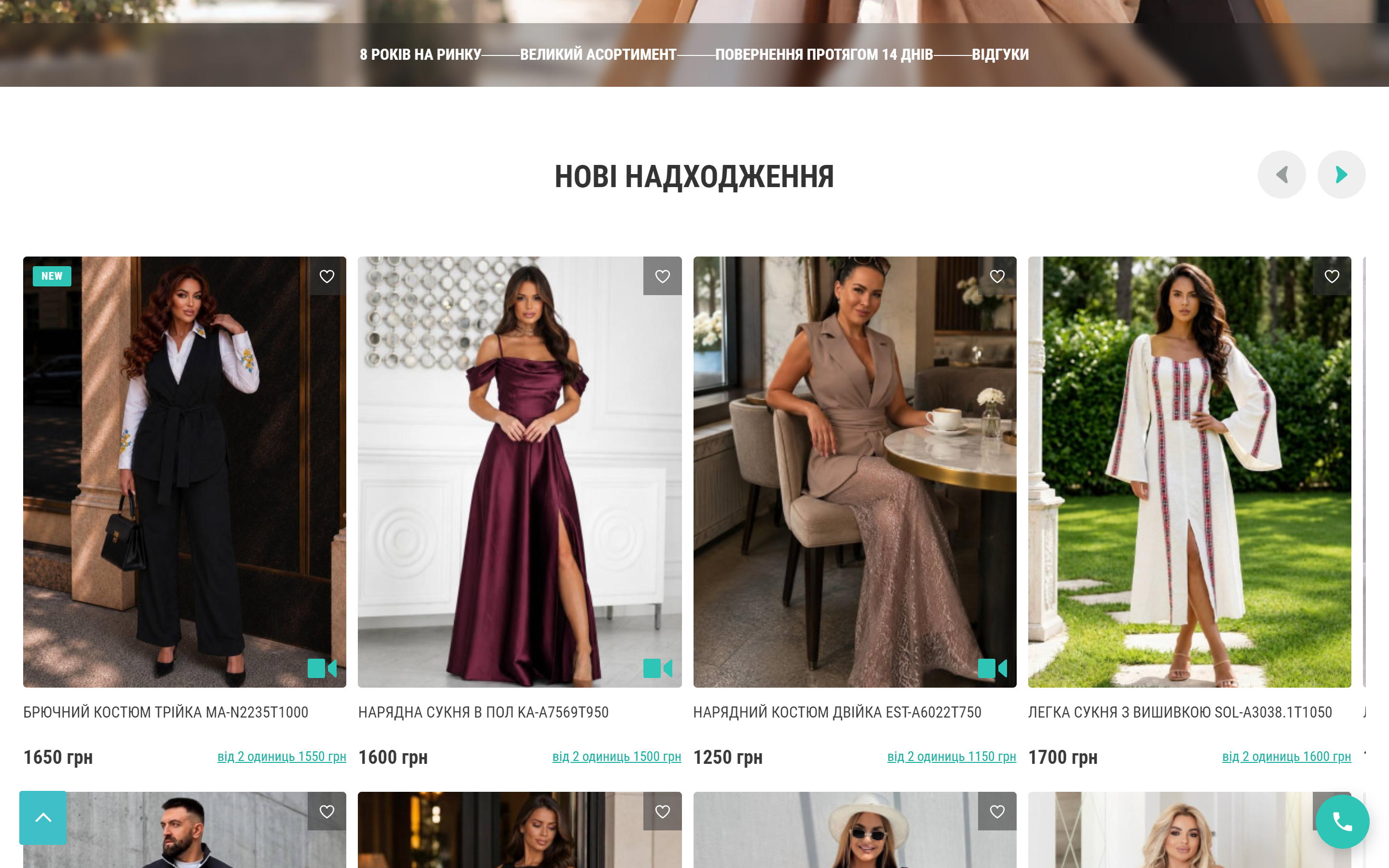
New arrivals
Right below the hero sits a new-arrivals carousel, two rows of four cards. The card is where this shop does most of its work: a second photo on hover, a “NEW” badge, a video-review marker, an “add to wishlist” button and, above all, two prices — the retail one in large type and the wholesale “from 2 items” right next to it. The shopper sees the saving before ever opening the product page.
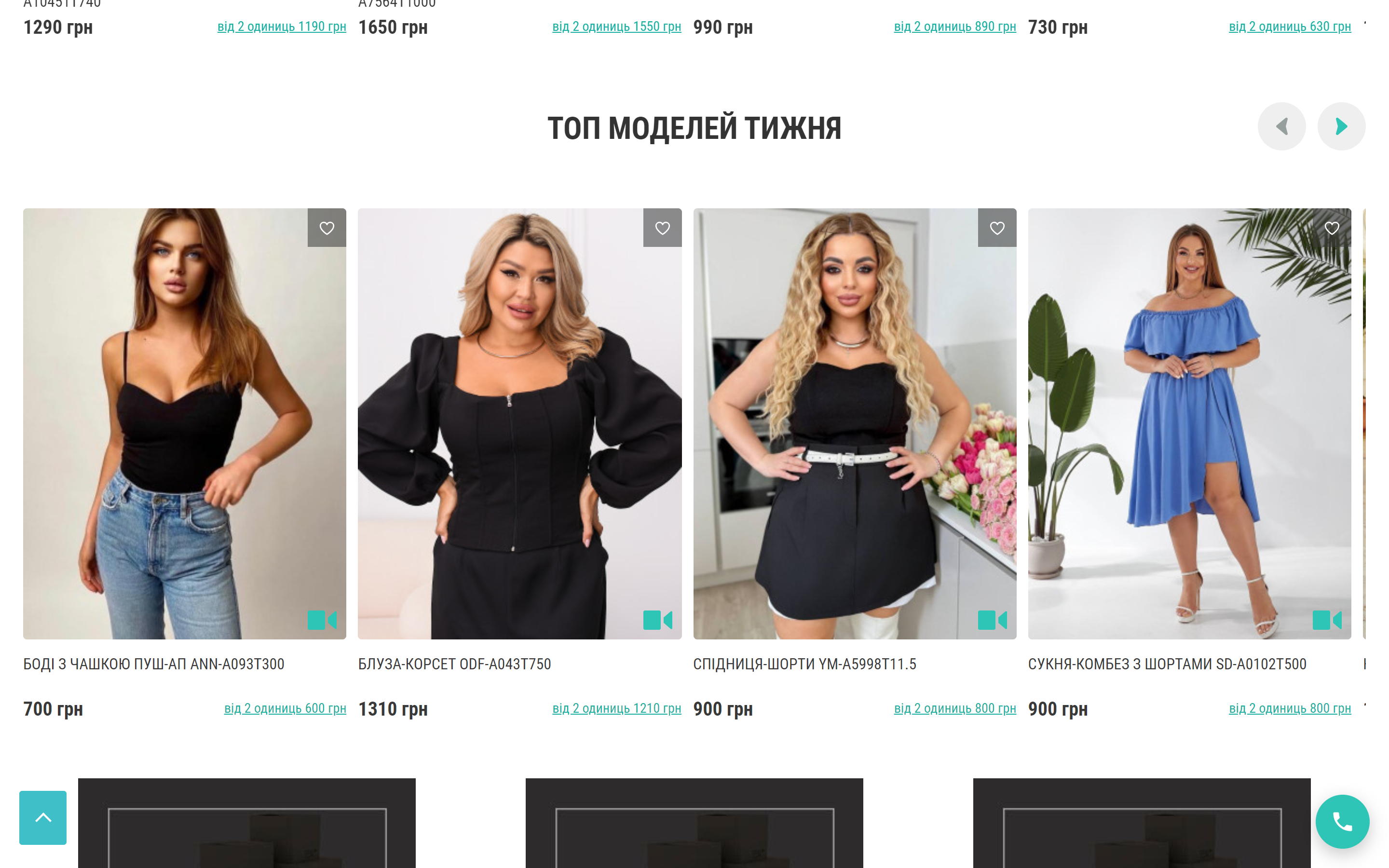
Top models of the week and the entry scenarios
Next comes “Top models of the week” (a selection the shop refreshes weekly) and three banners that split the audience by type of buyer: Wholesale, Retail, Dropshipping. This is an important junction: Joanna runs three different funnels with different rules and paperwork, and each gets its own landing page instead of a shared “About us”.
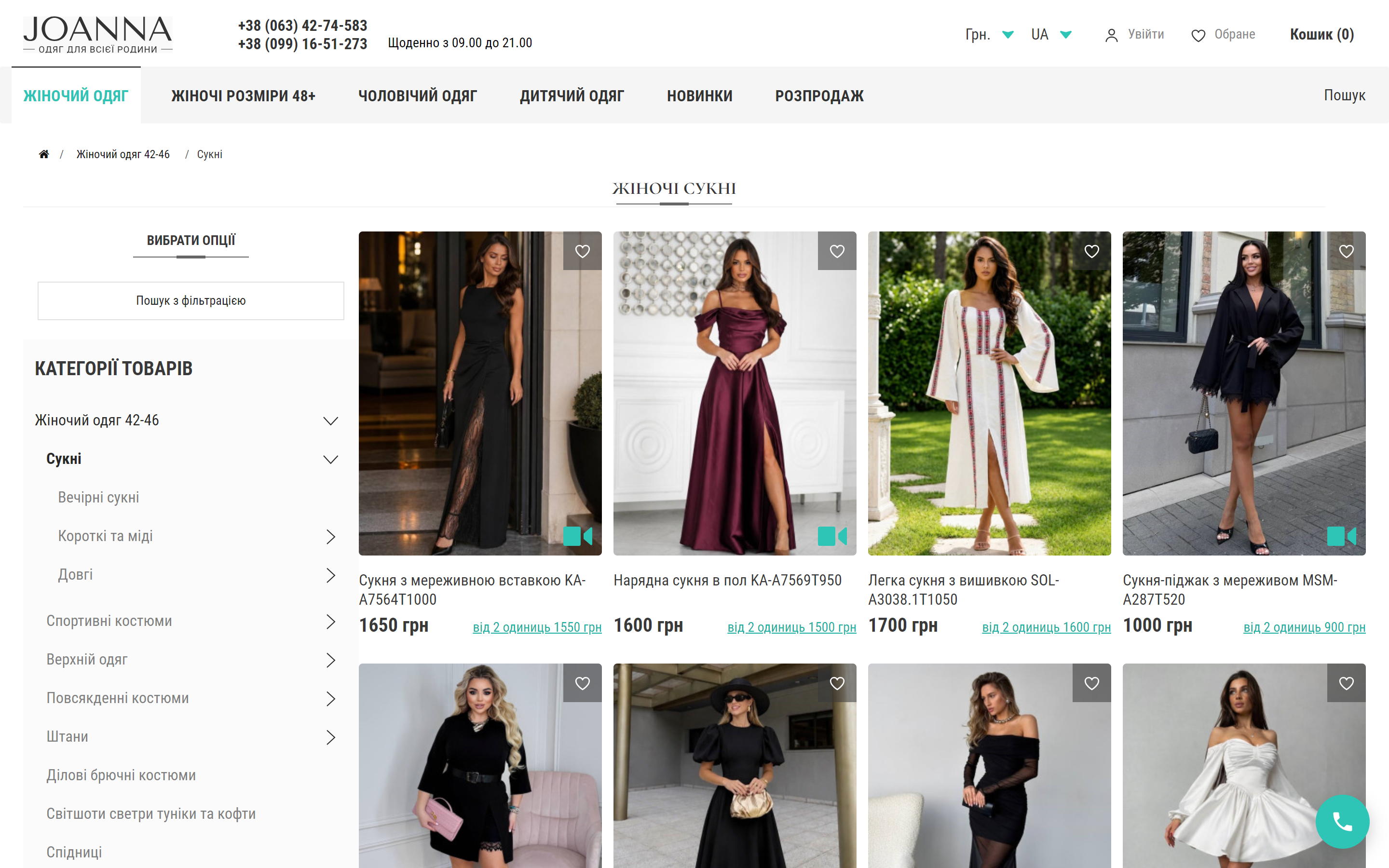
Catalogue and filters
The catalogue is built for volume: the “Women’s dresses” category alone holds 661 products with pagination and sorting. On the left there is the category tree and a panel of faceted filters: colour (with a product count next to every value), size and price. The “Found: N” counter is recalculated as filters are picked, so the shopper sees how many options will be left before applying anything. A category page ends with an SEO text and an FAQ accordion — that is what works for queries such as “buy a size 48 dress”.
The product page
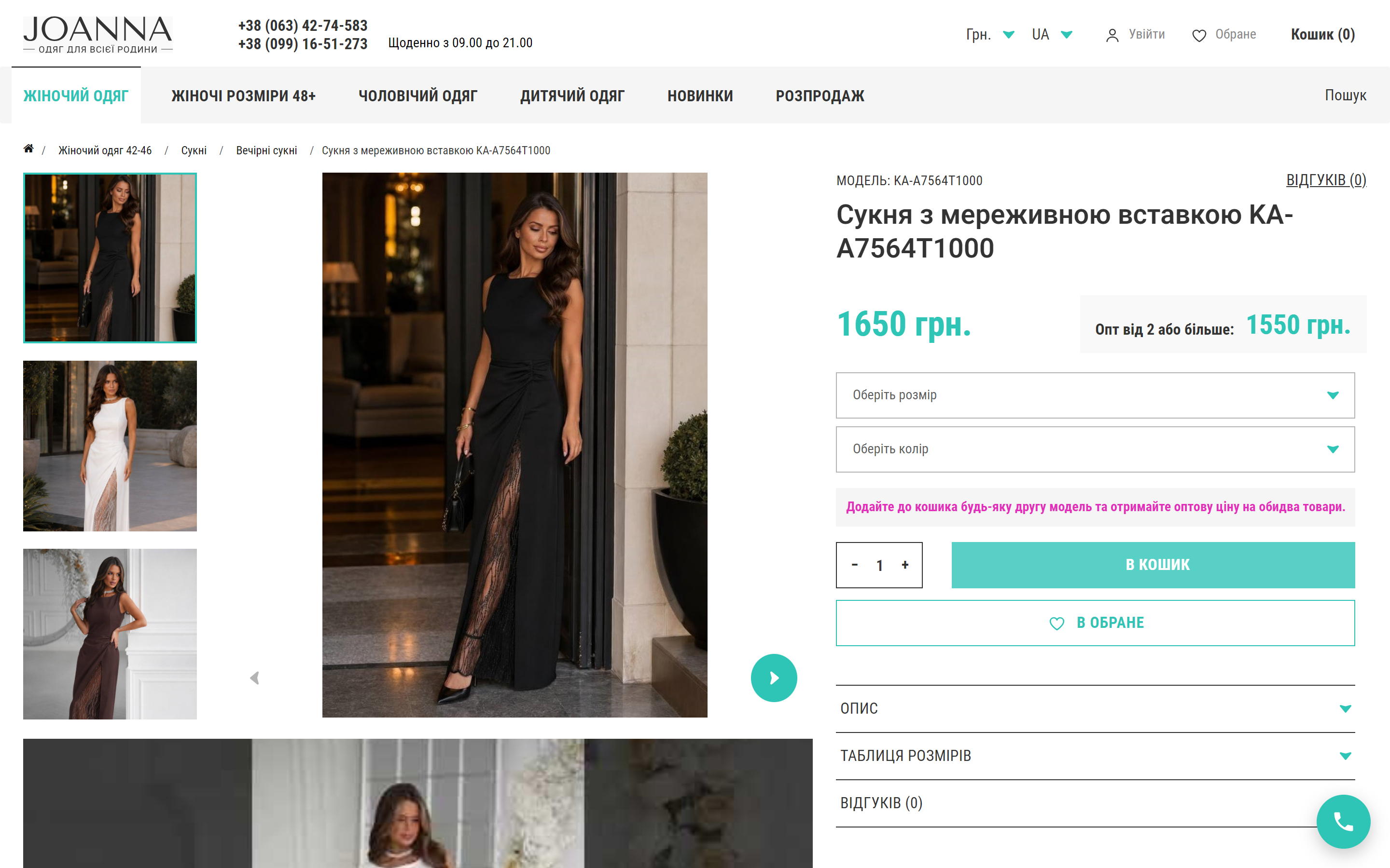
The product page is built around the gallery: up to nine photos with vertical thumbnails and a video review of the model underneath. On the right are the model code, the two prices (retail and “Wholesale from 2 or more”), the size and colour selects, a quantity stepper, “Add to cart” and “Add to wishlist”. Below the buttons the wholesale mechanic is spelled out in plain words: add any second model to the cart and get the wholesale price on both items. Further down, accordions hold the description, the size chart and the reviews, so a long page does not turn into a wall of text.
Cart and checkout
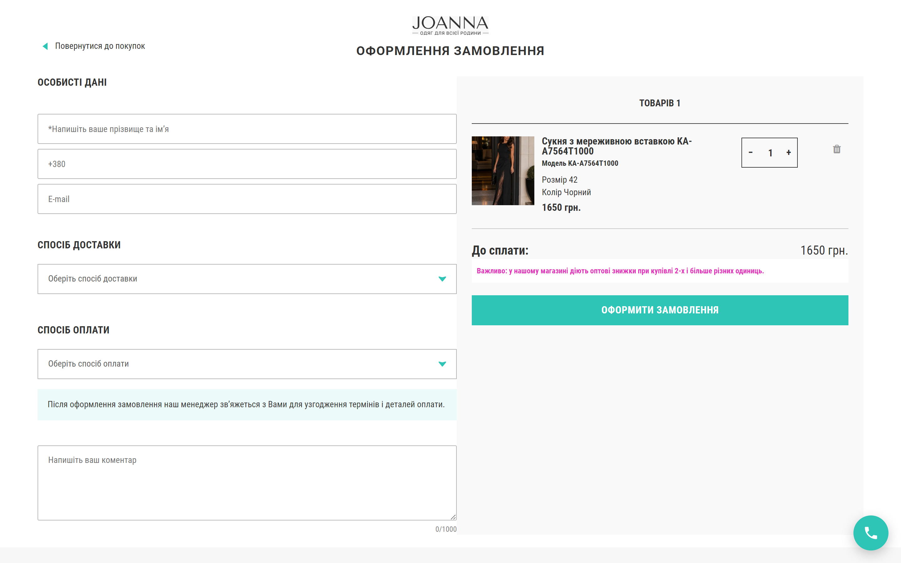
The cart opens as a side drawer rather than a separate page, and the checkout itself fits on one screen: personal details, delivery method, payment method and a comment on the left; the order contents with the chosen size and colour, the quantity and the total on the right. Quantities and removals are handled inside the checkout, without going back to the cart. Under the total sits a reminder about the wholesale discount — a last chance to add a second model and make both cheaper.
Analytics, advertising and speed
The shop lives on paid traffic, so the analytics were built as a separate module: every ecommerce event is printed in two schemas at once — GA4 and Google Ads — so that product identifiers match the Merchant Center feed and dynamic remarketing works. The purchase event is additionally duplicated from the server: if the browser hit never arrives (an ad blocker, a closed tab, a dropped mobile connection), the order still reaches GA4. Performance was a work package of its own: the heavy parts of the checkout were rewritten and the response time of the checkout page fell from 4.5 to 0.4 seconds, while the parasitic scraper-bot traffic that used to drain server resources through the faceted filters is now cut off at the web-server level.
Reviews and trust
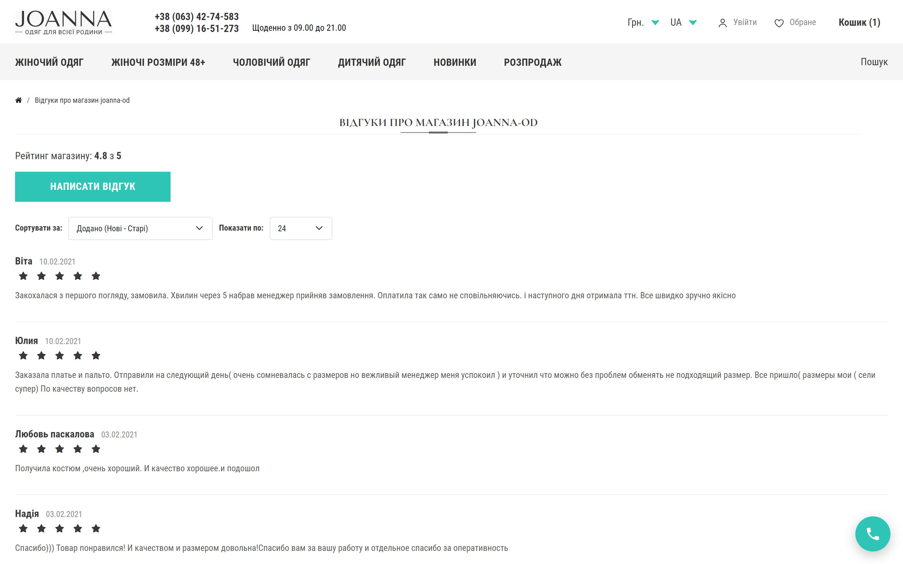
A dedicated store-reviews page is about the service rather than a single product: a 4.8-out-of-5 rating, sorting, a “Write a review” form and public replies from the administrator underneath. For a shop that works on prepayment this is one of the main arguments: the reviews are precisely about size exchanges, refunds and how fast an order ships.
The mobile version
Most of a fashion shop’s traffic is mobile, so on a phone the interface is rebuilt rather than squeezed: the hero and the catalogue go two columns wide, the menu hides in a burger, and a tab bar is pinned at the bottom with home, menu, account, wishlist and a cart with a counter. The call-back button and the messengers are reachable from any screen.
Summary
joanna-od.com is an example of a large product shop where complex commercial logic hides behind a simple interface: one storefront serves retail, wholesale and dropshipping, the wholesale price switches itself on from two different models, and the shopper only ever sees two numbers on a card. The move from OpenCart 2.3 to 4.1 with URLs and catalogue preserved, a custom analytics module with server-side purchase duplication, a faster checkout and bot protection give the shop exactly what all of it was for: advertising that adds up, pages that stay up, and an order that is placed on a single screen.




