
Inglewood Pawn Shop — a lead-gen landing page for a pawn shop with photo-quote via CF7 + EN/ES
Single-page WP-лендинг ломбарду в Лос-Анджелесі з CF7 multi-file upload, EN/ES bilingual і live Google Reviews
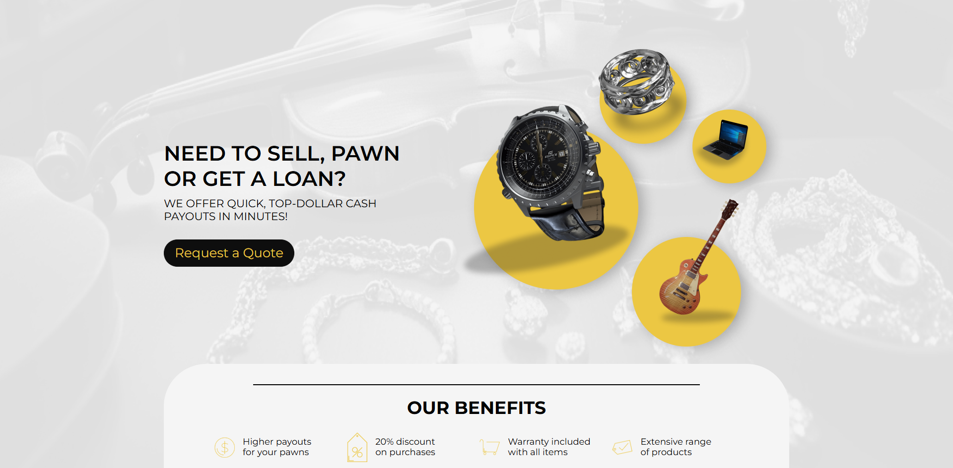
Inglewood Pawn Shop (legal name — Inglewood Jewelry and Loan) is a physical pawn shop that has operated since 1994 at 10721 Hawthorne Blvd, Inglewood, CA 90304 (Los Angeles, near LAX airport). The site inglewoodpawnshop.net is not an e-commerce catalogue of forfeited items and not a default search-engine landing page. It’s a single-page lead-gen tool whose main KPI is a photo request from the client’s phone: “Describe the item + upload 2-3 photos from your phone → get a quote without visiting the shop.” The theme is a custom pawnwp build (not Elementor, not Astra), built from scratch around this functional flow.
Hero as a visual taxonomy of the inventory, not a slogan
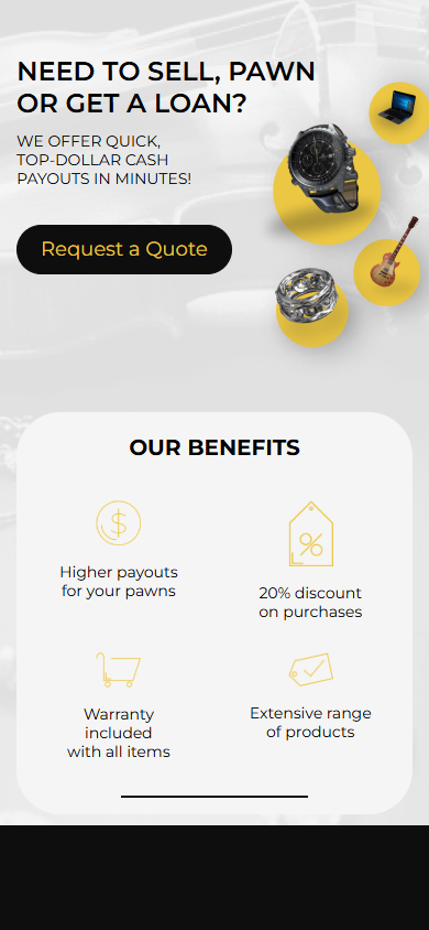
The first screen is a split layout: on the left, the headline “Need to sell, pawn or get a loan?”, the lead “We offer quick, top-dollar cash payouts in minutes!” and a single black CTA “Request a Quote”. On the right — not a stock promo image, but a composition of four floating yellow circles: a watch, a ring, a laptop, an electric guitar. This isn’t decoration — it’s a visual taxonomy of what the pawn shop accepts, readable in one second without reading the “We accept everything of value” section below. The background is a muted monochrome scene with a violin, pearls and jewellery lying around — reinforcing a “high-value” positioning (not a $50 plasma TV, but a Steinway, a Rolex, diamonds).
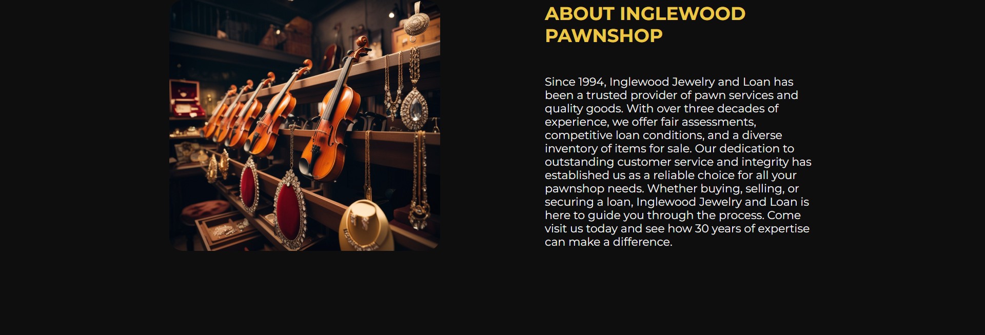
“About Inglewood PAWNSHOP” — positioning on 30 years in business, not a low rate
The “About” section is dark, with a photo of the shop’s display window (violins, guitars, jewellery) on the left and a single paragraph of text on the right, opening with “Since 1994, Inglewood Jewelry and Loan has been a trusted provider…”. No numbers on interest rates, no “best terms in LA”, no promises. Instead — 30 years in business, “fair assessments”, “competitive loan conditions”, “diverse inventory of items for sale”. This is classic US pawn-shop positioning: the pawn industry is heavily regulated (state licensing, ledger reporting to police, ID verification on every transaction), and advertising specific rates is a compliance risk. Longevity is the safest and strongest trust signal available.
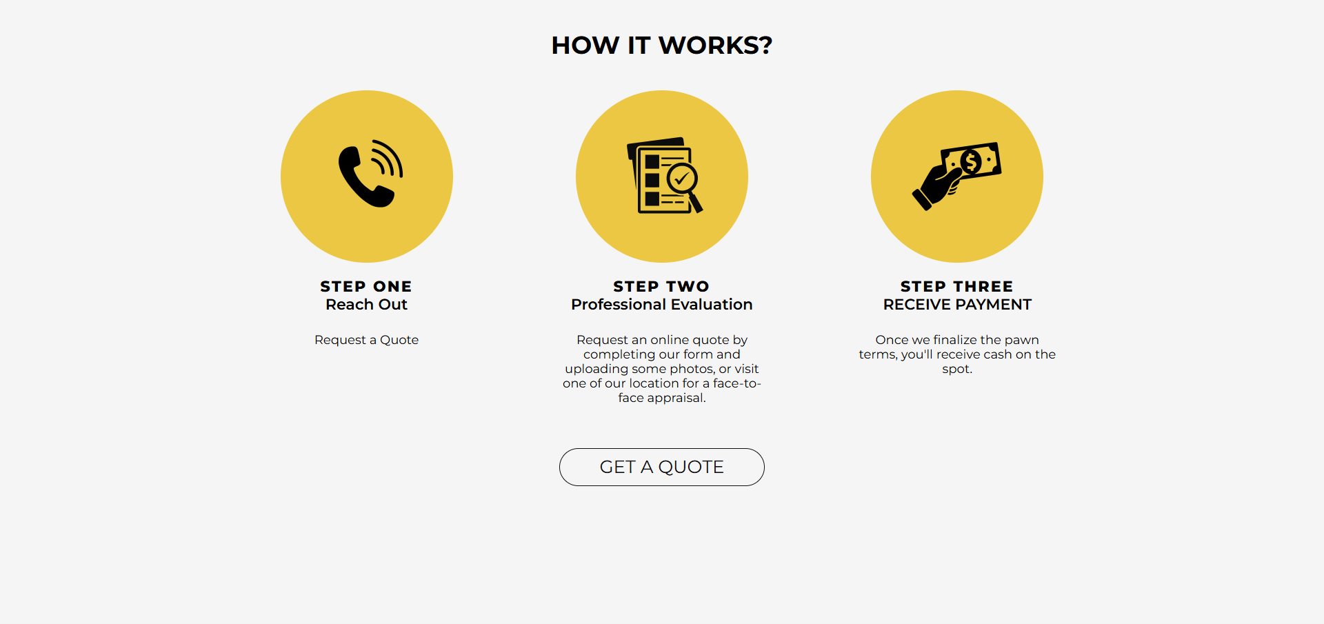
“HOW IT WORKS” — a 3-step funnel with minimal friction down to the photo request
The process is shown as 3 yellow circles with black icons: Step One “Reach Out” (phone icon, caption “Request a Quote”), Step Two “Professional Evaluation” (clipboard icon, caption “Request an online quote by completing our form and uploading some photos, OR visit one of our location for a face-to-face appraisal”), Step Three “RECEIVE PAYMENT” (hand holding a banknote, caption “Once we finalize the pawn terms, you’ll receive cash on the spot”). The closing CTA button “GET A QUOTE” under the 3-step block is outlined in a thin pill shape, not filled: visually “less aggressive” than the hero CTA, because by this point the client has already scrolled through two trust-building sections.
“We accept everything of value” — 6 categories as SEO + upfront lead qualification
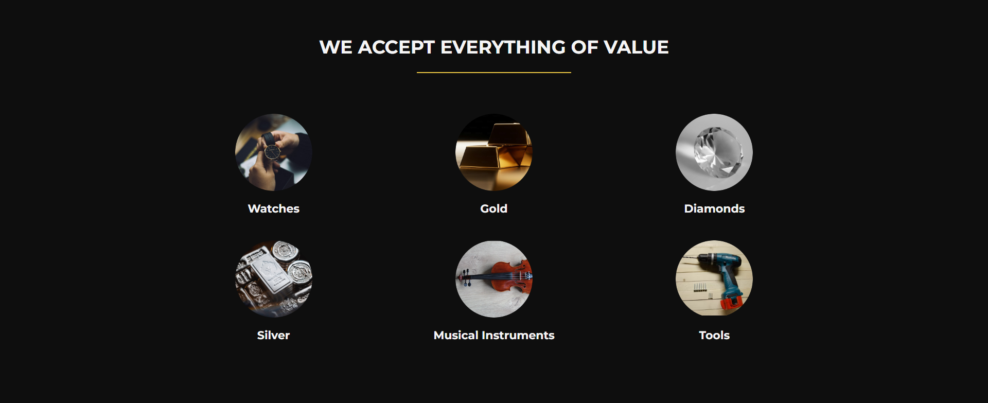
A dark section with a heading underlined by a yellow rule and 6 round photo icons in a 3×2 grid: Watches, Gold, Diamonds, Silver, Musical Instruments, Tools. Each icon is a real photo of the category on a black background (a watchmaker’s bench with a loupe, a stack of gold bars, cut diamonds, silver coins in a hand, a violin with a harp, a power drill on a workbench). The categories cover 80%+ of typical pawn-shop inventory without narrow specification. This block also does SEO work — each heading (“Watches in Inglewood”, “Gold pawn LA”, “Musical instruments pawn Inglewood”) is a potential long-tail entry point for people googling a specific category.
“Our Location” — shop-front photo + a Google Maps embed with a baked-in geocode
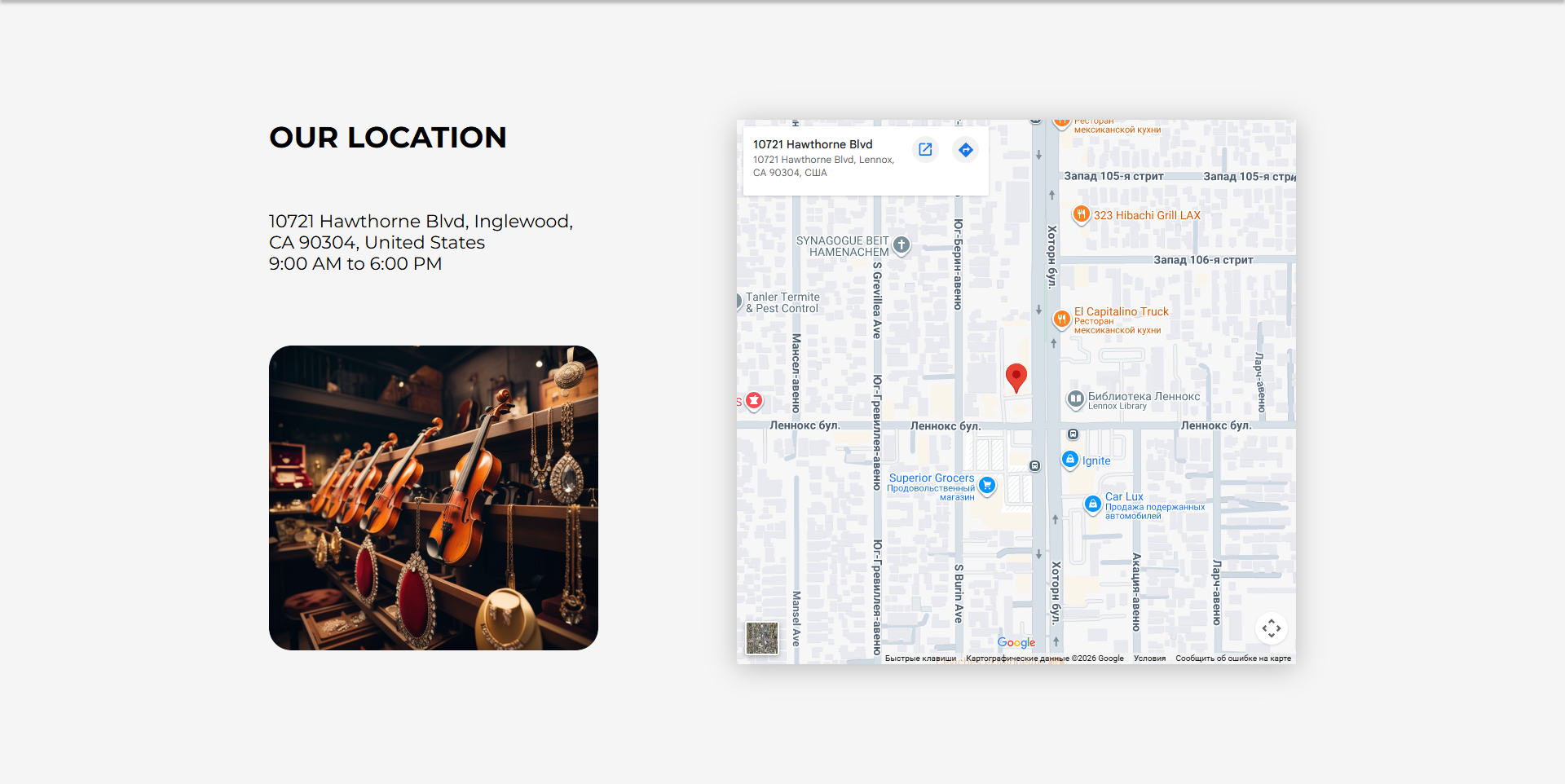
The “Our Location” section is two columns: on the left, the address 10721 Hawthorne Blvd, Inglewood, CA 90304, United States, opening hours 9:00 AM to 6:00 PM, and another photo of the shop window with jewellery; on the right, a Google Maps iframe embed with a red pin on the exact building, surrounded by nearby businesses (323 Hibachi Grill LAX, El Capitalino Truck, Lennox Library, Superior Grocers). The iframe URL contains the parameters !1sru!2sua — meaning the map renders labels in Russian with a regional bias set to Ukraine, an interesting artefact: the original embed URL was generated by someone with UA/RU locale settings and was never regenerated for en-US.
Reviews — real Google Reviews via Widget for Google Reviews, not mocked testimonials
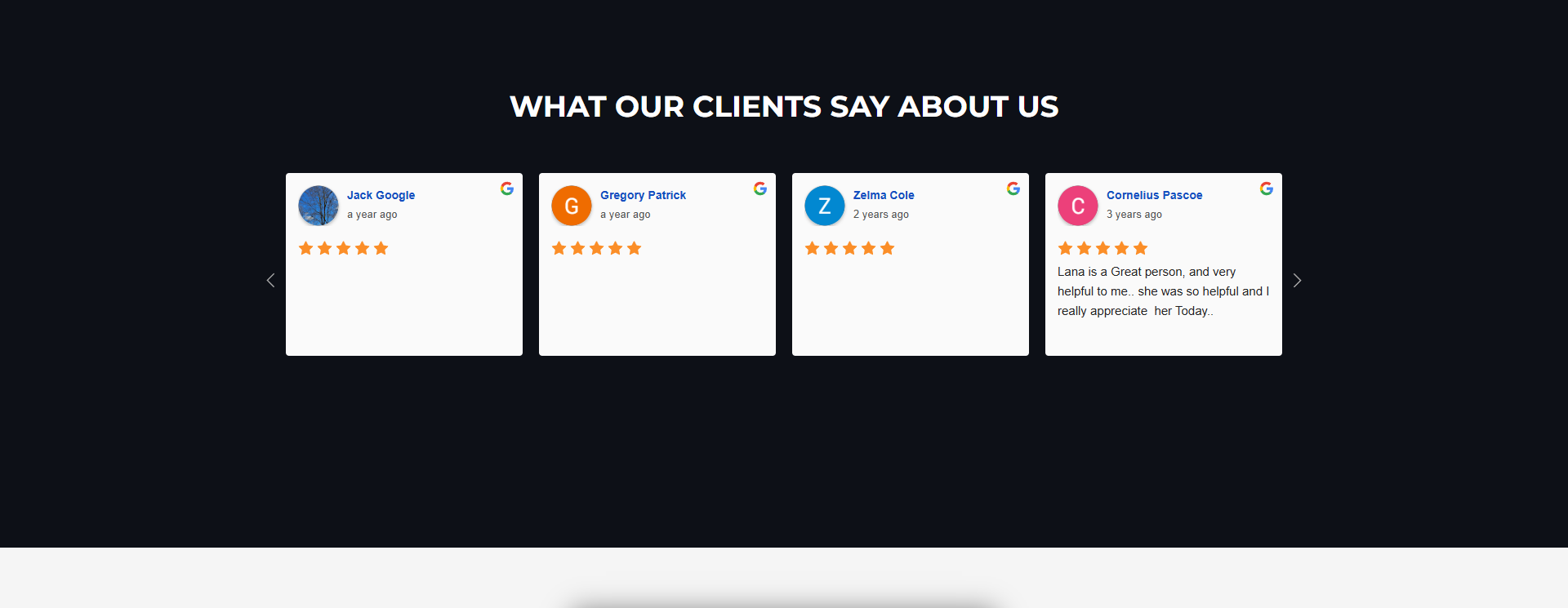
The “What our clients say about us” section is a slider with 6+ review cards. Each card has the author’s avatar, a name linked to the author’s Google Maps profile (maps/contrib/106818415512214249635/reviews), a “a year ago” / “2 years ago” label, a 5-star rating and the review text. In the top-right corner of each card is a coloured Google “G”. These are not CF7 mock-ups and not WordPress comments — they’re real reviews pulled from the Google Places API via the “Widget for Google Reviews” plugin (version 4.1). The slider runs on slick-carousel with arrow buttons for paging. A trust signal: the shop doesn’t filter out negative reviews (a 5-star-only filter isn’t active), and among the visible ones there are reviews up to 3 years old, showing sustained collection of social proof.
“Looking to Sell Items?” — Contact Form 7 with multi-file upload as the main conversion point
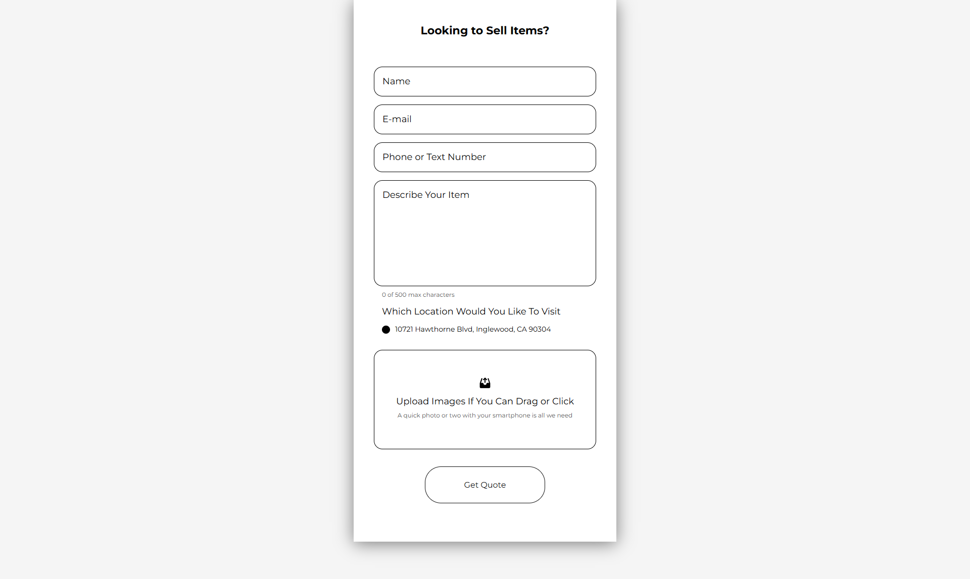
The form block occupies its own section headed “Looking to Sell Items?” and consists of 4 text fields (Name, E-mail, Phone or Text Number, Describe Your Item with a “0 of 500 max characters” counter), a radio choice of location (Which Location Would You Like To Visit → 10721 Hawthorne Blvd, Inglewood, CA 90304 — currently only one location, but the radio structure is ready for expansion), and — most importantly — a drag-and-drop file uploader: “Upload Images If You Can Drag or Click. A quick photo or two with your smartphone is all we need”. This isn’t the default CF7 file field but the “Multiline Files for Contact Form 7” plugin (version 7.0) — it allows multiple files to be uploaded in a single drop action, which is critical for jewellery (front+back+hallmark+damage photos needed) and musical instruments (neck+body+headstock photos).
EN/ES bilingual via WP Multilang — Inglewood demographics as a technical choice
In the header, to the right of the nav menu, is a language switcher En / Es. The active language is English; clicking Es leads to /es/ with the same layout but fully translated content and a matching ES form. The plugin is WP Multilang (version 2.4.10) — not WPML, not Polylang — a rare choice for US sites, but lightweight and free. This isn’t a “marketing whim”: per the 2020 US Census, the unincorporated community of Lennox (where the shop is physically located, ZIP 90304) is about 91% Hispanic/Latino, and neighbouring Inglewood is roughly 50%. Without an ES version, the site would cut off more than half the local market. ES isn’t a secondary language here but a primary one for local SEO.
Sticky floating call button — a pawn-shop-specific mobile UX pattern
On every page, at every breakpoint, in the bottom-right corner, there’s a green floating circle with a white phone icon, a click-to-call link to tel:+13106800776. This button persists through scrolling and isn’t hidden on either mobile or desktop. This is a pawn-shop-specific UX pattern: for a large part of the audience (older clients, people less comfortable with tech, or simply “I need to ask right now”), a phone call isn’t a fallback but the primary channel. The site deliberately doesn’t tuck the phone number away in the nav or footer — it’s always on screen, right by the thumb on mobile.
Stack, integrations, technical decisions
- WordPress + a custom
pawnwptheme — not Elementor, not the Astra builder, not any page builder. This is the shortest path from mockup to production: the markup is written once, content blocks are honestly prefixed (main-wrap__content,services,about,how,contacts,reviews,form), styles compile into a singlestyle.min.css. - Contact Form 7 5.9.8 + Multiline Files for Contact Form 7 7.0 — the main quote-request form with drag-and-drop multi-upload (the zl-multiline-files plugin adds a JS overlay on top of the default CF7 file input, with thumbnail previews of uploaded files and client-side validation).
- WP Multilang 2.4.10 — EN/ES bilingual via an
/es/URL prefix, without separate domains and without a cookie redirect. The switcher is aswitcher-blockcomponent in the nav bar. - Widget for Google Reviews 4.1 — pulls reviews from the Google Places API by the business’s Place ID, rendered in a slick-carousel with 6+ cards. Refreshes periodically via WP-cron, falls back to cache if the API is unavailable.
- Slick-carousel 1.8.1 (jsdelivr CDN) — for the reviews slider; a somewhat heavy dependency for one component, but chosen for stability over bundle size.
- jQuery 3.7.1 + jquery-migrate 3.4.1 — the standard WP bundle, needed for CF7 and slick. Migrate warnings are present in the console.
- Google Maps embed — a static iframe URL with a baked-in Place ID and coordinates (no JS API and no quota). The map’s locale accidentally being ru/ua instead of en-us is an artefact of generating the embed URL from a non-US locale.
- Google Fonts: Montserrat (100..900, regular + italic) — preloaded via
fonts.googleapis.com/css2with the full weight range, meaning a default-style choice without optimising for the actual weights used.
The architectural essence of the project is a single-page WP site with a custom theme, where all the complex UX pieces (multi-file upload, EN/ES switcher, Google reviews carousel, embedded map) are handed off to standalone plugins rather than being written from scratch. That keeps the theme itself light (one style.min.css, one app.min.js), while the business-critical mechanics stay updatable independently of the theme code.




