
Cashbee — landing page for an iGaming performance agency from Warsaw
Лендинг iGaming performance-агенції з Варшави: glass-3D візуал, EN/UA-білінгва, 3 принципи підходу і Join the Hive з відкритими вакансіями.

Cashbee is a performance marketing agency from Warsaw working exclusively in the iGaming vertical. The team positions itself not as a contractor but as part of the client's own product team: 50+ people in a globally distributed structure, 120M+ monthly traffic and 350+ active affiliate partners. The landing page is a single full-screen page with an EN/UA bilingual setup, built at the intersection of a prestige visual style (glass-3D objects, cream paper, a dark-cherry accent) and a clear funnel: hero promise → the Agency-as-Product differentiator → 3 approach principles → open positions → CTA.
Technical stack
A custom WordPress theme with no page builder, a cream-and-cherry palette with an accent amber-yellow (the "Get In Touch" CTA), and a branded typeface with a bold display cut used in caps for all H1–H2s. The decoration is photorealistic glass/jelly 3D objects (bee "stingers", a glass sphere, spiral ribbons) that work as a visual metaphor for a "light but weighty" product. SEO is standard Yoast (sitemap_index, OG, schema). The EN ↔ UA bilingual setup runs through a separate /uk/ prefix route, with a switcher in the top nav and the footer. Scroll-triggered reveal animations use opacity+translate with no library overhead.
Landing page structure
5 sections, each taking up roughly one screen on desktop: Hero, About us, Our approach, Join the Hive, Get In Touch + footer. Navigation is trimmed down to two anchors (About / Careers) — everything else opens through the single "Get In Touch" CTA, which is repeated in the hero, in the final section, and in the careers listings via the Apply button. This is a deliberate reduction: for a B2B agency of this profile, every extra menu item dilutes the positioning.
Hero — a promise and three numbers
An H1 reading "Drive & convert high-quality traffic with CashBee" sits against two glass stingers and a faint concentric grid, with an amber pill button "Get In Touch" in the middle. Below the heading is a one-line lead ("Performance marketing built on transparency, expertise, and deep product integration") and a row of three KPI blocks: 50+ Team Members Worldwide / 120M+ Monthly Traffic Delivered / 350+ Active Affiliate Partners. The numbers are presented without further explanation — a deliberate choice: the visual rests on scale, and the detail comes in the sections that follow.

About us — the User → Agency → Product model
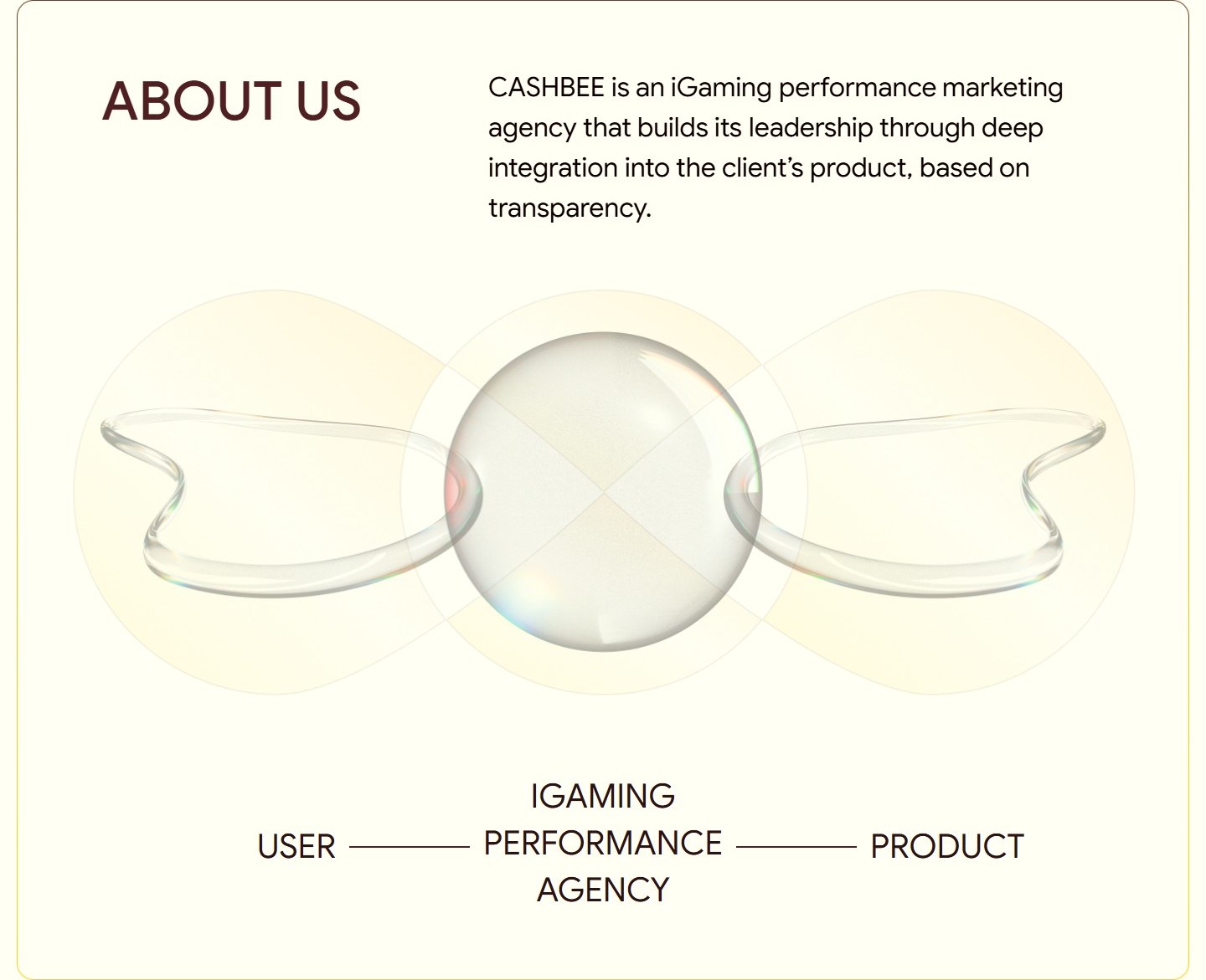
A text block on the left (a short manifesto: "CASHBEE is an iGaming performance marketing agency that builds its leadership through deep integration into the client's product, based on transparency") and a central 3D composition on the right: a light glass sphere between two glass wings. Below the composition is a minimalist horizontal diagram, USER ━━ iGAMING PERFORMANCE AGENCY ━━ PRODUCT, which visually spells out the main differentiator: the agency stands between the user and the product, not off to the side of it. This is a direct contrast to the typical "we're your performance contractor" positioning.
Our approach — three principles in an L-grid
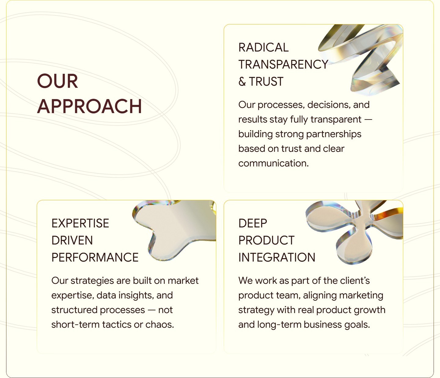
A large H2, "Our approach", sits in the top-left corner and stands in as a fourth "card", while the rest of the space holds three 2×2 cards with principles: Radical Transparency & Trust, Expertise Driven Performance, Deep Product Integration. Each card has an H3, a short description (2–3 sentences) and its own 3D glass object in the top-right corner (a spiral, an abstract droplet, a four-petal shape). The objects aren't random — they’re variations on the same glass aesthetic, keeping the section visually unified.
Join the Hive — open positions with a transparent rate
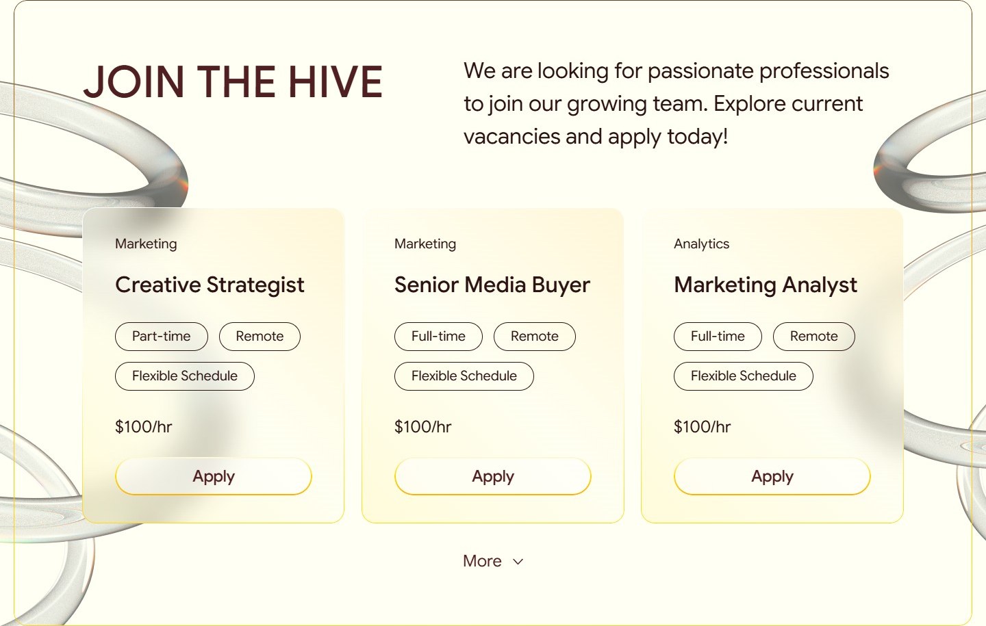
The careers section is built as a row of three job cards (Creative Strategist, Senior Media Buyer, Marketing Analyst). Each card carries a category (Marketing/Analytics), a position title (H3), chips for the work format (Part/Full-time, Remote, Flexible Schedule), a rate of "$100/hr" and an outline Apply button. Below is a "More" toggle with a chevron that expands the full list. The decoration is two large glass rings on either side of the section, creating a "hive" feel (a nod to the name "Hive") without literal bee icons.
Get In Touch — the final CTA on a gradient background
A contrasting switch: after the light, cream-toned sections comes a full-screen amber-yellow block with an H2, "Get In Touch", a one-sentence explanation ("Whether you're interested in partnering with us or joining our team, we'd love to hear from you") and a "Get In Touch" button in the bottom-right corner. The background colour exactly matches the hero's CTA — closing the visual loop of the page. The footer carries the contact details (+48 451 596 662, Warsaw Poland), company links, the EN/UA language switcher and three social channels (LinkedIn, Telegram, Instagram).

Individual pages
Structurally this is a single-page application in the form of an ordinary HTML landing page: all sections live on the home page, and the only thing that counts as a "separate page" is the Ukrainian version at /uk/, built from the same template with translated blocks. There are no separate about/services/blog pages — the information architecture is deliberately compressed onto a single surface so the focus doesn't get diluted. The sitemap, robots.txt and Yoast indexing are set up in the standard way: an EN home page + a UA mirror + automatic hreflang tags.
Summary
Cashbee is an example of an agency landing page that works more as a brand statement than a sales funnel. Instead of a standard services block there's a conceptual User → Agency → Product diagram. Instead of a case-study table there are three numbers in the hero. Instead of "send us a message" there's a direct $100/hr rate in the job listings. That’s a deliberate choice: in the iGaming vertical, where trust is built through transparency, this level of openness is itself a commercial argument.




