
BusMove — removals across Portugal
Багатомовний лендинг переїзної компанії з Кашкайша — 10 послуг, Google-відгуки, multi-field лід-форма по всій Португалії.
Context
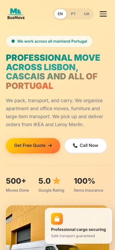
BusMove is a young removals company based in Cascais, serving Ukrainian-, Portuguese- and English-speaking customers across mainland Portugal: Lisbon, Cascais, Sintra, Porto, the Algarve and other regions. The brief was a three-language landing page (EN/PT/UA) that makes clear within seconds what the service is, which areas it covers, and how quickly an enquiry turns into a completed job.
Landing page structure
We built a single-page promo site with an anchor menu. Each anchor is a self-contained section built around one specific user action or question. That means the page works equally well scrolled top to bottom or opened straight from a direct link to a given section — from social media, for example, straight to the request form.
Service catalogue
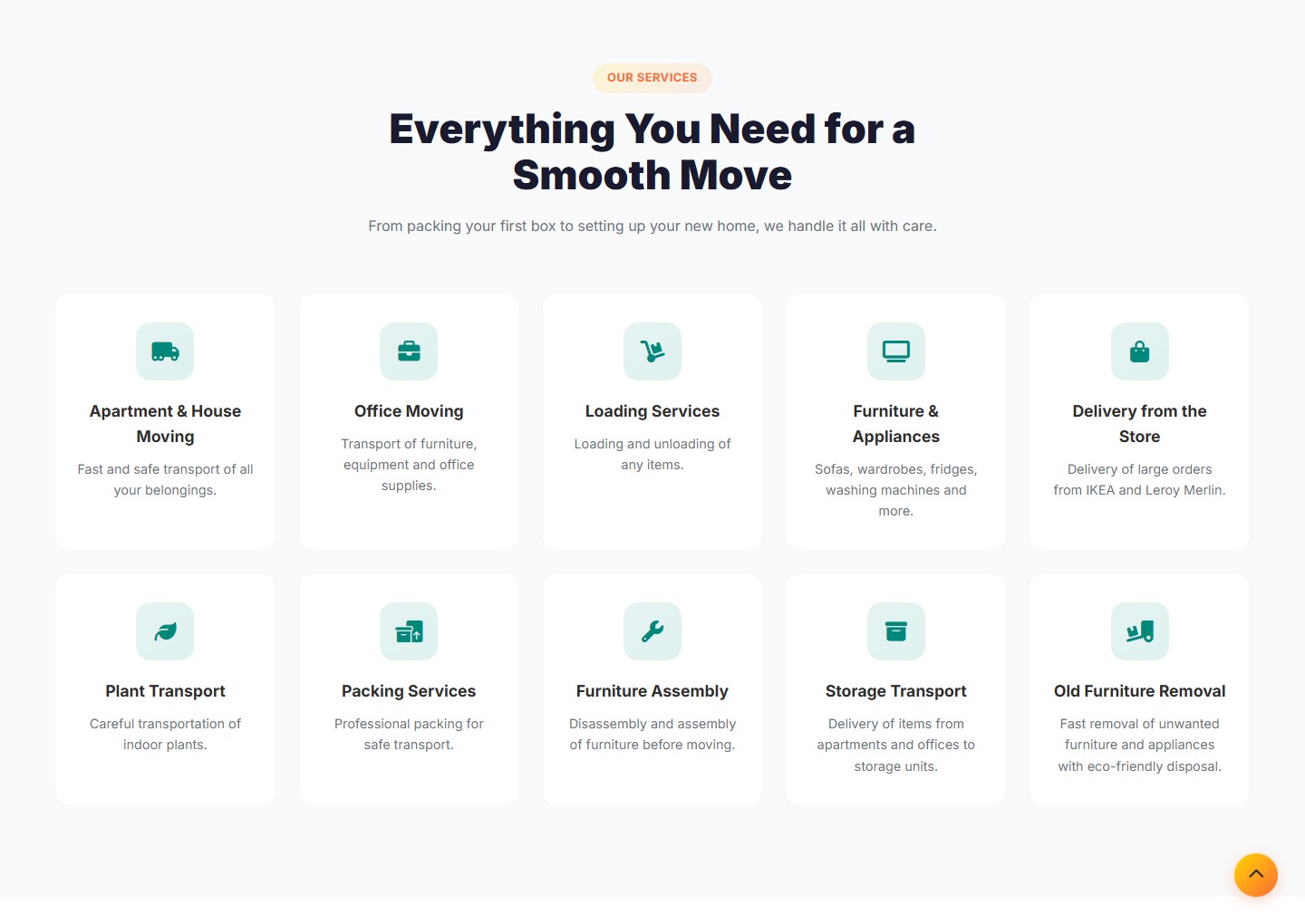
10 services in a 5×2 grid on desktop — from flat and office removals to packing, furniture assembly, IKEA/Leroy Merlin delivery, plant transport and old furniture disposal. Each service is its own card with a themed icon and a short description of what it is and when you need it.
The “Three steps” process
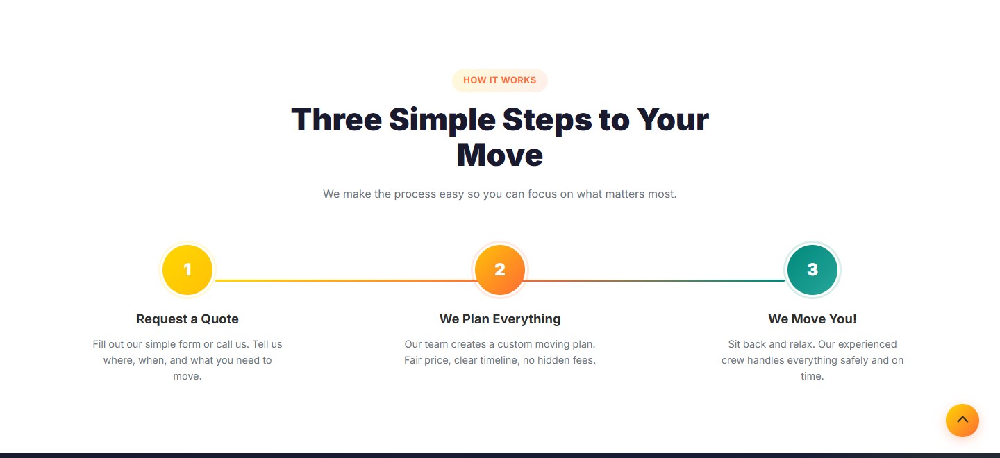
The hero transition defuses the typical objection that “moving is stressful”. The sequence “request → plan → move” tells the customer what happens next before they’ve even filled in the form, removing uncertainty about price and timing.
Social proof and numbers
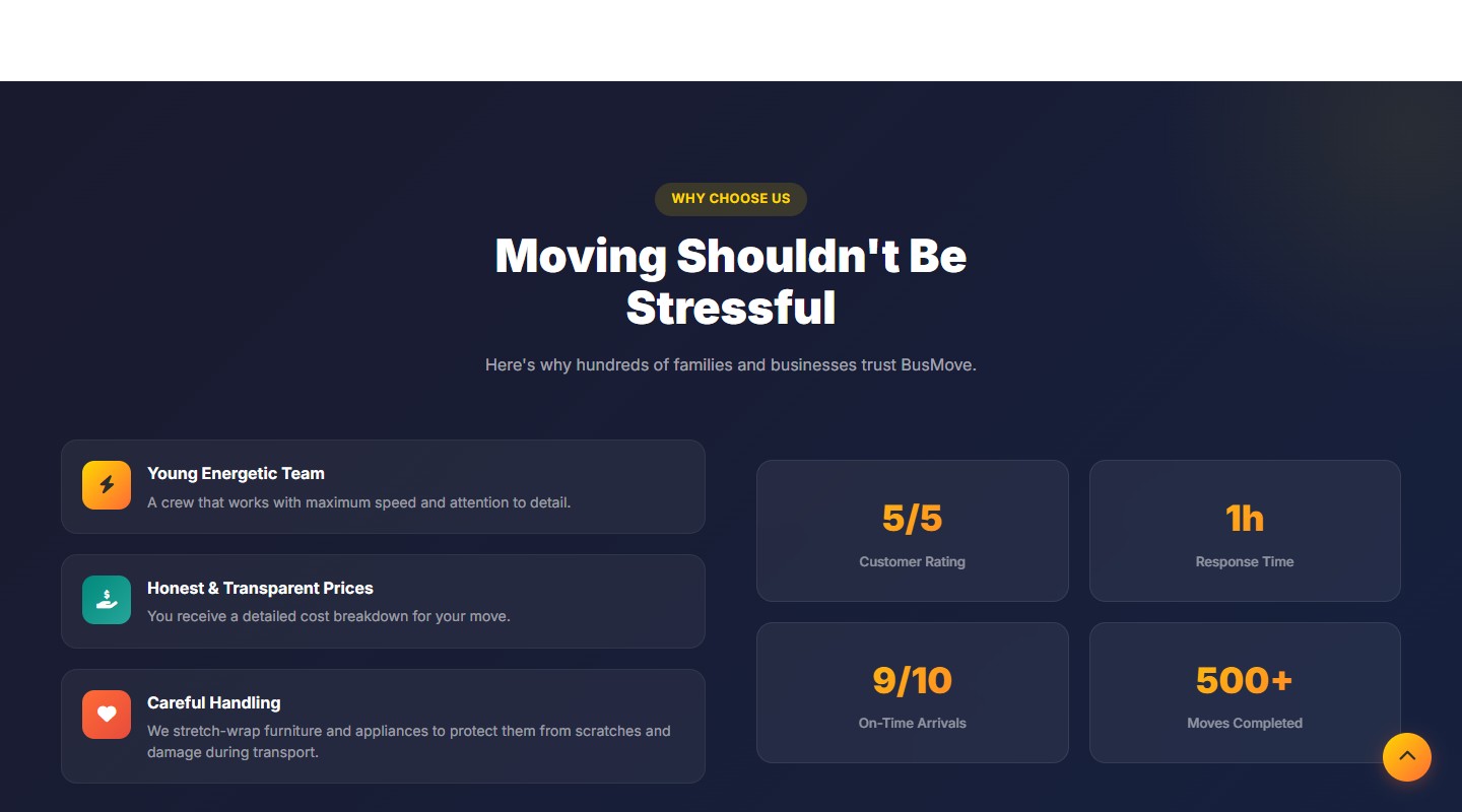
A dark section carries three trust factors (a young, energetic team, transparent pricing, careful handling of belongings) alongside four numeric stats: a 5/5 rating, a 1-hour response time, 9/10 on-time arrivals, 500+ completed moves. Combining “soft” benefits with hard numbers reads faster than separate text blocks would.
Google Reviews integration
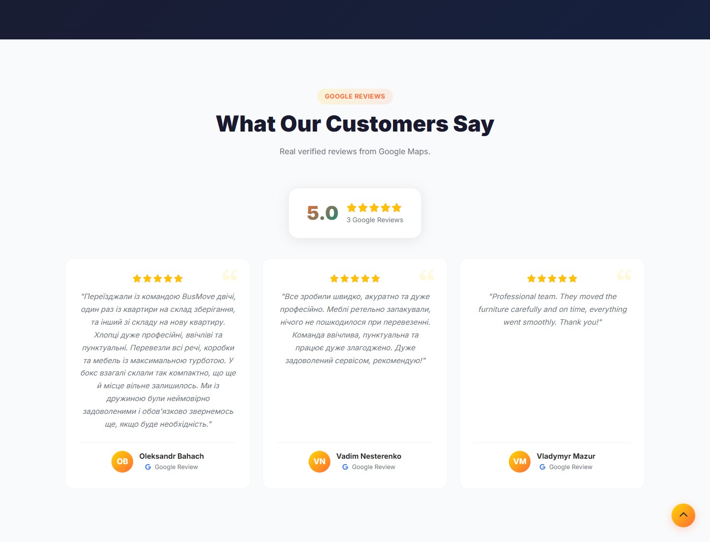
Instead of static testimonial cards, we pull real reviews straight from Google Maps — with a 5.0 rating, authors’ initials and a “See all reviews on Google” button linking to the original Maps page. This removes the typical objection that “anyone can make up a review” — the visitor sees that the reviews exist outside the site and can be checked.
Gallery and request form
Real photos from the job
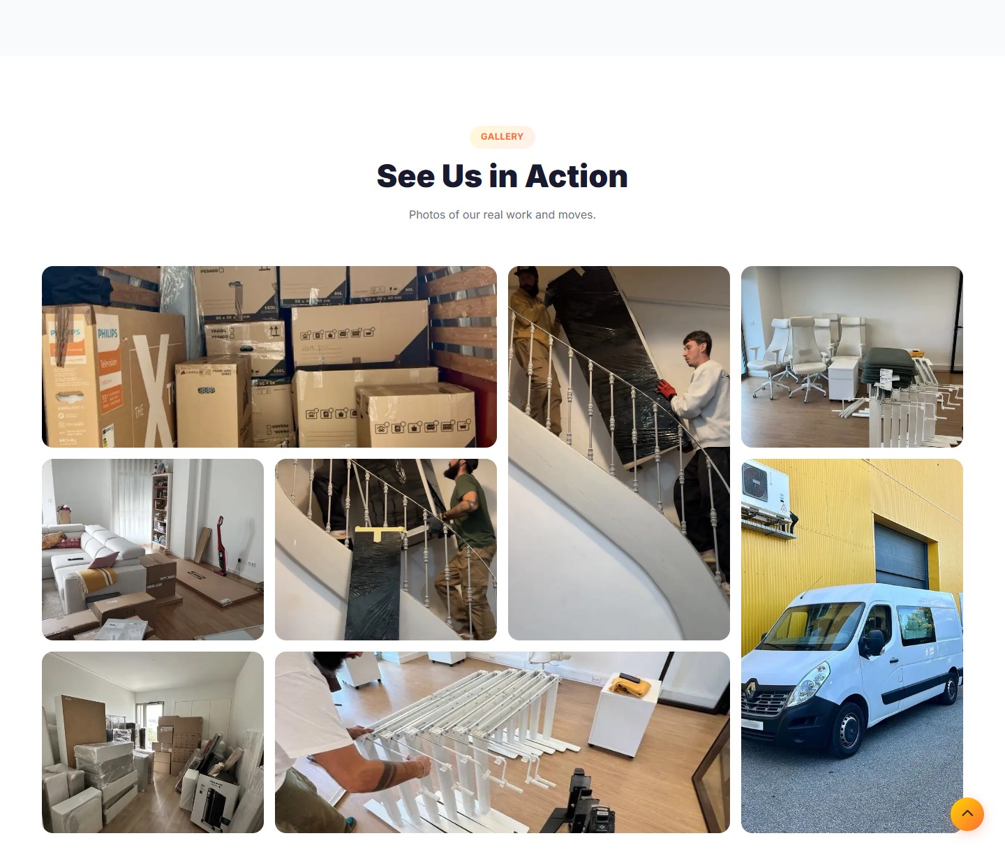
A bento grid of eight photos from real jobs: packed boxes in the van, staircase railing removal and reassembly, clients’ interiors after unpacking, and the branded Renault Master van in the company’s yellow colours. A lightbox on click lets you zoom in on details. No stock photos — only the company’s own material.
Multi-field lead form
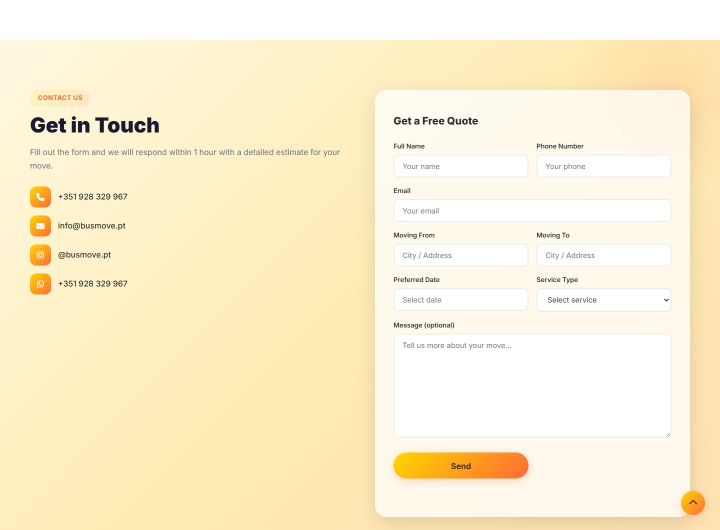
A request form with nine fields: name, phone, email, moving from/to, date, service type from a 10-option dropdown, and a free-text message. Next to the form are four quick contact channels (phone, email, Instagram, WhatsApp/Telegram), so a visitor who’d rather not fill in a form can message straight away in the messenger they already use.
Localisation and responsiveness
Three languages, separate URLs
EN, PT, UA — each locale lives under its own URL prefix (/pt/, /uk/). This gives correct hreflang and lets Google index each language as a separate page. The locale switcher lives in the nav and in the mobile menu — it’s never tucked away inside the burger.
Mobile version
On narrow screens the nav collapses into a burger, the hero becomes a vertical stack (heading → description → CTA → van photo), the service grid drops to a single column, and the gallery becomes a two-row grid. The quick “Get Free Quote” and “Call Now” CTAs stay visible at all times.
Result
- 10 services + 13 coverage cities + 3 languages on one landing page
- Live Google Reviews integrated instead of static testimonials
- A 9-field lead form plus 4 quick channels for anyone who’d rather not use a form
- Separate URLs per locale — correct indexing of the EN/PT/UA versions




