
Bizemigrant — a systems contractor for developers in Poland, Belgium and Germany
Корпоративний сайт системного будівельного підрядника, що працює в Польщі, Бельгії, Нідерландах і Німеччині. Дві воронки — B2B-девелопери і набір майстрів.

Context
Bizemigrant is positioned as a systems contractor for developers, working on the key structural stages — foundations, monolith, shell — in Poland, Belgium, the Netherlands and Germany. They have 15+ years of real experience on European construction sites and a two-sided business model: B2B contracts from developers, plus their own Guild of Craftsmen, through which they recruit bricklayers, formworkers, rebar workers and clinker layers for legal work in the EU.
The task for the site was to become a single public entry point for two different audiences with different motivations. A developer needs to quickly understand that Bizemigrant reduces operational risk (meeting deadlines, predictable budgets, legality) and get a quote right away. A craftsman needs to see that pay comes on time, the contract is official with insurance, housing and meals are arranged, and then apply for a specific specialisation. Both funnels have to live side by side without mixing.
What we built
A multi-page corporate site on WordPress with a custom theme, bizemigrantwp. A dark lime-yellow palette (lime-yellow #c9f30a on black with a concrete texture) sets a solid, industrial identity. The heading font is a monospaced geometric sans (like Geist Mono / Space Mono); body copy is a regular sans. Two separate lead forms serve the parallel funnels: /budivnycztvo-bez-operaczijnyh-ryzykiv/ for developers, /joinus/ for craftsmen.
Hero: systems contractor + two CTAs
The homepage hero is a light concrete texture with a bold H1, “A systems contractor for developers in Poland, Belgium and Germany”, a subheading, “15+ years of proven experience”, and two lime CTAs straight away — “Discuss a project” (→ the services landing page) and “Join the team” (→ joinus). A vertical lime line between the heading and the button block visually separates the pitch from the action. The header has a minimal 4-item nav plus a black “Contacts” button with a lime fill.
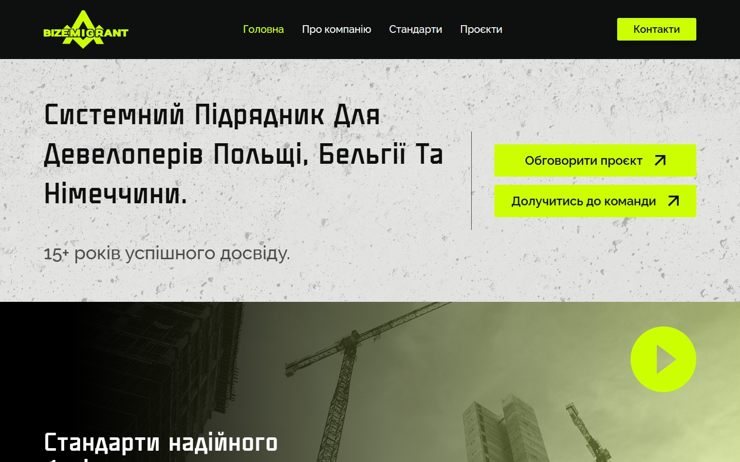
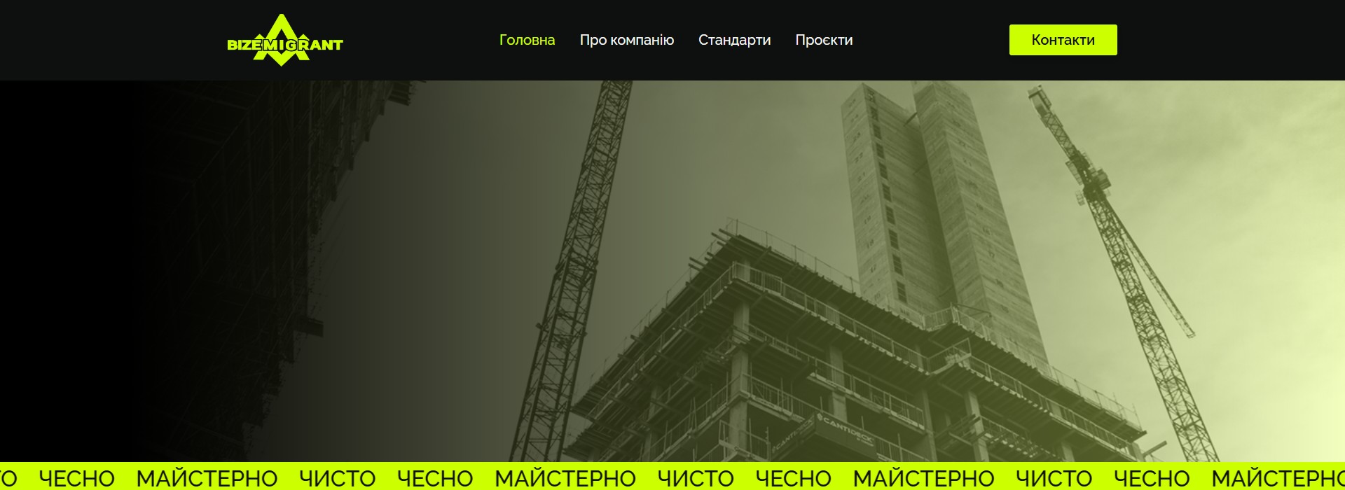
“Standards of reliable construction” — a film hero with a crane and a lime marquee
Right below the first screen is a wide, full-width film hero: a duotone photo of a construction high-rise with a crane, tinted in the brand’s lime green. Over it is an H2, “Standards of reliable construction”, and a play button for a YouTube video hosted on youtu.be. Running across the frame is a lime marquee strip, “CLEAN · HONEST · SKILLED” — Bizemigrant’s three-word mantra threaded through the whole site and repeated in the hero of every page.
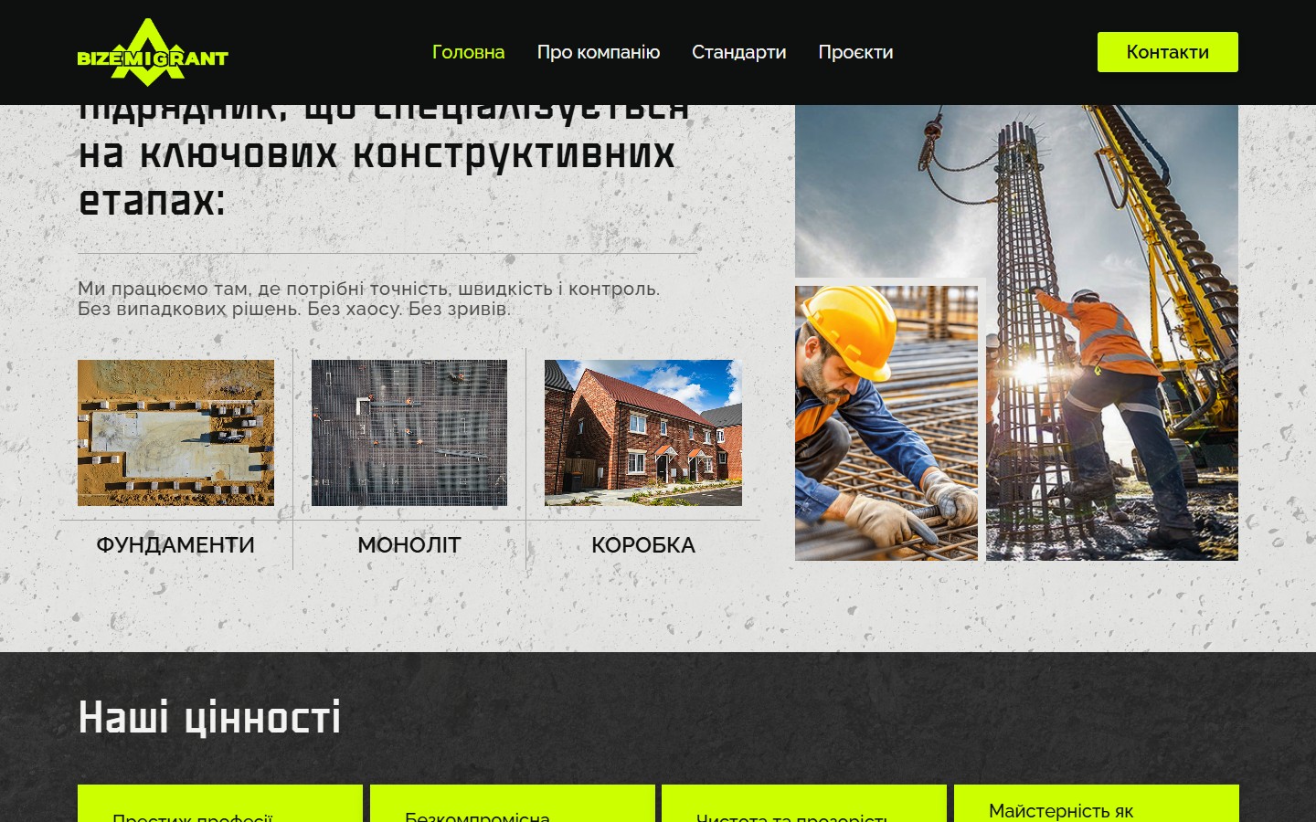
About the company: three specialisations — foundations, monolith, shell
A two-column “About the company” block. On the left, an H2, “Bizemigrant is a systems contractor specialising in the key structural stages:”, a paragraph about precision / speed / control, and three square specialisation tiles with real project photos: foundations (an overhead shot, formwork), monolith (an aerial view of scaffolding), shell (a finished residential building with a facade). On the right are two tall photos from real projects: a rebar worker in a hard hat, and a frame with workers. This block works as a quick service catalogue without navigating to separate landing pages.
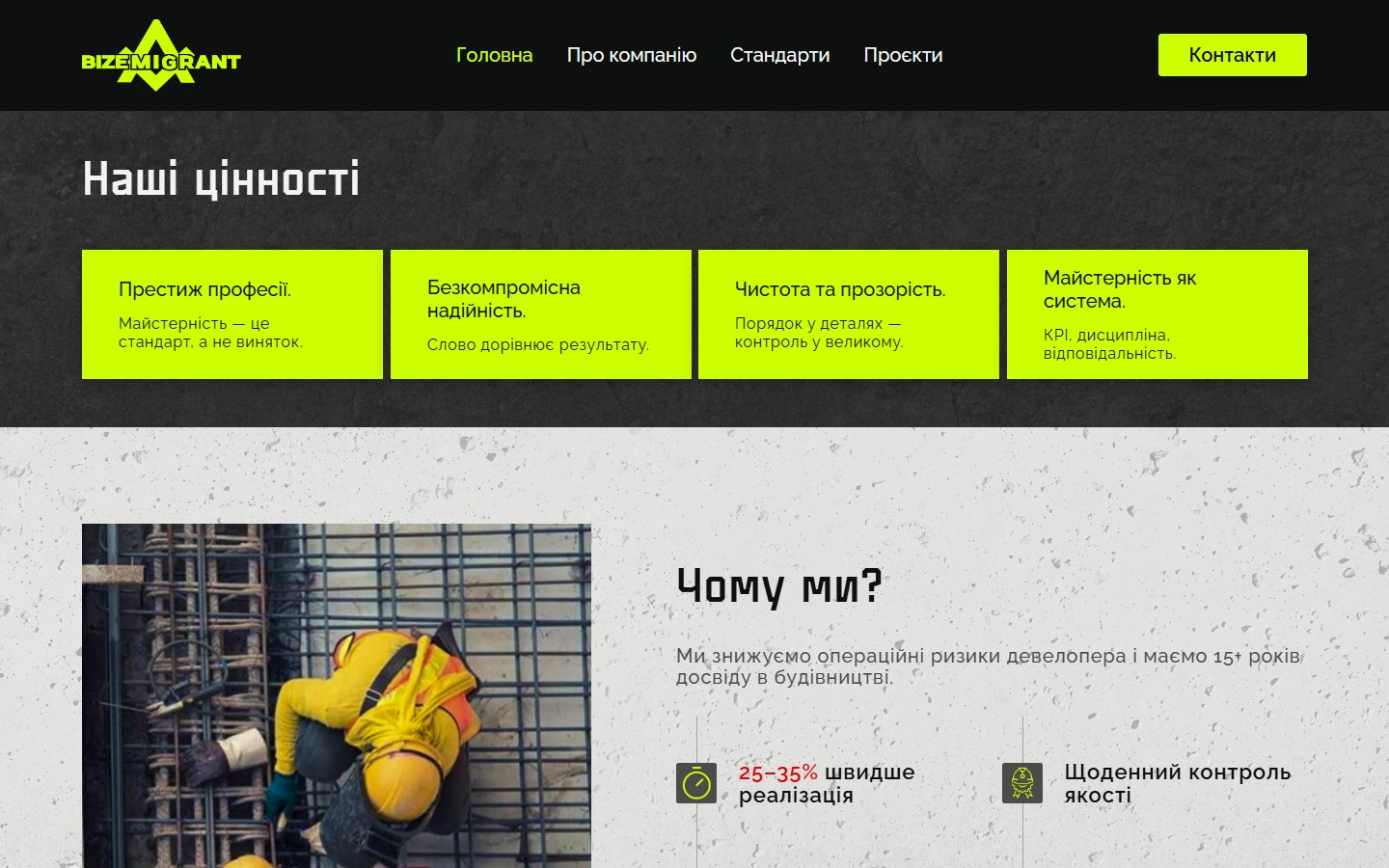
Values: 4 lime cards on black
“Our values” — a section on a black background with 4 identically styled lime-filled cards in a horizontal row: Pride in the trade, Uncompromising reliability, Transparency and integrity, Craftsmanship as a system. Each card has a short title on the top line and a one-phrase expansion below (“Craftsmanship is the standard, not the exception”, “Our word equals the result”, “Order in the details, control at scale”, “KPIs, discipline, accountability”). This is a standalone culture statement, not marketing copy — the wording reads like a corporate code of conduct.
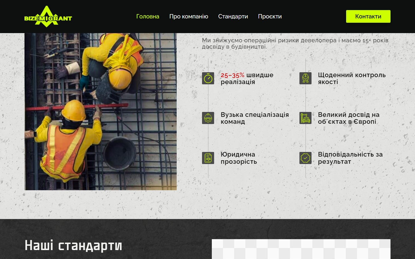
“Why us?” — 6 USPs with icons
A two-column “Why us?” block. On the left, a vertical drone photo (rebar workers tying a frame on a mesh); on the right, an H2, a subheading about reducing operational risk, and a 6-icon grid: 25-35% faster delivery (a lime-orange figure treated as a metric), Daily quality control, Narrowly specialised crews, Extensive experience on projects across Europe, Legal transparency, Accountability for the result. Each item is a lime line-icon plus a two-line caption. This is the B2B pitch for developers: operational advantages, not general slogans.
The Guild of Craftsmen: 4 trades with real photos
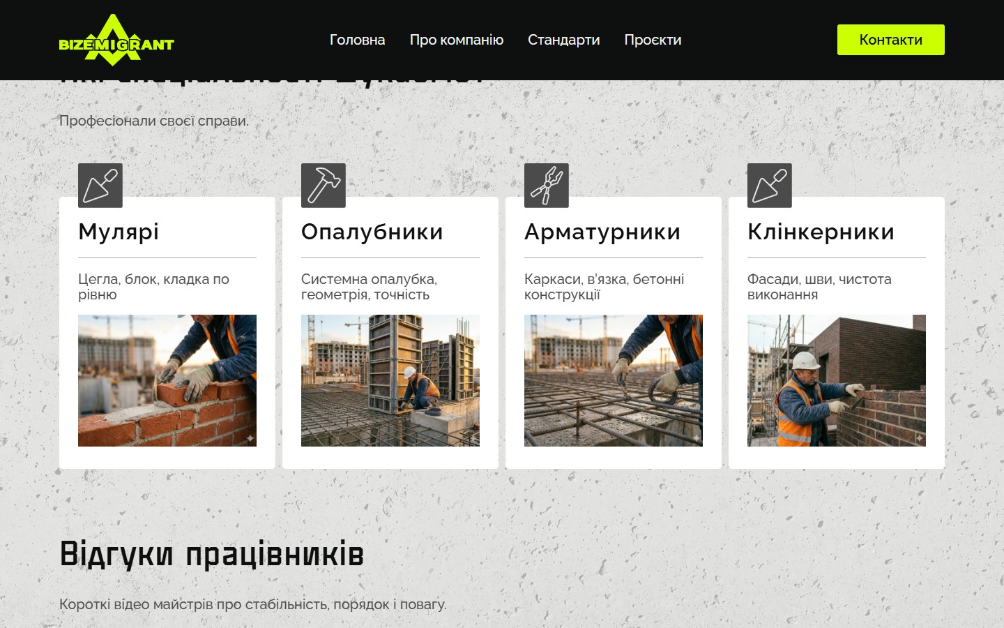
The joinus page is a separate recruitment funnel. Hero: “Bizemigrant’s Guild of Craftsmen”, captioned “Legal work in Poland, Belgium, the Netherlands and Germany. Paid on time. No chaos.”, with an “Apply now” button. Below is a “Why choose Bizemigrant?” block with 5 bullet advantages (on-time pay, clear rules, an official contract with recorded work history, housing and meals arranged by us, steady work). Further down is an interactive map of Europe with pins for PL/BE/DE/NL and a grid of 4 trades: Bricklayers (brick, block, masonry), Formworkers (system formwork, geometry), Rebar workers (frames, tying), Clinker layers (facades, joints). Each card has a line-icon, a title, a description and a real photo from a job site.
Services landing: “Construction without operational risk”
A separate funnel for developers — a full landing page with its own hero, a 5-item list of pain points (meeting deadlines, reducing rework, quality control, predictable budgets, legality), 4 “Why Bizemigrant” blocks (stable crews, narrow specialisation, KPIs for each role, daily oversight) and a 5-step “How we work” protocol: document analysis → detailed quote → start under protocol → daily reporting → final audit. The page closes with a 4-step “Starting the partnership” flow (scope → proposal → timeline → delivery) and a Contact Form 7 with Name / Email / Phone / Company / Message fields.
Multilingual UA / EN / PL / DE
A floating language switcher in the bottom-right corner (button.gtranslate, defaulting to UA). The target markets — Poland, Belgium, the Netherlands, Germany — are served through automatic translation, but the fallback stays Ukrainian. This is a deliberate choice: the core trust signal for both developers and craftsmen is a Ukrainian team with EU track record, so the base UX is built in UA.
Contact + lead forms
The homepage has a wide contact block with a map of Europe (the 4 countries of presence highlighted in lime) and a 5-field Contact Form 7 (Name / Email / Phone / Company / Project description). The services and joinus pages have separate forms with their own field sets (joinus has an extra select of specialisations: bricklayer / rebar worker / formworker / facade worker / clinker layer / roofer / other). So three forms serve three different intents without cross-noise in the CRM.
Implementation details
Responsive layout
At 390px the header collapses to a logo plus a burger icon (the 4 nav items move into an off-canvas menu). The hero stack becomes a single column: H1, subheading, and two full-width CTAs stacked one under the other. The three-tile specialisation block rebuilds into a vertical stack while keeping the square aspect ratio. The 6-icon “Why us?” grid becomes 2×3 on mobile. The Guild’s 4-trade block also goes vertical, with photos scaling to 100% of the card width. The “CLEAN HONEST SKILLED” marquee keeps running at the same pace — fluid font sizing keeps it legible.
Stack
WordPress 7.0 with a custom theme, bizemigrantwp (fully hand-built markup, no Elementor / Divi). Frontend: Swiper 11 for sliders, Slick 1.8 for the marquee and fallback carousels, Choices.js for custom selects in the forms, Fancybox 3.5 for media popups, AOS 2.3 for on-scroll animations. Forms — Contact Form 7 (6.1) with three separate forms for the different funnels. Tracking — PixelYourSite Free plus Facebook Pixel (not yet configured, but the integration is in place). Fonts are self-hosted via fonts/stylesheet.css in the theme. CDN — jsdelivr and unpkg for the libraries.
Two parallel funnels for two different people
The key architectural decision was not to mix developers and craftsmen. In the header nav, none of the items link to joinus (only the hero CTA and a footer link, “Jobs”). On the joinus page, the nav items are the same as on the main site, but the hero, the form, the FAQ, and the tone of voice are entirely “blue-collar”: “Paid on time”, “No chaos”, specialisation as a select. This lets Bizemigrant run ad campaigns to two different audiences (LinkedIn / Meta for developers, TikTok / FB for craftsmen) on separate URLs with no risk of cross-noise in the CRM.
Result
Bizemigrant got a corporate showcase site with parallel B2B and HR funnels that works as a single brand anchor for a team operating simultaneously in 4 EU markets. The dark-lime identity with the “CLEAN HONEST SKILLED” marquee, 15+ years of experience in the hero, and a 6-USP block with the concrete “25-35% faster” metric close the pitch for a developer. Joinus, with 4 trades, video reviews and a clear 5-step “Apply → Start” flow, closes the HR pitch for a craftsman. The portfolio of completed projects is ready to take real case studies with filters by country (PL/BE/DE/NL) and type of work (Foundations / Shell / Monolith) — it will be populated as the client adds content.




