
DentalKids — DK Family Clinic, a family dental practice in Kyiv and Chernihiv
Двомовний промо-сайт сімейної стоматології DK Family Clinic з двома філіями та командою 27 спеціалістів
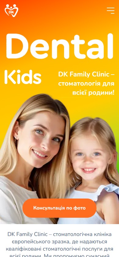
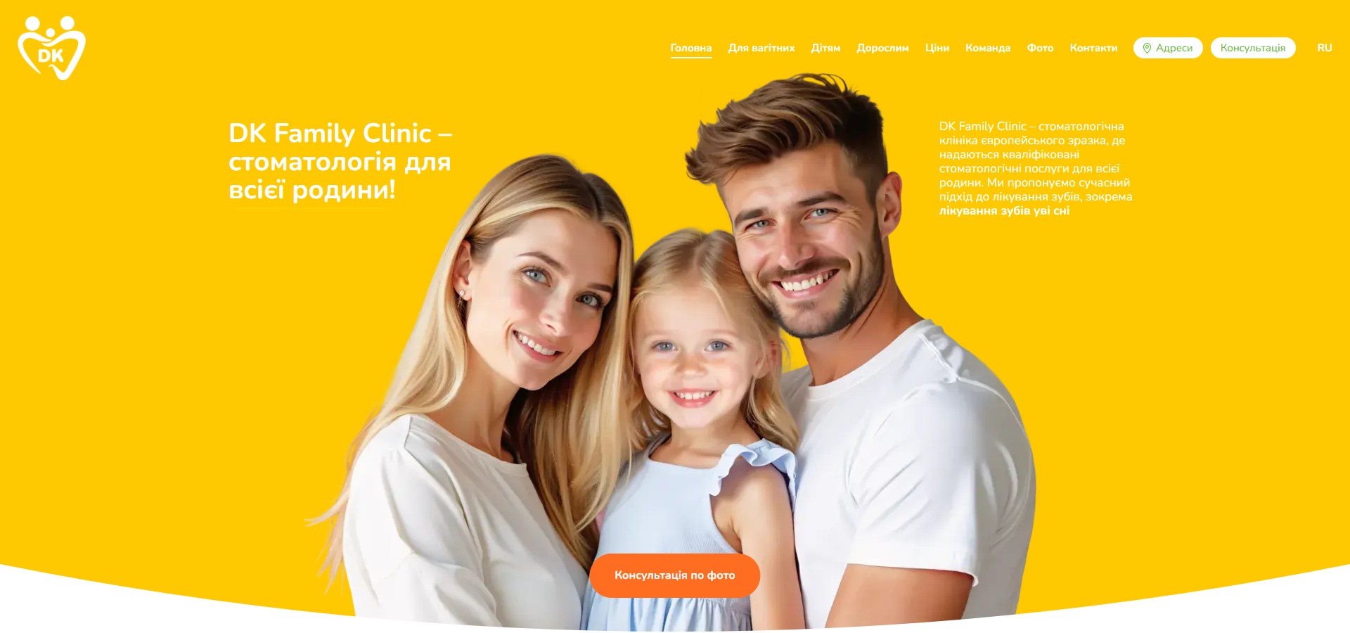
DentalKids is a family dental clinic with two physical locations: in Kyiv (62A Kakhovska St, Livyi Bereh) and in Chernihiv (106 Striletska St). In 2024–25 the clinic repositioned from a purely-paediatric “DentalKids” into a family clinic, “DK Family Clinic”, while keeping the legacy domain dentalkids.com.ua and all the SEO weight of the old brand. The site is built around three parallel audiences — children, adults, and expectant mothers — offering a separate service catalogue for each, plus a USP unique in Ukrainian dentistry: a “photo consultation” with a promised 30-minute reply.
Two locations, two geographic pitches — Kyiv Left Bank and Chernihiv
The “How to find us?” block right after the hero isn’t a small address line in the footer — it’s a full section with two large cards. Kyiv is described through familiar residential complexes and districts (“Troieshchyna, Livoberezhnyi, Rusanivka, Lisovyi, Voskresenka, Pivnichno-Brovarskyi; Faina Town, Sofia Nova residential complexes”), Chernihiv through topographic landmarks (“the area near the Summer School, near the Stryzhen river, opposite Yalivshchyna, bus 37, Instytut stop”). This is local SEO copywriting in its classic “we’re located between …” genre: a patient from these neighbourhoods reads the page as “this is our clinic” and clicks straight through to the phone number matching their own carrier.

A rebrand — DentalKids → DK Family Clinic, without breaking the domain
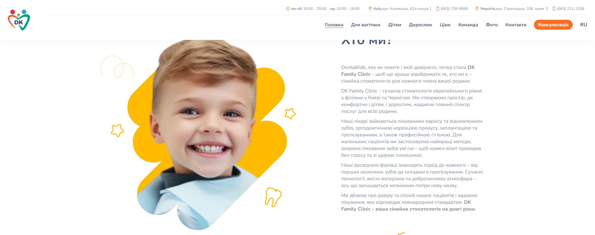
The “Who are we?” section explains the transition straight away: “DentalKids, the clinic you know and trust, is now DK Family Clinic — to better reflect who we really are: a family dental practice for every member of your family.” This isn’t a random marketer’s gimmick — it’s an honest reaction to the fact that family patients had long been coming here (the parents of children who grew up and became clients themselves), and the “paediatric” name had grown too narrow. The old domain dentalkids.com.ua is kept, because over 5+ years it built up organic traffic on queries like “paediatric dentist Kyiv” and “sedation dentistry” — moving to a new domain would mean losing that funnel.
Three audiences — three service catalogues on one page
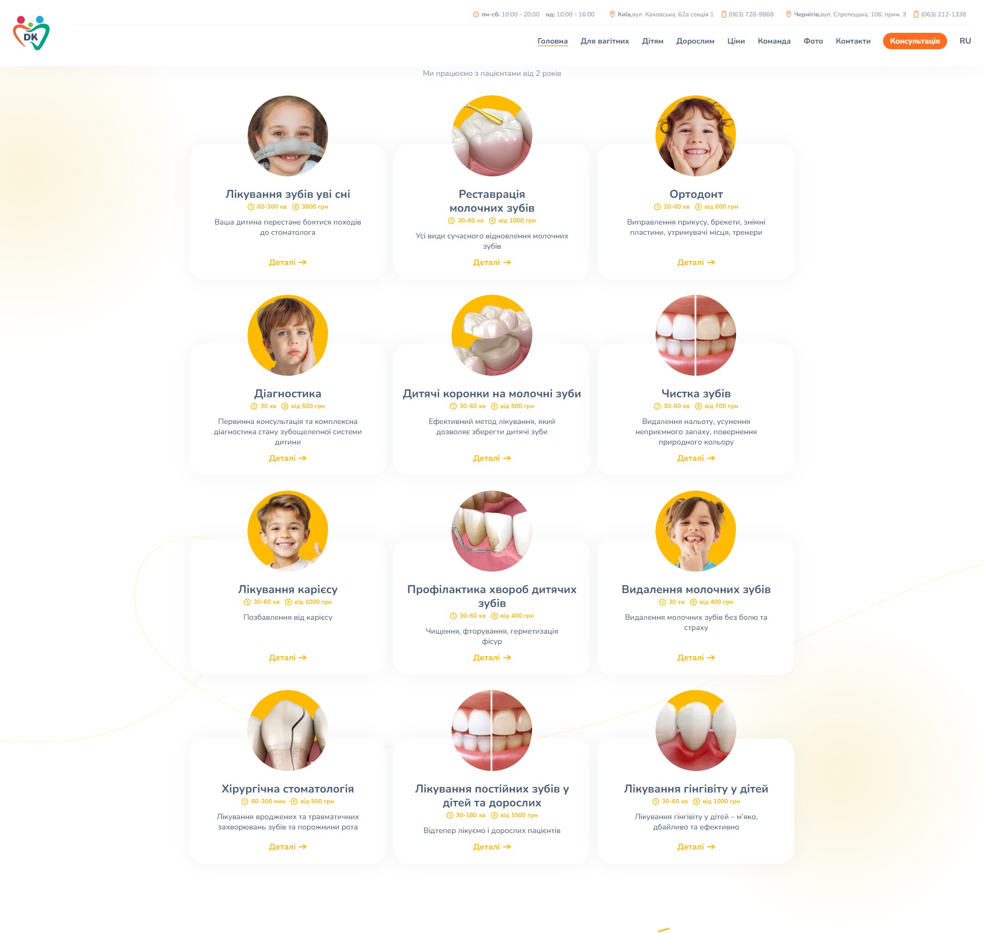
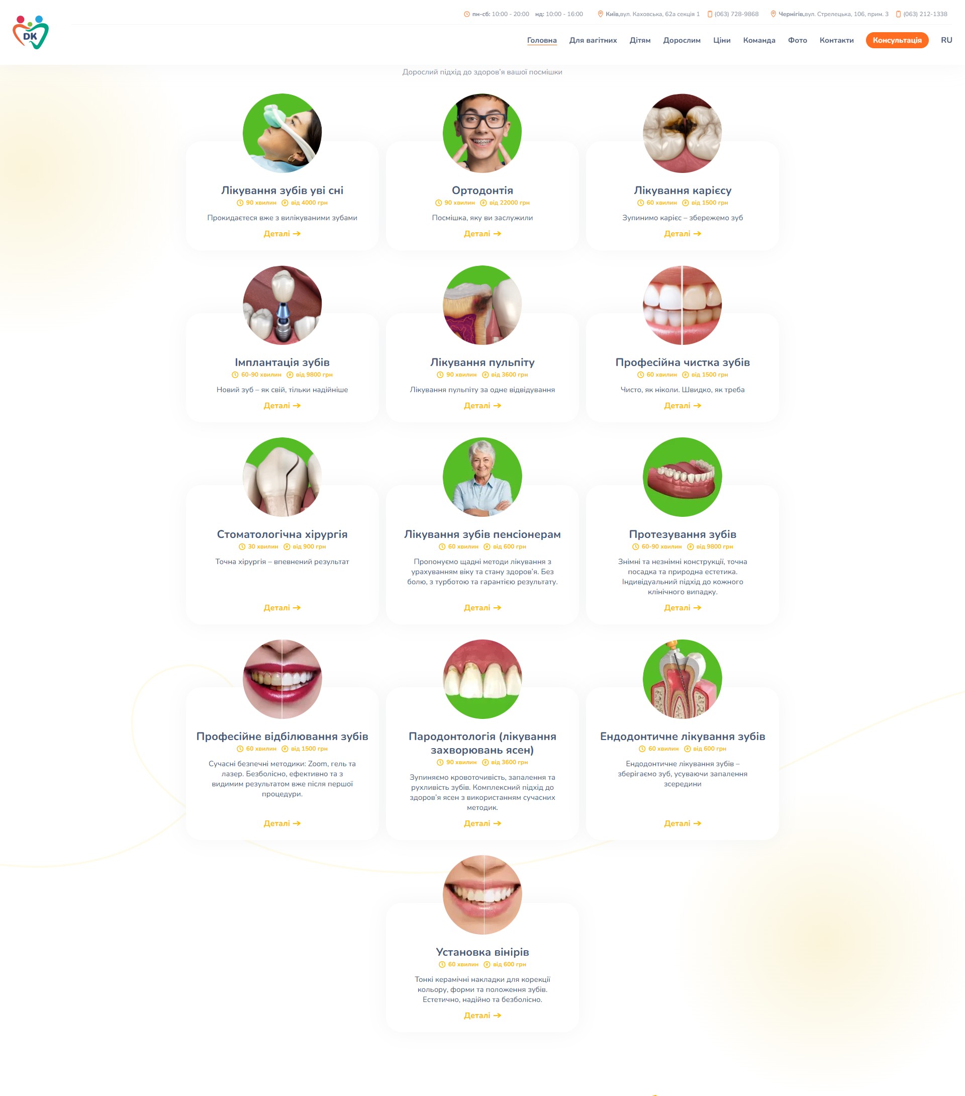
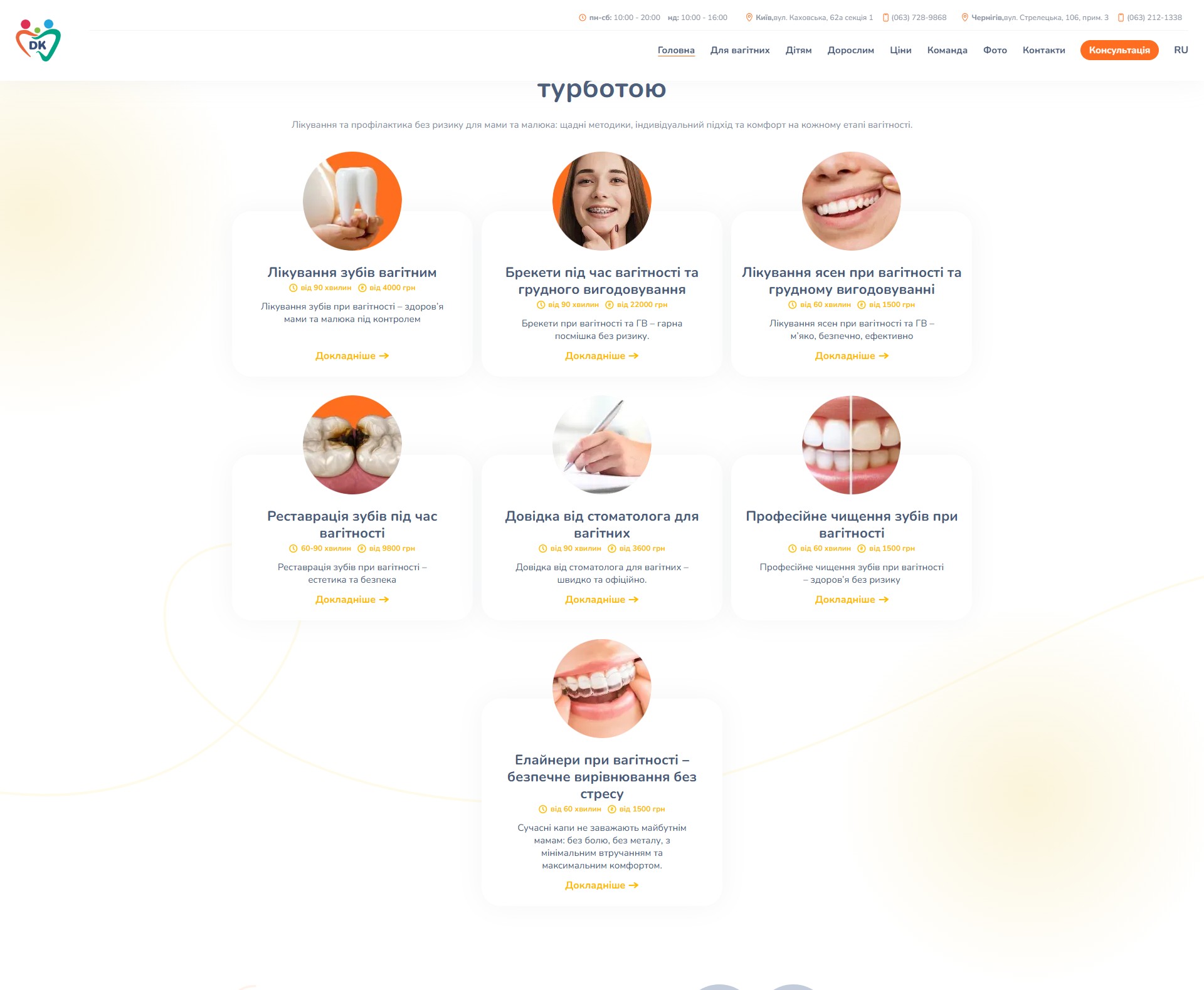
This is the site’s most interesting architectural decision. Instead of a single shared “Services” menu, there are three separate grid sections right on the homepage: “Paediatric dentistry” (12 cards, “age 2+”), “Dental services for adults” (13 cards), “Dentistry for expectant mothers” (7 cards). Each card has a circular photo on top, the service name, a “procedure duration / price from” line, a short result-promise, and a “Details” / “Learn more” button. Clicking through leads to a dedicated service landing page with full SEO copy, an FAQ accordion, a price table and a reviews block.
“Photo consultation” — a differentiating USP
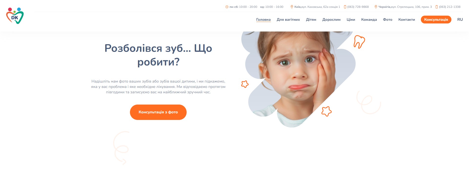
A dedicated section titled “A tooth started hurting… What do I do?” shows a crying child holding their cheek. The text: “Send us a photo of your teeth, or your child’s teeth, and we’ll tell you what the problem is and what treatment you’ll need. We reply within half an hour.” This isn’t an online chatbot — it’s a promise of a live reply from a dentist, with a specific SLA (30 minutes). For the parent of a 3-year-old whose gum abscess flared up overnight, this is a very different funnel from “book an appointment in 5 days”: a photo sent at 11 PM, a reply at 11:25 PM — “see Sorokina urgently in the morning, don’t give ibuprofen-based painkiller”. This kind of interaction costs the clinic one duty dentist on shift, but wins it a near-monopoly position on night-time queries like “what to do when your child’s…”.
The service page — a full long-read, not a card
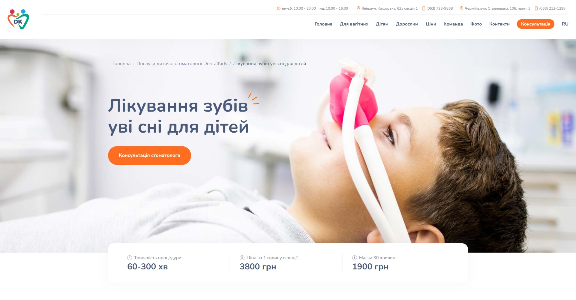
What’s behind the “Details” button on a catalogue card is not a 200-character summary but a full landing page with its own H1, breadcrumbs, a hero image, a pricing block (duration / price per hour / price for a short session), an FAQ accordion, a price table formatted as “service / price, UAH”, a reviews block with avatars and star ratings, a list of the clinic’s advantages, and internal links to 15+ related services. For “Sleep dentistry” (one of the most expensive SEO queries in Kyiv paediatric dentistry) the content runs to about 1,800 words with natural keyword occurrences and references to medical sections. This isn’t auto-generated SEO copy — it clearly shows a copywriter who understands sedation.
The team — 27 specialists, no nested biographies
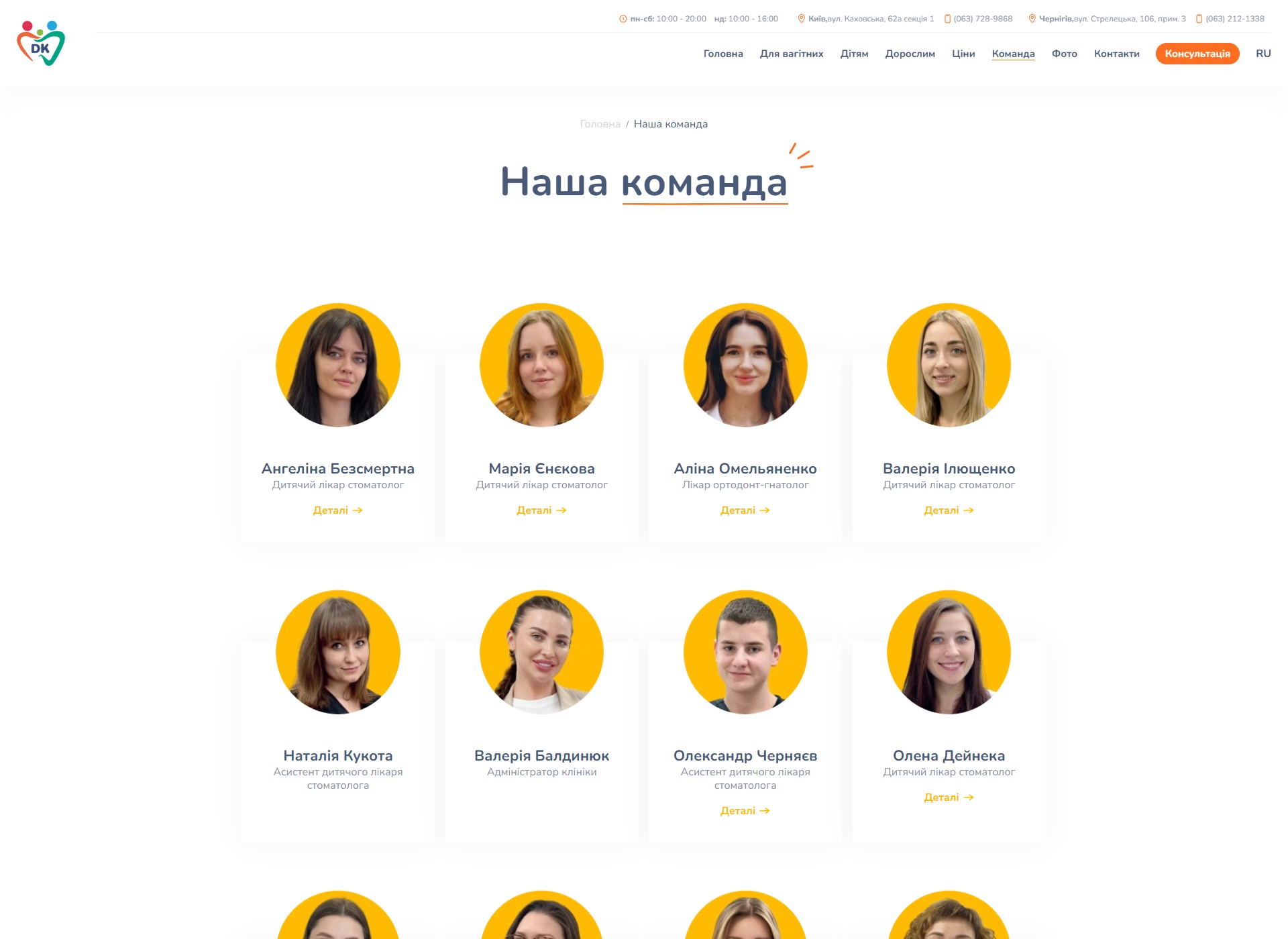
The /uk/likari/ page is a grid of 27 cards (dentists, paediatric dentists, orthodontists, implant surgeons, anaesthesiologists, assistants, an administrator). Each card is a portrait on the brand’s signature yellow round background, a name, a role, and a “Details” button. Some cards are clickable (leading to a dedicated doctor page with a biography and photos at work), others are static (assistants, the administrator) with no link. This is an honest split: a patient chooses a dentist by their bio, not an assistant — assistants are shown for the sake of a complete team, without claiming a personal brand of their own.
Social proof — a review carousel + a blog with current promotions
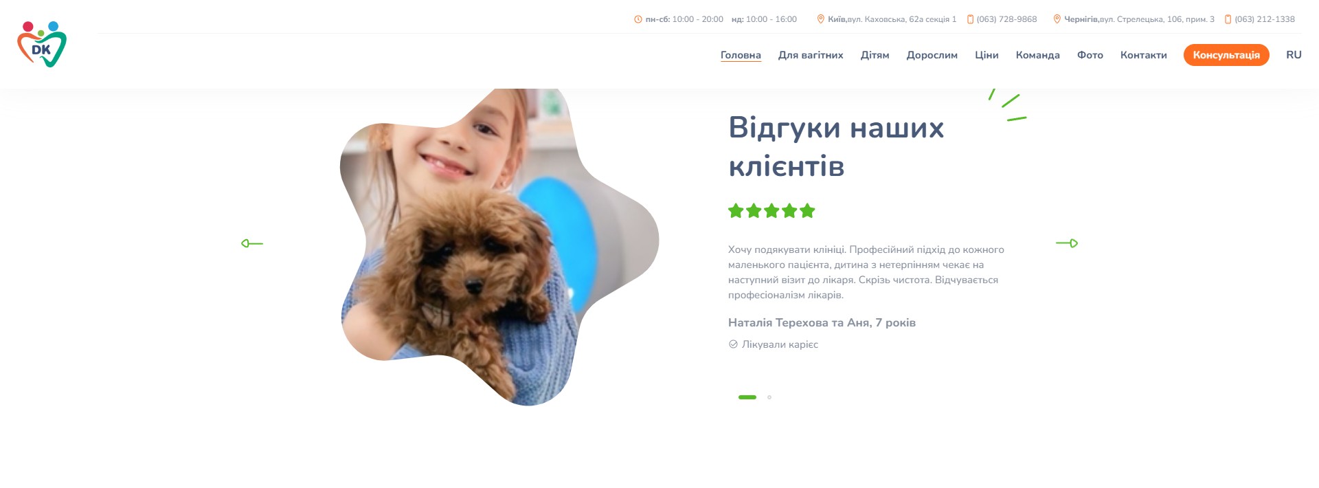
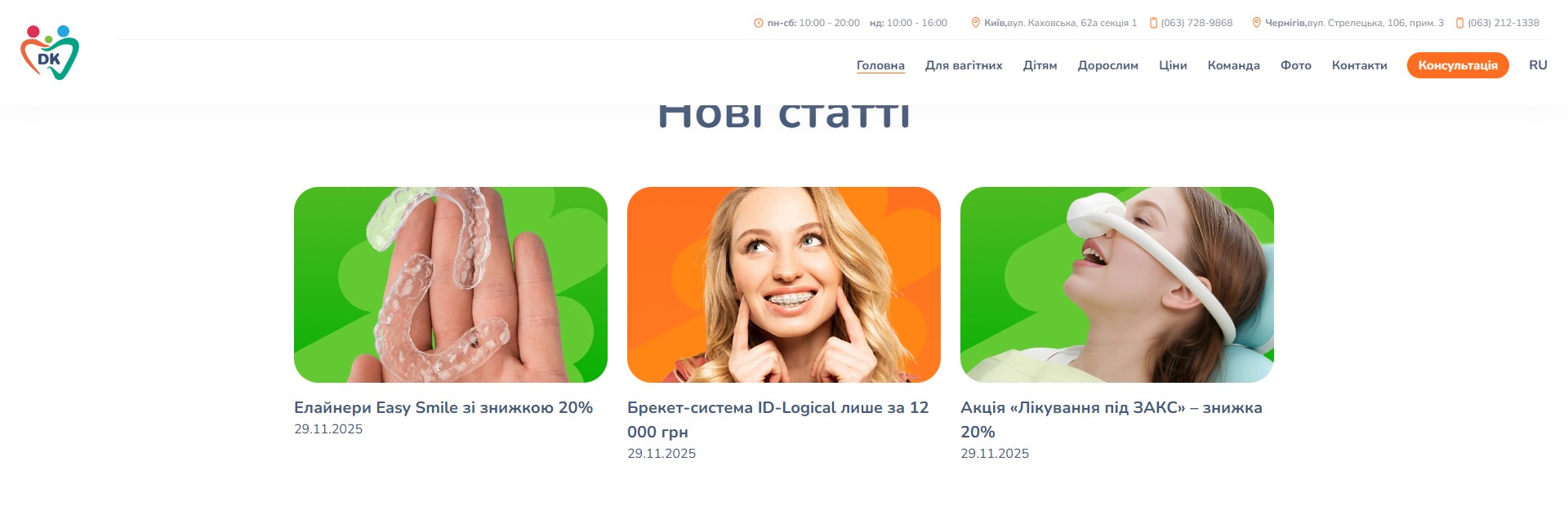
Below the service catalogues on the homepage are two social-proof sections. “Reviews from our clients” is a slick carousel with photos of children with pets and parent reviews, each accompanied by a five-star rating in green and a tag such as “treated for caries / treated for caries under sedation” — a specific procedure, not an abstract “very happy”. Below that — “New articles”: three blog cards, dates like “29.11.2025” — not SEO filler about “the causes of caries”, but marketing news about active promotions (“20% off Easy Smile aligners”, “ID-Logical braces for just 12,000 UAH”, “20% off treatment under general anaesthesia”).
Bilingual UA/RU — separate URLs for every piece of content
The site runs in two language versions: Ukrainian with the /uk/ prefix (dentalkids.com.ua/uk/) and Russian at the root (dentalkids.com.ua/). This isn’t machine translation through a GTranslate widget but hand-written content in two copies, with its own URL for every service and every doctor — for example, the Russian “Enekova Maria Aleksandrovna” and the Ukrainian “Yenieekova Mariia Oleksandrivna” live on two different post IDs with their own SEO copy. For a Kyiv-Chernihiv clinic, where part of the older patient base still reads in Russian, this investment in a dual content structure is a strategic choice, not data bloat: dropping Russian content would cost 30–40% of organic traffic — for a regional clinic, the equivalent of closing a branch.
Technical implementation
- WordPress with a custom template — every homepage section (hero, locations, rebrand, three service catalogues, photo consultation, reviews, blog, final CTA) is a separate template part; the admin edits fields independently, without touching HTML.
- Polylang-style bilingualism — a
/uk/prefix for Ukrainian, the root for Russian; every service, doctor and contact page has two twins with differentpost_ids and their own SEO. - Yoast SEO — the XML sitemap is split into 4 sub-maps (pages, posts, categories, tags), with roughly 350 indexed URLs across the main
sitemap_index.xml. - An in-house photo-consultation funnel — a modal “Photo consultation” form with fields for name, phone, a description of the issue, and up to 5 file uploads; the lead lands in the CRM admin, and the doctor replies manually within the 30-minute SLA during working hours.
- A Slick carousel for the reviews block with “< / >” controls and a small paginator; it initialises after DOMContentLoaded, with its own fallback if JS is disabled — a static first slide stays visible even without scripts.
- Binotel as the phone integration — a bottom-right “CALL BUTTON” widget asks for the user’s number and calls the administrator through the Binotel API; every call from the site is visible in the Binotel dashboard tagged with a UTM source.
- Social media — YouTube (
@Dental_Kids), TikTok (@dental.kids_familyclinic), Facebook, Instagram (@dentalkids_family_clinic); a straightforward transition from the footer to each platform. - Licence transparency — the footer openly lists the medical licence numbers (No. 235 from 12.02.2024, No. 1126 from 28.06.2024) and the Ministry of Health order from 19.06.2025 No. 985; this disclosure is mandatory for a medical facility, but DentalKids clearly doesn’t bury it in the “public offer agreement” — it’s visible on every page.
What we were solving for
The clinic started out as “DentalKids, a paediatric dental practice”, and over the years grew into a family-format one, where the parents of paediatric patients became long-term clients themselves. The rebrand to DK Family Clinic was a formal acknowledgement of that fact, but moving to a new domain would have cost significant search visibility. The site’s architecture resolves this tension: a new brand, an old domain, content expanded to three audiences (children / adults / expectant mothers), each with its own service catalogue and its own SEO copy. Separately — a differentiating “photo consultation” service with a specific 30-minute SLA, turning the site from a static business card into a channel for urgent medical help you can genuinely get a useful reply from at 11 PM. This isn’t a marketing promise but a working protocol built into the on-duty dentist’s schedule — exactly the kind of decisions people expect from a “family” clinic for years to come.




