MedOffice Group — a multi-speciality medical centre in Kyiv
A Kyiv medical centre rewritten from Elementor onto a custom WordPress theme: speciality pages built from fields, doctors, prices and FAQs from one source of data, reviews collected on the site, two languages — and 478 of the 480 old addresses still resolving.
MedOffice Group (medofficegroup.com.ua) is a multi-speciality medical centre in Kyiv: cancer surgery for complex cases, gynaecology and mammology, hernia surgery, chronic pain treatment, ultrasound, laboratory diagnostics and participation in international clinical trials. We rewrote the site from scratch: it used to be WordPress on an off-the-shelf theme with Elementor, and it became a custom theme with no page builder — carrying over 280 pages, 200 articles, both languages and the SEO fields, without a single page address changing.
Technology stack
WordPress with a custom theme, medofficewp — no Elementor and no ACF: every content field runs on our own metabox engine, so the editor sees plain fields (“lead”, “prices”, “FAQ”, “doctors for this service”, “gallery”) instead of a builder canvas. The two languages run on Polylang (Ukrainian with no prefix, Russian under /ru/) and SEO on Rank Math with the titles and descriptions carried over. The theme has five templates: home, service page, doctor page, listing pages (services, doctors, blog) and “About us”. Forms are Contact Form 7 in our own styling plus an appointment modal that intercepts any phone-number button. Reviews are not a plugin but ordinary WordPress comments with the rating in a meta field: the patient leaves a review through a modal and the administrator sees it in the standard moderation queue.

Site structure
The menu covers every patient journey: About us, Services, Prices, Clinical trials, Doctors, Internship, Reviews, Contacts, Blog and the language switcher. The home page is arranged as a path from doubt to booking: slider → why this centre → about the clinic → doctors → booking CTA → ratings on independent platforms → reviews → articles → contacts with the map and opening hours.
Advantages and the clinic block
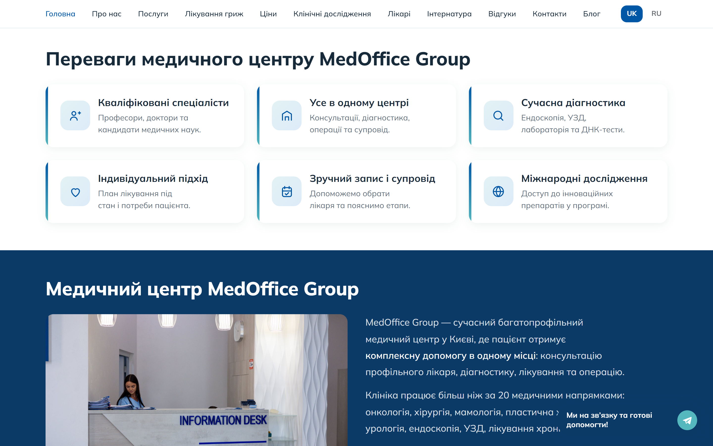
The six advantage cards are not “we are the best” but the specifics people ask about on the first phone call: the doctors’ qualifications, the full cycle in one place, modern diagnostics, an individual plan, easy booking and follow-up, and access to international trials. Below sits a short text about the centre with a real photo of the reception desk and a link to the full “About us” page.
Doctors
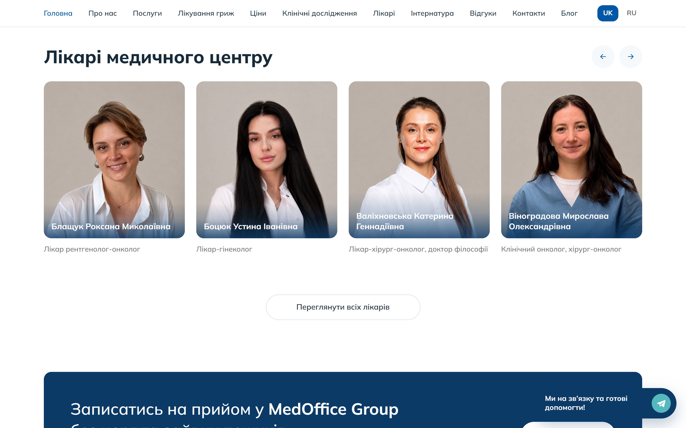
The team is on the home page as a carousel of portraits with specialities — in private medicine people choose a doctor, not a clinic. Every card leads to that specialist’s page; the full list lives on the “Doctors” page.
Ratings and reviews
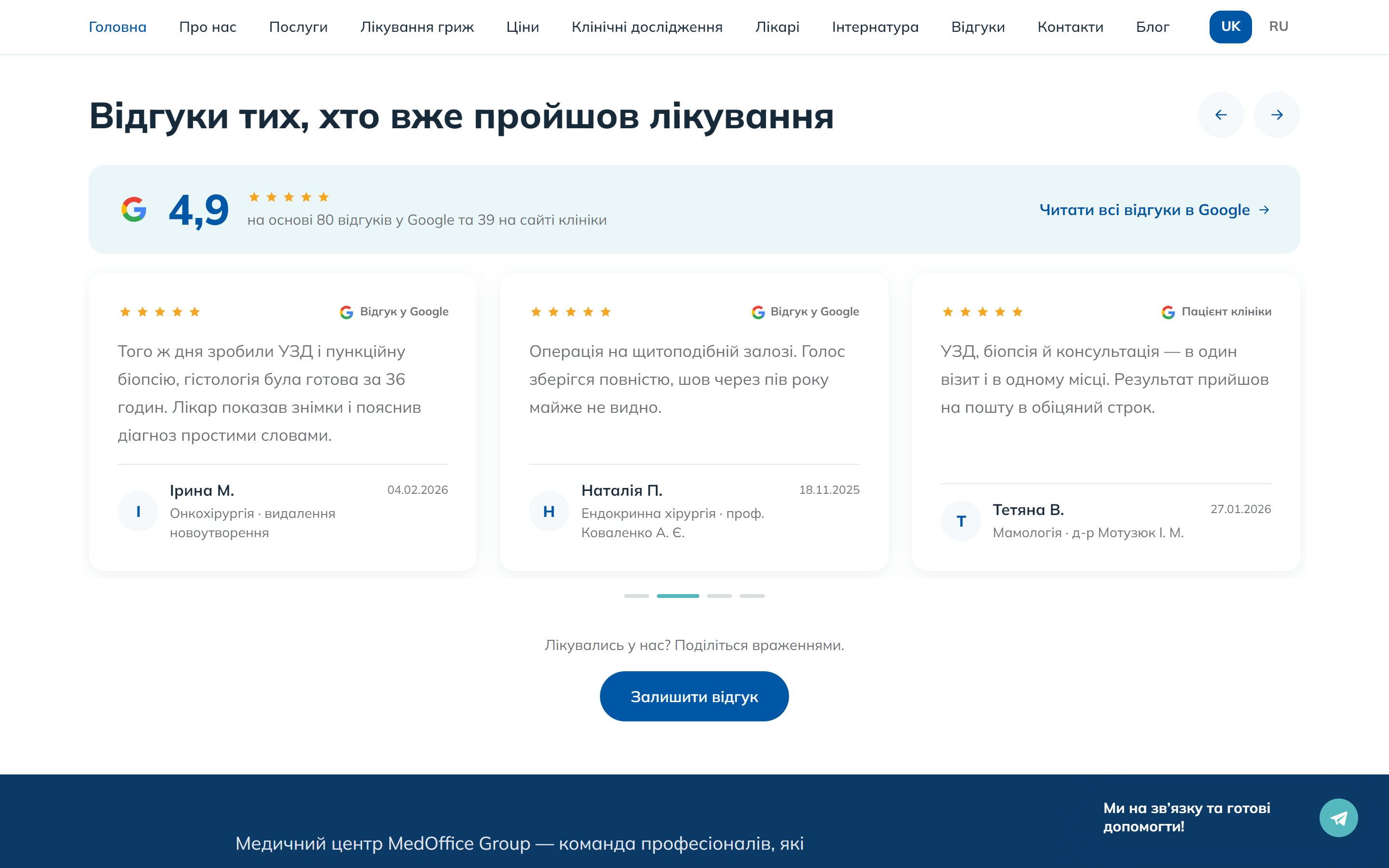
The ratings block gathers the numbers that answer doubt: the average patient score, how many doctors are on the team, how many medical specialities the centre covers and how long test results take. Directly below are the reviews: the real Google reviews are mixed with the ones patients left on the site itself through the form, each marked with its source.
Articles and contacts
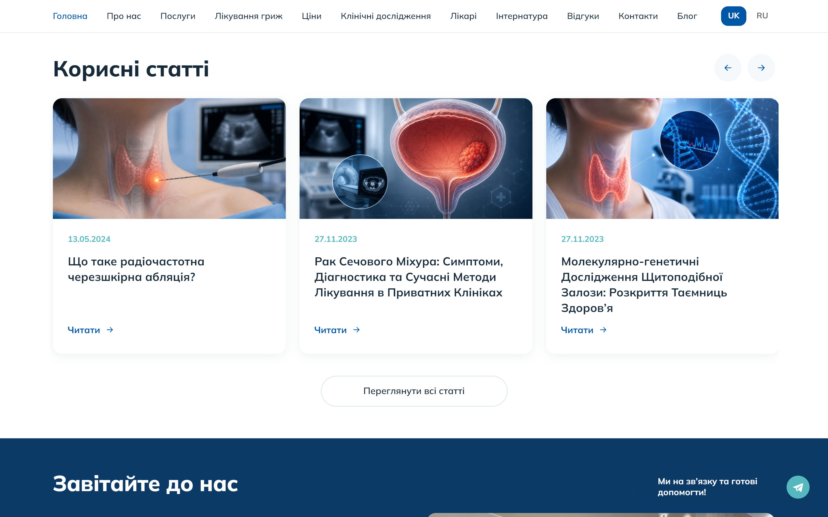
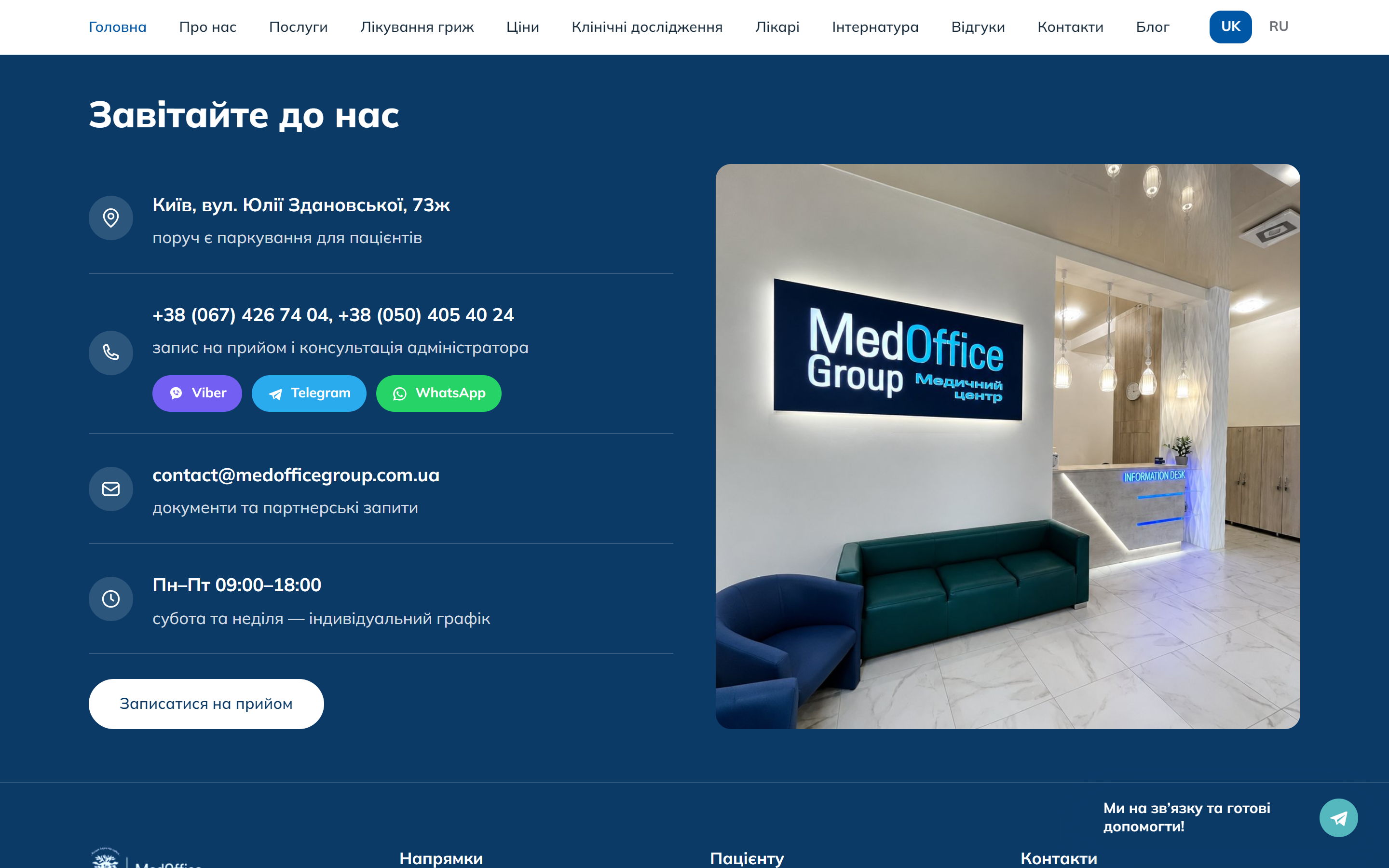
The “Useful articles” block pulls in recent blog posts — for a medical site that is the main source of organic traffic. The home page closes with “Come and visit us”: the address with a note about parking, the phone numbers, messengers, email, opening hours and a booking button.
Inner pages
Specialities and services
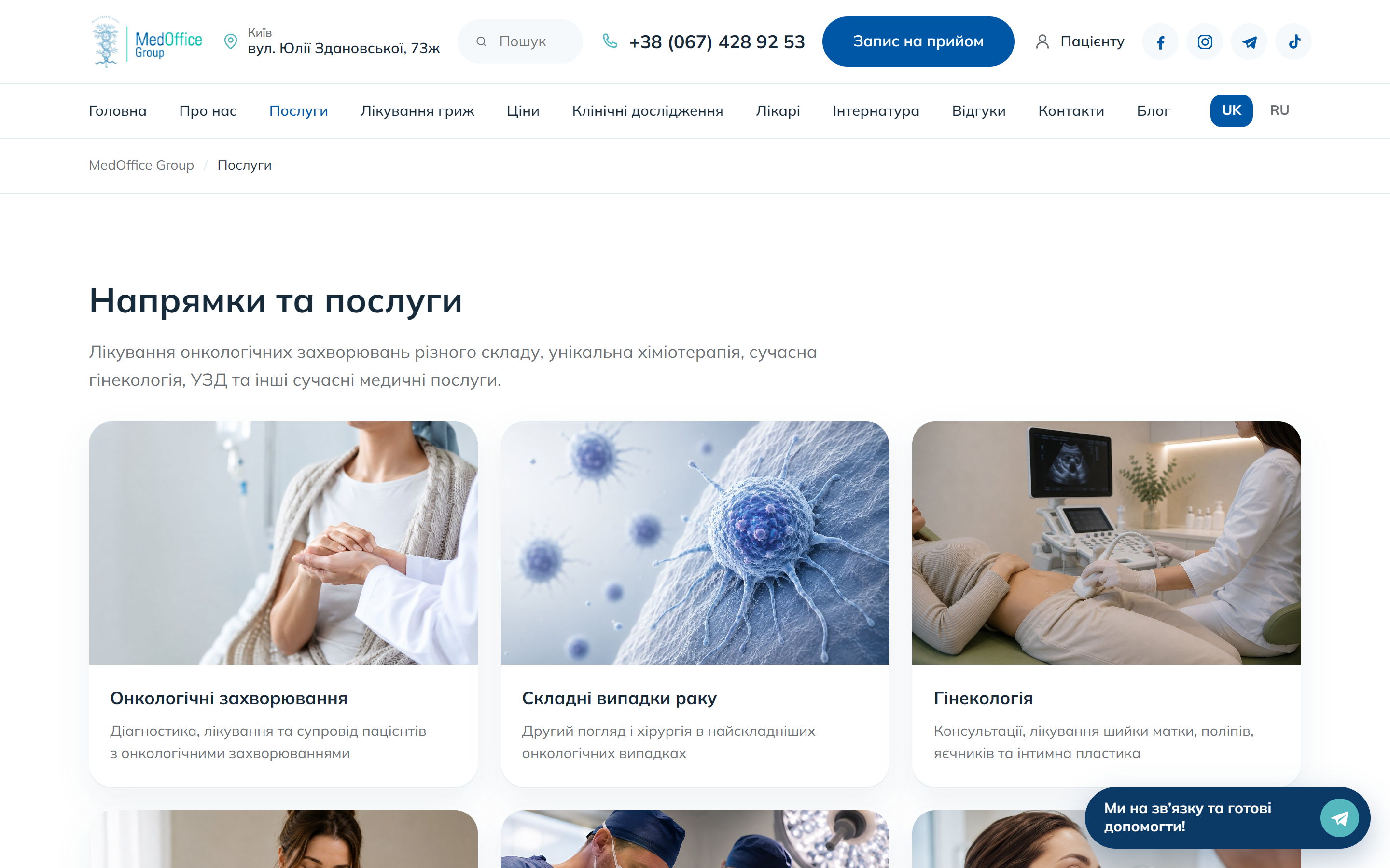
The services section is a catalogue of specialities with photos and short descriptions, from oncology and complex cancer cases to gynaecology, mammology, ultrasound and surgery. Each speciality gets its own page rather than a line in a shared list.
A speciality page
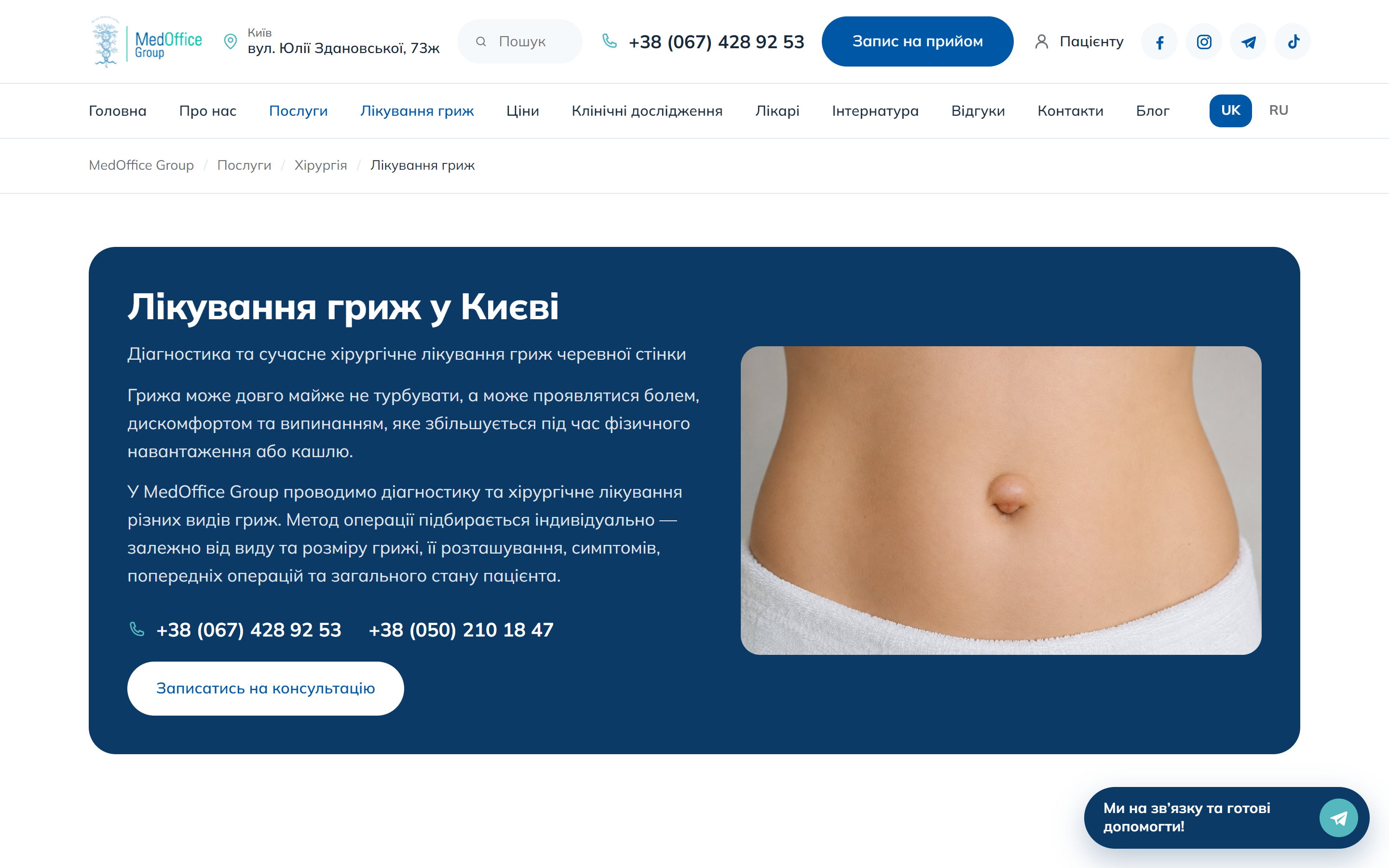
Every service page follows the same shape: a blue lead card with the essence of the method, the phone numbers and a booking button, then the text about diagnosis and treatment, the prices for that speciality, the frequently asked questions, the doctors who work in it, a gallery and a closing call to action. All of those blocks are edited as fields in the admin, so the clinic can add a new speciality without a developer.
A doctor
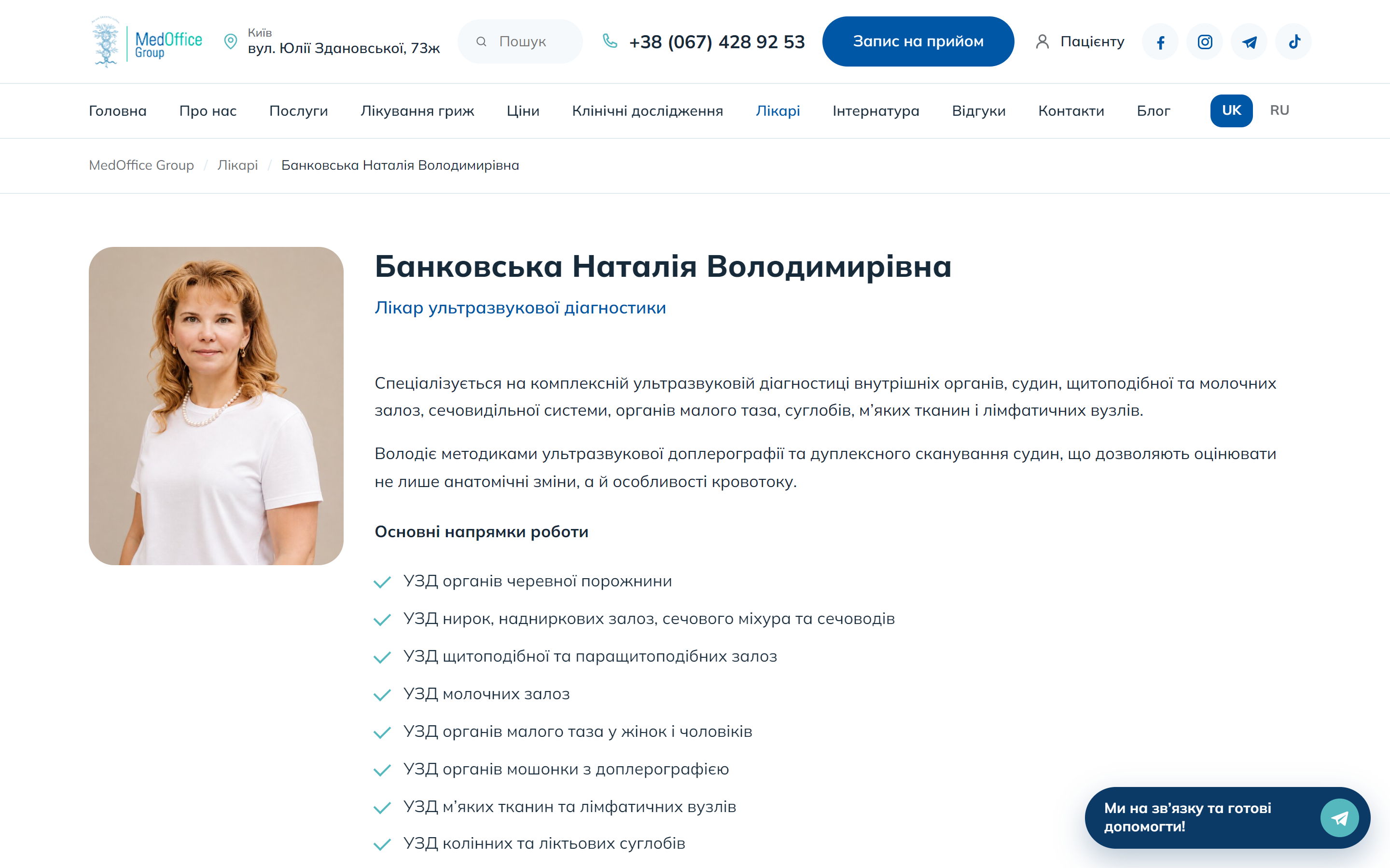
A doctor’s page carries the portrait, the speciality, the experience, the education and the areas they see patients in, plus booking with that particular doctor. The same cards feed the “Doctors” listing and the home-page carousel from a single source of data.
Prices and blog
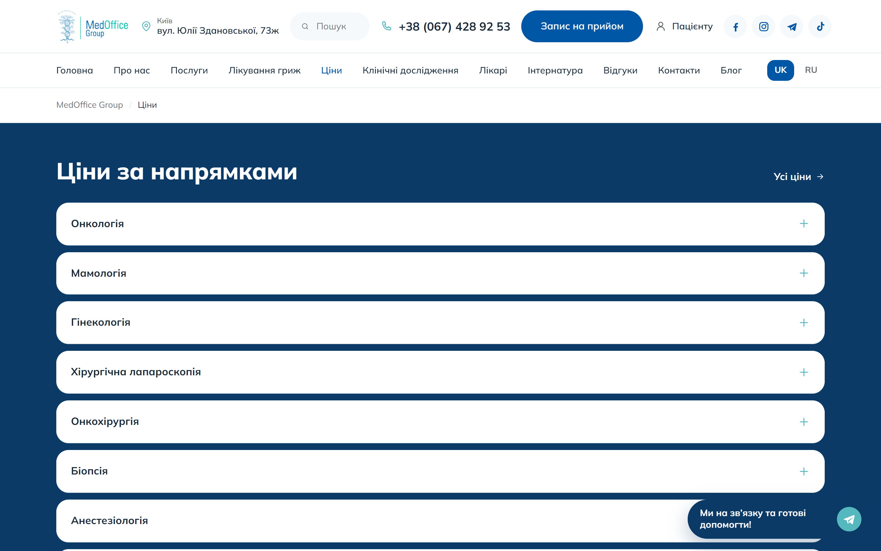
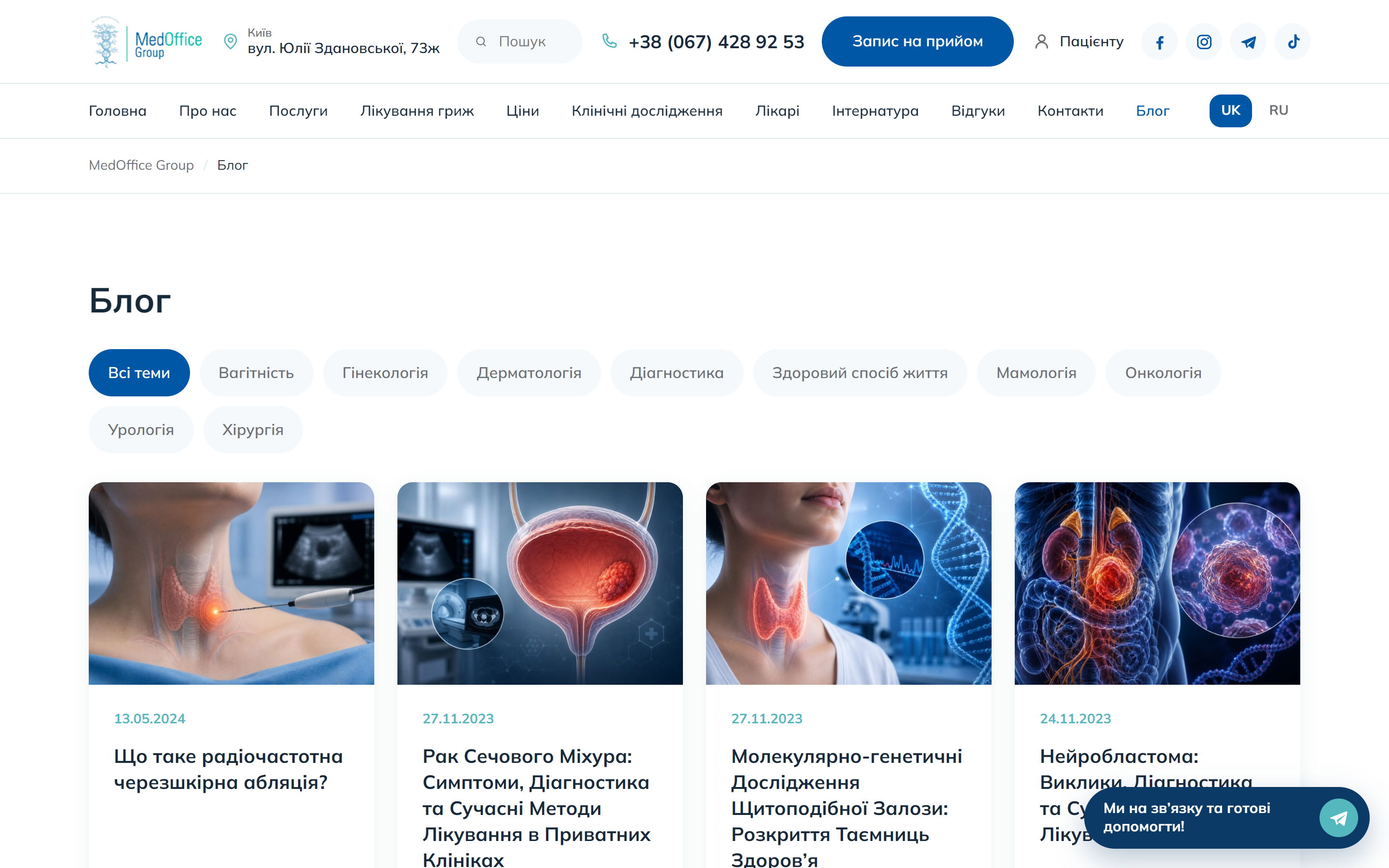
The prices sit in a single accordion by speciality — the patient opens the section they need instead of scrolling a ten-screen table. The blog has a topic filter (oncology, gynaecology, mammology, dermatology, diagnostics, urology, surgery, pregnancy, healthy lifestyle); the categories are linked across the two languages, so the filter works identically in Ukrainian and in Russian.
A migration with nothing lost
The old site ran on Elementor and an off-the-shelf theme, and the real risk in the move was not the design but the search rankings: in medicine those take years to build. So we carried over 280 pages and 200 articles in both languages along with 290 media files, kept the slugs one for one and the permalink structure for posts, moved the Rank Math titles and descriptions across and linked the translation pairs. After the move 478 of the 480 old addresses return 200 and the remaining two return a correct 301. A patient who found a page on Google a year ago still lands exactly where they did before.
The mobile version
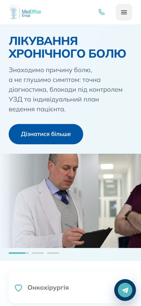
Patients look for a clinic on a phone, often urgently, so on mobile the phone number and the booking button stay at the top, the menu collapses into a burger, the slider and the cards rebuild into one column, and the messengers are one tap away.
Summary
medofficegroup.com.ua shows what a medical site gains by moving off a heavy page builder onto a theme of its own: a speciality page is assembled from fields instead of being drawn with a mouse; doctors, prices, FAQs and articles live in one source of data and appear wherever they are needed; reviews are collected on the site itself; and both languages, along with the search positions built up over years, stay exactly where they were.