
Skargart — an online shop for a manufacturer of standalone diesel heaters
WooCommerce-магазин виробника з лендинг-style PDP, WOOF-фільтром і 4-кроковою діаграмою принципу роботи
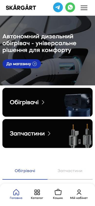
Skargart is a Ukrainian online shop and the official channel for SKÄRGÅRT, a manufacturer of standalone diesel heaters, with a warehouse and pickup point in Vyshneve (Kyiv region, Promyslova St., 10). The site runs on WordPress with a custom skargart theme, WooCommerce 9.6, and WPML/WC-Multilingual in the infrastructure — but every product page isn’t the default WC product layout, it’s a full landing page with a 4-step diagram of how the heater works, a technical illustration of air/fuel/vapour flows, a power-parameters section, and a repeated CTA block.
A hero with a 6-channel segment switcher — one product, six contexts
The first screen is a slick carousel with 6 background scenes, each for its own use-case segment: electric vehicles, buses, trucks, motorhomes, dugouts and trenches, heavy equipment. On the right is a vertical navigation list of the same 6 items, highlighting the active segment and letting you switch scenes manually. The persistent H1, “A standalone diesel heater — a universal comfort solution”, and the blue “To the shop” CTA don’t change — only the background scene does. This is a strong product-marketing device: the product is physically one and the same, but customer recognition differs — a heavy-equipment operator sees an excavator, a motorhome owner sees a caravan, a soldier sees a dugout. All 6 land on the exact same PDP.

Two category cards instead of a default WC mega-nav
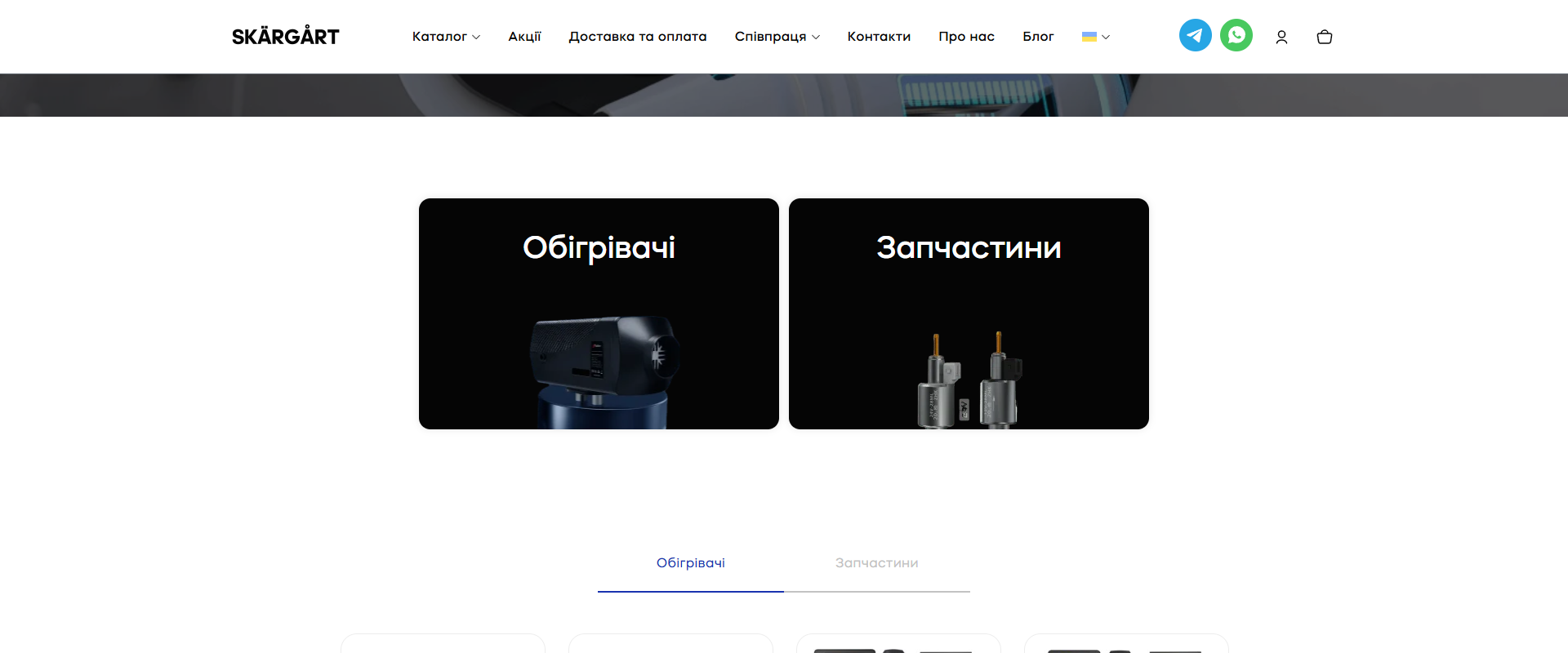
Instead of a standard /shop/ link or a dropdown mega-menu, right after the hero come two enormous black cards, “Heaters” and “Parts”, with photo models of the products. This is a hard binary fork: the customer is either buying the heater itself (a new buyer) or looking for a part for one they already own (a repeat customer). The path is short: / → click a card → /product-category/obigrivachi/ or /product-category/zapchastyny/. Below that is a tab switcher with the same two categories, showing the first 4 products of each category right on the home page.
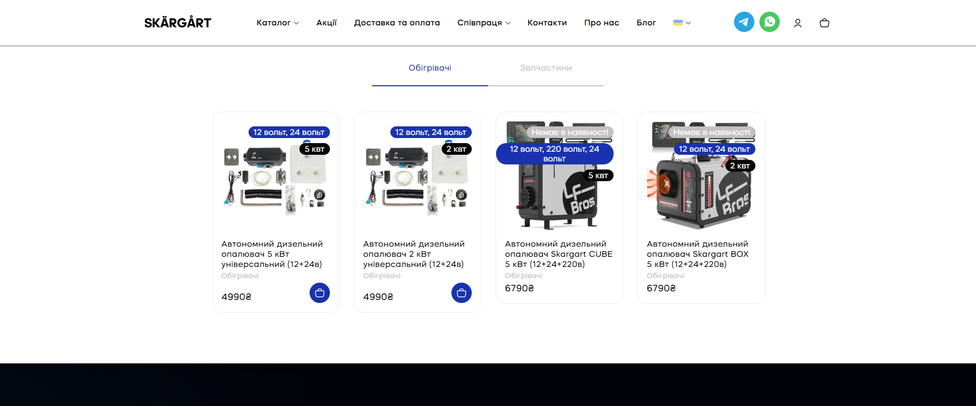
A catalogue tab with a product-card grid — no overlay prices, with voltage/power badges
The tab section shows 4 product cards in a row: Universal 5 kW (4,990 UAH), Universal 2 kW (4,990 UAH), CUBE 5 kW 12+24+220V (6,790 UAH), BOX 5 kW 12+24+220V (6,790 UAH). Each card carries two technical badges: “12 volts, 24 volts” in blue and “5 kW” or “2 kW” in black. The CUBE/BOX cards additionally show an “Out of stock” tag — these models exist in the catalogue but not in stock, which is honest and doesn’t mask availability.
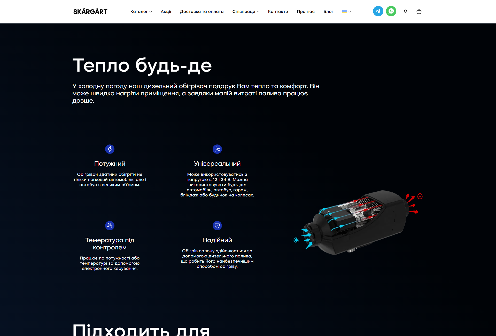
“Warmth anywhere” — 4 USP cards with a 3D heater render
The “Warmth anywhere” section is black, with 4 USP cards on the left and a large 3D render of the heater with coloured flow arrows on the right (red for hot vapours, light blue for cold air). The USPs are chosen to close four different objections: Powerful (because the customer worries whether it will heat a large space), Universal (12+24V, any infrastructure), Temperature under control (electronic control, not analogue), Reliable (diesel vs gas — the safest fuel).
“Fits any need” — a 6-card photo grid of segments
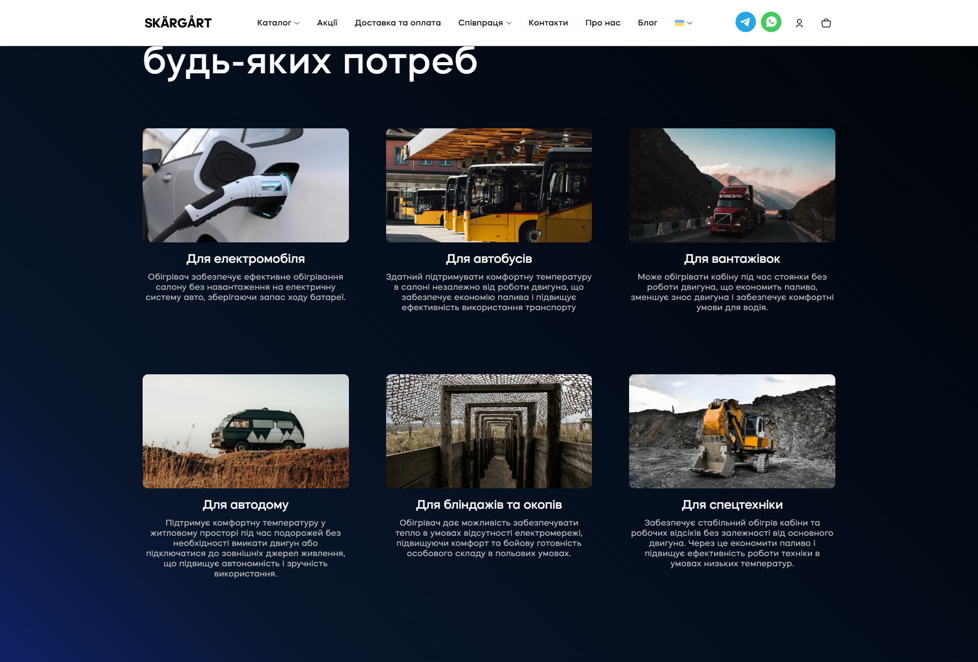
The same 6-segment logic from the hero repeats here as a full 3×2 grid block with real photos for each scenario: an electric car at a charging station, a row of yellow buses in a depot, a Volvo truck on a mountain road, a camper van in a field, a dugout shelter, an excavator at a quarry. Each card carries the segment name and 2-3 lines of a value proposition specific to that context (for example, for the electric car — “preserves battery range”, for dugouts — “heating without a power grid, improving comfort and combat readiness of personnel”).
The single-product page as a full landing page with a 4-step diagram of how it works
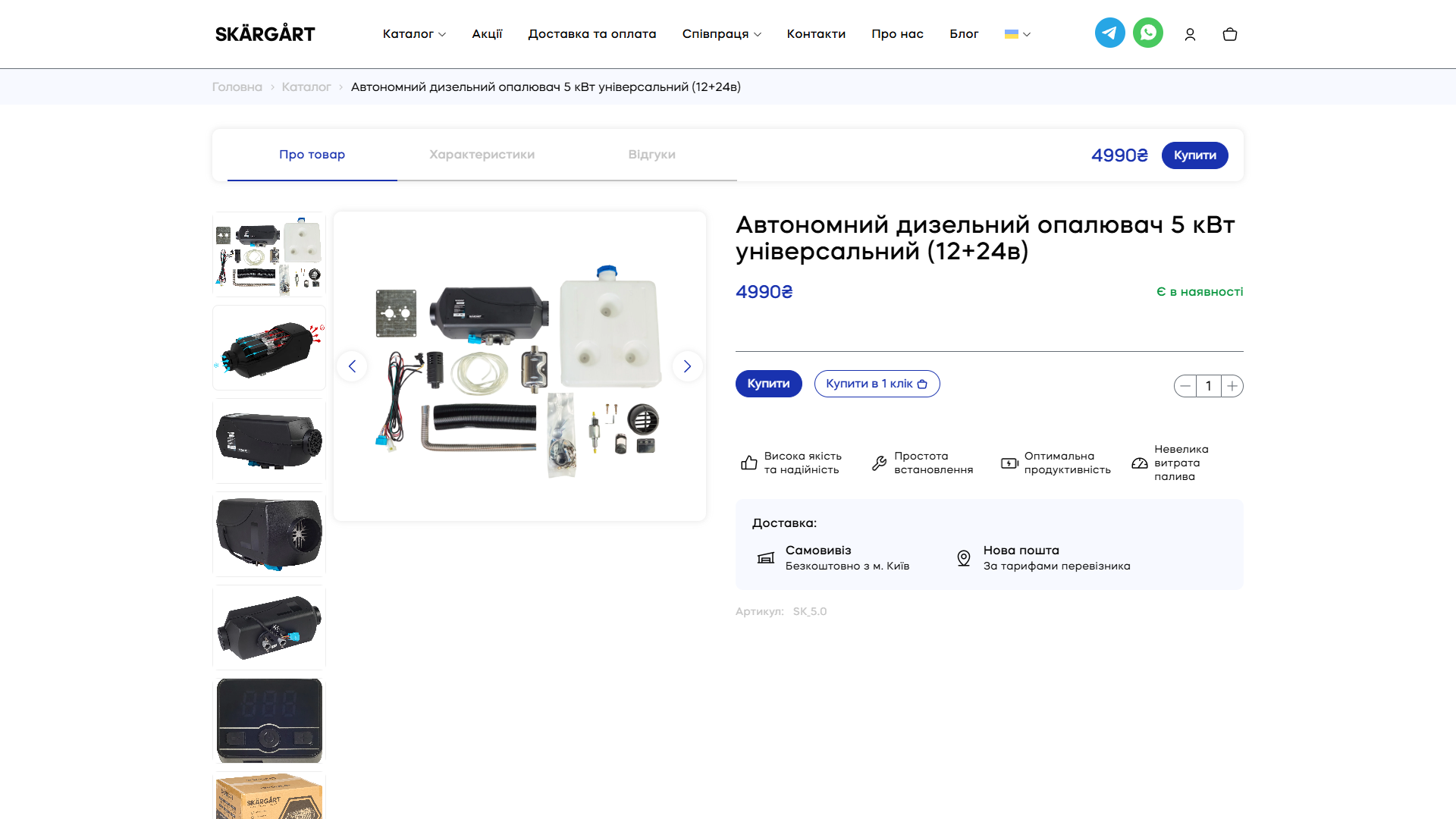
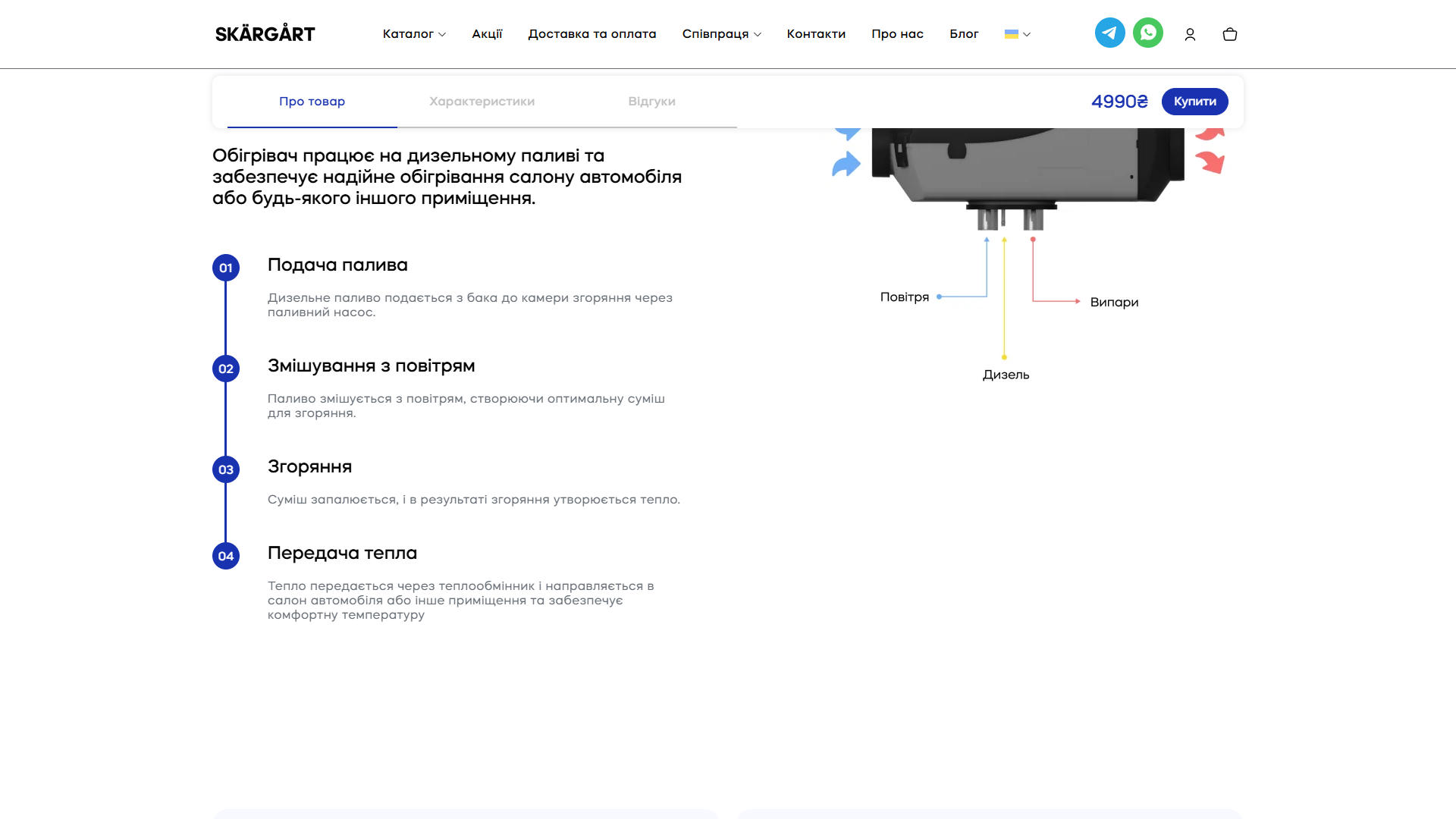
A single product page (for instance /product/skargart-universalniy/) isn’t the default WC PDP. It’s an 8-section landing page: a sticky top bar with anchor navigation (About the product / Specifications / Reviews) + price + “Buy”; a vertical slick gallery with 7 photos in a Fancybox lightbox; the main block with H1, price, availability, two CTAs (“Buy” and “Buy in one click”) and a quantity selector; 4 USP tags; delivery info (Pickup / Nova Poshta); the SKU (SK_5.0); then a “How the heater works” section with a 4-step vertical process (01 Fuel supply → 02 Mixing with air → 03 Combustion → 04 Heat transfer) and a technical illustration of the flows.
The /shop/ catalogue with a WOOF filter — 4 attribute groups instead of “variations”
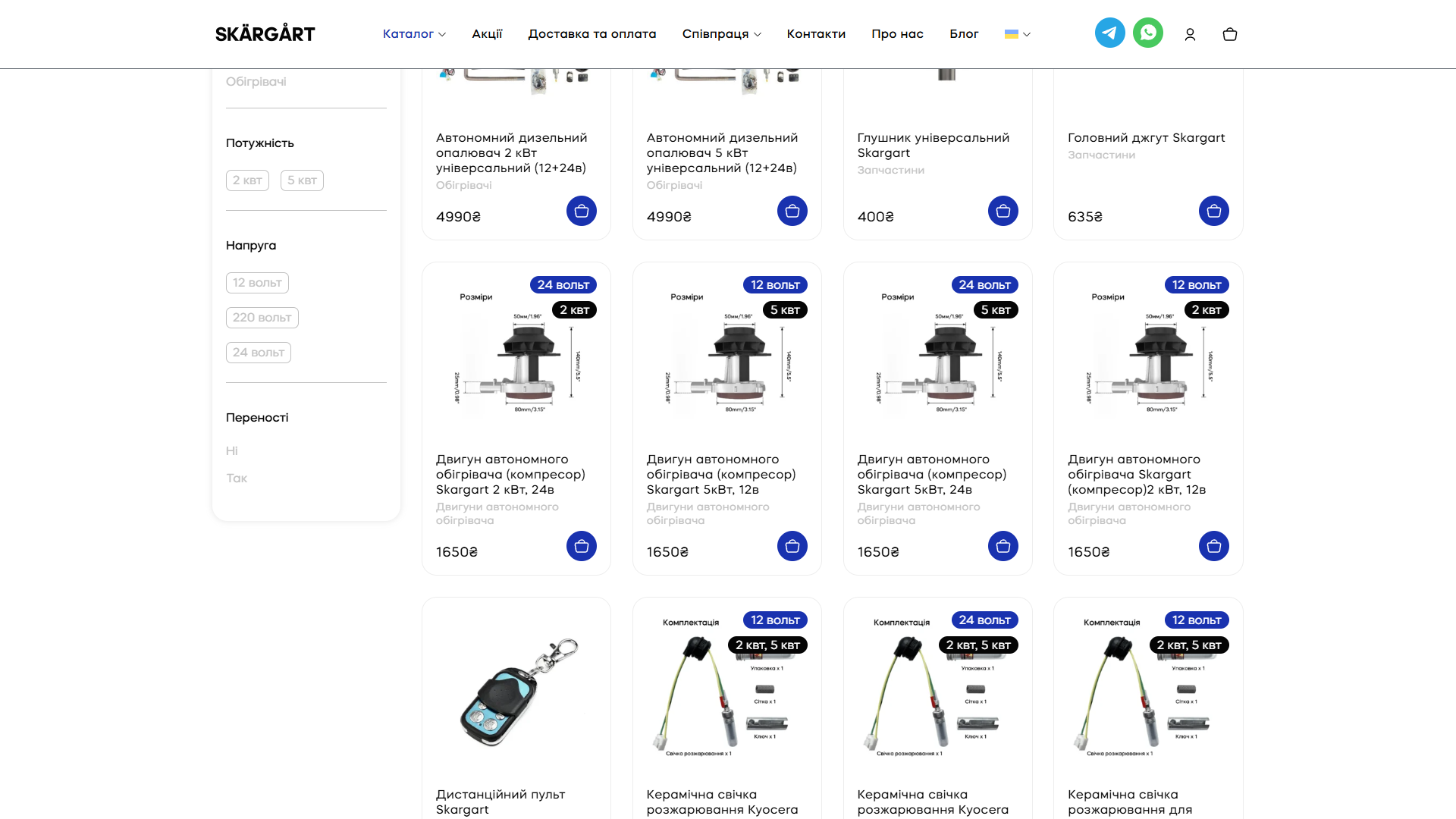
The /shop/ catalogue is a WooCommerce archive with a sidebar filter built on WOOF (WooCommerce Products Filter / Husky). Four attribute groups: Product categories (Parts / Heaters), Power (2 kW / 5 kW), Voltage (12 / 220 / 24 volts), Portable (No / Yes). The catalogue spans 3 pages of products — besides heaters there’s a whole line of parts: mufflers, main wiring harnesses, remote controls, Kyocera ceramic glow plugs, fuel lines, gaskets, and compressor motors of different power and voltage.
Cart flow — a confirmation modal → a skinny /cart/ → a 2-step /checkout/ with 3 carriers and an NP branch picker
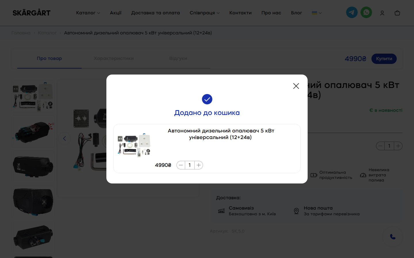
Clicking “Buy” on a product page doesn’t trigger a redirect to the cart, nor does the default WC bulky woocommerce-message notice with a “View cart” link appear. Instead, a centred modal pops up mid-screen with a status-avatar checkmark, the heading “Added to cart”, the current item (a photo thumbnail + name + price + qty with ± buttons) and an × close button. This is a deliberate UX choice: confirm the action, give one more interaction point with the item (you can change the qty right in the modal), but don’t interrupt the current browsing context. A user who’s added a 5kW heater and is about to add a glow plug isn’t forced through “Back / next / return to catalogue” for a second add.
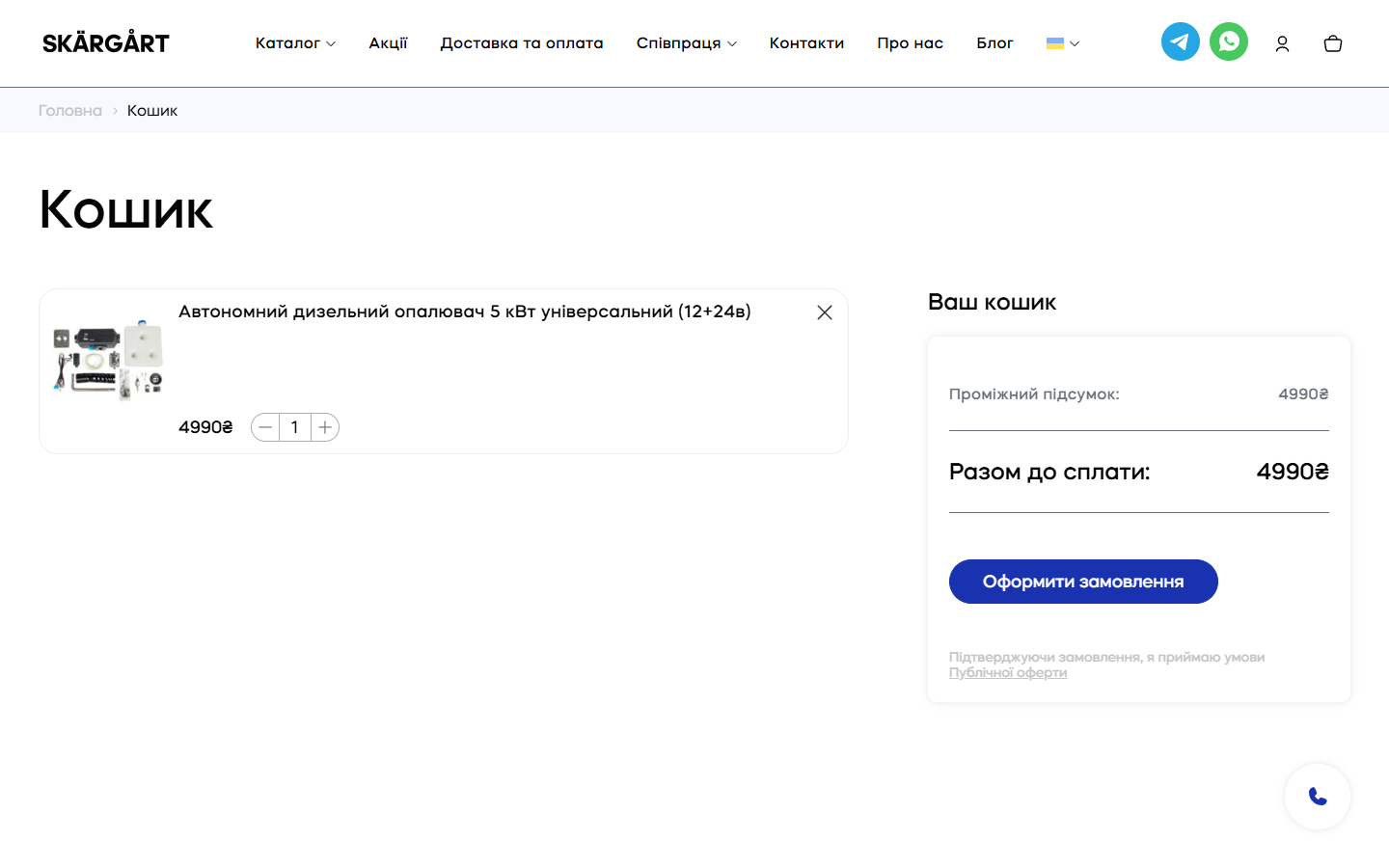
The /cart/ page isn’t the WC default with a 6-column table (image / product / price / quantity / subtotal / remove), it’s a radically skinny single row: a photo thumbnail on the left, then the name above, price and a qty control in one row below, then blank white space, then a close “×” button in the top-right corner of the card. No “Update cart”, no coupon field in the cart itself (moved to checkout as a collapsed accordion), no “Cross-sells” block with “you might also like” suggestions. On the right is a sticky “Your cart” block with “Subtotal”, “Total due”, and a CTA “Place order” + a small line “I accept the Public offer” with a link.
The /checkout/ page is a 2-step accordion (01 General / 02 Payment) with an “Information” block on the first step: Email*, First name*, Last name*, Phone number + a full-width “Sign in with Google” button for returning customers. Next — Delivery method with 3 radio options: Nova Poshta (default), Ukrposhta, Pickup (Promyslova St., 10, Vyshneve). Below the method is a Delivery address block with a smart dropdown for “to a branch” (a toggle to switch to “to an address” mode with Nova Poshta courier delivery), “Choose a city” with server-side autocomplete from the NP API, “Choose a branch” loading a list based on the chosen city. On the right is a sticky “Your order” block with the item (photo + name + price + qty), an expandable “Have a coupon? Click to use it” link, lines for “Subtotal”, “Delivery: as per carrier rates”, “Total due”, and a disabled CTA “Place order” (activated once the required fields are filled in).
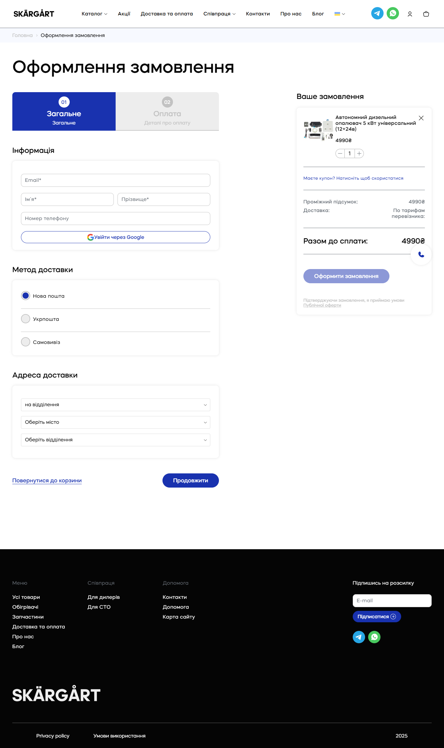
nova-poshta-shipping-wc-style integration with server-side caching of API results for 24 hours (otherwise it’s 1 request per key + rate limits). The disabled state of the “Place order” CTA is a deliberate UX signal: “you see the button, you see why it’s inactive, you don’t click into a dead end”. It’s only enabled once Email + name + phone + address are filled in — a clean validation flow.B2B channels — separate pages for dealers and repair shops with their own CF7 forms
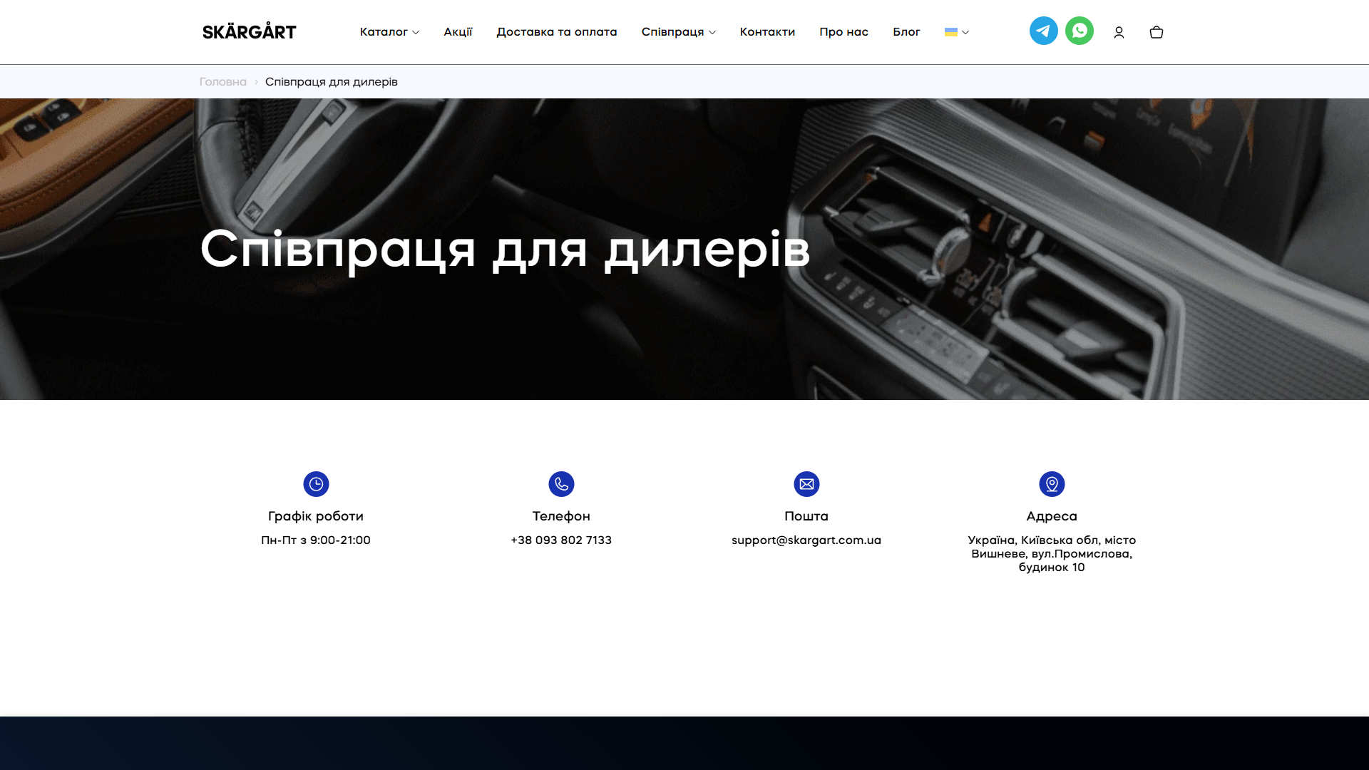
Besides the retail flow (PDP → cart → checkout), the site has two separate B2B pages: /spivpraczya-dlya-dyleriv/ and /spivpraczya-dlya-sto/. Each has its own hero with a contextual background photo (a premium car showroom for dealers — a nod to the seriousness of the partnership), a 4-card info section (Working hours / Phone / Email / Address), and a separate Contact Form 7 with fields Name / Phone number / E-mail / Message and a “Get in touch” button (with jQuery Inputmask for correct phone formatting).
Delivery, payment, FAQ — three synchronised interfaces on every page
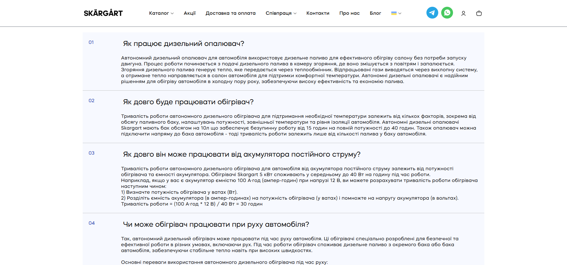
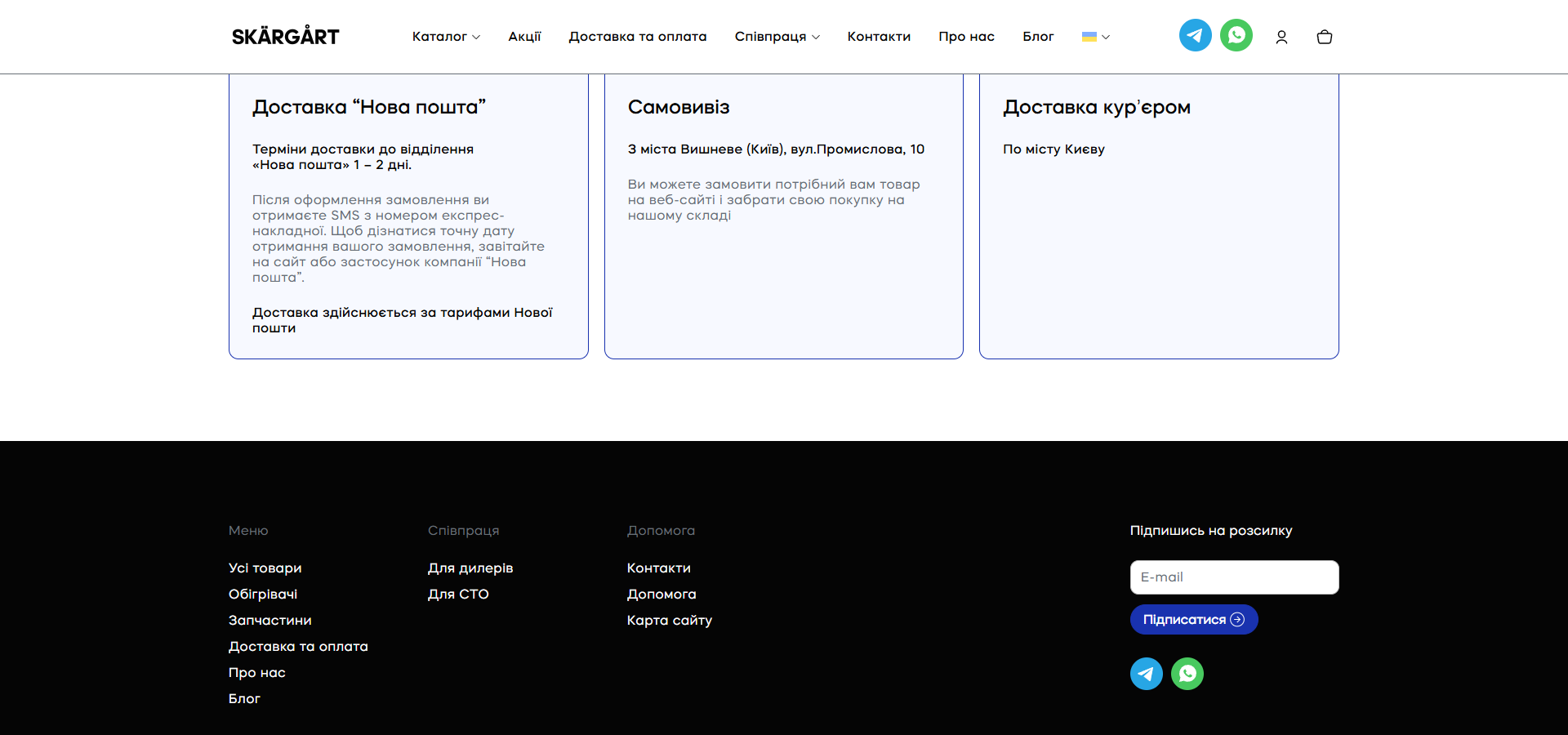
On every page (home, single-product, dealers, repair shops, contacts, about us), the bottom part repeats three standard blocks: a 4-icon nav (FAQ / Delivery / Payment / Returns), then an 8-question FAQ accordion (How it works / How long it runs / Off the battery / While moving / What size / Warranty / Fuel consumption / What’s included), and a 3-card delivery-methods section (Nova Poshta 1-2 days / Pickup from Vyshneve / Courier in Kyiv).
Contacts — a 4-pill grid + a Google Maps embed over an industrial zone + a 4-field lead form with a reused FAQ block
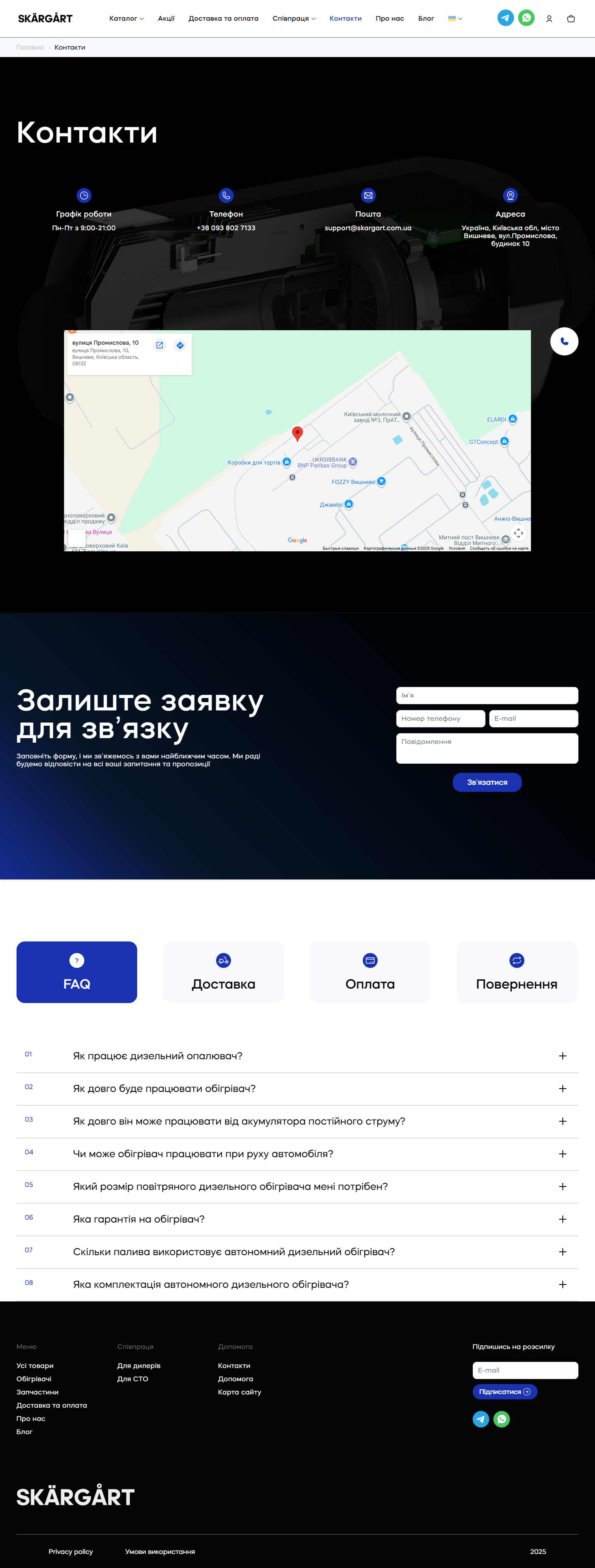
The /kontakty/ page is built as one screen, one action: a massive H1 “Contacts”, below it a horizontal grid of 4 yellow pill cards (Working hours: Mon-Fri 9:00 AM-9:00 PM, Phone: +38 093 802 7133, Email: support@skargart.com.ua, Address: Ukraine, Kyiv region, Vyshneve, Promyslova St., 10), against a dimmed photo of a disassembled heater cutaway. Below that is a full-width Google Maps embed with a pin dropped on Vyshneve’s industrial zone, where nearby you can see Kyiv-EVO (Padlon Group blvd.), Krosna for clothing, LLC T. Vyshneve — this isn’t a cosmetic map, it’s a signal of a physically real production facility in an industrial cluster, not a coworking office with a brand board.
Mobile — a portrait layout with a sticky bottom nav like a native app
The mobile version (390×844, an iPhone format) is built for one-handed scrolling: a full-screen hero cropped for portrait, two stacked category cards below it, and — at the bottom of the screen — a sticky bottom nav with four icons: Home / Catalogue / Cart / My account. This is a clear borrowed pattern from native iOS/Android e-commerce apps (Rozetka, Prom, OLX mobile), significantly cutting the scroll time to checkout. The header on mobile shrinks down to the logo + two messenger icons + a burger menu.
“About us” — positioning the manufacturer with international certification
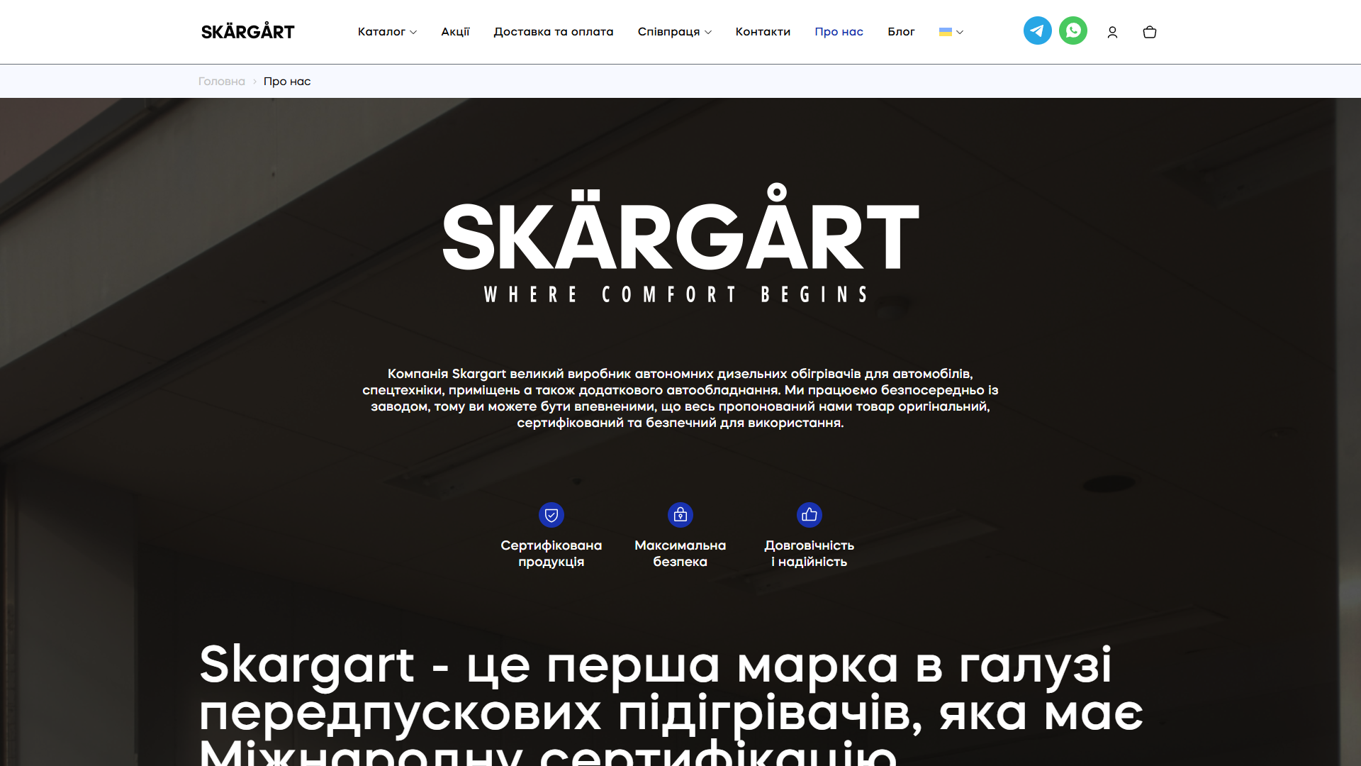
The /pro-nas/ page is built as a corporate positioning message: the SKÄRGÅRT logo with its signature diacritics, the tagline “WHERE COMFORT BEGINS”, a muted indoor background scene (a warehouse), a paragraph about the direct channel from the factory, 3 USP icons (Certified products / Maximum safety / Durability and reliability), and the key H1 “Skargart is the first brand in the pre-heater industry to hold International Certification”. Next is an H2, “Technology is changing the future, and innovation drives us forward”, with a paragraph on patented technologies (a dual thermostat, generating electricity by splitting electrical charges in a water flow).
Stack, integrations, technical decisions
- WordPress 6.x + a custom
skargarttheme (no page builder, no Elementor) — full control over the markup, the sticky bars and the product landing pages, with no extra layer on top. - WooCommerce 9.6.4 — the main e-commerce engine, with a custom
single-product.phprewritten for the landing-page format. - WOOF (WooCommerce Products Filter) 1.3.6.5 — a sidebar filter on the shop archive with categories, power, voltage, and portability.
- WPML 4.x + WooCommerce Multilingual 5.3.9 — the multilingual infrastructure is in place (sitepress, a language cookie), currently only Ukrainian is active; it’s ready for EN/PL/RU without switching plugins.
- Contact Form 7 6.0.4 — three form instances: a footer newsletter (a single email field), dealer leads at
/spivpraczya-dlya-dyleriv/(4 fields), repair-shop leads at/spivpraczya-dlya-sto/. - Slick 1.8.1 — the slick carousel for the hero (6 background scenes with autoplay), the product gallery (7 photos with vertical thumbs), related products on the PDP, the category tab switcher.
- Fancybox 3.5.7 — a lightbox for product images (clicking the main photo opens a full-screen viewer navigating across 7 frames).
- jQuery 3.7.1 + jQuery Migrate 3.4.1 + jQuery BlockUI — the standard WC stack for DOM manipulation (cart fragments, AJAX add-to-cart).
- jQuery Inputmask 5.0.7 — a phone mask for CF7 forms (the format
+38 (___) ___-__-__). - Seraphinite Accelerator — page caching + CSS/JS minification (inlines used CSS in a
<style>tag as the first payload, lazy-loads the rest); visible from thecache/seraphinite-accelerator/s/m/d/css/...prefix in the CSS URLs. - Cookie Notice + Google Analytics 4 (G-M0CNJR82K2 via MonsterInsights Premium 10.0.3) — GDPR consent and cart-event tracking.
- Telegram + WhatsApp deep links (
#tg,#whatsappin the header and footer) — the main lead channel, with no classic “request a callback” form. Configured in JS — a click handler swaps thehreffortg://resolve?domain=...andwa.me/....
Summary
Skargart is a WooCommerce shop that visually and functionally behaves like an 8-section landing page on every PDP, not a standard WC product. The skargart theme has rewritten the single-product template beyond recognition: a sticky anchor bar, a 4-step diagram of how the heater works with a technical illustration, a 7-photo gallery with Fancybox, a “Buy in one click” option alongside a full cart flow. The catalogue uses WOOF instead of WC variations — every voltage×power combination is a separate, indexed SEO product. The lead channels are Telegram and WhatsApp in the header and footer instead of a callback form, with separate dealer and repair-shop pages for the B2B segment. The site is export-ready (WPML + WC-Multilingual in the stack), the brand positions itself as “the first brand of pre-heaters with international certification” — and the whole UX architecture is built to serve a solo long-haul trucker (PDP→cart→Nova Poshta), a soldier ordering for a dugout (PDP→Telegram→a bulk consultation), and a dealer/repair shop (a separate B2B page with its own CF7 form) all at the same time.




