
“Novyi Khotiv” residential complex — an apartment catalogue and a quiz funnel for a developer near Kyiv
WordPress-каталог квартир із власним CPT-роутингом, інтерактивним 3D-планом комплексу і окремим субдоменом-квізом на adsquiz.io для конверсії з Facebook/Google-реклами.

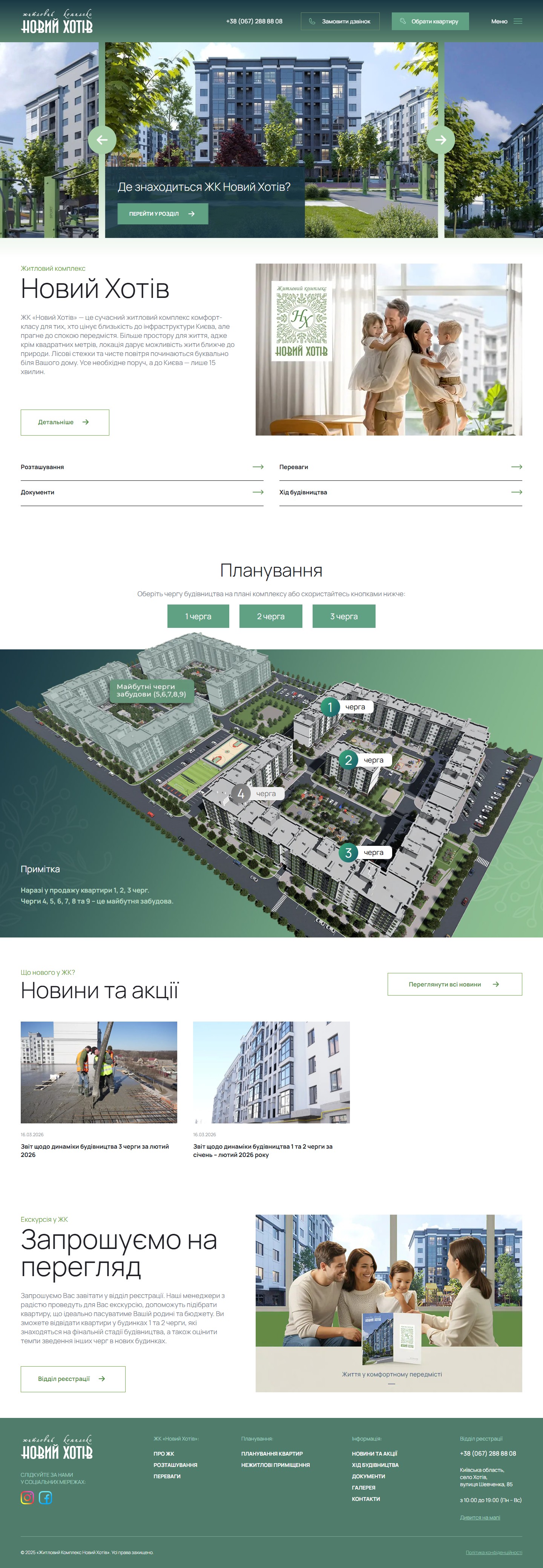
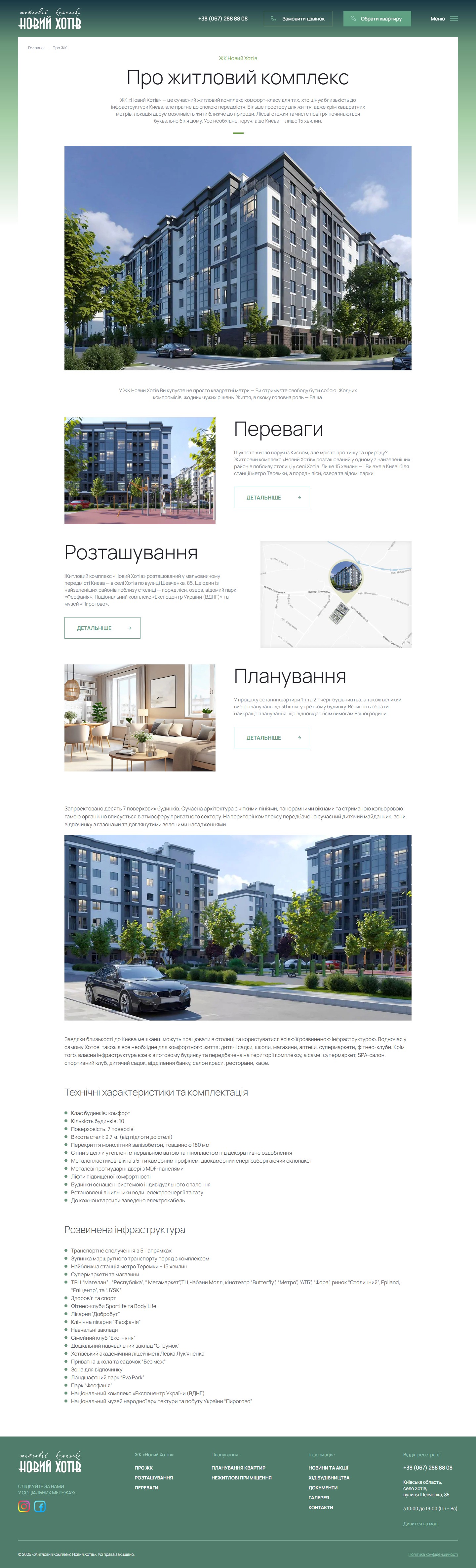
“Novyi Khotiv” is a comfort-class residential complex of 10 seven-storey buildings in the village of Khotiv, 15 minutes from Teremky metro station. The site novyhotiv.com.ua works as a sales machine for a developer at phases 1–3: the top of the funnel is fed by Instagram/Facebook and Google ads, and the site’s main job is to walk a buyer from “where is this?” to a specific floor plan on a specific floor of a specific phase. The architecture isn’t the classic corporate model — “homepage → services → about us → contacts” — but two independent layers: an informational WordPress site with an apartment database, and a conversion subdomain, l.novyhotiv.com.ua, with a responsive quiz that every CTA button in the header and every “find out the price” link leads to.
An interactive 3D site plan — the core mechanic for choosing a phase
The homepage’s central section is an interactive development render with 9 construction phases, where phases 1–3 (currently on sale) are colour-marked and clickable, while 4–9 are dimmed and labelled “Future construction phases”. Above the plan are three tab buttons, “Phase 1 / Phase 2 / Phase 3”, with the instruction “Choose a construction phase on the complex plan or use the buttons below”. This is a key decision block: before showing any apartments, the site makes the client choose a building, because the price, floor count, completion status and layouts differ radically between building No. 1 (final stage) and building No. 3 (still under construction, phase 3).
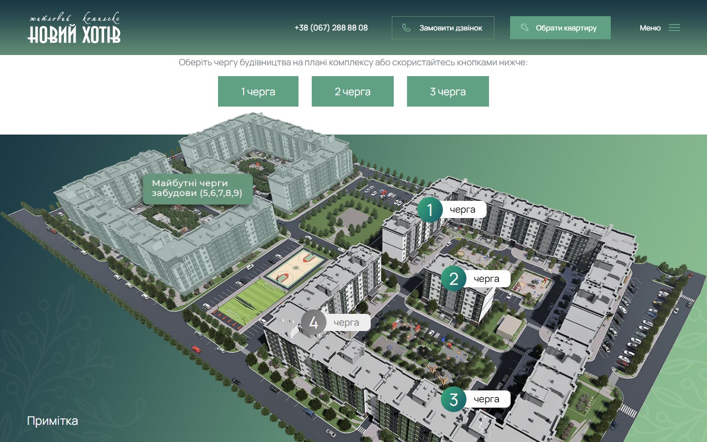
/apartments/building/budynok-N/. The “Future construction phases (5, 6, 7, 8, 9)” are marked with a transparent green — the developer deliberately keeps the long-term perspective of the project in view, even where nothing is yet for sale. For a buyer who’s purchasing not “an apartment” but “a neighbourhood”, this perspective matters: they can see that, next to their building, a whole courtyard with a school playground and a football pitch will take shape within 2 years, rather than an empty field with just the developer’s promise.A catalogue site — an apartment finder on its own CPT, not a third-party plugin
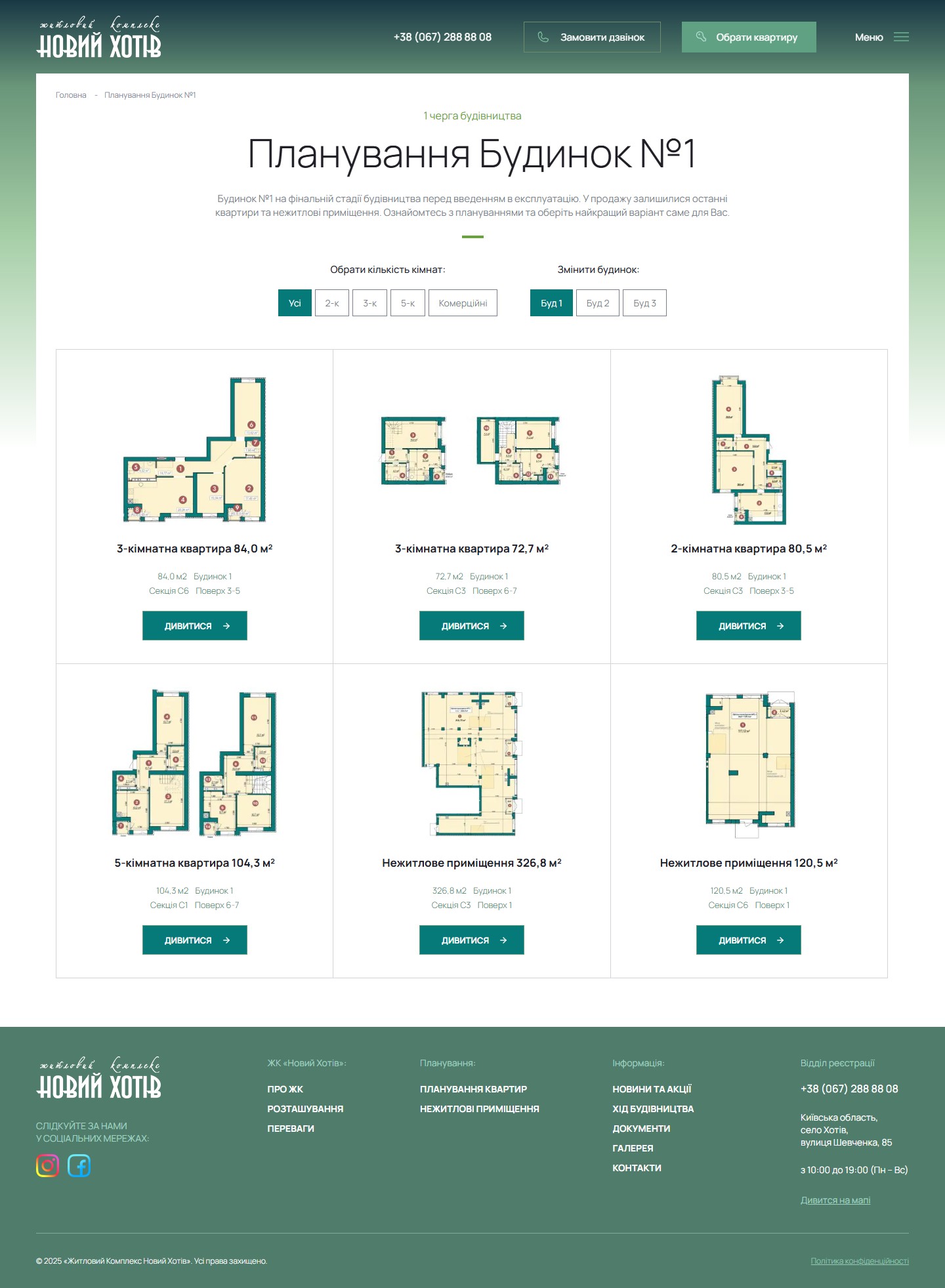
Instead of a plugin like WP Real Estate, OpenAgent, or Estatik, the developer built the apartment listings as a full WordPress CPT with custom URL routes. Each building is its own archive page, /apartments/building/budynok-1/, with a filter by room count (All / 2-room / 3-room / 5-room / Commercial) and a switcher between neighbouring buildings (Building 1 / Building 2 / Building 3). Room categories form their own taxonomy: filters lead not to JS regrouping but to their own URL, /apartments/building/budynok-1/rooms/3-k/, which search engines can index, giving every “building × room count” combination its own landing page. This is an SEO-considered decision: a query like “3-room apartment Khotiv” lands not on the general homepage but directly on the list of 3-room units in the right building.
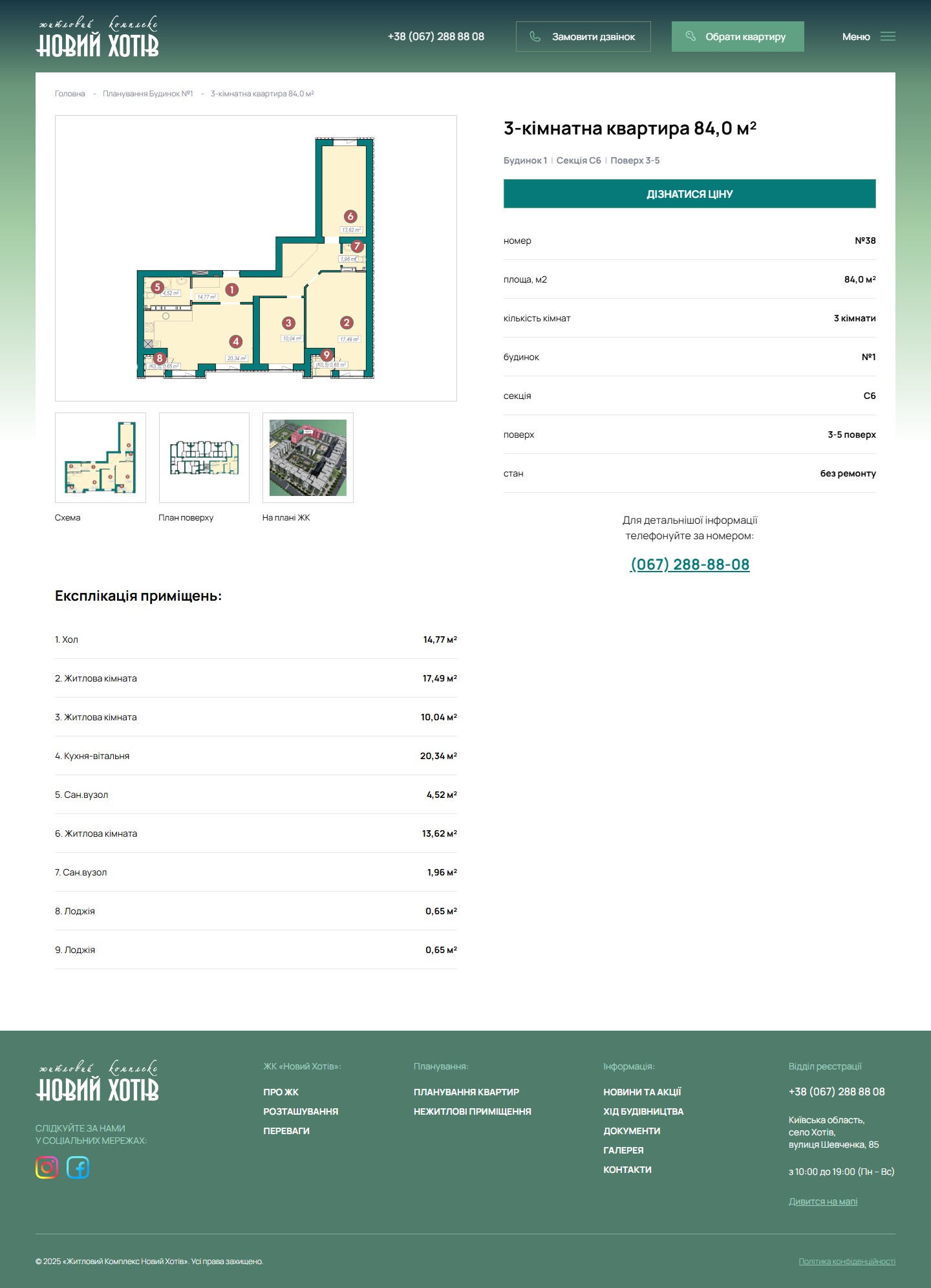
An apartment page — a plan + a room schedule + two columns instead of a landing page
A single floor-plan page is a hybrid between a technical passport and a selling page. On the left — a slider with 3 views (Apartment layout / Floor plan / Position on the complex plan) with thumbnail tabs below it, and a numbered room schedule with areas (1. Hallway 14.77 m² / 2. Living room 17.49 m² / … / 9. Loggia 0.65 m²). On the right — an H1 with the room count and area, a line reading “Building 1 | Section S6 | Floor 3–5”, a large dark-green “FIND OUT THE PRICE” button (leading to the quiz), a table card with 7 fields (unit No. 38, area 84.0 m², room count, building, section, floor, condition “unfinished”), and a direct phone number with the line “Call this number for more details”.
Two funnels for two types of buyer — an informational one on the site and a conversion quiz on a subdomain
The “Request a call” buttons in the header, and every “find out the price” link on floor-plan pages, don’t lead to an on-site form but to a separate subdomain, l.novyhotiv.com.ua/question-1, with a responsive, multi-step quiz built on the SaaS platform adsquiz.io (visible from the title tag “Made by – adsquiz.io” and resources loaded from static.adsquiz.io). Step one: “What type of property are you interested in?”, with three options — Apartments in finished buildings 🔑 / Apartments under construction 🏗️ / Commercial units 💼. The quiz then walks through a series of questions (apartment type, room count, budget, payment method) and finishes with a contact form.
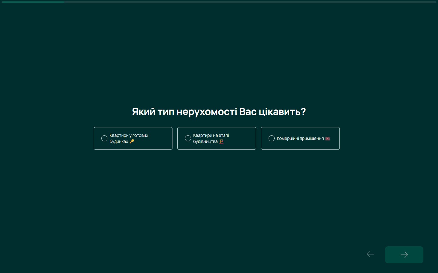
l. subdomain has its own GA4 event stream with an event_label: 'Start' on the opening step, and adsquiz_Start, adsquiz_Step_N and adsquiz_Submit events under the adsquiz category — forming a self-contained funnel independent of the main site’s sessions. The quiz’s dark charcoal-green palette, instead of the homepage’s light green, is another signal: “this is a separate surface, not a continuation of the catalogue” — the user shifts psychologically from “looking and deciding” to “answering”.Internal sections — not a one-pager with anchors, but a separate page for every informational block
Instead of the common residential-real-estate pattern “everything on the homepage under anchors” (Hero → Location → Advantages → Layouts → Contacts on scroll), every section here is a separate page: /about/, /location/, /perevagy/, /news/, /news/hid-budivnycztva/, /documents/, /gallery/, /contacts/. This yields 8 self-contained URLs for SEO instead of one, plus every page becomes an indexed entry point for Google Ads campaigns under its own query (“complex location”, “developer documents”, “construction progress Khotiv”).
Location — quantified, with a Google Maps route instead of a static screenshot
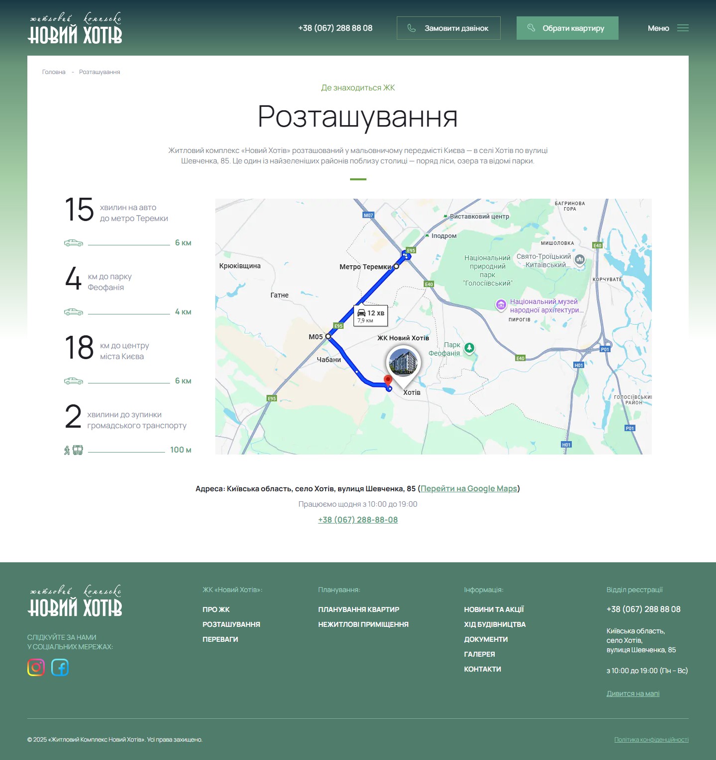
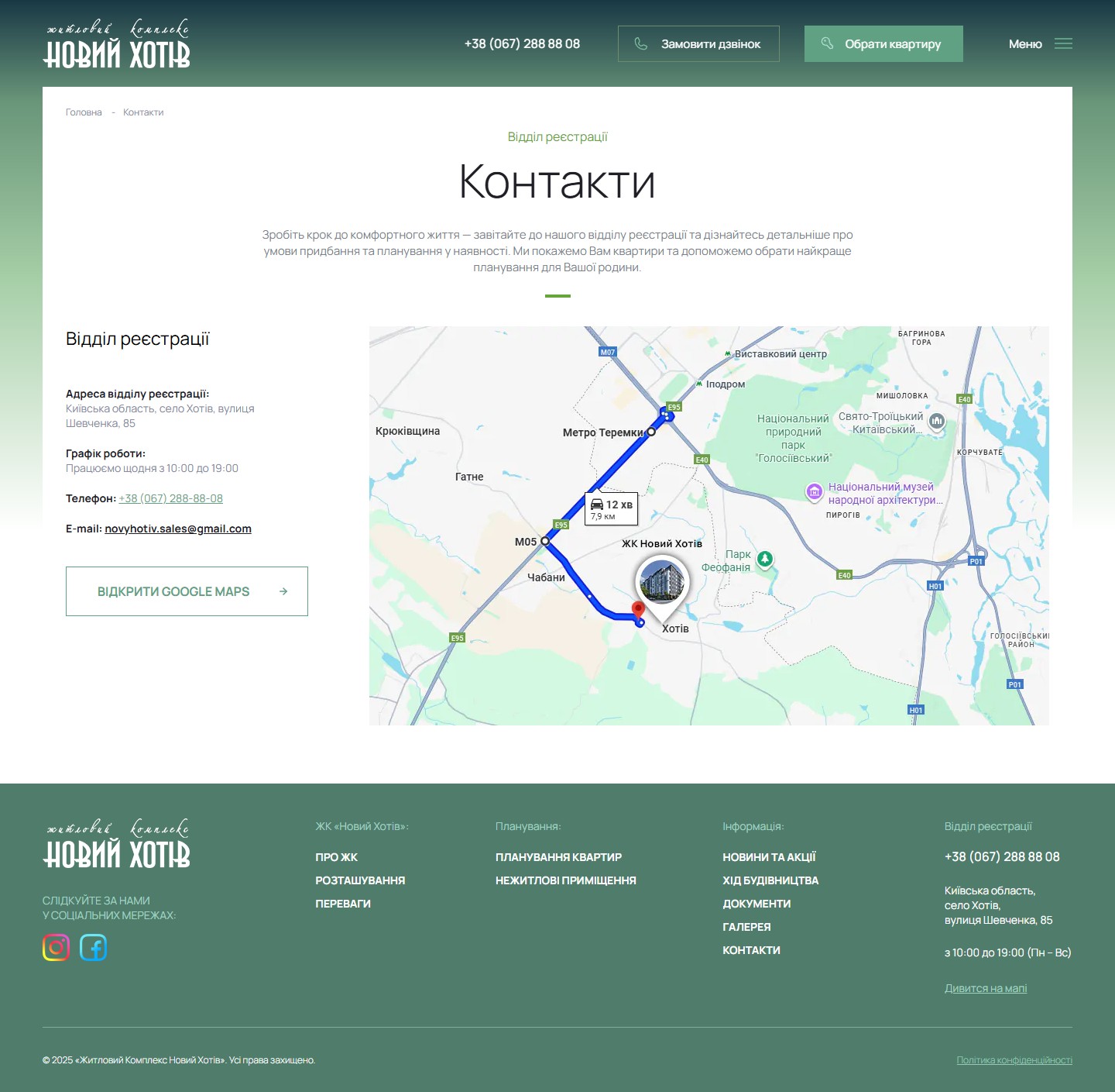
The /location/ page is built around four quantified distances: 15 minutes by car to Teremky metro (6 km), 4 km to Feofaniya Park, 18 km to central Kyiv (with a 6 km figure duplicated in the calculation, apparently), and 2 minutes to a public-transport stop (100 m). Each line is visualised with a transport-icon (car, bus) and a proportional scale bar. On the right is an embedded Google Maps with a route drawn from the complex to Teremky metro and a timer, “12 min / 7.9 km”, right on the map.
Advantages — a numbered list with photos, not an icon dashboard
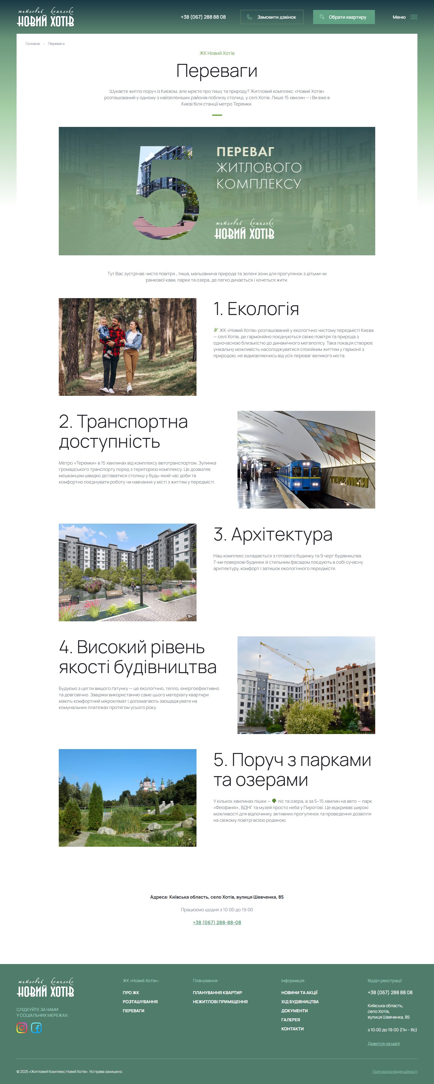
The /perevagy/ page isn’t a 3×3 grid of benefit cards with icons, as is common for residential complexes, but a long list of 5 items, each with its own large photo and paragraph. 1. Environment (a photo of a family on a forest trail) → 2. Transport accessibility (a photo of Teremky metro station with a train) → 3. Architecture (a photo of finished façades) → 4. High construction quality (a photo of a construction site with a crane) → 5. Near parks and lakes (a photo of a pagoda in Feofaniya Park).
Construction progress — monthly reports as a trust tool
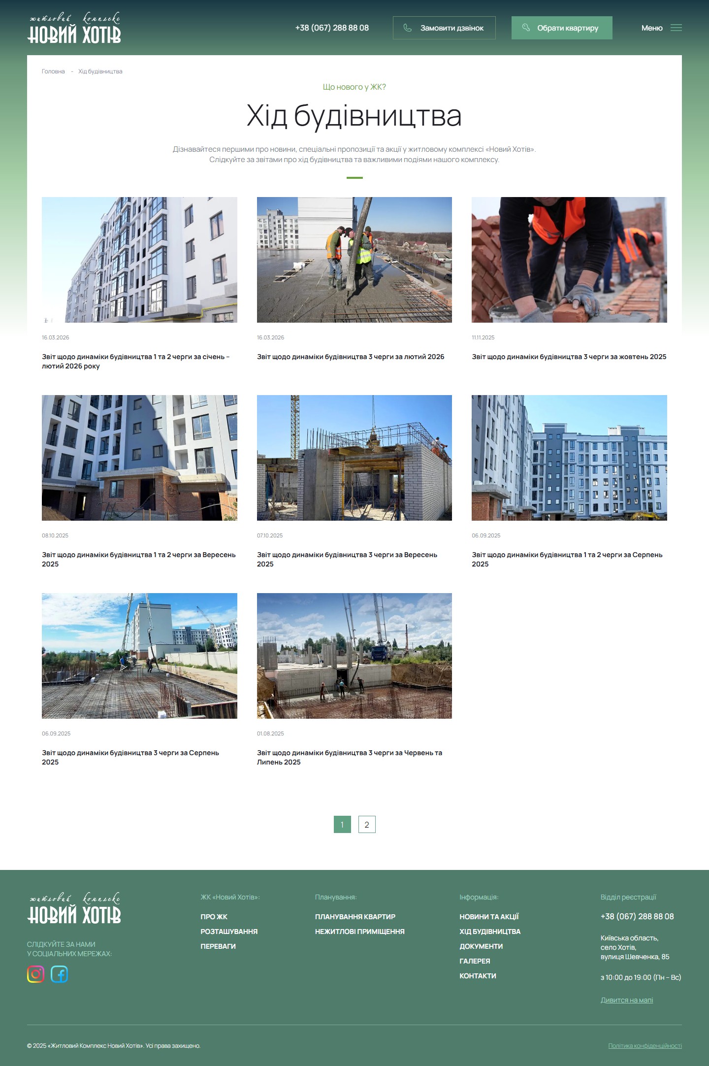
A separate /news/hid-budivnycztva/ section holds 13+ report articles, published roughly once a month: “Construction progress report for phases 1 and 2, January–February 2026” (16.03.2026), “… phase 3, February 2026” (16.03.2026), “… phase 3, October 2025” (11.11.2025), and so on, going back with pagination across 2 pages. Every article has a publication date, a construction-site cover photo, and a title that clearly states the phase number and month.
Gallery — a Swiper with 11+11 slides, 3D renders kept separate from photos
The /gallery/ page holds two independent Swiper carousels: the top one — 11 slides of 3D renders (building renders, courtyards, façades) — and, under the subheading “Photos”, a bottom one with 11 slides of real photos of already-built sections and landscaped courtyards. Splitting “3D” from “photos” is a conceptually important choice: a buyer sees that the render matches reality, while also understanding that for future phases only visualisations exist so far. Photos and renders open in a jQuery Fancybox (3.5.7) lightbox — a standard feature on the Ukrainian WordPress market that the developer doesn’t even attempt to swap for a more modern lightbox component.
Contacts — a minimalist page, since the quiz has already absorbed the conversion load
The /contacts/ page is deliberately stripped down: one block with an address (Kyiv region, village of Khotiv, Shevchenka St, 85), opening hours (10:00–19:00 daily), a phone number (+38 067 288-88-08), an email novyhotiv.sales@gmail.com, an “Open Google Maps” button, and an embedded map. No feedback forms, no “managers with photos”, no separate departments — just the sales office’s address details.
novyhotiv.sales@gmail.com) instead of a corporate @novyhotiv.com.ua address is a typical choice for a mid-tier Ukrainian comfort-class developer: gmail gives working email without setting up MX/SPF on your own domain, native integration with a CRM in Google Workspace, and no need for a sysadmin. For a regional development, this is standard practice — legal documents carry the registered legal entity with its own official correspondence address, while the site runs on a familiar gmail address for buyers. A single contact number, +38 (067) 288-88-08, across every point (header, footer, the “Come and see it for yourself” section, every floor-plan page) is a decision in favour of a single entry point to the sales department, without branching into “support / complaints / partnerships”.Technical implementation — stack, tools, infrastructure
- WordPress 7.0 with a custom theme,
novyhotivwp— no Elementor, no WPBakery, no Bricks. A clean custom theme with its own archive and single templates for the apartment CPT, its own 3D-plan rendering, and its own filter logic. jQuery 3.7.1 + jquery-migrate 3.4.1 run on the site; custom scripts are bundled into a singlescript.jsin the theme. - Swiper for everything carousel-shaped — a top swiper on the homepage (6 sections), a Swiper for the two /gallery/ carousels (3D and photos), a Swiper for the three plan views on the apartment page. The Swiper bundle is loaded as one file and reused for every carousel on the site, without multiple slider libraries.
- Fancybox 3.5.7 for lightboxes — loaded from the jsdelivr CDN, opens gallery renders and apartment plans in a modal window with next/prev navigation and lazy zoom.
- A separate subdomain,
l.novyhotiv.com.ua, for the adsquiz.io quiz — not an SPA on the same domain but a fully separate SaaS page that loads a JS bundle froml.novyhotiv.com.ua/assets/index.jsand resources fromstatic.adsquiz.io. The main site’s header hardcodes the quiz link into thehrefattribute of the “Request a call” buttons, so the quiz is the single landing point for all off-site CTAs. - Google Tag Manager + GA4 (G-CN99Y3XYLG, GTM-PLTLWSRZ) + Facebook Pixel (1268696721712590) — a full tracking stack duplicated on the main site and the quiz subdomain. On the quiz side, the events
adsquiz_Start,adsquiz_Step_N,adsquiz_Submitare set up under the site’s own GA4 category,adsquiz, letting GA reports count the funnel “step 1 → step N → submission” separately from the site’s overall traffic. - The URL structure for the apartment catalogue is custom rewrite rules, not CPT defaults:
/apartments/building/budynok-N/for a building’s archive,/apartments/building/budynok-N/rooms/X-k/for the room-count filter,/apartments/3-kimnatna-kvartyra-84m/for a specific apartment. This means a separatebuildingtaxonomy with three terms (Building 1 / 2 / 3) and aroomstaxonomy with nested values (All, 2-room, 3-room, 5-room, Commercial), plus anapartmentpost type with a direct slug route, skipping the/apartments/apartment/prefix. - An interactive 3D building plan — implemented as an SVG overlay over a PNG render, where clickable zones correspond to individual phases, and the “Phase 1 / Phase 2 / Phase 3” tabs duplicate the same navigation with standard buttons. No three.js, no WebGL, no real-time 3D — this is a 2D image map with overlay markers, cheaper to maintain and works equally well on mobile.
- A Google Maps embed with a drawn route — the map on
/location/and/contacts/is embedded not as a simple iframe pin but with a ready-made route from point A (Teremky metro) to point B (the complex), including a time badge, “12 min / 7.9 km”. This is set up through the Google Maps Embed API viaorigin/destinationparameters, giving user-facing proof before the user even opens Google Maps themselves. - Hosting and social media — a standard Ukrainian setup: the main site and the lead subdomain sit with the same provider (the same SSL, shared Cloudflare DNS); Instagram
@novyhotiv.com.uaand Facebook/novyhotiv.com.ua/are the only channels linked in the footer’s social block (no TikTok, no YouTube, no Telegram channel, no Viber bot).
Summary
“Novyi Khotiv” is a case study of a catalogue site for a mid-size developer, where the key architectural decision was made not at the design level but at the level of splitting two funnels: an informational one (a WordPress apartment catalogue with its own building and room-count taxonomy for SEO) and a conversion one (a quiz on a separate l. subdomain with its own event analytics). The site avoids two typical pitfalls of the Ukrainian residential-advertising market: it doesn’t try to be a one-page landing with every block on the homepage (instead giving every section its own indexed page), and it doesn’t try to sell an apartment with a single hard “buy now” — instead it carefully guides the buyer through an interactive 3D plan to a specific floor plan, where the price is deliberately hidden behind the quiz as a soft paywall.
Strong decisions: an interactive SVG overlay on a PNG plan instead of an expensive WebGL alternative, regular monthly construction-progress reports as an obligatory trust genre, apartment room schedules to the hundredth of a square metre, quantified distances with a real Google Maps route, a separate lead-subdomain host with full GA4 funnel tracking. Weak points, typical for the Ukrainian residential segment: gmail for the sales department instead of a corporate domain, no Ukrainian-English switcher for foreign investors (though for the actual target segment — comfort-class buyers in Kyiv — this isn’t much of a limitation), and dependence on the adsquiz.io SaaS quiz instead of an in-house form (a trade-off between “fast campaign launch” and “full control over lead data”). Overall, the site does one clearly defined job — moving traffic from Facebook/Google ads to a price request for a specific apartment — and does it without unnecessary complexity.




