
STUDY.UA landing page — Higher education in Canada
Промо-лендінг освітнього івенту STUDY.UA для українських школярів про навчання у Канаді.

The brief
STUDY.UA is an education agency with 20 years of experience, an official representative of 550 universities and schools across 10 countries. For its 2022 Canadian education campaign, the client needed a standalone promo landing page with a single conversion action: capture a request for a free expert consultation and, in return, deliver a helpful PDF, “The most popular fields of study in Canada.”
The design came from STUDY.UA’s in-house team. Our side handled the engineering: pixel-perfect layout, interactive blocks, a form with an international phone-number field, analytics, Binotel and Meta Pixel integrations, and production optimisation.
Implementation
A hero with a lead form
The hero screen is built around a stylised map of Canada with maple leaves and a city silhouette. A form card “floats” above the hero with fields for “Name / Email / phone with country selection” and a red “Submit a request” CTA. The card overlaps both the hero and the top edge of the next section — not an accidental cosmetic touch, but a deliberate message: “registration is step one, there’s no getting past it.” The phone field uses a library with country flags and number auto-formatting, with validation on both the client and the server.

The PDF-bonus block
Right after the form comes a “PDF trap” — a reward for the request. The section background is laid out with illustrations of faculties (Media, Natural Sciences, Computer Tech, Business…), with a large PDF icon and the gift promise on the right. It’s all built as one integral piece, with no break between the request and the reward.

The benefits slider
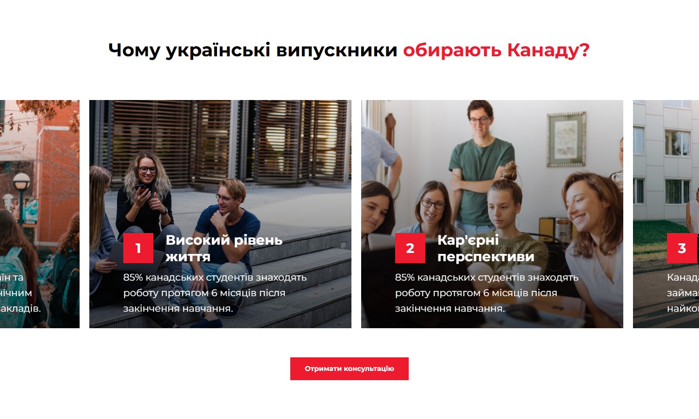
“Why do Ukrainian graduates choose Canada?” — a horizontal slick slider of photo cards. Each card is a full-bleed photo with a gradient overlay, a red position number, a heading, and a short explanation. The slider shows 2.5 cards on desktop and 1.2 on mobile, with a custom bold headline and no visible arrows or dots.
The Study.ua corporate block
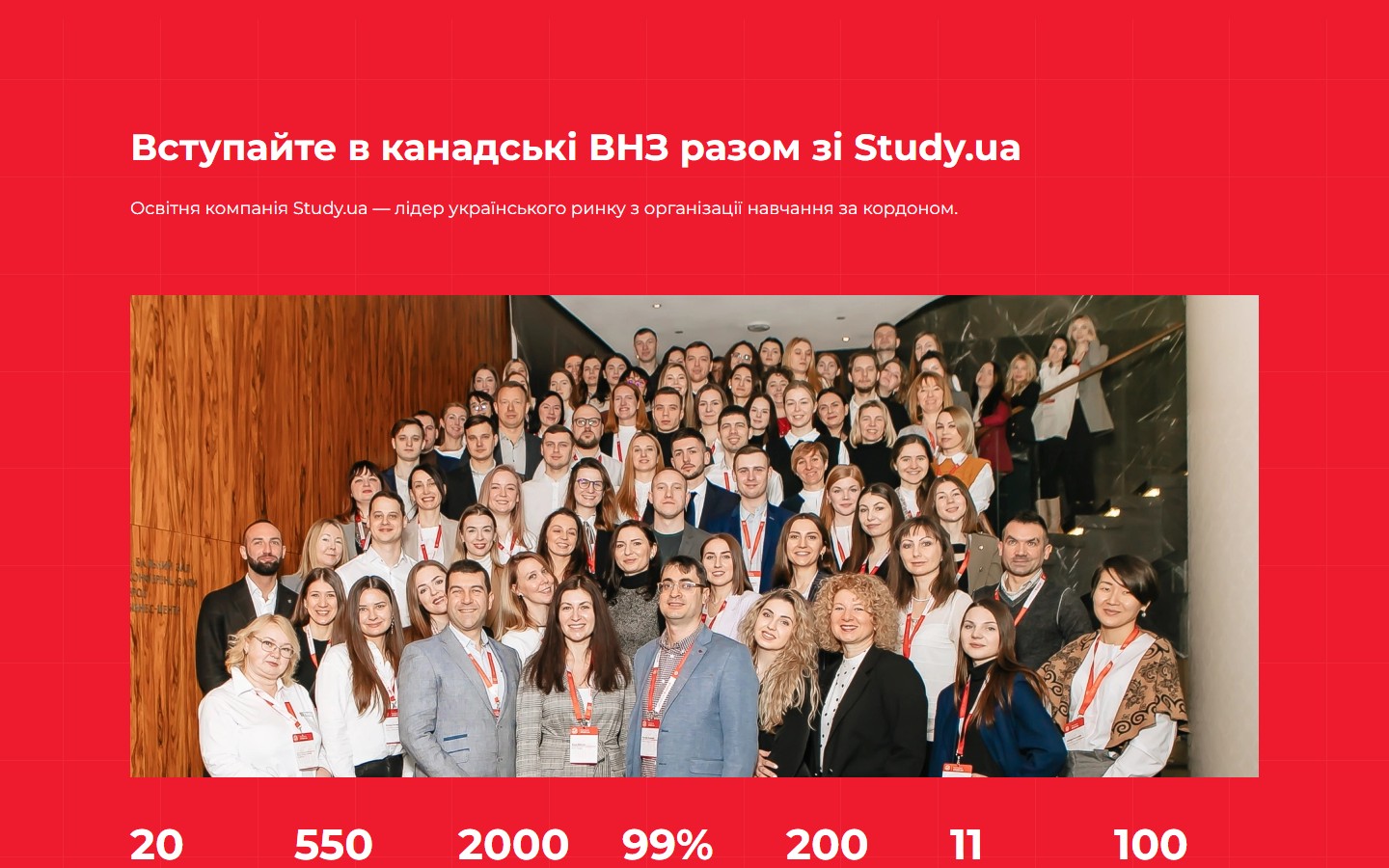
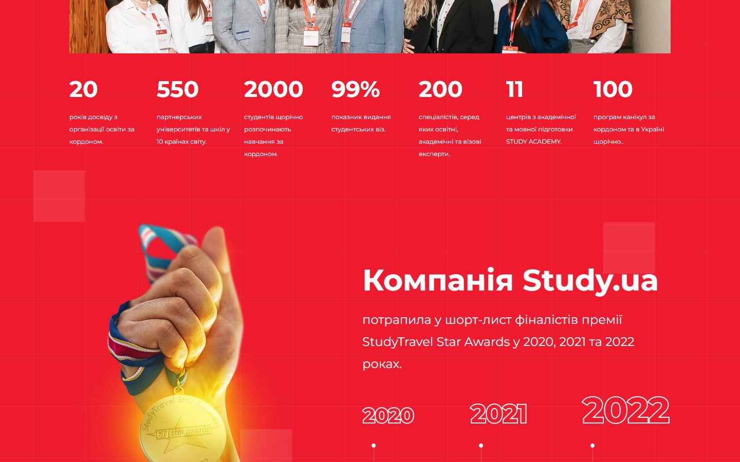
On a red background: a team photo, 7 numeric metrics in a single row (20 years / 550 universities / 2,000 students / 99% visas / 200 specialists / 11 centres / 100 programmes), and a StudyTravel Star Awards block underlining the years 2020/2021/2022. The dynamic numbers aren’t static images — they’re text that gently counts up from 0 to its value on scroll (wow.js plus a custom counter).
“Find out at the consultation” cards
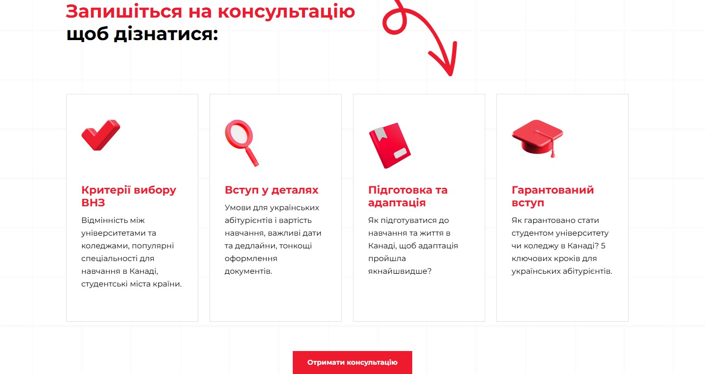
A grid of 4 cards with 3D icons and text blocks, with a decorative rough-sketch arrow-path in the background. The cards handle content flexibility gracefully — some have shorter text, others run up to 4 lines, and heights align via min-height with no cropping.
The partner-universities slider
“Study.ua — official representative of 550 universities.” This was built as a multi-row horizontal logo strip with masked white cards, 4 per row on desktop. Logos are individual transparent PNGs, optimised for retina.

The final CTA
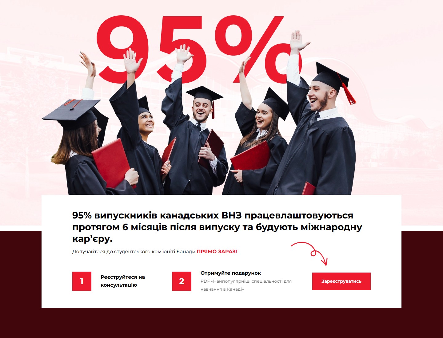
The landing page closes with a large composite block: a giant “95%” behind a photo of graduates in caps and gowns, a white card carrying an employment-rate fact, and a two-step reminder, “Register → get your gift.” Instead of a plain button at the bottom, a rough-sketch arrow “points” toward the “Register” CTA.
Integrations
- Lead form — POSTs to STUDY.UA’s internal API with server-side validation; requests land in the agency’s manager CRM.
- Binotel — a callback widget with a configured availability schedule, plus a virtual PBX for calls from the landing page.
- Meta Pixel — full event tracking (PageView, Lead) for Facebook/Instagram ad campaigns.
- PDF delivery — after a successful request, the user receives an email with a link to download the promised PDF.
Technology
The landing page was built as a standalone subfolder on the online.study.ua domain — a fully self-contained one-page site with no CMS, optimised for a fast ad-campaign launch. Stack: HTML5 + SASS + jQuery / slick / wow.js / IntlTelInput. All assets are optimised, with no external blocking scripts above the fold.




