
Rise of Ukraine — corporate site for a charity fund with a bilingual setup and a transparency block
A corporate charity fund website with 6 areas of support, a transparency block (5 report categories), a donate flow with 5 payment methods and a bilingual EN/UA layer for international donors.
Context
Rise of Ukraine is a charity fund founded in May 2022 in Dnipro by four volunteers who started out sewing body armour and delivering humanitarian aid to the front line. Over almost four years the team has grown to 18 staff members, run 348 events for vulnerable groups, helped 12,860 families, and opened a 350 m² child-development HUB. The fund works with GIZ, Save the Children, HELVETAS, INSO, INTERSOS, FAO, Mercy Corps, UKaid and roughly 60 other partners — from international donors to local Dnipro businesses.
The brief was a corporate site for the fund that serves four audiences at once: international institutional donors (an English-language layer with a transparency block), Ukrainian private donors (a Ukrainian layer with a donate form), aid beneficiaries (a clear entry point into 6 focus areas and a “Get help” CTA), and media (a press kit, news, downloadable reports). All without CMS headaches for the fund’s team — everything is editable from the admin.
A hero that reads as a charitable mission
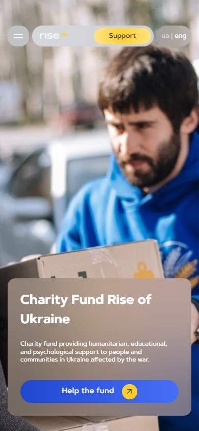
The first screen is a full-width photo from a real humanitarian mission: a volunteer in a blue “Rise of Ukraine” hoodie handing an Ukrposhta L1 box to a woman on the street. Above it sits an H1, “Charity Fund Rise of Ukraine”, and a one-sentence mission statement (“Charity fund providing humanitarian, educational, and psychological support to people and communities in Ukraine affected by the war”). The CTA — “Help the fund” with an outbound arrow — leads to a Google Form for submitting an aid request. A glass-card overlay with a blurred background keeps the text readable over any photo exposure.

A bilingual EN / UA layer for two audiences
The site exists in two locales — English (default) and Ukrainian (/uk/) — on separate URL segments with a “ua | eng” switcher in the top-right corner. English serves international donors (GIZ, Save the Children, UKaid, INSO, INTERSOS), who pull reports from /reporting/ and write to partnership@. Ukrainian serves private donors within the country, beneficiaries and the media. Every key page is duplicated: the hero is translated, the statistics and numbers match, and the navigation is localised (“Про нас”, “Напрямки діяльності”, “Проєкти”, “Новини”, “Звітність та документи”, “Контакти”, “Підтримати”).

Numbers as the first evidence block
Right after the hero comes an “Overall results” section with 4 numbers visualised as a bubble cluster: 12,860 (families — the largest circle, yellow), 5,516 (children), 348 (events), 350 m² (the HUB) — the circles’ sizes are proportional to the scale of each number. This isn’t a table or a counter — it’s a semantic accent. A visitor opening the site for the first time sees the order of magnitude at a glance: tens of thousands of families, thousands of children, hundreds of events, hundreds of square metres. Text on the left provides context: “Every day, we work in different areas of support, from humanitarian missions to educational programs”.

Six focus areas with their own hub pages
A 3×2 grid on the home page
The “Focus areas” section shows 6 photo cards in a 3×2 grid: Humanitarian aid, Child support, Fund HUB, Integration and educational activities, Rebuilding, Veteran support. Every card carries a real mission photo: a volunteer handing over a box, a group photo of 12 children at a children’s hub (a wall with pink decoupage lettering), children drawing at a table in the Fund HUB, an adult audience at a workshop, a team in blue T-shirts with children in front of a “tree” mural, a veteran in a T-shirt with a bionic arm prosthesis. A glass pill with the area’s name plus a “+” marker leads to the full hub page.

Second-level hub pages
Behind every card is a full hub page, not an anchor. The hero follows the same pattern (a real mission photo plus a glass card with an H1 and short description), followed by statistics specific to that area alone. For Humanitarian aid these are: 12,860 families helped, 270 individual psychological and medical consultations, 85 humanitarian missions to frontline areas, 14.3 tonnes of medical aid. The numbers come from real reports, not marketing — and are backed up by the PDF reports at /reporting/.

A sub-project grid with its own photos
Every hub page has a “Focus areas” Swiper carousel with 13–15 sub-projects: Rise: Emergency Support, Rise of shelter, Providing winterization assistance in hard-to-reach areas of Kharkiv/Dnipropetrovsk/Donetsk regions, Rescue of Kherson Region After Flooding, “Native Strangers”, Distribution of Baby Food in Partnership with Danone Ukraine, Distribution of Stationery Sets 2025, Rise for Help, “Place of Life”, Christmas Humanitarian Kits with Space Eye, LIVES 3.0 with international donors, State Emergency Service Emergency Readiness Project. Every card carries a photo, a name, and a “Read more” glass overlay. This lets an institutional donor audience grasp the scale and nature of every area without reading a full report.

Projects — a separate taxonomy for active and completed work
The /projects/ page is a separate section with “Active | Completed” filters plus categories “All / Cultural events / Medical direction / Psychological support / Humanitarian aid” (with a “+” option to expand the full list). A 3×N grid of photo cards shows: Summer Camp: Happy Child 2.0, ART4MENTAL (a 3D render in VR goggles — an international project), Charity Football Championship “Automotive & Rise”, Individual / Group psychological consultations, ProstoNeba FEST 2026, V.RISE – Veterans Hub, Access to Life-Saving Oncology Medicines, Cybersecurity Course, VR-Based Learning, Flexible Skills Development Course, Financial Literacy Course. A “Load more” button handles pagination. This is a working surface for a media team wanting to see what the fund is doing right now.

About: history, mission, values, team
A word-art hero as a bold gesture
The /about/ page hero is a full-width photo of a wheat field with a massive word-art treatment reading “rise of UKRAINE”, where the “o” in “rise” is replaced by a yellow sun-arc (the fund’s minimalist logo mark). This isn’t a typical “text over a stock photo” — it’s a bold typographic composition holding a single focal point. The “Home > About us” breadcrumb is minimalist, in the top-left corner.

Our story — a 4-step timeline
The “Our story” section is a tabbed carousel with 4 stages (Slick/Swiper with 1–4 pagination): early 2022 (4 volunteer friends), May 2022 (the fund’s official registration), 2024 (a focus on humanitarian areas and opening the children’s HUB), today (a team of 18 people, large programmes). Each stage is a pair of columns: text and a photo from that period (a group portrait of the team in blue hoodies, photos from military missions, the Fund HUB’s interior). This is autobiographical material too long for a single paragraph — the carousel lets visitors read at their own pace without an endless scroll.

Vision and Mission as paired cards
“Vision” and “Mission” sit in two parallel cards, each with a sun-arc icon. Vision describes a post-war vision of society (“A post-war Ukrainian society that is educated, innovative, mentally stable and united”). Mission is the operational commitment (“To contribute to the restoration of Ukraine and improve the quality of life of its citizens by providing humanitarian, social and medical assistance to war-affected people, support and development of children, youth, internally displaced persons, veterans and their families”). This isn’t a marketing placeholder — it names specific target groups and specific forms of aid.

Values as a bubble composition
The “Our values” section lists 8 values (Professionalism, Teamwork, Responsibility, Creativity, Ambition, Collaboration, Collective decision-making, Initiative), but instead of a 4×2 grid they’re shown as a hand-arranged bubble cluster: “Collective decision-making” is the largest circle in the centre (as the core value), “Teamwork” is a large yellow circle on the left, “Initiative” / “Collaboration” are smaller yellow accents. Circle size equals the value’s weight, and colour (yellow vs blue) marks the standout ones. It’s the same visual language as “Overall results” — unifying the brand.

Our team — 15 portraits in a carousel
“Our team” is a Swiper carousel with 15 portraits of staff members (Co-founders: Kukhtin Oleksandr, Paladiieva Yana, Sarkisian Artur, Safonov Denys; Head of projects: Prima Yelyzaveta; project managers by area — communities, children, humanitarian; an event manager; communications; a HUB administrator; copywriting; content; the Kyiv office team lead and project manager). Each carries a large portrait photo on a blue background with a name and role. This raises the trust factor: real named faces stand behind the fund, not a faceless “team”.

Our volunteers — a bubble cluster of 20+ faces
“Our volunteers” shows 20+ round volunteer portraits arranged as a bubble cluster (the same visual language as values/results) with yellow heart accents between the circles. It’s not a linear grid but a compositionally lively block that reads as a “community” rather than a “table”. Circle sizes vary — the largest portraits sit in the centre, smaller ones towards the edges.

About us in the Media — a carousel of outlet logos
A separate “About us in the Media” section is a Swiper carousel with 12+ features in international and national outlets: Suspilne Donbas, Ukrinform, SHOTAM Media, Dnipro TV, Vidkrytyi, Suspilne Dnipro, SME Slovakia (international media — a photo exhibition, “Price of Life”, in Bratislava). Each card carries a cover image for the article/video, a headline, the outlet’s name with a type label (“National media”, “Regional media”, “International media”, “Video report”), a year, and a “Read” CTA linking directly to the source. This works as a media kit without a separate page — journalists and donors see the coverage right away.

The transparency block as a critical surface for donors
Reports & Documents
A separate /reporting/ page is what an international donor won’t enter a partnership without. The hero repeats the “Overall results” bubble cluster (the same stats — 12,860 / 5,516 / 348 / 350 m²), so that transparency is visibly rooted in the numbers behind the work. Below is an H2, “Reports and documents”, with the statement: “Transparency is one of the key principles of our work. We publicly provide access to reports, policies, strategies, and other documents that describe the fund’s activities”. 5 categories of available documents appear as glass pills: Annual reports, Monthly reports, Strategies, Constitutive documents, Policies.


The newsroom as an advocacy tool
The /news/ page is a standard blog archive, but focused on quality long-reads: “Rise of Ukraine Joins the European ART4MENTAL Project”, “The Team That Holds the Process Together”, “PROSTONEBA: An Experience That Translates Into Results”, “How Changes in Space Transform Everyday Life: the Rise of Shelter Project in Dnipro”, “Fedir: An Experience That Has to Be Accepted and Lived Through” (the story of a veteran with the call sign “Shkiper”), “Pavlo: A Story About a Childhood That Has to Be Rebuilt” (the story of a boy from Kharkiv). This isn’t “news for SEO’s sake” — it’s narrative material that can be quoted in grant applications, handed to international partners, or used in media campaigns. A 3-column grid, a glass card with a photo, headline, 2-line teaser, date and “Read more”.

The partner wall as social proof
“Our partners” is a wall of 60+ logos split into 2 carousels (by priority). The first tier holds the strategic donors: GIZ (Deutsche Gesellschaft für Internationale Zusammenarbeit), Save the Children, HELVETAS Switzerland, INSO (International NGO Safety Organisation), INTERSOS, FAO (UN). The second tier holds UKaid, Mercy Corps, and other partners, plus local Dnipro partners (Danone Ukraine, UNIT.City, Avtomotiv, Esper Bionics). The third and fourth tiers hold smaller local businesses, media, and municipalities (Dniprorada, planetakino.ua, ukrposhta.ua, ukrnafta.com). Every logo is clickable and links to the partner’s own site, adding a soft cross-referral flow of traffic.

Real stories as a bridge to Instagram
“Real stories” shows 7 photo cards in a free-form composition (varying aspect ratios, partially overlapping): a portrait of a child in a sweater, a team group hug in blue hoodies, a child with cups and medals, a veteran in rehab with a leg prosthesis, a Volvo with “PROSTONEBA FEST” written across the windscreen, a Christmas tree and flower installation, a child on a bicycle. Each links to an Instagram post or to a Real story page on the site. A centred “Follow us” CTA at the bottom leads to @rise_dnipro. This isn’t a standard “follow us on social” — it’s an emotional bridge from “what we do” to “what it looks like in everyday life”.

A donate flow with 5 payment methods
The /donate/ page hero
The first screen of /donate/ carries an H1, “Support Ukraine with us!” (a deliberately international phrasing), a “Quick donation” CTA (a yellow gradient, jumping straight to a LiqPay checkout), and, alongside it, 5 glass cards for payment methods: Card payment (an in-page form), Bank transfer (IBAN details below), Foreign transfer (a foreign-currency account), Cryptocurrency (a QR code plus addresses), Other payment methods. This isn’t “one payment method” — it’s infrastructure for any donor: a Ukrainian donor via card, an international one via bank wire, a crypto donor via QR, a corporate one via bank transfer with a payment purpose noted on the statement.

“I want to help” — a multi-currency form with preset amounts
Below is the main donate form in a white glass card: a currency choice (UAH / USD / EUR / CRYPTO as glass pills), preset amounts (150, 300, 500, 1,000, 5,000, 7,000, 10,000, Other), name + email, a checkbox agreeing to the Public offer + Terms + Privacy Policy, and a Donate button with a yellow gradient. On the right is a large QR code as an alternative for anyone who’d rather pay through their banking app. Bank transfer details (IBAN, USREOU, payment purpose) sit in a separate section below for anyone who needs a formal document.

A feedback form for beneficiaries
The home page carries a separate “Feedback form” section (in Ukrainian, “Форма зворотнього звʼязку”) with three fields: Full name, E-mail, “What happened?” (a textarea). This isn’t a contact form for partnership enquiries — it’s a channel for requests for help or complaints. A Send button with a yellow gradient sits on a blue glass background. After submission, a modal reads “Thank you for your message” with a hearts illustration and the text “Our team will get in touch with you during working hours. Your Rise team”.

Responsiveness and brand unity
On mobile (390×844) the navigation collapses into a burger, leaving only the logo, Support and the language switcher. Hero photos switch to a vertical orientation, with the glass card carrying the H1 and CTA taking up the bottom half of the screen. The 6 focus areas become a vertical stack instead of a 3×2 grid. The partner wall becomes a horizontally scrolled carousel instead of a large grid. The donate form keeps all preset amounts, but the pills wrap into a 2-row layout. This is a deliberate choice — not to optimise everything down for mobile but to keep full functionality in a more compact form.
The brand system
A unified visual vocabulary runs across every page: a primary blue (roughly #3050e0) plus a yellow accent (the sun-arc logo), with every key metric and concept visualised as a bubble cluster (Overall results on the home page, Overall results on /reporting/, the values on /about/, the volunteers on /about/) — a repeating brand pattern that reads as “rounded objects of varying size = a human community”. A glass card with a blurred background is the main container for text over hero photos (the hero, focus-area cards, news cards, donate cards). The sun-arc, a minimalist half-disc, appears in the logo, before the footer, next to Vision/Mission, and even as a decorative object between sections.
Result
- A corporate fund site with 7 key pages (Home, About, 6 service hubs, Projects, News, Reporting, Donate, Vacancies) and 13+ sub-projects on the service hubs — a full site tree, not a static “landing page on WP”
- A bilingual EN / UA layer on separate URLs (/uk/*) — correct hreflang for international and Ukrainian donors, full content duplication, localised nav and CTAs
- 5 payment methods on /donate/ (LiqPay quick-donate, card, UAH bank transfer, foreign USD/EUR transfer, crypto with a QR code) plus a multi-currency form with 7 preset amounts — infrastructure for any type of donor
- A transparency block at /reporting/ with 5 categories of downloadable documents (Annual reports, Monthly reports, Strategies, Constitutive documents, Policies) — a mandatory criterion for institutional donors such as GIZ/UKaid
- 60+ partners on a wall of clickable logos split into 4 priority tiers — from institutional ones (GIZ, Save the Children, INTERSOS, FAO, Mercy Corps) to local Dnipro businesses
- An About page with 15 staff portraits, 20+ round volunteer photos in a bubble cluster, 12+ media features and a power-typography hero — a full trust pack for donor due diligence
- A distinctive visual language built on bubble clusters (4 numbers on the home page + 8 values + 20 volunteers) and a word-art About hero — this is custom design with its own identity, not a “WP template”
- A news section with quality long-reads (stories of veterans, children, sub-projects) — an advocacy tool that can be quoted in grant applications and media campaigns




