
Institute of Agrobiology — an accredited testing laboratory
Сайт науково-експертної лабораторії — 5 напрямів випробувань і двоканальна форма заявки
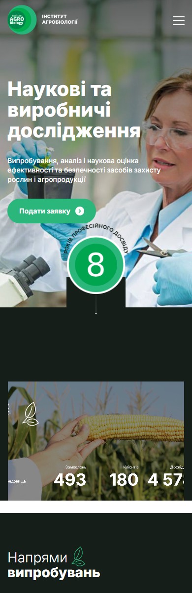
The Institute of Agrobiology is a scientific and expert company running accredited laboratory, field and ecotoxicological trials for the agricultural market: from seed germination quality and grain physicochemistry through to the state registration of pesticides and agrochemicals. The site’s job was to prove, in a calm scientific tone, that behind a “lab in Kyiv” stand ISO/IEC 17025, international OECD methodologies and real test fields — and to capture a lead through a single “Submit a request” click.
One CTA on the homepage — “Submit a request”
The hero doesn’t try to sell a catalogue of services — just one action. A large heading, “Scientific and industrial research”, a subheading, “Testing, analysis and scientific assessment of the efficacy and safety of crop protection products and agricultural produce”, one green “Submit a request” button. The background photo shows a research scientist in safety glasses with a test plant sample in a greenhouse — not a clichéd stock scene of “a scientist with a test tube,” but the actual scenario of the company’s real work. In the bottom-right corner sits a signature round badge, “8 years of professional experience”, with a thin green outline, doubling as a trust mark and a brand element.
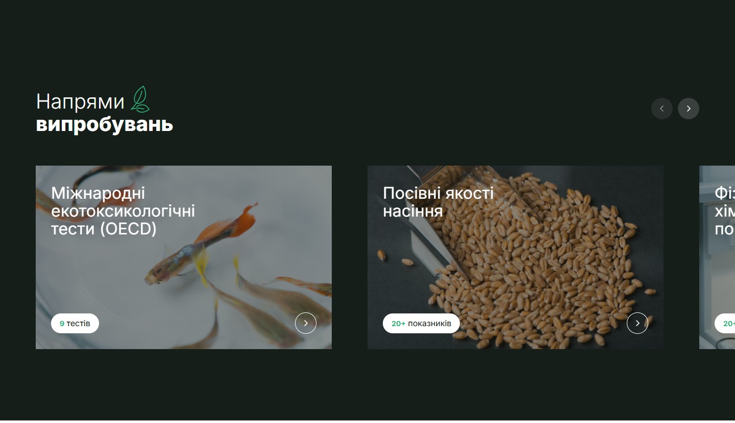
5 testing areas — a slider with metric counters
“Testing areas” is a horizontal slider covering 5 accredited fields: International ecotoxicological tests (OECD) — 9 tests, Seed germination quality — 20+ indicators, Physicochemical indicators — 20+ indicators, Phytosanitary expertise — 15+ indicators, Soil testing — 5 indicators. Each card carries a subject-matched photo (fish for ecotox tests, wheat grain for seed quality, lab equipment for physicochemistry) and a bottom chip with the count — a quick competence marker without diving into the methodology.
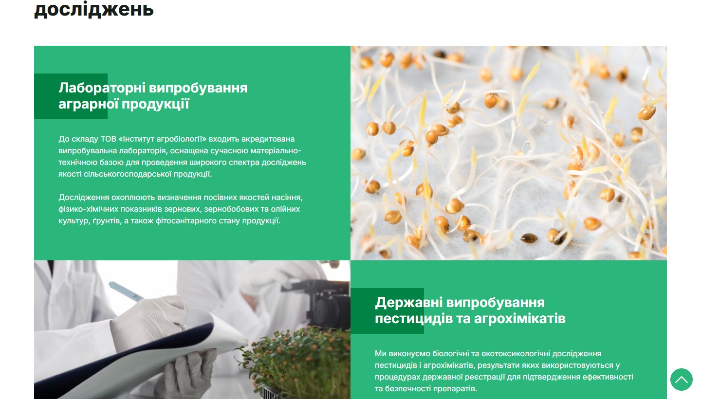
Two story cards on the About page — laboratory vs. state trials
On the About page the research directions unfold into two large blocks with photo panels. The left one — “Laboratory testing of agricultural produce”: an accredited testing laboratory, seed germination quality, grain and oilseed physicochemistry, soils, phytosanitary status. The right one — “State testing of pesticides and agrochemicals”: biological and ecotoxicological research for state registration procedures. A black-and-green checkerboard of real lab shots — a microscope, seedlings on test trays, gloved hands over a tablet — creates a sense of an actual process rather than marketing gloss.
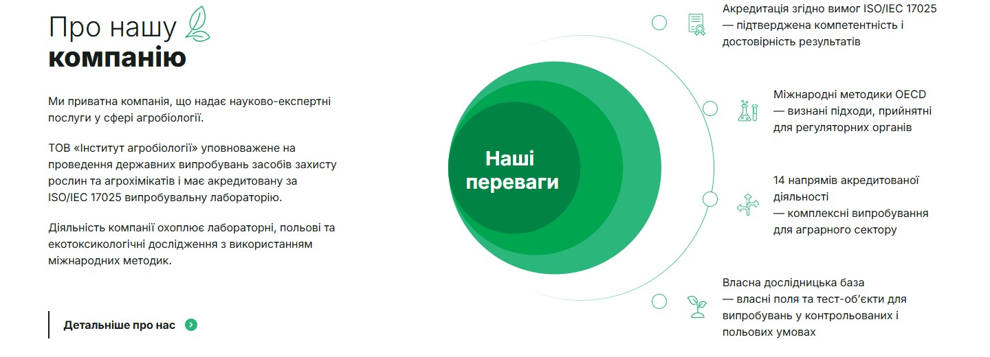
“Our advantages” — concentric circles with four USPs
The “About our company” section is built around a large concentric target of three green circles with a central “Our advantages” label. To the right of the target sit 4 USPs with thin line icons: ISO/IEC 17025 accreditation (verified competence), international OECD methodologies (recognised by regulators), 14 accredited fields of activity (comprehensive testing for the agricultural sector), an in-house research base (fields and test sites for controlled conditions). This is more than a list of benefits — it’s a visual metaphor of “we sit at the centre of the research ecosystem,” where each circle is a layer of expertise.
A team of 9 experts with academic degrees
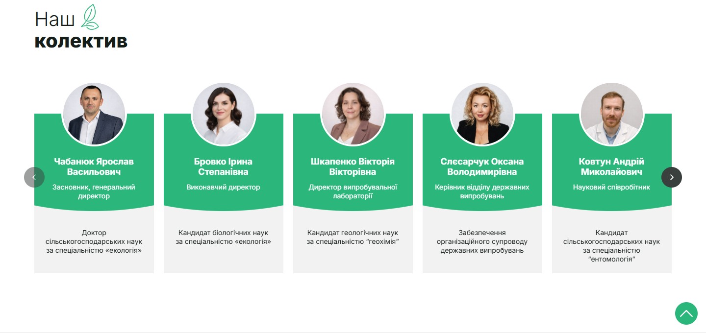
The team is presented in its own carousel section with 9 specialists: the founder and CEO (Doctor of Agricultural Sciences, ecology), the executive director (PhD in Biological Sciences), the director of the testing laboratory (PhD in Geological Sciences, geochemistry), the head of the state-testing department, a research fellow (PhD in Agricultural Sciences, entomology), the chief microbiologist, the quality systems manager (ISO/IEC 17025), the administration manager, and a research agronomist. Each card is a half-round green “wave” with a photo in an oval medallion, the name and role on the green background, and the academic qualification on a light-grey lower panel. For a regulatory sector where clients trust a signature and a degree, this level of detail is a necessary trust layer.
Partners — Syngenta, Corteva, Ukravit and 5 more agri-brands
Partner logos get their own section rather than a banner strip: 3 key partners in the first row (Syngenta, Corteva Agriscience, Ukravit), and 5 more in the second row (AgroFlex, Agrochemical Technologies, Agritema, Dolina, Sharda Cropchem). Mixing global agro-conglomerates with local crop-protection manufacturers sends a market signal: “we’re trusted by both, which means our methodology holds up at both levels of standardisation.”
Two-tier consultation — two phone numbers for two types of request
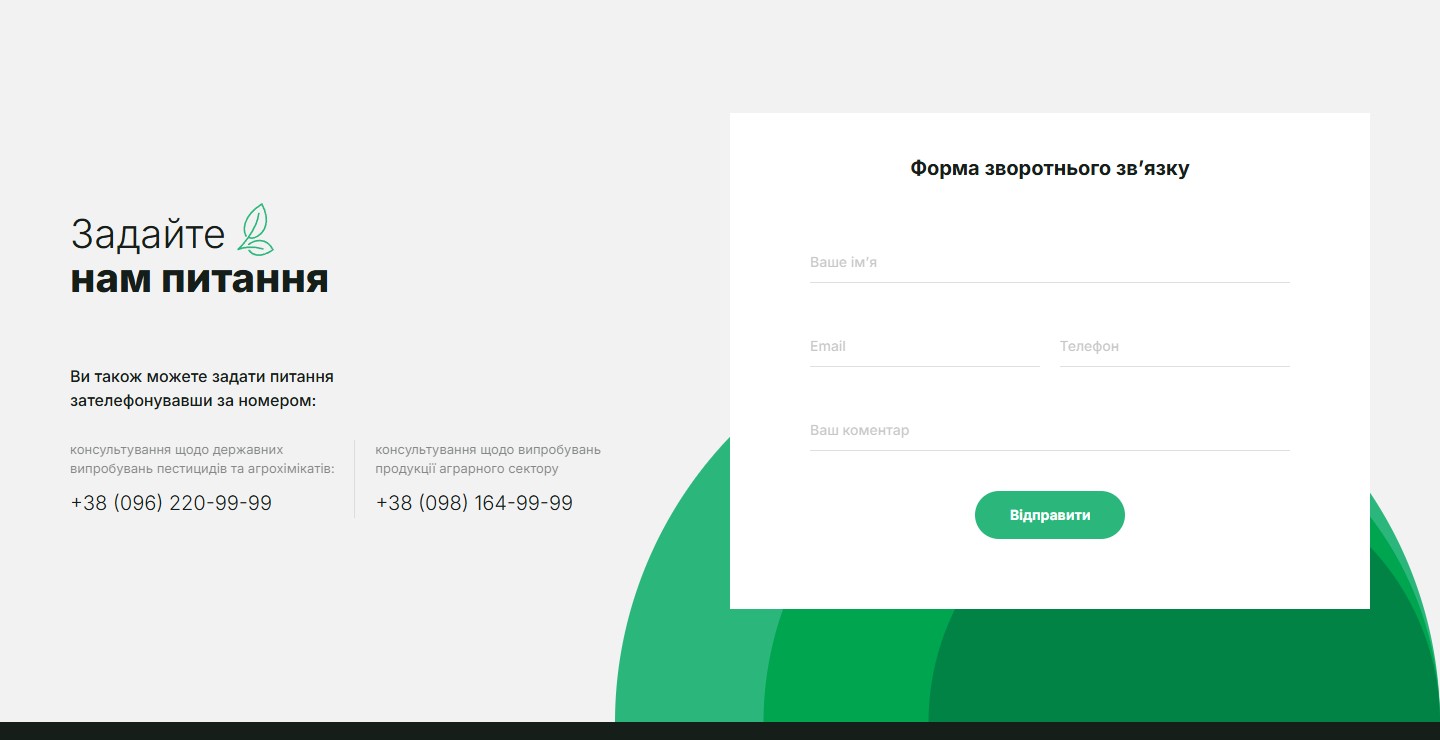
The “Ask us a question” section is one of the smartest details on the site. Instead of one generic number, there are two separate channels: one phone line for consultations on state testing of pesticides and agrochemicals, another for testing of agricultural produce. To the right sits a compact contact form (name + email/phone + comment) with a green “Send” button and two wavy green gradients as a backing “brand advantage” motif. Splitting leads by topic at the UI level cuts the manager’s response time and filters out irrelevant requests up front.
Stack, integrations, marketing
- WordPress on a custom AgroWP theme — a fast content cycle for accreditation news and field-trial case studies.
- Slick — sliders for the testing-areas (5 cards) and team (9 cards) sections with native arrow controls.
- Contact Form 7 — a minimal 4-field request form (name, email, phone, comment) on the homepage and in every page footer.
- WOW.js + fadeInUp animations — sections fade in gently on scroll. On a scientific site this reads as a “calm” visual accent, with no aggressive parallax.
- UA/EN bilingual support — a top-right selector switches the whole site between Ukrainian and English (important for international agro-conglomerate clients).
- Social media — Facebook, Instagram, LinkedIn, YouTube as 4 PR presence channels, with an emphasis on LinkedIn (regulatory audience) and YouTube (field-trial video content).
- SEO — navigation structured around 6 key pages (About, State Registration, Laboratory, Competencies, News, Contacts), each optimised for its own cluster of agri-market queries.
Summary
The Institute of Agrobiology site rests on two pillars: trust through detail (ISO/IEC 17025, OECD, academic degrees across the whole team, accreditations and licences) and calm B2B conversion (one CTA on the homepage, two phones split by request type, a minimal form). There’s no emotional marketing, no “success guaranteed” — only a clear structure of testing areas, factual indicators, and real partners. This isn’t a landing page — it’s a multi-page expert showcase with a conversion line built on trust in a signature rather than trust in a promise.




