
ColorHome — an online store for roller blinds and Venetian blinds with a configurator, Kyiv
Київський WooCommerce-магазин рулонних штор і жалюзі — 70 сторінок каталогу, фасетний фільтр з 60+ колекціями і 30+ кольорами, кастомний продуктовий конфігуратор з полями Ширина/Висота/Сторона/Комплектація і окремою секцією послуг.
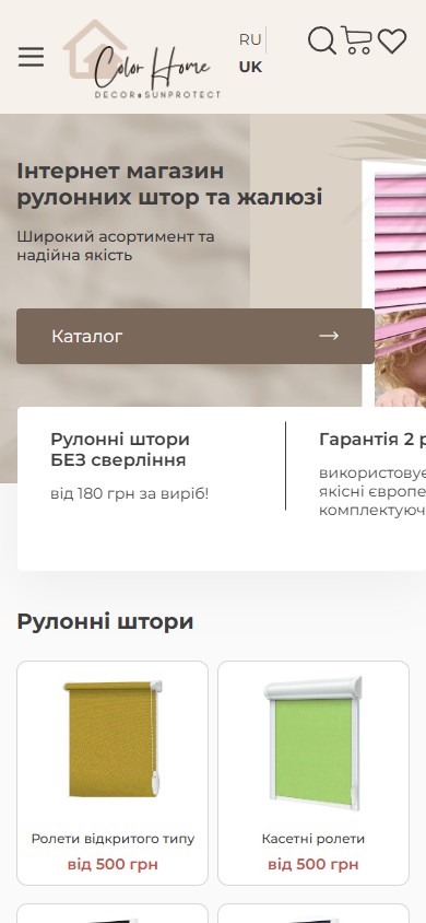
ColorHome is a Kyiv online store for roller blinds and Venetian blinds under the Color Home — Decor & Sunprotect brand: 70 catalogue pages across 4 product branches (roller blinds, Venetian blinds, pleated blinds, Roman blinds), a faceted filter with 60+ fabric collections and 30+ colours, a custom product configurator with Width/Height/Control side/Extra fittings fields, a dedicated Services block (Measure, Delivery, Installation) and bilingual UA/RU localisation. Stack — WooCommerce + WordPress, a typical B2C catalogue with complex size-based product variation and configurable customisation.
A two-layer brand hero — Color Home + Decor & Sunprotect
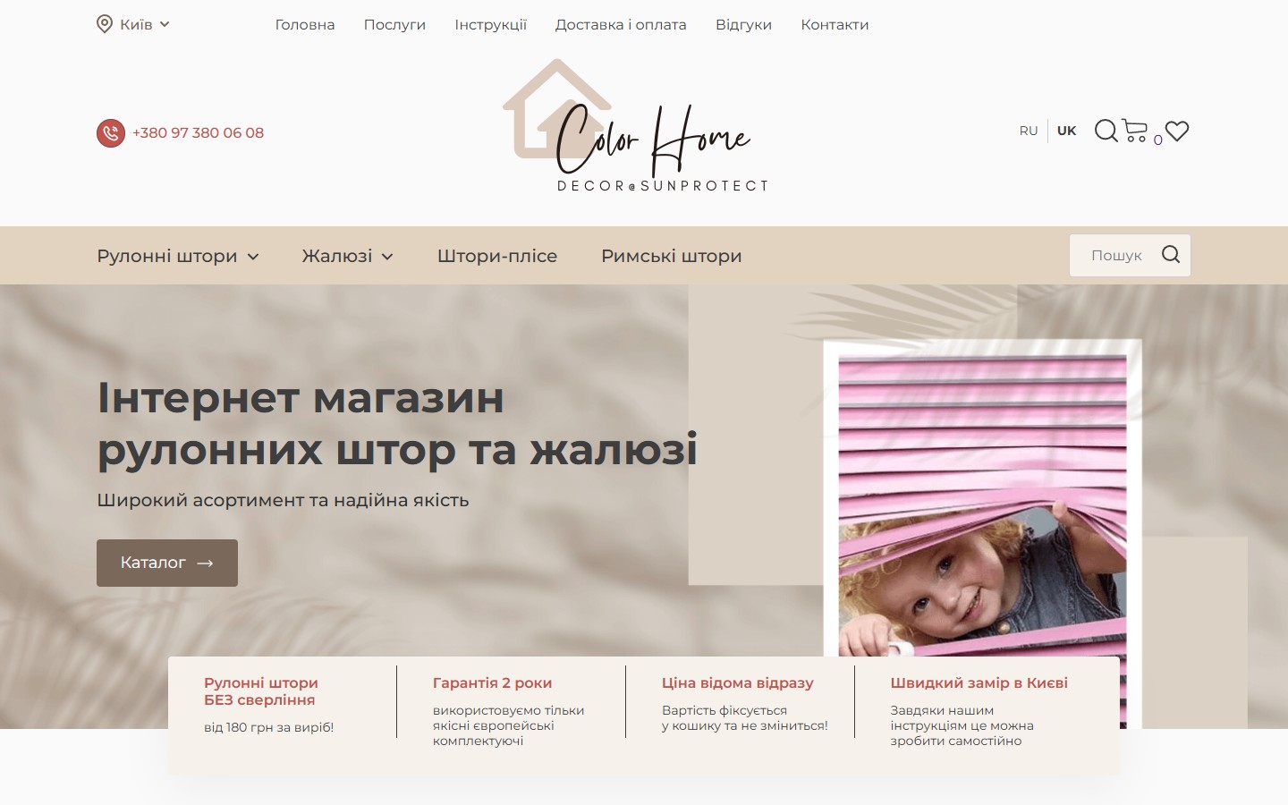
The first screen is a calm beige hero over a crumpled-fabric background, with a vertical shot of a pink roller blind (a child sitting behind it — not a stock photo, an interior scene). At the top — the Color Home logo in handwritten cursive with a little house icon, and beneath it a small subline, DECOR & SUNPROTECT, in capitals: one name to remember, one for the search query “decor + sun protection”. On the left — the H1 “Online store of roller blinds and Venetian blinds”, the H2 subheading “A wide range and reliable quality”, and a brown “Catalogue” CTA with an arrow leading to /shop/.
A header with city geolocation — “Kyiv” as a service-area declaration
In the top-left corner — a pin icon labelled “Kyiv” with a dropdown arrow. This isn’t a language switcher (there’s a separate UK/RU toggle above it for that) — it’s an explicit statement about the service area: ColorHome is a Kyiv store with local service (measuring around Kyiv, courier delivery around Kyiv, delivery across Ukraine handled as a separate line). Right below the header — the main menu with 4 product categories (Roller Blinds, Venetian Blinds, Pleated Blinds, Roman Blinds), the first two carrying caret arrows to expand subcategories (Open-type roller blinds / Cassette / Day-night / Blackout — for roller blinds; Horizontal / Wood / Cassette Venus — for Venetian blinds). On the right — a phone number in blue, a mini-cart with a counter, a wishlist heart and a full-width search input.
A 70-page catalogue with 5-factor faceted filtering
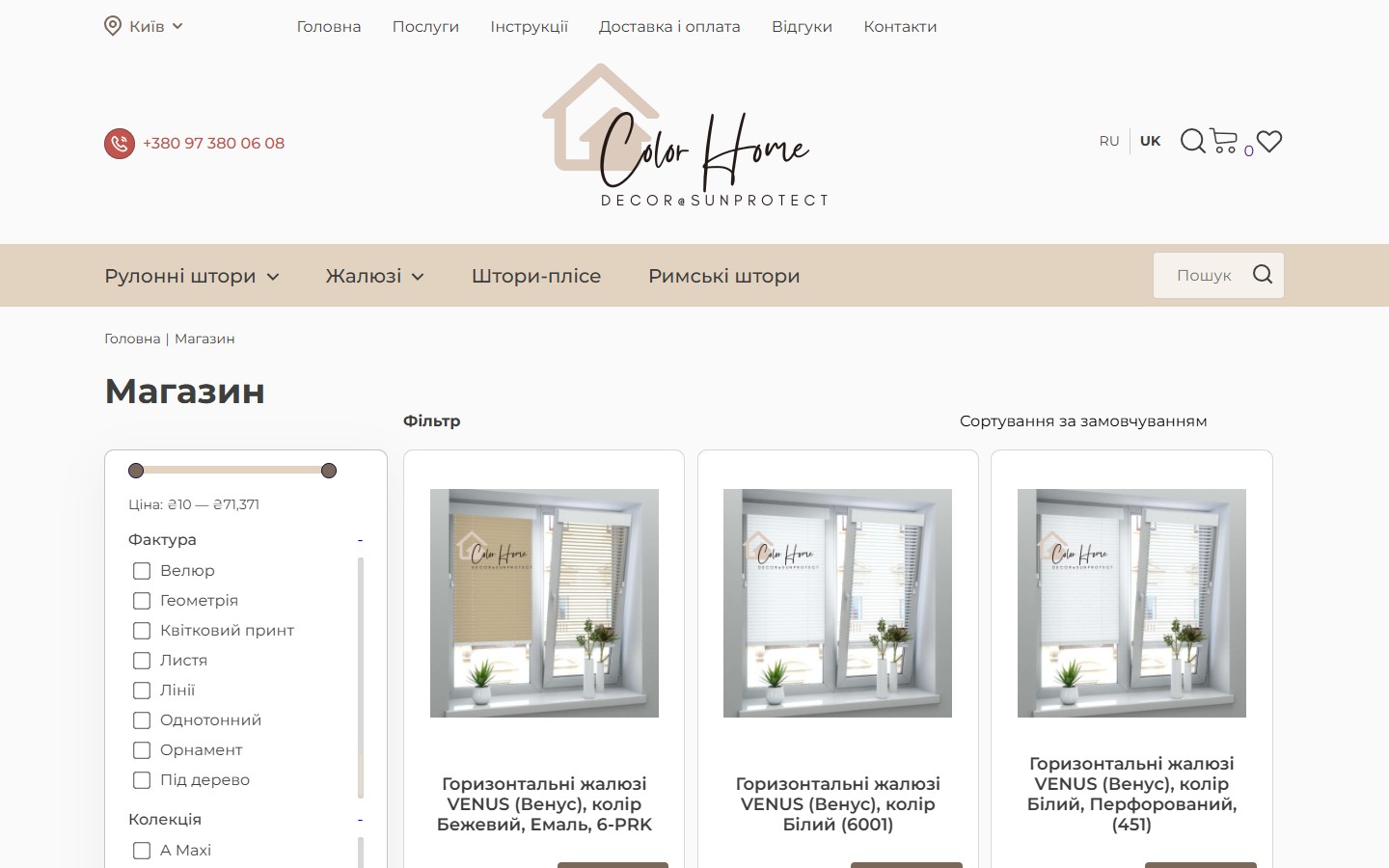
The /shop/ page is a global catalogue with pagination running 1…70 and a 4-across product grid. The left sidebar holds 5 faceted filters: Price (a ₴10 — ₴71,371 range slider), Texture (Velour, Geometric, Floral print, Leaf, Lines, Solid, Ornament, Wood-look, Marble-look, Stripes), Collection (60+ collection names: A Maxi, Abris, Bamboo, Berlin, Boston, Calcutta, Champagne, Ikea, Jungle BO Pearl, Linen Look, Royal, Screen, Velour…), Light transmission (Up to 100% blackout, 80% darkening, up to 50% darkening), Manufacturer (DCSN, NKS, PRK) and Colour (30+ — Ivory, Anthracite, Beige, White, Lilac, Mustard, Cocoa, Olive, Emerald…). Each item is a checkbox list with a numbered count of available variants, all of which build a URL as standard WP term queries (multi-facet).
4 roller-blind types + 3 Venetian-blind types + pleated + Roman — every subcategory as its own landing page
Below the hero on the homepage sits the Roller Blinds section with 4 product cards: Open-type roller blinds (from ₴500), Cassette roller blinds (from ₴500), Day-night blinds (from ₴500), Blackout blinds (from ₴850). Each card leads to its own /shop/ archive under its own slug (/mini-shtory/, /kasetni-shtory/, /shtory-den-nich/, /rolety-blekaut/), and all 4 archive pages inherit the same 5-facet filter (Price, Texture, Collection, Light transmission, Manufacturer, Colour). Below that — a Venetian Blinds section with 3 cards (Horizontal, Wood, Cassette Venus), plus separate Pleated Blinds and Roman Blinds categories in the main menu. This structure (4 top-level product categories, each with 3-4 subcategories) lets a 70-page open catalogue run not just one “entry through /shop/” but 11+ targeted archive pages for each specific intent — “a dark bedroom with blackout” leads straight to /rolety-blekaut/, not to a general search.
The product page as a configurator — Width/Height/Side/Fittings/Quantity
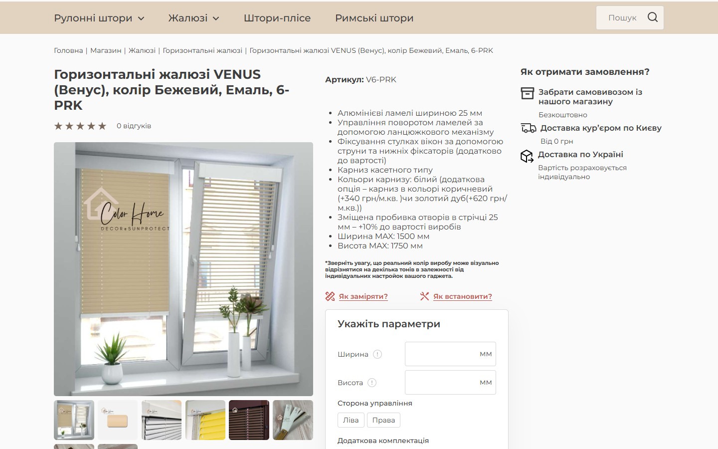
The PDP (using Horizontal Venetian blinds VENUS, colour Beige, Enamel, 6-PRK as an example) isn’t a WC default with a fixed price and an Add-to-Cart button — it’s a full customisation configurator. On the left, a gallery with 8 thumbnail images (different slat colours on the same window design); in the middle, the H1, the SKU V6-PRK, an 8-point marked list of technical specs (25 mm aluminium slats, a chain mechanism, a cassette-type headrail with an optional brown recolour +₴340/m² or golden oak +₴620/m², a MAX size of 1500×1750 mm); and on the right, a white rounded card headed Specify parameters with fields: Width (a text input, mm), Height (a text input, mm), Control side (Left/Right radio), Extra fittings (Cord/Bottom clips/Magnets checkboxes), Quantity (a stepper). Below that — a dynamic price of ₴525 and two CTAs, a blue “Add to cart” and an outline “Buy in 1 click” (no registration needed).
“How to measure?” and “How to install?” as CTAs right next to Add-to-Cart
Above the configurator — two outline CTAs with tape-measure and screwdriver icons: “How to measure?” and “How to install?”, leading to /instrukcziyi/. This is thought-through placement: a client buying a roller blind or Venetian blind for the first time doesn’t know how to measure correctly (against the sash or inside the recess? in millimetres or centimetres? account for curtains or not?) — and it’s exactly at the moment of filling in the Width/Height fields that they need instructions. Instead of tucking that away in a footer menu, it sits 50 pixels from the problem. This lowers support load (fewer “how do I measure?” calls) and lifts conversion (the client feels confident about the numbers and doesn’t stall the decision).
“How do you receive your order?” — 3 delivery types plus a 5-step operational flow
Below the configurator sits a separate rounded card headed How do you receive your order? with three horizontal rows with SVG icons: Pick up from our store (Free), Courier delivery around Kyiv (From ₴0), Delivery across Ukraine (Cost calculated individually). This sits right next to the order button — not in a footer block, not on a separate /dostavka-i-oplata/ page, but exactly at the moment of decision. Below that — a full-width 5-step operational flow diagram: 1) Submit a request on the site (or call), 2) Measure (a measurer visits with catalogues and product samples), 3) Agreement (a written contract + deposit), 4) Manufacturing (from 72 hours, with a +15% rush option), 5) Delivery and installation. This isn’t a sales funnel — it’s a process explanation for a client ordering custom manufacturing for the first time in their life and unsure why it isn’t “bought and received in 3 days” the way Rozetka works.
Services as a dedicated section — Measure, Delivery, Installation with real people on camera
The /poslugy/ page holds 3 services in a 1×3 grid: Measuring with product samples (URL /zamir-rulonnyh-shtor-ta-zhalyuzi/), Delivery (URL /dostavka-i-oplata/) and Installation (URL /montazh-rulonnyh-shtor-ta-zhalyuzi/). Each card has a rounded beige background and a full-length photo of real staff: a measurer in a blue overalls with a tape measure, a courier in a red shirt with a parcel and a clipboard, an installer in a light blue work suit and a yellow hard hat next to a stepladder. These aren’t Shutterstock “professional worker” stock photos — this is a real photo shoot with real employees and custom styling matched to the brand palette (beige/brown/blue accent). Below each photo — the service name in bold beige, and the clickable tile leads to a full service page with pricing.
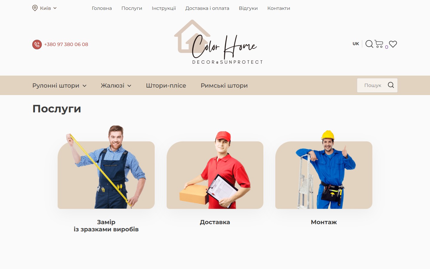
/instrukcziyi/) or installation only (if they already received a parcel from an earlier order and just need it hung). This lowers the average order value but increases retention — the client comes back for individual services instead of a one-off purchase. Measuring with product samples isn’t just a visit with a tape measure — it’s an offline session for choosing fabric in real home lighting (because a standard online rendering doesn’t convey the true shade under different lighting types).UA/RU bilingualism — a full translation, not a handful of key pages
In the top-right corner — a UK/RU language toggle. Switching from UK to RU doesn’t redirect to the homepage (a common mistake on bilingual WP sites) — it preserves the current context: /shop/ → /ru/magazyn/, /rulonni-shtory/ → /ru/rulonni-shtory-ru/, /cart/ → /ru/koshyk/. That means the RU version has a fully parallel WordPress permalink structure, not a key-pages-only translation (as often happens with Polylang falling back to Ukrainian for 80% of the content). The slug scheme uses Russian transliterations (koshyk, magazyn) — a deliberate locale declaration for search engines: Google distinguishes Russian-language content by the URL signal, not just lang="ru" in the HTML.
Mobile layout at 390×844 — a burger menu, a full-width CTA, a stacked USP block
At a 390×844 viewport (iPhone 13) the layout rebuilds cleanly (see the iPhone overlay at the top of this case study): the top row collapses into a burger icon on the left, the logo and language toggle shrink, and the cart and wishlist stay visible in the top-right corner as persistent icons. The hero shows the H1+H2+”Catalogue” CTA at full width (the CTA is a beige-brown bar with an arrow, spanning the full width), and the 4-block USP row doesn’t turn into a swiper — it stacks vertically, 2 to a row, in the scroll. Below that — the “Roller Blinds” section with a 2-across card grid (Open-type roller blinds and Cassette roller blinds in the visible area). This isn’t a desktop-shrunk-and-zoomed layout — it’s a structural rebuild: the separation between hero / USPs / categories is preserved, but the layout density is reduced to something readable on a 6-inch screen held in one hand. The USP block on mobile doesn’t switch to a swiper or carousel — it reads vertically in full, no gestures required: all 4 benefits need to be visible at once, without needing active interaction. Carousels on mobile (especially without autoplay) are barely clicked through — a client sees only the first slide and moves on.
Breadcrumbs Shop → Venetian blinds → Horizontal → SKU — a full navigation trail
On every subpage (category, subcategory, product) there’s a breadcrumb strip at the top of the page: Home | Shop | Venetian Blinds | Horizontal Venetian blinds | Horizontal Venetian blinds VENUS, colour Beige, Enamel, 6-PRK. This is a 5-level hierarchy with full names (not “Back” / “Category” — actual subcategory names). On a WordPress catalogue with 70 pages and 11+ categories this isn’t cosmetic — it’s a strong UX/SEO signal: a client arriving at a product from a Google ad sees their context (“ah, this is Venetian blinds, not vertical”), and Googlebot gets a clean taxonomy structure for SERP sitelinks.
Summary
ColorHome is a typical B2C WooCommerce catalogue for a product category built around custom manufacturing: 70 product pages, 5-facet filtering across 60+ collections and 30+ colours, a custom configurator instead of a static price, a separate services section (measure/delivery/installation), and an honest 5-step pipeline — “Request → Measure → Agreement → Manufacturing 72 hrs → Installation” — that explains to the client why this isn’t “buy it, get it”. The strong decisions here are the two-layer brand (Color Home + Decor & Sunprotect), a geolocation signal (“Kyiv”) right in the header, a “How to measure/install” link placed right next to Add-to-Cart, real staff photos instead of stock on the services page, and a fully parallel UA/RU structure with both localised slug sets. This isn’t “a designer competitor to Westwing” — it’s a working store for a Kyiv client who buys a roller blind for their bedroom once every 3 years and wants to understand the process before filling in a request form.




