
Aquarum — a WooCommerce shop for a German water-treatment manufacturer
WooCommerce-магазин німецького виробника RO-систем, пом'якшувачів і мембран — 340+ SKU, 28 категорій, фасетна фільтрація з власними product-атрибутами і CPT-послугами
Aquarum is a German manufacturer and online shop of industrial- and household-grade water-treatment systems: industrial RO systems (AMRO/SLIM series), water softeners, Hydranautics membranes, dosing stations, filter media, cartridges, control valves, UV lamps, dispensers. The theme is a custom WooCommerce stack: 28 product categories, 340+ SKUs (38 archive pages of 9 items each), a services CPT with 4 engineering services, facet filtering with proprietary product attributes (output in l/day, pressure in bar, pump type, purification grade, filtration method, connection type), VDI-2035-oriented content for heating engineering, fully German localisation, and its own Yoast SEO stack with 10 sitemap indexes, including product-attribute archives (pa_abflussleitungsanschluss, pa_arbeitsdruck-bar, pa_produktivitat-m³-h-bis).
A hero with a 4-channel category switcher — one landing page for 4 buyer personas
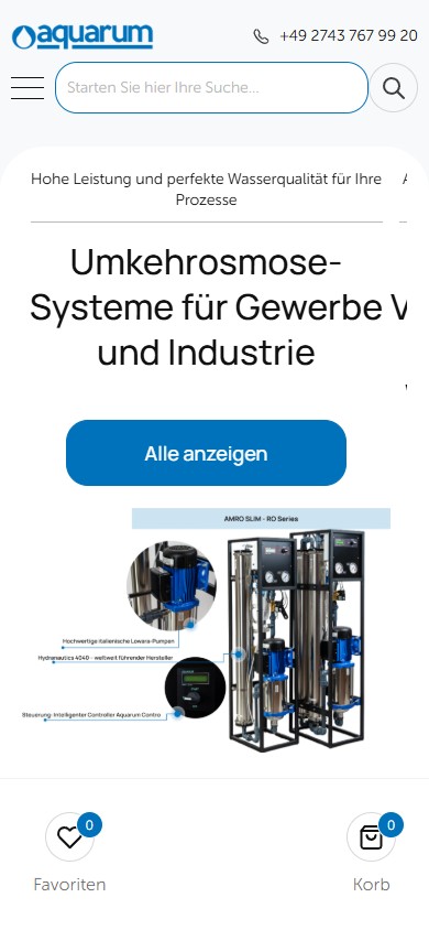
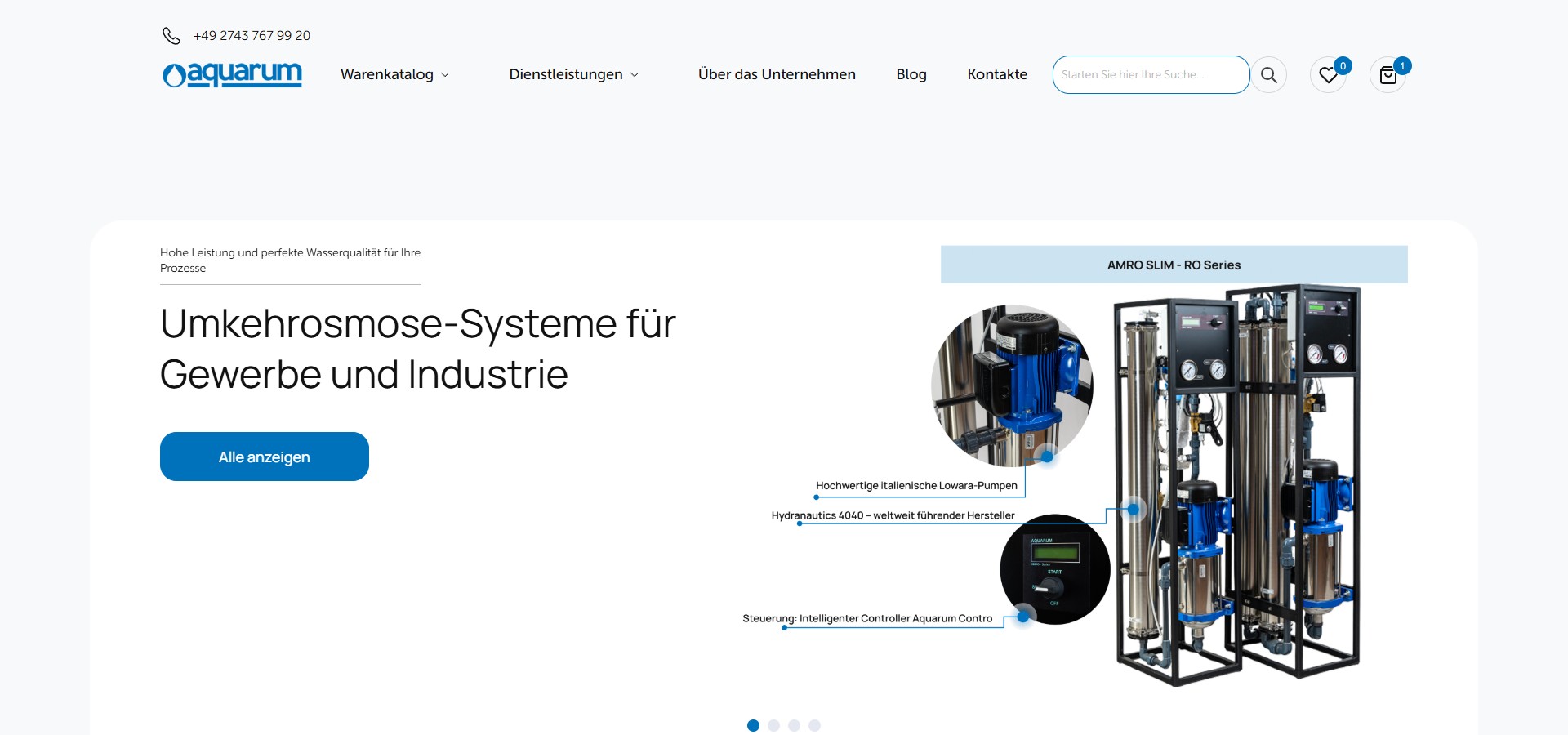
The first screen is a slick carousel with 4 background scenes, each highlighting a distinct segment: household water softeners, industrial RO systems, cartridges and filter media, household RO/reverse osmosis. The active slide carries a full promo block: a short tagline above the H1, the H1 itself, a lead paragraph, a blue “Alle anzeigen” CTA to a specific product-category archive, and on the right an annotated product visualisation with callout lines. In the screenshot below — the AMRO SLIM RO Series: one render marks three key components in engineering fashion — “Hochwertige italienische Lowara-Pumpen”, “Hydranautics 4040 — weltweit führender Hersteller”, “Steuerung: Intelligenter Controller Aquarum Contro”. This isn’t a marketing image, it’s an RO station’s engineering data sheet, right on the home page.
“Suche nach Kategorie” — 9 top categories with product visuals, not icons
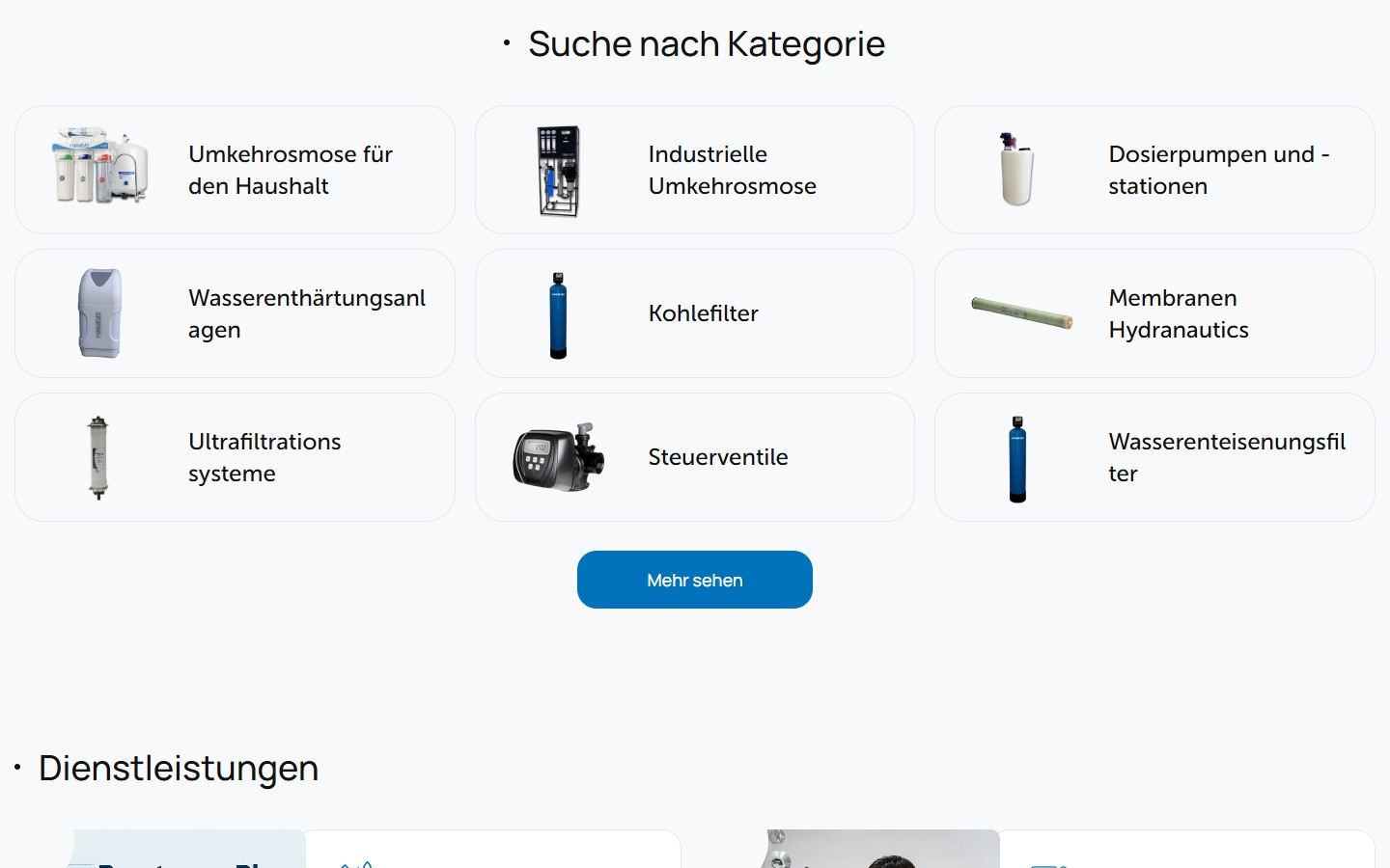
The second section of the home page is a 3×3 grid of the 9 most important catalogue categories: Umkehrosmose für den Haushalt, Industrielle Umkehrosmose, Dosierpumpen und -stationen, Wasserenthärtungsanlagen, Kohlefilter, Membranen Hydranautics, Ultrafiltrationssysteme, Steuerventile, Wasserenteisenungsfilter. Each card is a minimalist rounded rectangle with a thin border, a render of an ACTUAL product on the left (not a stock icon), and the category name on the right. Below the grid is an outline CTA “Mehr sehen” → /suche-nach-kategorie/ (a separate page with the full list of 28 categories with images, since they don’t all fit in the footer menu). It’s a layered SEO page in its own right, self-positioning for the long-tail query “Wasserfilter Kategorien”.
“Dienstleistungen” — a services CPT, not WC products
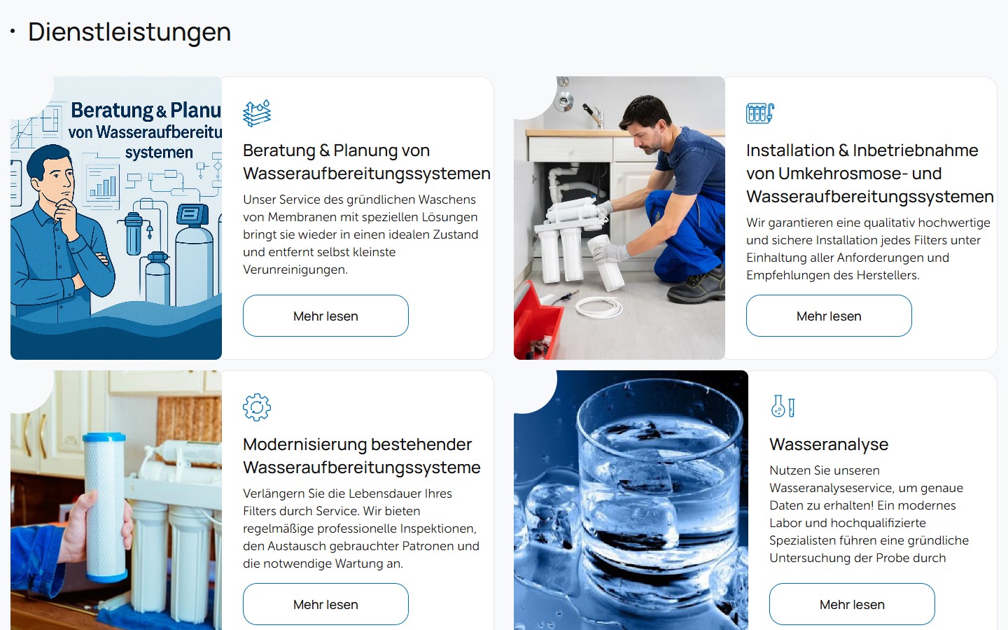
The Dienstleistungen section holds 4 services: Beratung & Planung von Wasseraufbereitungssystemen, Installation & Inbetriebnahme von Umkehrosmose- und Wasseraufbereitungssystemen, Modernisierung bestehender Wasseraufbereitungssysteme, Wasseranalyse. Each service is a separate post in the services CPT (URL /services/<slug>/) with its own sitemap index (services-sitemap.xml, 4 URLs), rather than a custom taxonomy on products or a plain page. This lets each service have its own full SEO landing page with tags, a description and a lead form, without mixing into the WooCommerce structure. The cards form a 2×2 grid: on the left a wide photo illustration (an engineer under a sink with filters, a glass of water on a blue background, an illustrated design with a person in a blue shirt), on the right a category icon (a stack of discs, a tap, gears, lab test tubes), an H3, a lead line, and an outline CTA “Mehr lesen”.
“Über das Unternehmen” — two industrial photos + counters with no animation
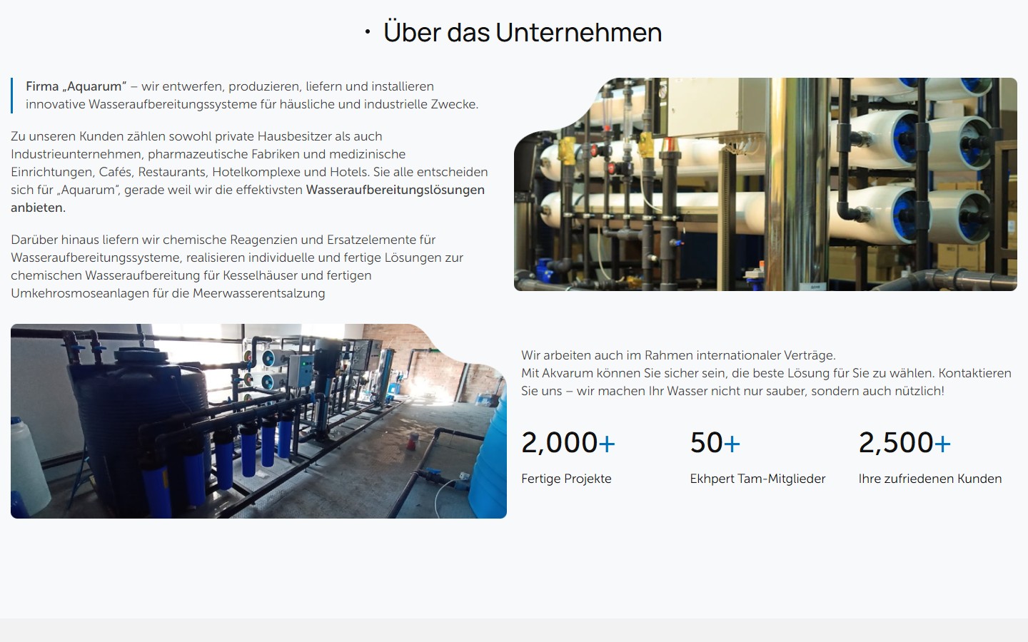
The About block is split into two strips. The top one — text about the company + a photo of the membrane RO rig (vertical white membrane housings in blue casings with connected piping and fittings). The bottom one — a photo of the power station with 6+ blue buffer tanks and a pump group + text about international contracts and three counters: 2,000+ Fertige Projekte, 50+ Ekhpert Tam-Mitglieder, 2,500+ Ihre zufriedenen Kunden. The counters do not animate on scroll — static large numbers with a blue “+”, which is unusual for 2024+ layouts (everyone loves CountUp.js). This is a choice in favour of load speed and clarity — no need to wait for the animation to finish to read the number.
“Warum sie uns vertrauen” — 4 USP cards with one active state
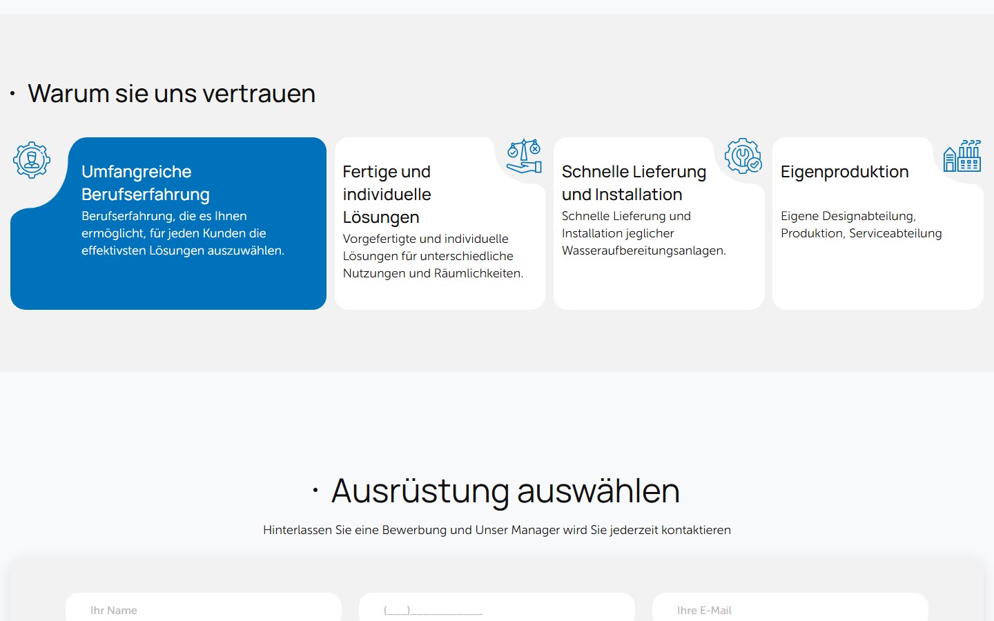
The trust section is a grid of 4 cards (Umfangreiche Berufserfahrung, Fertige und individuelle Lösungen, Schnelle Lieferung und Installation, Eigenproduktion). The first card is always in the active state — a solid blue fill (#0070C0), white text, a white person icon on the blue background. The other three have a light-grey border, dark text, and a blue outline icon. On hover (and on mobile tap), the active state switches. This is a psychological device: the eye always has one anchor block that automatically draws attention — and it’s the one stating the company’s main USP (“years of experience”), not “fast delivery”. Delivery matters, but is secondary for a B2B customer in the pharma/heating sector. Experience comes first.
Shop archive: 28 categories in a fixed sidebar + custom pagination of 9/18/24
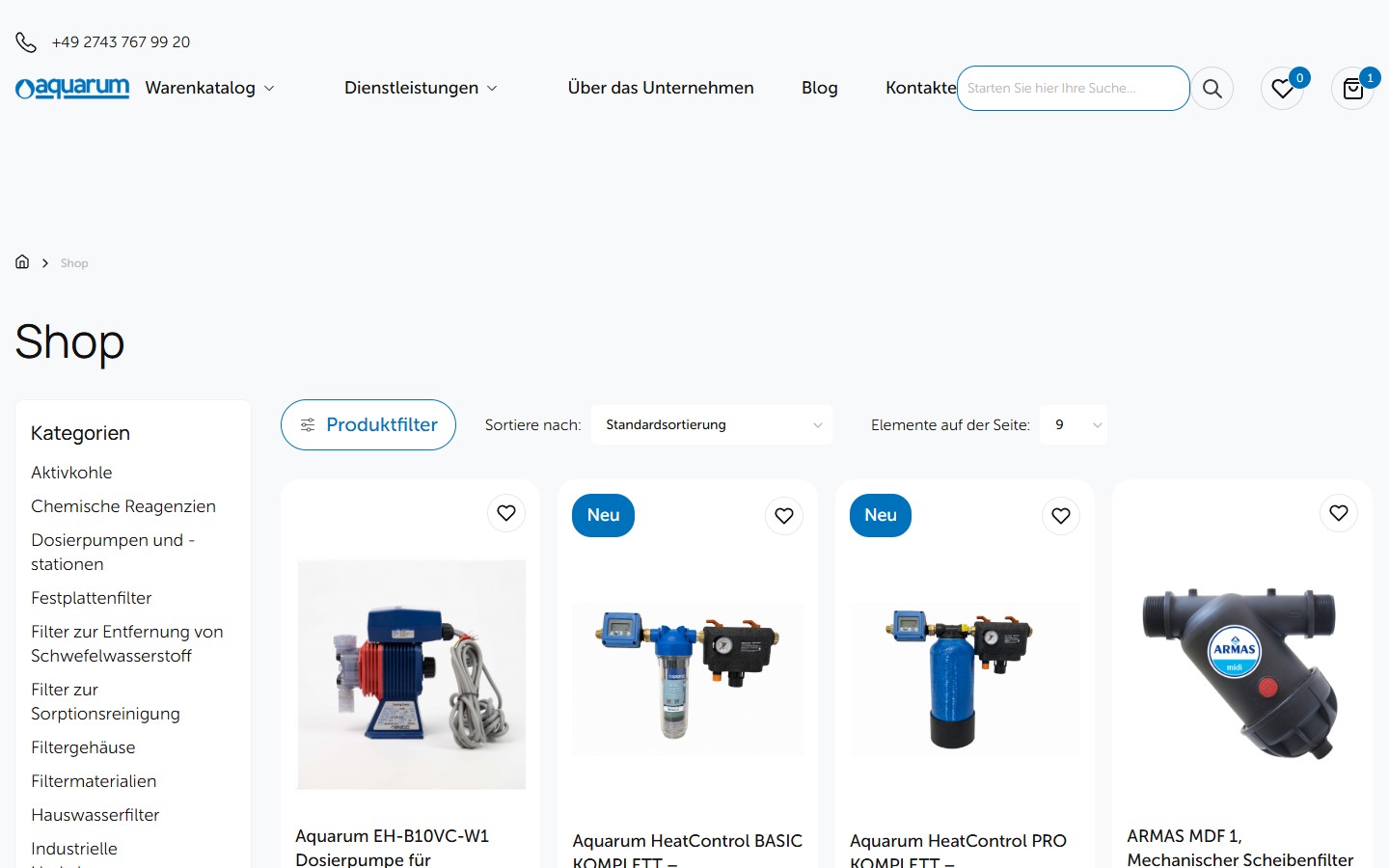
The /shop/ page is the global catalogue of 340+ SKUs, split across 38 pages of 9 items each (the standard WC default). The left sidebar is a sticky list of 28 categories with no icons, just single-column text links. Above the grid are three interactive controls: Produktfilter (opens the facet overlay, covered below), Sortiere nach (6 presets: Standardsortierung, Beliebtheit, Durchschnittsbewertung, Aktualität, Preis aufsteigend/absteigend) and Elemente auf der Seite (9/18/24 — the customer picks their own density). The product card is a photo on top, a “Neu” badge (a blue rounded pill) in the top-left corner for new listings, a wishlist heart icon in the top right, the name below, and the price in blue bold. None of the old WC-standard clutter: no “Add to Cart” straight from the card, no star rating, no description strip — all absent. This is a catalogue grid, not an e-commerce grid: click → go to the PDP → make your decision there.
A facet filter with product attributes: price, output in l/day, pump type, filtration method
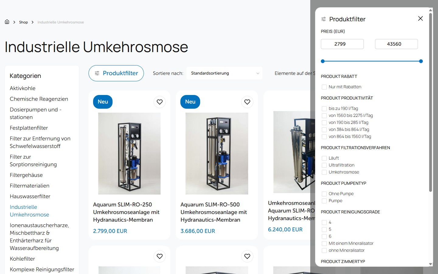
Clicking “Produktfilter” on the shop or a category page opens a right slide-out overlay with the full set of facet filters. In the screenshot below — Industrielle Umkehrosmose: Preis (EUR) with a 2799–43560 range slider, Produkt Rabatt (a “Nur mit Rabatten” checkbox), Produkt Produktivität (5 l/day ranges: bis zu 190 / von 190 bis 285 / von 384 bis 864 / von 864 bis 1560 / von 1560 bis 2275), Produkt Filtrationsverfahren (Läuft, Ultrafiltration, Umkehrosmose), Produkt Pumpentyp (Ohne Pumpe, Pumpe), Produkt Reinigungsgrade (4, 5, …). Each field is a separate WP product attribute with its own sitemap index (pa_produktivitat-m³-h-bis-sitemap.xml contains URLs for every output value — adding a separate SEO surface for long-tail queries like “RO Anlage 500 l/Tag”).
Single product page — gallery, product_cat breadcrumbs, a 3-tab description and a 15-field spec table
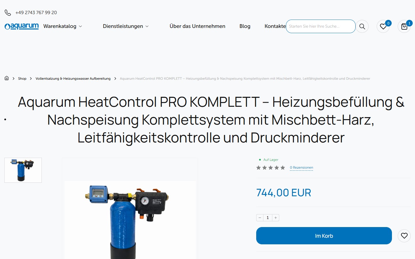
The product page (using Aquarum HeatControl PRO KOMPLETT — Heizungsbefüllung & Nachspeisung Komplettsystem mit Mischbett-Harz, Leitfähigkeitskontrolle und Druckminderer as an example) is a two-column layout: on the left a gallery with a vertical thumbnail strip, on the right the H1, an in-stock indicator (a green dot), a 5-star rating (0 reviews so far), the price 744.00 EUR in bold, a qty stepper, a blue full-width CTA “Im Korb”, an outline heart wishlist button next to it, and below a “Lieferung, Garantie” block with 3 trust signals: kostenlose Lieferung ab 400 Euro, kostenlose Rücksendungen, 30 Tage für eine Rückerstattung. Breadcrumbs: Home → Shop → Vollentsalzung & Heizungswasser Aufbereitung → — i.e. the product_cat is built into the navigation.

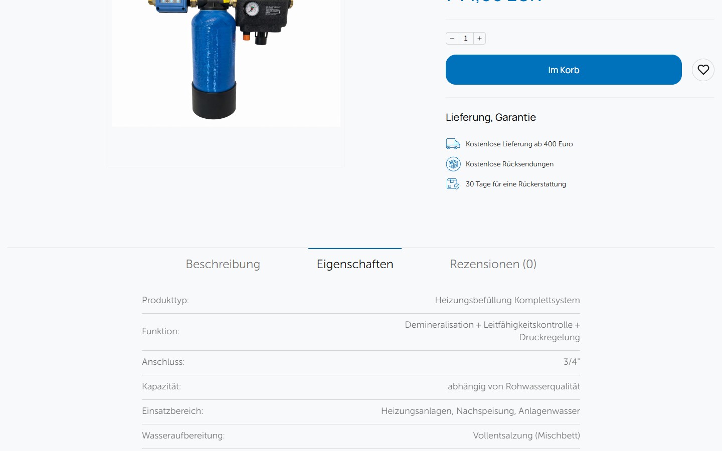
The Eigenschaften tab is a 15-field spec table of key:value pairs, each field on its own row with a divider line. Fields: Produkttyp, Funktion, Anschluss, Kapazität, Einsatzbereich, Wasseraufbereitung, Überwachung, Messparameter, Durchflussanzeige (Ja/Nein), Druckregelung, Manometer, Anwendung, Wartung, Energieversorgung, Herkunft. This isn’t the standard WC “Additional information” panel with 2 attributes — it’s a full technical data sheet right on the page, suitable for making a B2B decision without any back-and-forth emails with sales. The field “Herkunft: Made in Taiwan (Elektronik) / Systemmontage EU” is an honest disclosure of origin: the controller is made in Taiwan (normal for this class of electronics), the system is assembled in the EU (important for compliance and CE marking).
Checkout — a 3-step page with no separate /cart/, with city autocomplete and 2 bank-transfer types
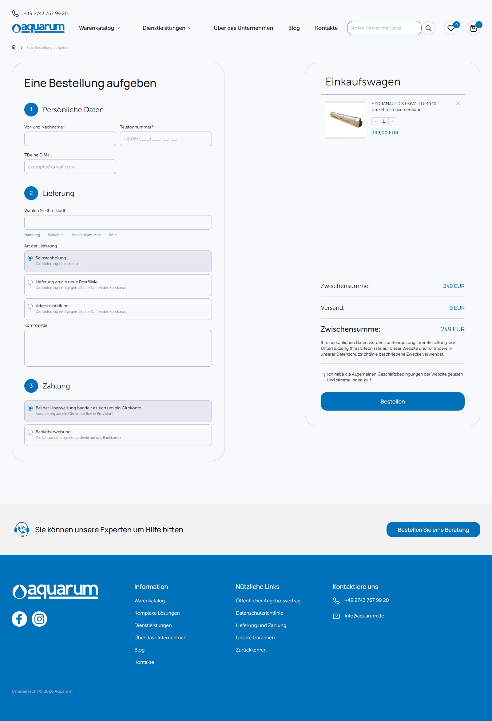
Unlike the standard WC /cart/ + /checkout/, on Aquarum the /cart/ URL redirects straight to the home page — the cart is only accessible via a dropdown icon in the header and leads to /checkout/ in one step. The checkout page itself is a compact 3-section form in the left column: 1. Persönliche Daten (first and last name, phone number with a mask +4989 (___) ___-__-__, email), 2. Lieferung (a “Wählen Sie Ihre Stadt” autocomplete with four quick-chip suggestions — Hamburg / München / Frankfurt am Main / Köln, then a radio with 3 types — Selbstabholung kostenlos / Lieferung an die neue Postfiliale / Adresszustellung + a “Kommentar” textarea), 3. Zahlung (2 options — Bei der Überweisung handelt es sich um ein Girokonto by default and Banküberweisung with prepayment). The right column has a sticky mini-cart with a product photo, a qty stepper, and a transparent breakdown of Zwischensumme / Versand / Zwischensumme. No Stripe iframe or PayPal button — this is a B2B catalogue, where large orders go through a bank transfer, not an instant card payment.
Category page = shop + SEO canvas built around “Worauf sollte man beim Kauf achten?”
The /product-category/<slug>/ page isn’t just a product grid. Below the listing and pagination sits a full SEO page: an H1 “Industrielle Umkehrosmose”, 2 lead paragraphs, an H2 “Was ist industrielle Umkehrosmose?”, an H2 “Wie funktioniert eine Umkehrosmoseanlage?” with a numbered list of stages (Vorfilterung → Aktivkohlefilterung → Membranfiltration → Nachbehandlung), an H2 “Vorteile”, an H2 “Anwendungsbereiche” (Lebensmittel, Pharma, Energie, Halbleiter, Landwirtschaft), an H2 “Worauf sollte man beim Kauf achten?” with an HTML table of 5 rows (Kapazität / Membranqualität / Energieeffizienz / Anpassungsfähigkeit / Wartungsfreundlichkeit), and an H2 “FAQ” with 4 questions and answers (maintenance frequency, customisation, a 3-5 year membrane lifespan, environmental friendliness). This is category-page-as-pillar-content — a strategy Yoast recommends as a “cornerstone” and which most sites forget to implement on their e-commerce categories. Here it’s done properly.
“Neueste Artikel” blog — a slider with 4 visible articles, not a grid
The blog section on the home page is a slick carousel with 4 cards visible at once. Each card: a date in a blue round badge (21.04, 14.04, 09.04) in the top-left corner of a product photo, the full article title as an H4, the first 60 characters of the body text with an ellipsis truncation, an outline CTA “Mehr lesen”. This is not a grid — it’s a horizontally-scrolling carousel, which doesn’t require vertical scrolling and shows more articles within a limited visual budget. The visible articles cover VDI 2035 vollentsalzung, industrielle RO-anlagen, an ion-exchange resin comparison, hauswasserfilter im hausanschluss — this is NOT a lifestyle blog, it’s technical reference content that helps engineers make decisions while also lifting category-page rankings on Google for technical long-tail queries.

FAQ — 3 cards at the end of the home page, borderless accordion style
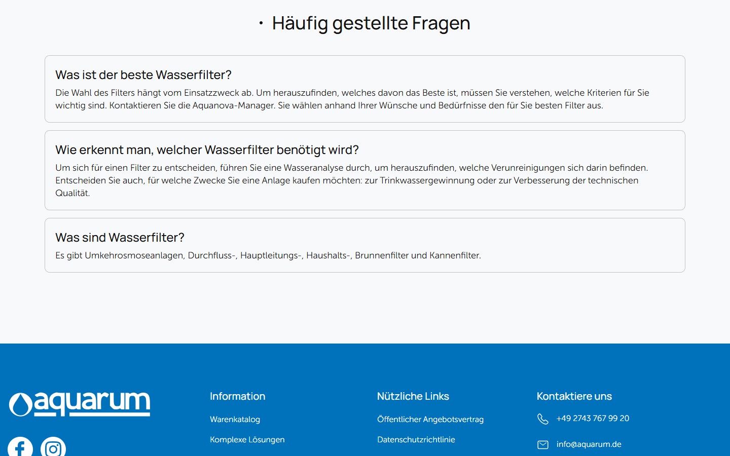
Before the footer is a Häufig gestellte Fragen section with 3 questions, each in its own light-grey rounded rectangle: “Was ist der beste Wasserfilter?”, “Wie erkennt man, welcher Wasserfilter benötigt wird?”, “Was sind Wasserfilter?”. All 3 are expanded by default — this isn’t a click-to-expand accordion, it’s a pure-text FAQ block. This lets Google’s crawler read the whole FAQ content immediately for FAQPage schema and potential rich results. The classic mistake — hiding a FAQ behind a clicker accordion with aria-expanded=false — still works for the schema, but yields a lower CTR in the SERP.
Mobile layout at 390 — a burger menu, sticky search, a full-screen hero with no cropping
At the 390×844 viewport (iPhone 13) the layout rebuilds itself: the top bar with the phone number collapses into a compact row, the main navigation folds into a burger icon on the left (a 3-line stack), the search input becomes full-width, and the cart and wishlist stay visible in the bottom-right corner as floating action elements. The hero shows slide 1 in full (Umkehrosmose-Systeme, the same as desktop slide 1, only here it’s already AMRO SLIM with the vertical product visual at the bottom), and the blue “Alle anzeigen” CTA is centred and full width. No desktop-only artefacts (horizontal scroll, cropped elements) — a fully-fledged mobile-first rebuild, not desktop-with-zoom.
The SEO stack: 10 sitemap indexes, including product-attribute archives
Yoast SEO generated 10 separate sitemap XML files: post, page, product, services (CPT, 4 URLs), category, product_cat (28 URLs), pa_abflussleitungsanschluss (drain-line connection type attribute), pa_arbeitsdruck-bar (operating pressure), pa_produktivitat-m³-h-bis (output in m³/h), author. Including product-attribute archives in the sitemap is an additional SEO surface, rarely enabled by default in Yoast. Every attribute value (for example, “5 m³/h”, “10 bar”, “3/4″ Anschluss”) gets its own archive URL listing the products with that value. This removes the need to manually build a “landing page for all RO systems at 500 l/day” — Yoast auto-generates it from products carrying pa_produktivitat=500.
Kontakte as a separate page with an address, hours, and a Google Maps iframe
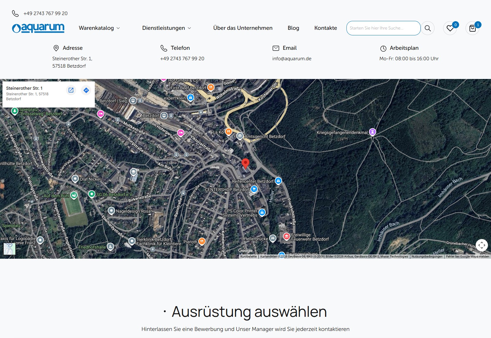
Rather than the templated “contact form via a footer anchor”, Aquarum has a full /kontakte/ page with a 4-card header block: Adresse (Steinerother Str. 1, 57518 Betzdorf — a small municipality in Rheinland-Pfalz, signalling a real German legal presence, not a “virtual office in Berlin”), Telefon with a clickable tel link, Email info@aquarum.de and Arbeitsplan Mo-Fr 08:00–16:00 Uhr. Below is a full-width Google Maps embed with a pin, then a repeated lead-form block “Ausrüstung auswählen” (Ihr Name / Phone with a mask / E-Mail / Ihre Nachricht + Schicken) with a GDPR disclaimer. Separately, in the header and footer, there’s a wishlist page /wunschzettel/ (heart icon) with its own heading and an empty state “Die Favoritenliste ist leer” for new visitors — this isn’t a dropdown, it’s a persistent page where B2B procurement can accumulate items over weeks ahead of a tender.
Summary
Aquarum is a B2B catalogue with an industrial-engineering character: a full WooCommerce shop across 28 categories and 340+ SKUs, integrated with a services CPT for engineering work, facet filtering with 6+ product attributes, technical content on category pages as cornerstone content, honest spec tables free of marketing filler, a minimalist flat UI with no visually foreign add-ons. Every design decision (the 4-channel hero, the active blue trust card, fixed l/day ranges instead of a slider, a floating thumb-zone wishlist on mobile) reads like the choices of someone who watches, every day, how engineer-customers combine searching, reading specs and requesting a quote. This is a site that didn’t try to sell a fantasy — it tried to make buying simple.




