
Amodent — a family dental practice in Uzhhorod, 4 locations, 18 specialists
Промо-сайт стоматологічної клініки з 4 відділеннями в Ужгороді — single-page структура з акордеоном послуг, каруселлю команди і конверсійною формою на CF7 з селектом філіалу.

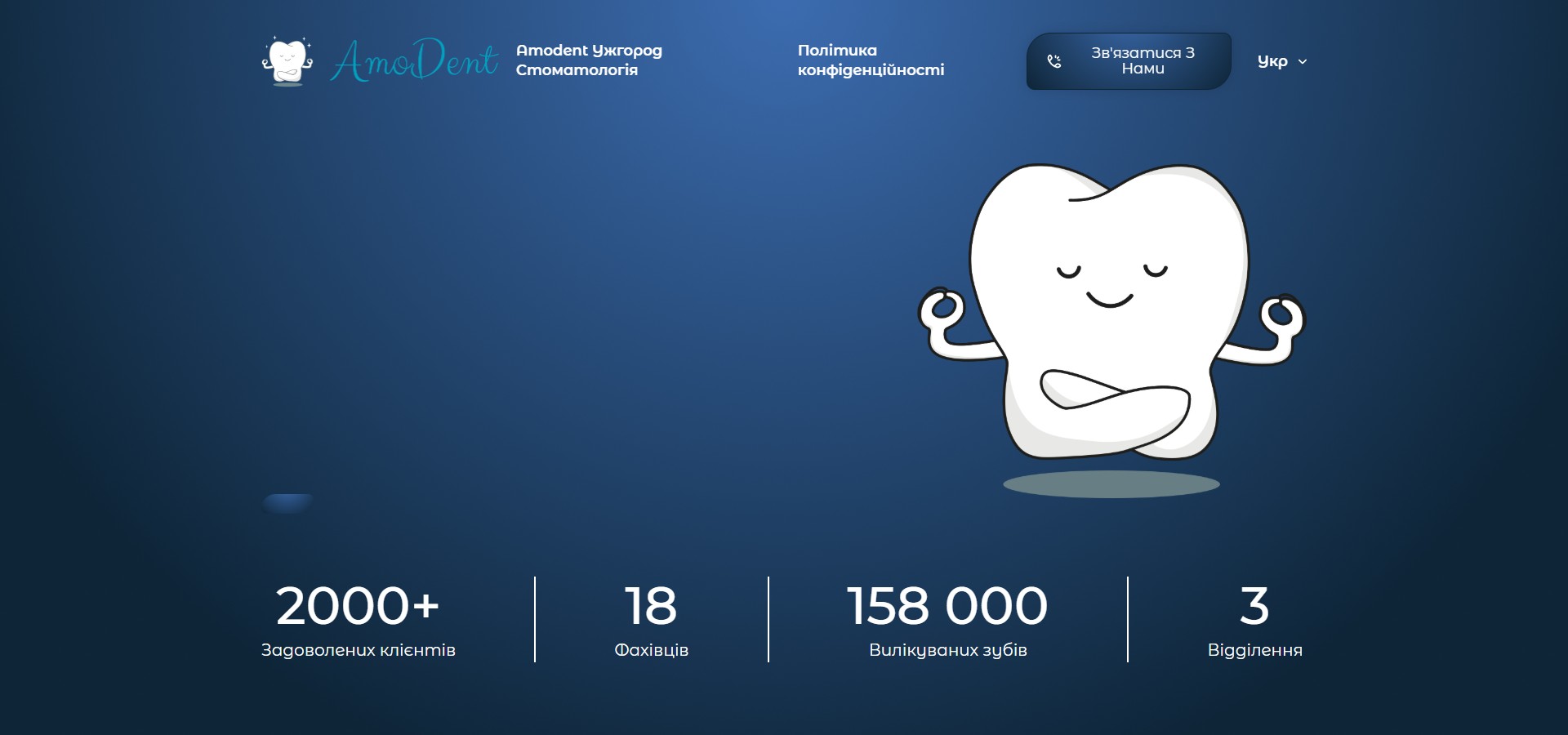
“AmoDent” is a network of family dental clinics in Uzhhorod with four locations (Kapushanska 145/b, Onokivska 16, Krasnodontsiv market, Mynaiska 54). On the site amodent.com.ua, the whole clinic fits into one long page: a hero with an animated tooth mascot and four counters, a team-introduction block, a “why people love us” advantages card, an accordion of seven dental specialties, a carousel of twelve doctors, and a bottom block with a four-field contact form. There are no sub-pages with pricing or dedicated landing pages — everything is compressed into a single scroll and a single “Get in touch” CTA, which always leads either to tel:+380960114614 or to the #contacts anchor with the form.
Page script — “introduction → advantages → services → team → form”
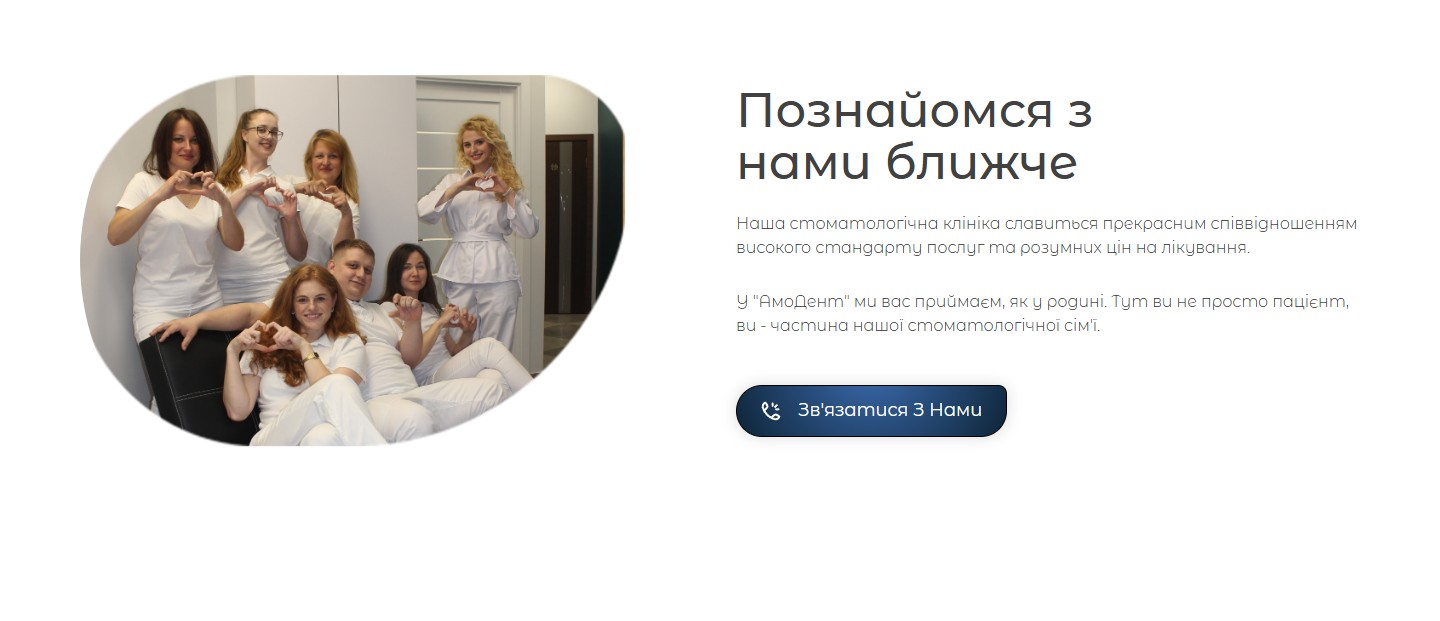
The site’s structure is standard for a small-city dental practice’s online presence: a single scroll that sequentially addresses three objections a visitor might have — “who are you”, “why should I choose you”, and “what can you treat”. The hero answers the first; the “Get to know us better” section, with a group photo of the team in white coats making heart shapes with their fingers, answers “who’s behind this”. The copy is deliberately homely: “we welcome you like family”, “you’re part of our dental family”. This isn’t B2B copy with regulatory bullet points, it’s a domestic tone fitting the “family” clinic positioning.
Four advantages — calm positioning, no overpromise
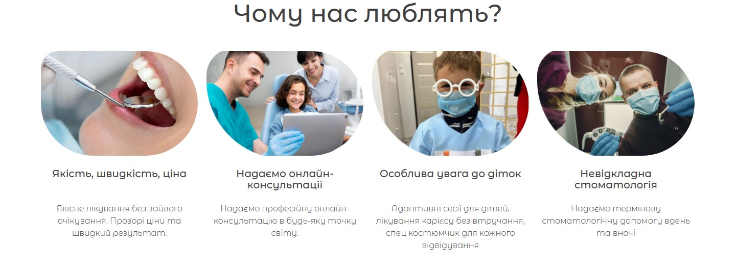
The “Why people love us” block is a grid of four cards without a generic Material/FontAwesome icon set, using the clinic’s own photo circles instead: a toothbrush with a dental mirror, a paediatric dentist with a child at a tablet, a boy in a white coat and glasses, a night shift in the treatment room. Each card carries one specific message: quality/speed/price (no queues, transparent pricing), online consultations (for patients abroad), paediatric dentistry (adaptive sessions, drill-free caries treatment, a special outfit), emergency care day and night.
Seven specialties — a two-column accordion instead of sub-pages
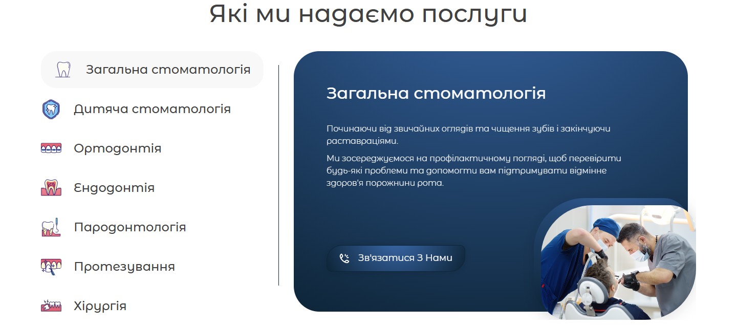
The clinic’s services are organised not as sub-pages, /services/<slug>, but as a vertical tabs accordion in the “Services we provide” block. The left column holds seven tabs with their own icons (General Dentistry, Paediatric, Orthodontics, Endodontics, Periodontology, Prosthetics, Surgery). The right side shows the active tab, with a heading, a descriptive paragraph, an illustrative photo in the bottom-right corner, and a duplicate “Get in touch” button. Switching happens with a click on a tab item, no page reload. This is an SPA pattern for a non-SPA site — it saves ten separate URLs and ten Yoast entries with SEO copy, but at the cost of losing deep content: each specialty gets one paragraph, not a full long-read with indications, methods, and pricing.
The team — a carousel of 12 doctors
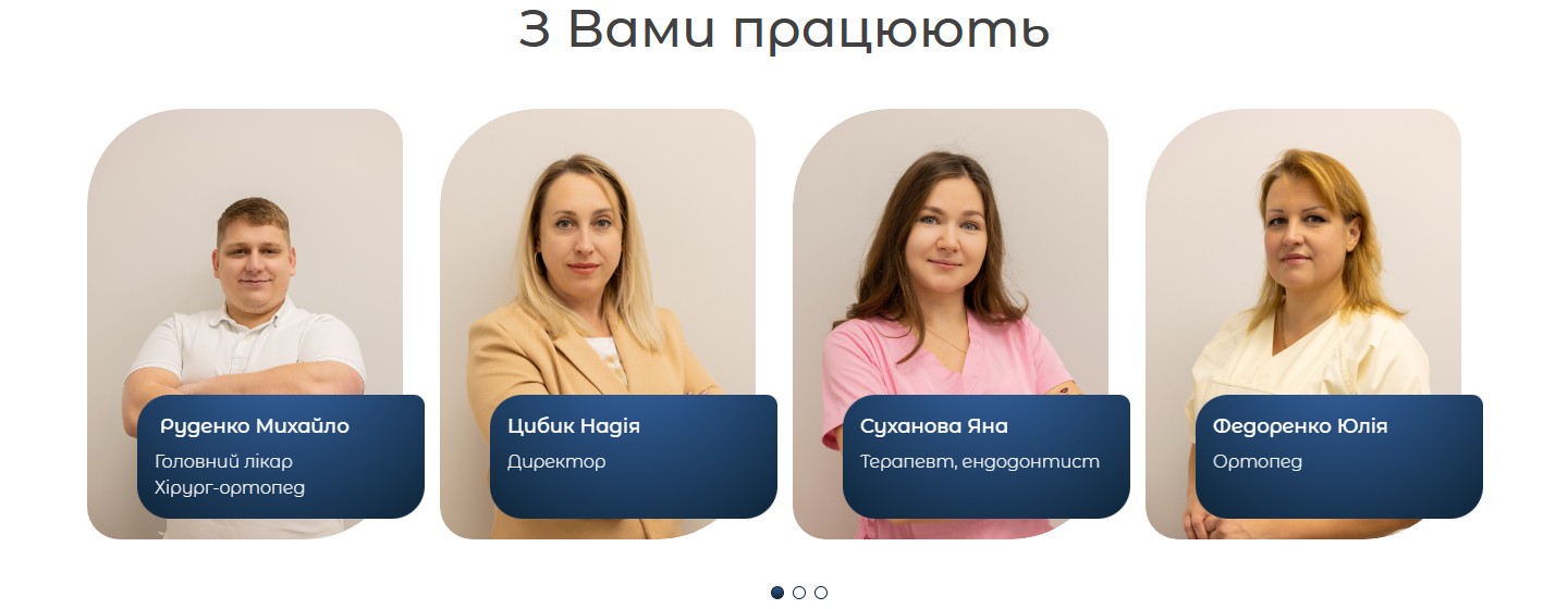
The “You’re in the hands of” section is a slick carousel: on desktop, 4 cards are visible at once, 12 specialists in total (a chief dentist and orthopaedic surgeon, a director, an endodontist, a prosthodontist, an orthodontist, a periodontist, two general dentists, a paediatric dentist, a periodontologist, and two assistants). Each card is a doctor’s portrait with a name-and-role caption underneath. There are no nested biographies, diplomas, or reviews — there’s nowhere to click through to “learn more”. This is a deliberate simplification: for a small regional-centre clinic, showing faces and headcount matters more than turning every doctor into a separate page with an appointment schedule.
One CTA, one form — and a select box of four locations
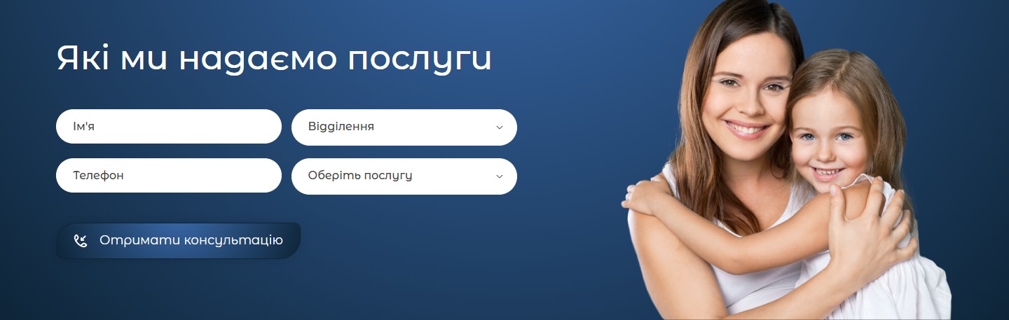
The final screen repeats “Services we provide”, only now, instead of an accordion, it’s a four-field form: name, a “Location” select with the four branch addresses, phone, and a “Choose a service” select with the same seven specialties as in the accordion above. In the background — a photo of a mother and daughter embracing, closing the loop on the family positioning from the first screen. The form is built on Contact Form 7, submitted asynchronously, with tel validation (a Ukrainian mask). Through GTM Tracker (CatCode’s own plugin for tracking GA4/Meta Pixel events), every submit-fail and submit-success streams as a separate event — meaning a marketer can see per-location CPL in a GA4 report without extra instrumentation.
Language versions — UA/EN, no Russian
The site is bilingual: Ukrainian (default, amodent.com.ua/) and English (amodent.com.ua/en/) — Polylang-style routing via the /en/ URL prefix. There is no Russian version, as a matter of principle, which for a western-Ukrainian clinic in 2024 is standard. The English version isn’t there for tourists but for the Ukrainian diaspora and medical tourism from across the Carpathians — Uzhhorod is geographically closer to Košice and Debrecen than to most of Ukraine, and that shapes seasonal traffic (patients from abroad plan their dental visit around their holidays).
Technical implementation
- WordPress + Elementor — the homepage is built from Elementor sections with a custom header and footer, a sticky header on scroll. There’s no template logic for CPT services/doctors — everything is nested into one page via editor blocks.
- Contact Form 7 — a standard form with a custom mail template to the clinic’s address + a copy to the selected branch (routing emails by the select via
[select branch]in CF7 tags). - GTM Tracker (a CatCode plugin) — tracks clicks on
tel:links, form submit events, and clicks on the#contactsanchor; all events proxy through into Google Tag Manager without code edits on the site. - Yoast SEO — an XML sitemap of just four URLs (UA homepage, EN homepage, UA privacy, EN privacy), the full semantic core fitting on one page.
- Social media — Instagram (
@amodent.clinic), TikTok (@amodent_clinic), Facebook — three channels with a unified brand style; footer icons open profiles in a new tab.
What we were solving for
For a clinic of this scale — “four locations, 18 specialists, a regional centre of 100,000 people” — building a full multi-page site with a landing for every service and every doctor would be over-engineering: there are no internal resources to maintain that much content, and SEO traffic from long-reads on “caries treatment in Uzhhorod” would arrive in 6–9 months, which doesn’t match the owner’s planning horizon. Instead, the “one page with everything + a phone number in the header + a form at the bottom” model gives a fast CPL from Instagram/Google Ads performance campaigns, and visitors come to the site only to verify “this is a real clinic, here’s the team, here are the photos” — the rest of the conversation happens on the call. It’s an honest architecture built for a real business scenario, without overreaching promises of digital transformation.




