
NOVQO — a B2C catalogue of tiling tools
WooCommerce-каталог українського виробника інструменту для плитки — 7 категорій, WOOF фасетний фільтр з 14 інженерними атрибутами, 6-провайдерна розстрочка 2–12 платежів, WPML 3 мови, дилерська програма
NOVQO is a Ukrainian manufacturer and online shop of professional tiling tools: manual and electric tile cutters (800–3200 mm models), vacuum and vibration suction cups, diamond blades and core bits (M14/HEX), routers, spatulas for mechanised grouting, and tables and transport systems for large-format tiles. The stack is WooCommerce + WPML (3 languages, UA/RU/EN), a WOOF facet filter with 14 engineering product attributes (blade and bit diameters in mm, arbor size, RPM, grit, mount type, manufacturing technology), B2C instalment payments from 6 bank providers (2–12 instalments), Apple Pay/Google Pay, a manual cross-link between SKU sizes instead of WC product variations, a separate /porivnyannya/ page for the compare flow, and optional registration via /mij-akkuant/. The footer shows sales@master-tools.com.ua — this is Kharkiv-based Master Tools, which built NOVQO as its B2C-friendly brand front, with a dealer programme for shops and construction crews.
A hero carousel with three conditional cart scenarios instead of one-size-fits-all promo
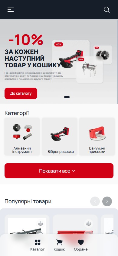
The first screen is a slick carousel with 3 separate promo scenarios, each a distinct live cart mechanic, not a static banner. Slide 1 — “20% off when you buy a tile cutter”: buy any manual tile cutter and get −20% off everything else in the same order (a cart conditional rule on product category). Slide 2 — “−10% for every next item in the cart”: an automatic discount from the second SKU onward (a cart quantity rule, not a coupon). Slide 3 — “−10% for a newsletter subscription”: a classic email lead magnet with a promo code after subscribing. This isn’t three promo codes in one slider — it’s three DIFFERENT automatic rules that run in the cart simultaneously (cross-stackable), giving the customer a sense that the price genuinely drops with every step of the funnel.
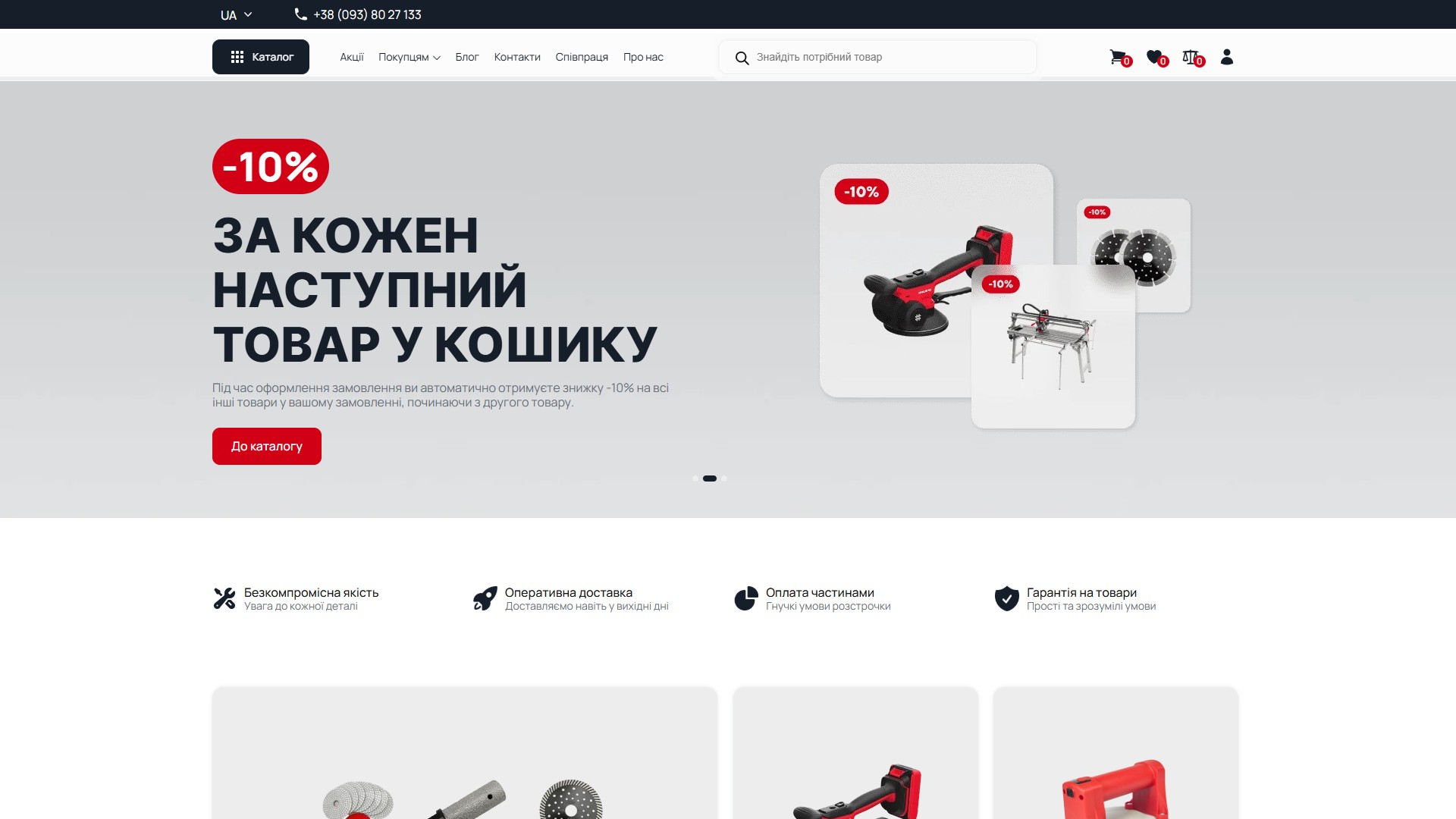
7 catalogue categories — real product visuals instead of abstract icons
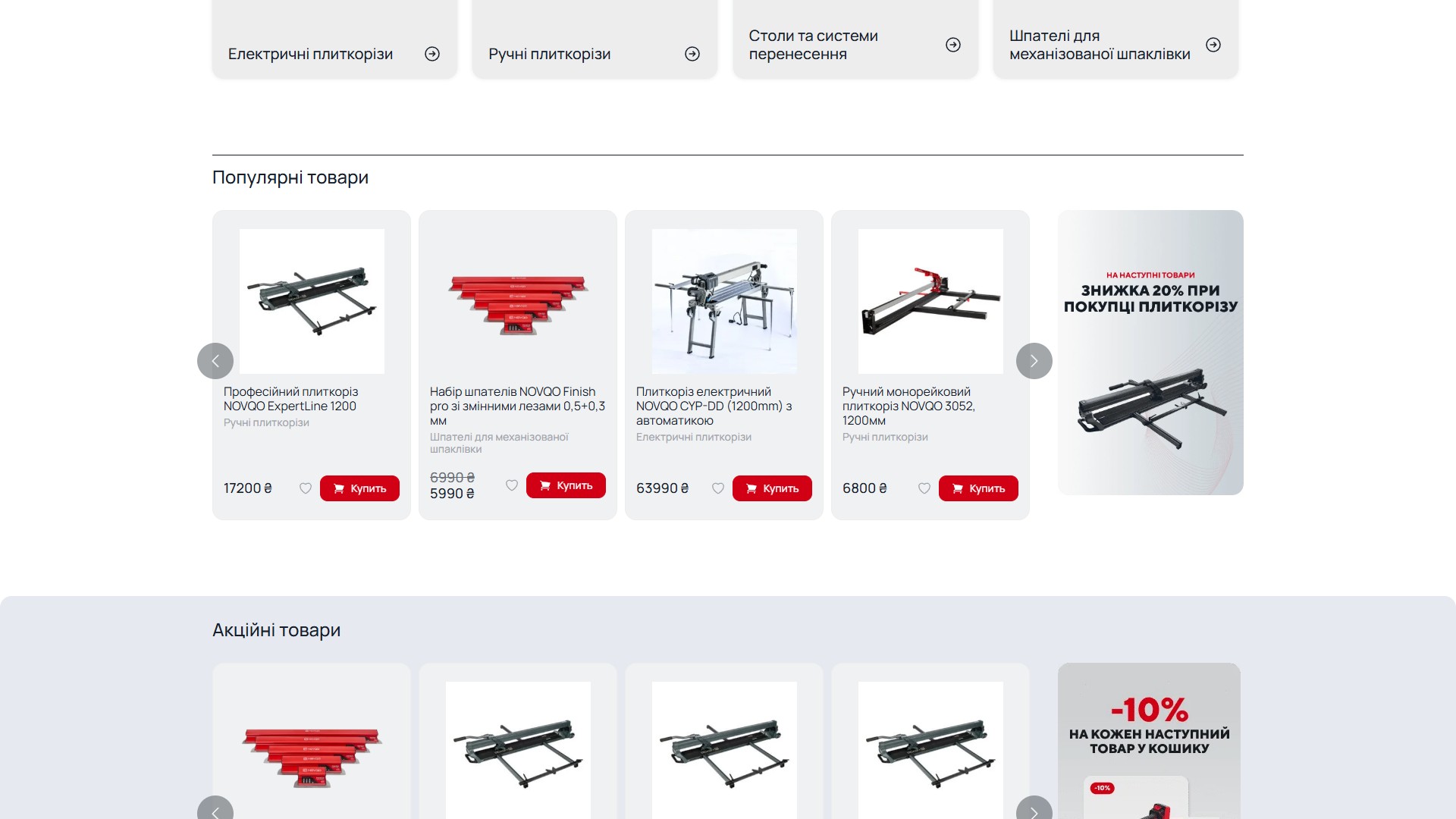
The second section of the home page is a 4×2 grid of 7 key product categories: Diamond tools, Vibration suction cups, Vacuum suction cups, Electric tile cutters, Manual tile cutters, Tables and transport systems, Spatulas for mechanised grouting. Each card is a minimalist light-grey rounded rectangle with a render of a REAL product from the category (3 diamond blades and a core bit for “Diamond tools”, a red battery-powered NOVQO vibration suction cup, a frame-and-rail transport table with clamps), the category name and a chevron arrow. No SVG line-art icons of a “hair dryer” or a “shovel” here.
Manual cross-link between SKU sizes — no WC product variations
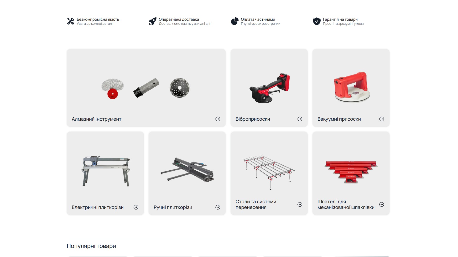
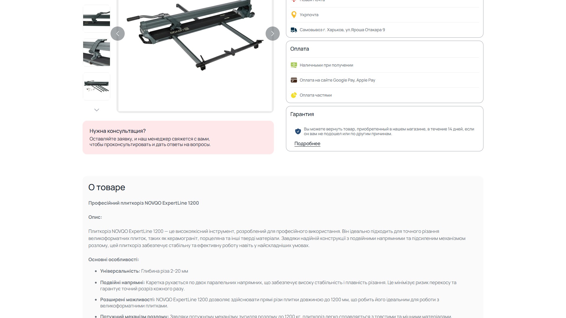
A single product page (NOVQO ExpertLine 1200 Professional Tile Cutter) has a block “Maximum cut length: 1200 / 1240 / 1600 / 1800 / 3200 / 800 mm”, where EACH size is a separate product/<slug>/ link to a different SKU, not a WC variation on the same product. This is a deliberate architectural decision: different models within the ExpertLine range have different specs (breaking force, weight, number of rails, laser pointer), and cramming them into a WC variable product with 6 variants would hide these differences from the catalogue and from SEO. Here, every size is a full indexable URL with its own H1, meta description, rating, reviews and an 8-photo gallery. The 3200 mm size, incidentally, is excluded from the cycle (shown as a disabled pill with no link) — meaning that model has been temporarily discontinued, but the link is NOT a broken 404, it’s acceptably greyed out with context.
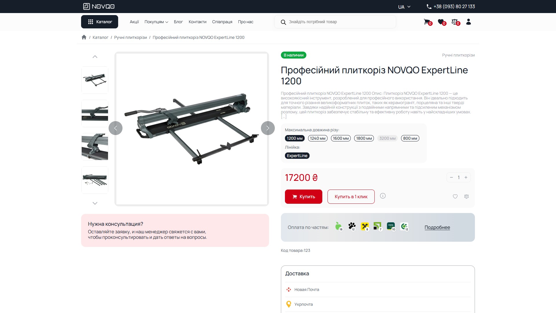
A 6-provider instalment scheme, 2–12 payments — built into the product card, not the checkout
Below the price on the product page is a horizontal row of 6 bank icons, each with its own number of instalments: Monobank Pay 2–6 instalments, PrivatBank Privat24 2–12, Mono instalments 3–10, OschadPay 2–12, Sense SuperApp 2–12, A-Bank 3–8. This isn’t one unified “BNPL widget” — it’s 6 separate bank providers, each with a different maximum number of instalments for the same product (so on one 17,200 UAH tile cutter, one bank offers 6 instalments, another 12 — the customer chooses). Clicking “Details” opens an overlay calculator with the monthly payment for each provider at the current price and quantity. This is not a standalone marketplace plugin, it’s a custom integration with 6 separate payment APIs — for building tools at 5,000–60,000 UAH price points, this is a precisely tuned instrument: an individual entrepreneur-builder doesn’t have 17,000 UAH cash on hand, but does have 1,500 UAH/month for instalments.
A 10-field spec table right on the page — no accordion, no tabs
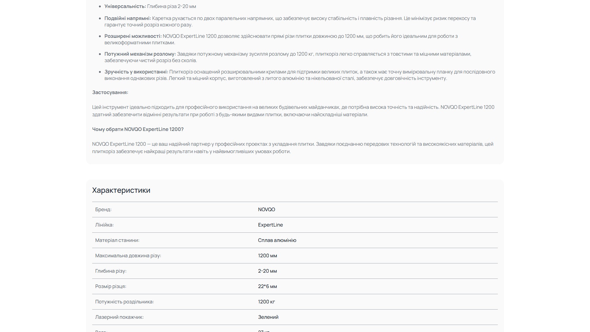
Below the product description is a “Specifications” section with a 10-field flat table of key:value pairs, each row with a divider line. Fields for the tile cutter: Brand: NOVQO, Line: ExpertLine, Frame material: Aluminium alloy, Maximum cut length: 1200 mm, Cut depth: 2–20 mm, Cutting wheel size: 22×6 mm, Breaking force: 1200 kg, Laser pointer: Green, Weight: 27 kg, Warranty: 12 months. Everything is visible at once, with no click-to-expand and no switching to a “Specifications” tab. The B2B rationale: a tradesman on site quickly scans the page on their phone, looks for “weight 27 kg” to plan transport in a car and “1200 kg breaking force” for 12 mm porcelain stoneware — and finds it in 5 seconds, not 15.
A WOOF facet filter with 14 engineering product attributes
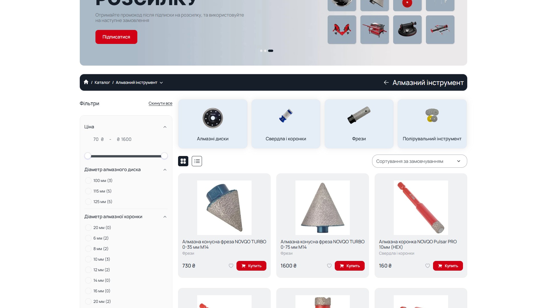
The /product-category/almaznyj-instrument/ page has a left sticky sidebar with a WOOF facet filter (WooCommerce Products Filter) on 14+ attributes specific to construction tools: Price (a 70–1600 UAH range slider), Diamond blade diameter (100/115/125 mm with a product count for each value), Diamond core bit diameter (6/8/10/12/14/16/20 mm), Arbor diameter, Purpose (by material — ceramic/porcelain stoneware/marble/granite), Operating speed (RPM), Manufacturing technology, Wheel thickness, Mount type (M14/HEX/22.23 mm), Cut type, Drilling type, Grit. Every value shows the product count in brackets — the customer sees that “6 mm bits: 2 in stock, 16 mm: 0” BEFORE clicking, not after.
A sub-category grid above the listing — the category as an SEO hub, not just a filter
On the same Diamond tools page, above the product listing and above the filter, is a grid of 4 sub-categories: Diamond blades, Drills and core bits, Routers, Polishing tools — each with a real product photo, not an icon. Clicking a sub-category leads to its own /product-category/<parent>/<child>/ URL with a filter configured specifically for that sub-category (for example, for “Drills and core bits” the filter attributes switch to Bit diameter, Mount type, Grit, while Blade diameter disappears). This is a 2-level WooCommerce taxonomy with a reactive filter at the child level. The classic mistake — dumping everything into one flat “Tools” category with 200+ SKUs — is deliberately avoided here.
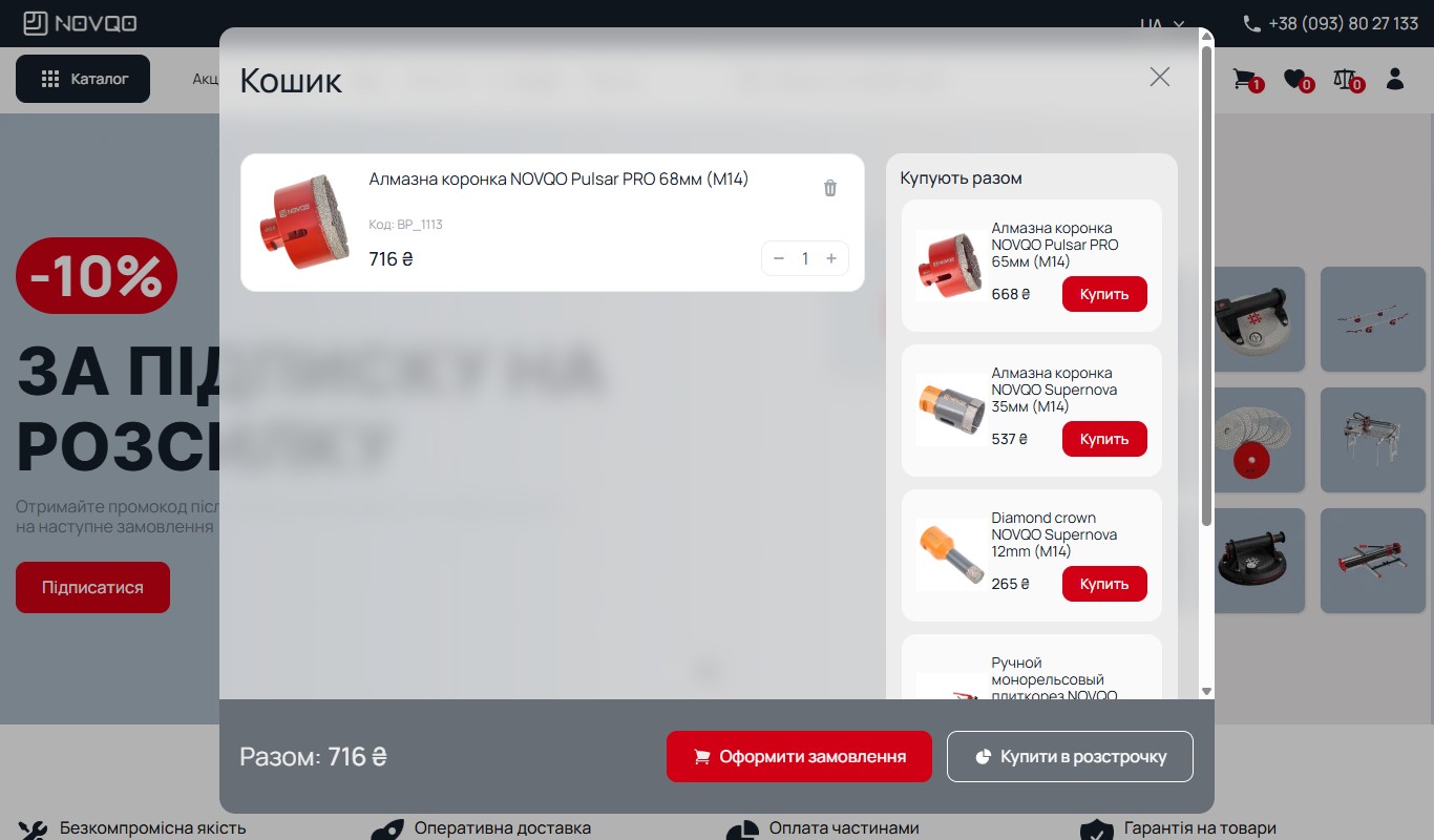
A side-drawer cart with a “Bought together” upsell block and two CTAs
Unlike the traditional WC /cart/ route, NOVQO opens the cart as a side-drawer overlay over any page (the URL renders as /?cart=true, but visually it’s a slide-out panel from the right edge). The drawer is split into two columns: the left one is the current item (product photo, name, SKU code BP_1113, price, a qty stepper and a trash icon), the right one is a “Bought together” section with 4 recommended, manually sourced products, each with its own “Buy” button (immediate add to the same drawer with no navigation). This isn’t the standard WC “Recently viewed” or “Related products” — it’s a manual cross-link between compatible SKUs (for example, alongside a 68 mm core bit, the shop suggests 65 mm and 35 mm bits from the same line + a 12 mm one for a smaller diameter + a manual tile cutter as a complementary tool). At the bottom of the drawer are two parallel CTAs: “Place order” (standard) and “Buy on instalments” (leads straight to the same /checkout/, but with an active instalment flag in the session). This is pure sales-driven UX: the cart isn’t a “storage spot”, it’s an upsell funnel.
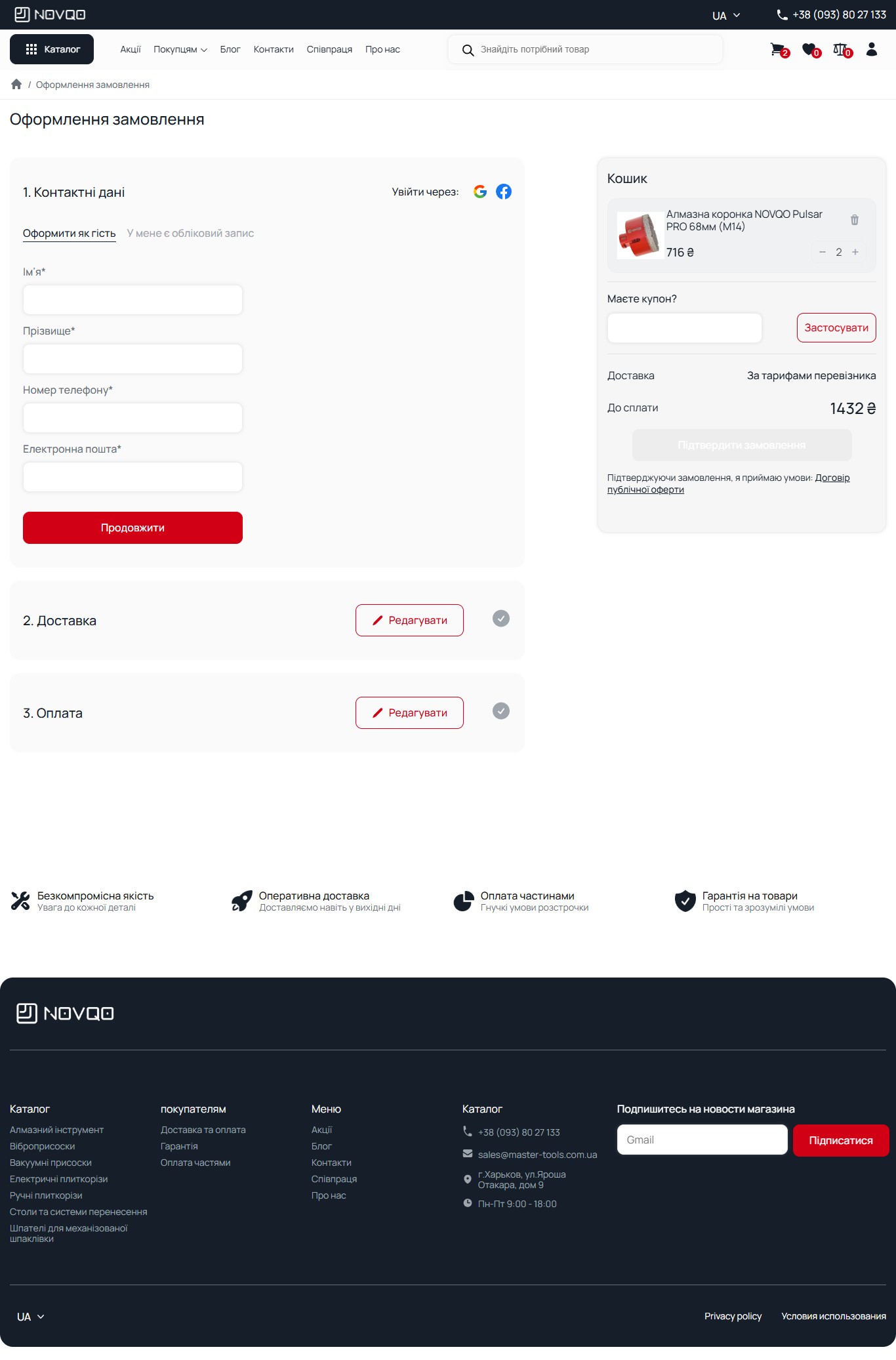
A 3-step accordion checkout with Google/Facebook social login and a Guest/Account toggle
The /checkout/ page is built as a 3-step accordion: 1. Contact details (open by default), 2. Delivery (collapsed), 3. Payment (collapsed). The first step immediately offers “Sign in with: Google / Facebook” with two large social buttons — this isn’t WC-standard, it’s an integrated OAuth login via a WP plugin (loginSocial=google|facebook). Below is a toggle “Checkout as guest / I have an account”, which switches the form to the matching flow. In guest mode there are 4 required fields (First name, Last name, Phone number, Email) + a “Continue” button, after which step 1 collapses with a ✓ marker and step 2 opens automatically. The right column has a sticky mini-cart with a qty stepper, a “Have a coupon?” field with an “Apply” button, a Delivery / Total breakdown, and the primary CTA “Confirm order” — disabled by default, activated once all 3 steps are complete. This is a progressive form with non-blocking validation: the user doesn’t see errors on fields they haven’t reached yet.
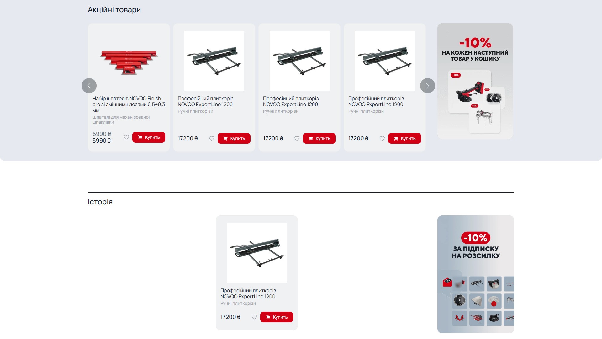
“History” — a recently-viewed stripe for a guest with no login
A separate section on the home page and on product pages — “History” — a personal stripe of the last 4–6 products the user viewed in the current session. It works even for a guest session (no login) via localStorage + a cookie holding the product-ID list, stored for 30 days. This isn’t “Recommended products” (algorithm-based) or “Similar products” (taxonomy-based) — it’s a pure personal history stripe that lets the user come back to a product they looked at 5 minutes or 5 days ago, without needing to re-authenticate or restore the cart. For a high-AOV category (a 60,000 UAH automated electric tile cutter), a customer reasonably compares 2-3 models over a week — and the personal-history stripe works as a reminder, without email spam.
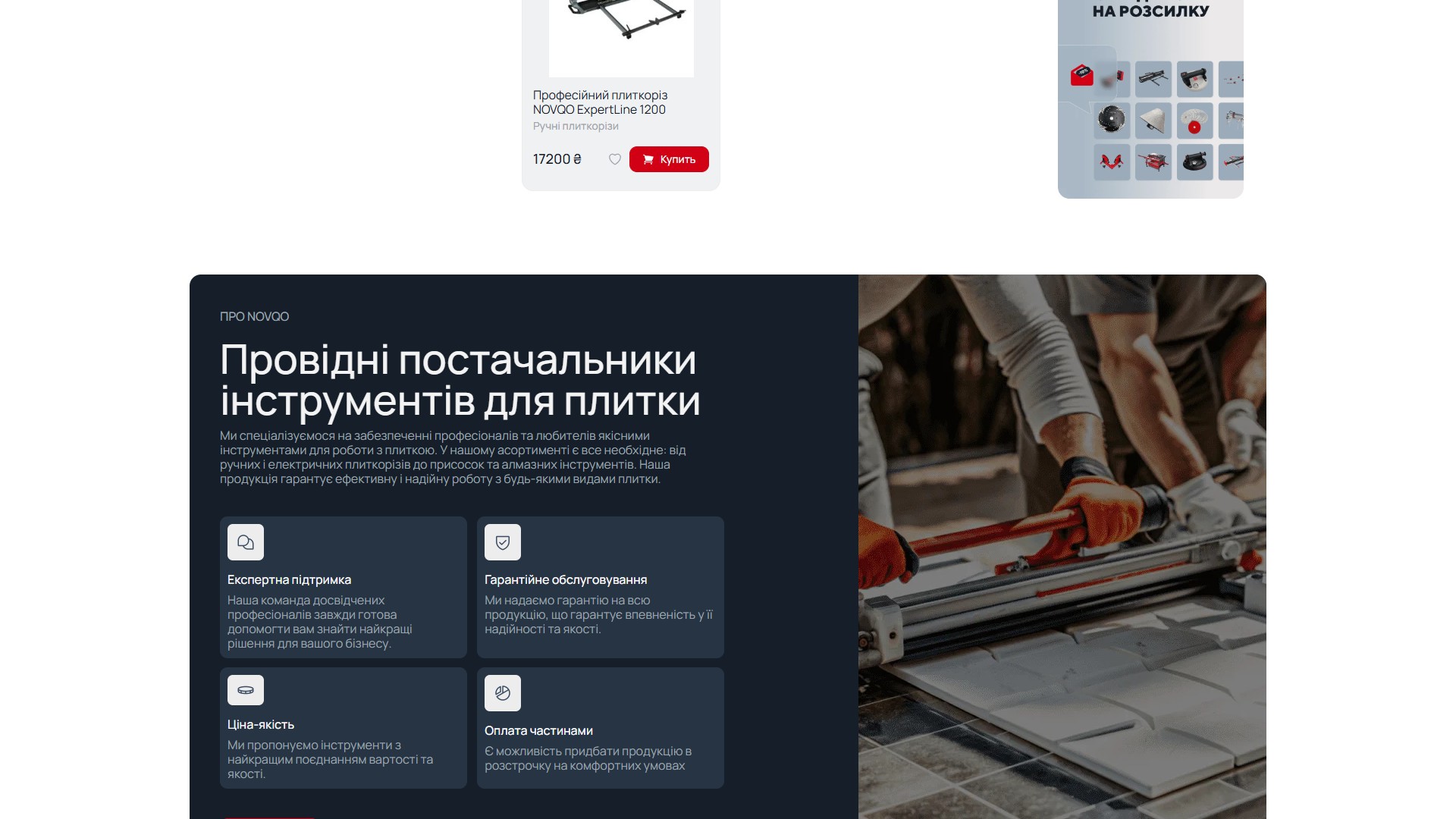
An About page with a dealer programme — a B2C front over a B2B distribution model
The /pro-novqo/ page ends with an explicit CTA towards a wholesale partnership: “We invite dealers and shop owners to partner with NOVQO. Together we can bring your customers the best tools and help grow your business” with a “Learn more” button. This isn’t a random banner — it marks the fact that NOVQO is simultaneously a B2C storefront (individual tradespeople buy at retail) and a B2B distributor (dealer shops buy wholesale). The backend is the same one — the same WooCommerce, the same catalogue — but the pricing mechanics (2–12 instalments, single-item checkout) are clearly oriented towards a single-tradesman purchase. Wholesale prices and dealer terms are a separate negotiation flow via the /spivpraczya-z-novqo/ page (not a public price list).
sales@master-tools.com.ua — confirming that NOVQO is a trademark of Kharkiv-based Master Tools, not a faceless overseas reseller with no service presence.Mobile 390 — bottom-tab navigation with 3 buttons instead of a sticky header
At the 390×844 viewport (iPhone 13), the layout switches from a desktop-style sticky header to a Telegram-style bottom-tab navigation: 3 thumb-zone buttons at the bottom of the screen (Catalogue with a grid icon on the left, Cart with a shopping-bag icon in the centre — a red focal point, Favourites with a heart icon on the right). The top bar only holds a burger menu (opens an overlay with categories) and a search icon (opens a full-screen search overlay). The hero carousel is fully responsive — slide 1 with “-10% for every next item” is shown with a horizontal-stack collage on the right, the “To the catalogue” button is full-width and red. The brand logo is removed from the top bar (search takes its place), freeing more horizontal space for actual content. This isn’t desktop-with-zoom, it’s mobile-first with navigation functions redistributed for thumb reach.
FAQ + Newsletter — two sticky trust elements before the footer
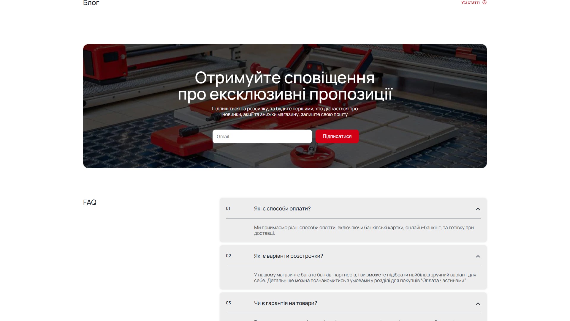
Before the footer on the home page are two mandatory sections: a Newsletter banner with a background photo of the tile cutter in use and a centred “Subscribe to our newsletter” form (input + a “Subscribe” CTA), and an FAQ accordion with 4 key questions (What payment methods are available?, What instalment options are there?, Is there a warranty on products?, Are there discounts or special offers?). The FAQ is a click-to-expand accordion (not all-open-by-default as with some schema-driven FAQs), which is optimised for FAQPage schema but keeps the page’s visual budget in check. Each question is numbered 01/02/03/04 on the left with a chevron on the right — a flat outline style with no visual noise.
Kontakty — a separate page with a Google Maps embed and a dark contact form
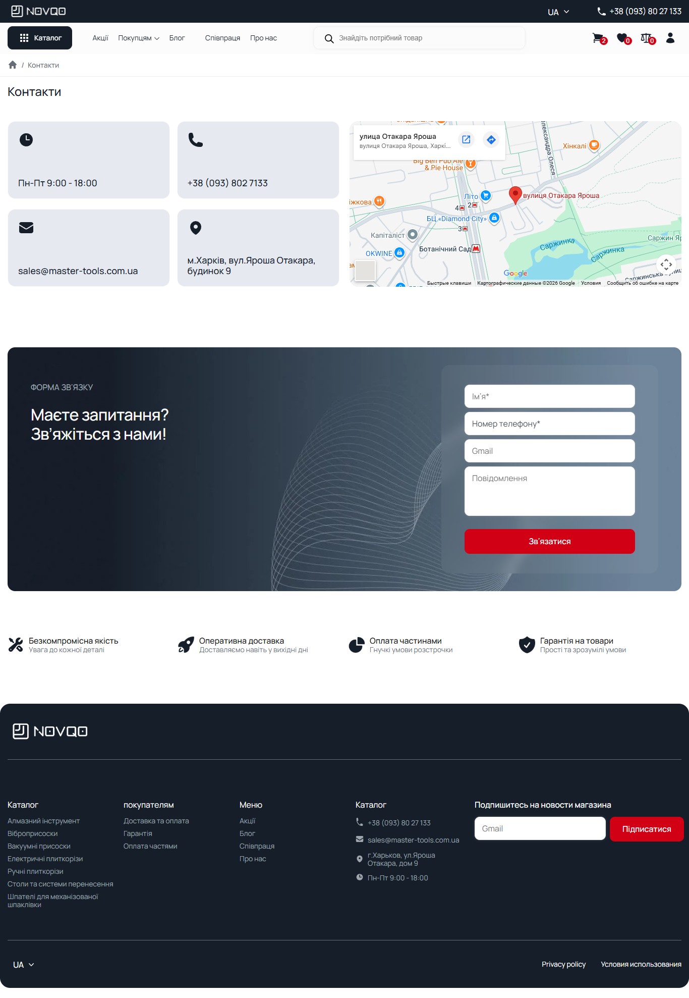
The /kontakty/ page is built as two sections: the top one — 4 inline cards on a light-grey background (“Mon-Fri 9:00 AM–6:00 PM”, “+38 (093) 802 7133”, “sales@master-tools.com.ua”, “Kharkiv, Otakara Yarosha St., building 9”) plus a wider Google Maps embed with a pin on “Otakara Yarosha Street” (hinting at the target area for pickup). The bottom one — a dark hero “Have a question? Get in touch!” with a custom SVG background of wavy lines and a 4-field form on the right (Name, Phone number, a Gmail placeholder, Message + a red “Get in touch” CTA). An interesting detail — the email domain is master-tools.com.ua, not novqo.tools: NOVQO is the product brand, while “Master Tools” is the operating company (a Kharkiv-region dealer), which is only visible on this page and in the footer. For B2B procurement this is a signal: the purchase goes through a legal entity with 10 years of market experience, not through a startup .tools domain.
Summary
NOVQO is a Ukrainian B2C catalogue of construction tools sitting at the intersection of individual-tradesman purchasing and dealer distribution: a full WooCommerce stack across 7 categories and 200+ SKUs with sub-category detail and a 14-attribute facet filter (diameters, RPM, grit, mount type), a 6-provider instalment scheme with 2–12 payments as the core sales mechanic for 5,000–60,000 UAH price points, Apple/Google Pay for a friction-free iOS flow, a manual cross-link between SKU sizes instead of WC variations so every model keeps a full PDP, a sticky callback CTA for high-AOV consultations, a separate product-comparison page, a personal recently-viewed “History” via localStorage, WPML 3-language localisation (UA/RU/EN), and mobile-first bottom-tab navigation instead of desktop-with-zoom. The footer honestly states Master Tools’ Kharkiv address — this is NOVQO as a B2C front over a manufacturer/importer, not an invisible white-label overseas reseller. This is a site where the price doesn’t dance, and the funnel is built precisely around a tradesman who asks three questions: “what’s the monthly payment”, “how much is delivery”, and “what’s in the specs”. All three are answered within a single scroll.




