
Solida Construcciones — a construction company website on the Costa Blanca
Багатомовний (6 локалей) сайт іспанської будівельної фірми на Costa Blanca. 4 послуги з вкладеними підсторінками, портфоліо з фільтрами, WordPress.
Context
Solida Construcciones is a construction company from Torrevieja working along the Costa Blanca coast from Alicante to Valencia. Its services are private house building, comprehensive home renovations (remonty integralne), commercial premises refurbishment with licence handling, and pool construction/renovation. Its clients are Polish and other European property buyers in Spain, for whom the site becomes the first point of contact and the only proof that this team can run a project from concept to turnkey handover.
The brief was a corporate site with a strong SEO foundation for multi-regional queries (“budowa willi na Costa Blanca”, “remont basenu w Alicante”, “firma budowlana w Torrevieja”), a system of subpages for each type of work, a filterable portfolio, a blog, and six locales for every market buying property in the region.
A hero built around regional positioning
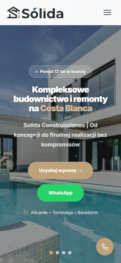
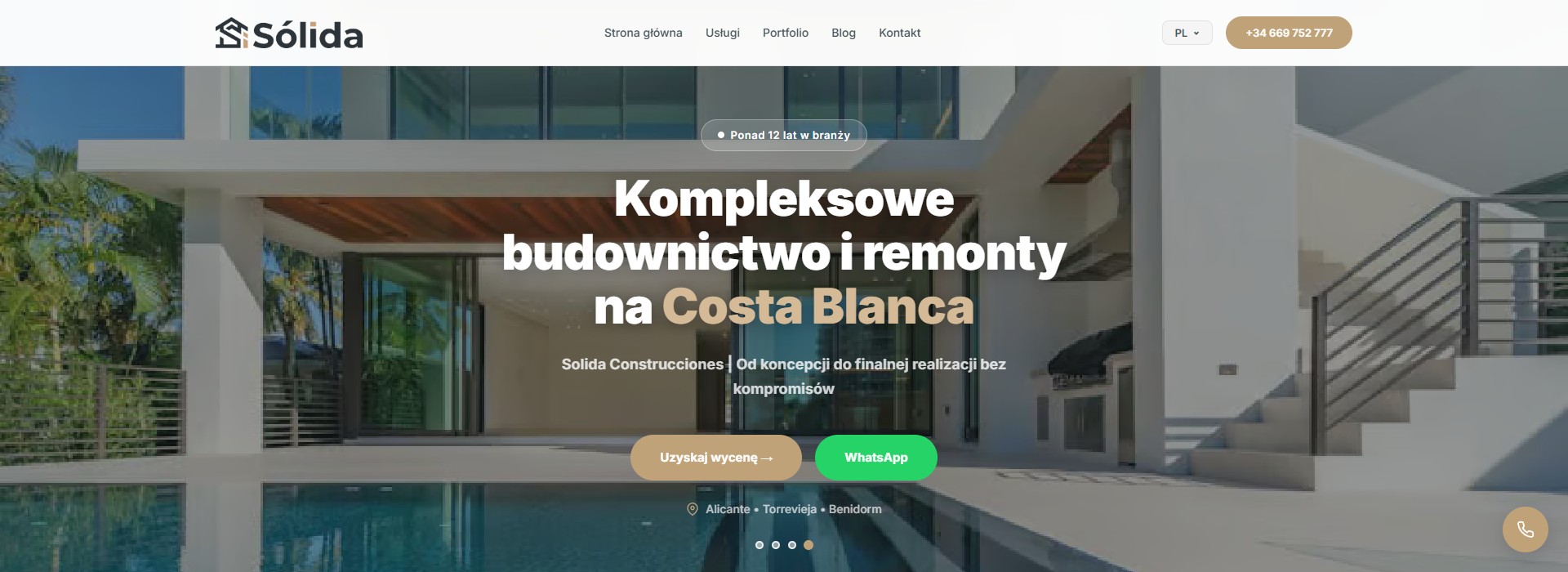
The first screen is built around one idea — “kompleksowe budownictwo i remonty na Costa Blanca”. The tagline under the heading carries the brand (“Solida Construcciones | Od koncepcji do finalnej realizacji bez kompromisów”), a badge above it adds a signal of maturity (“Ponad 12 lat w branży”), and under the CTA sits a row of anchor cities: Alicante • Torrevieja • Benidorm. Next to the quote-request button is a separate WhatsApp CTA — for the Spanish market that’s effectively the primary contact channel.
A service catalogue with a nested hierarchy
Four top-level cards on the home page
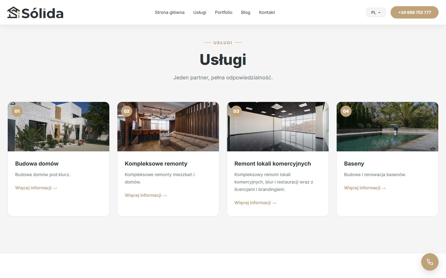
The home page carries a grid of four cards with numbered badges 01–04: Budowa domów, Kompleksowe remonty, Remont lokali komercyjnych, Baseny. Each card leads to a full hub page rather than an anchor — a separate URL with its own H1, a unique description and its own block of sub-services. The structure is deliberately built for SEO clustering, with each category carrying its own set of long-tail queries.
Second-level hub pages
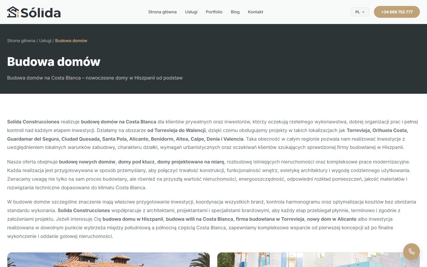
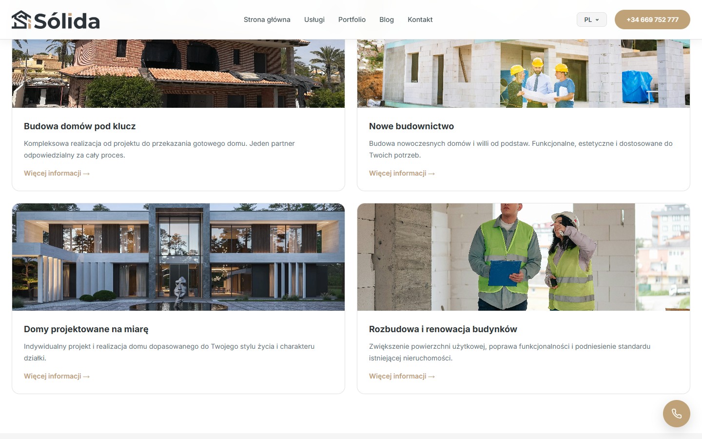
Inside each hub are 2 to 4 sub-services, each with its own page. Under “Budowa domów” these are Domy pod klucz, Obra nueva, Casas personalizadas and Ampliaciones y rehabilitación. Above this grid sit three dense paragraphs of localised SEO copy, where key phrases like “budowa willi na Costa Blanca”, “firma budowlana w Torrevieja” and “domy pod klucz” are marked with <strong> and woven into natural text. Listing cities within each paragraph reinforces the local LSI signal rather than reading as artificial keyword stuffing.
A sub-service grid with its own photos
Below the SEO paragraphs is a 2×2 grid of sub-service cards, each with its own photos of completed projects: a tile-roofed villa, a crew with plans at a construction site, a minimalist villa with a pool, and two engineers in workwear. Each card is its own URL with no shared image pool: photos are unique per page, which works for SEO (unique content) and as an evidence frame (not stock photography).
The Reformas Integrales hub
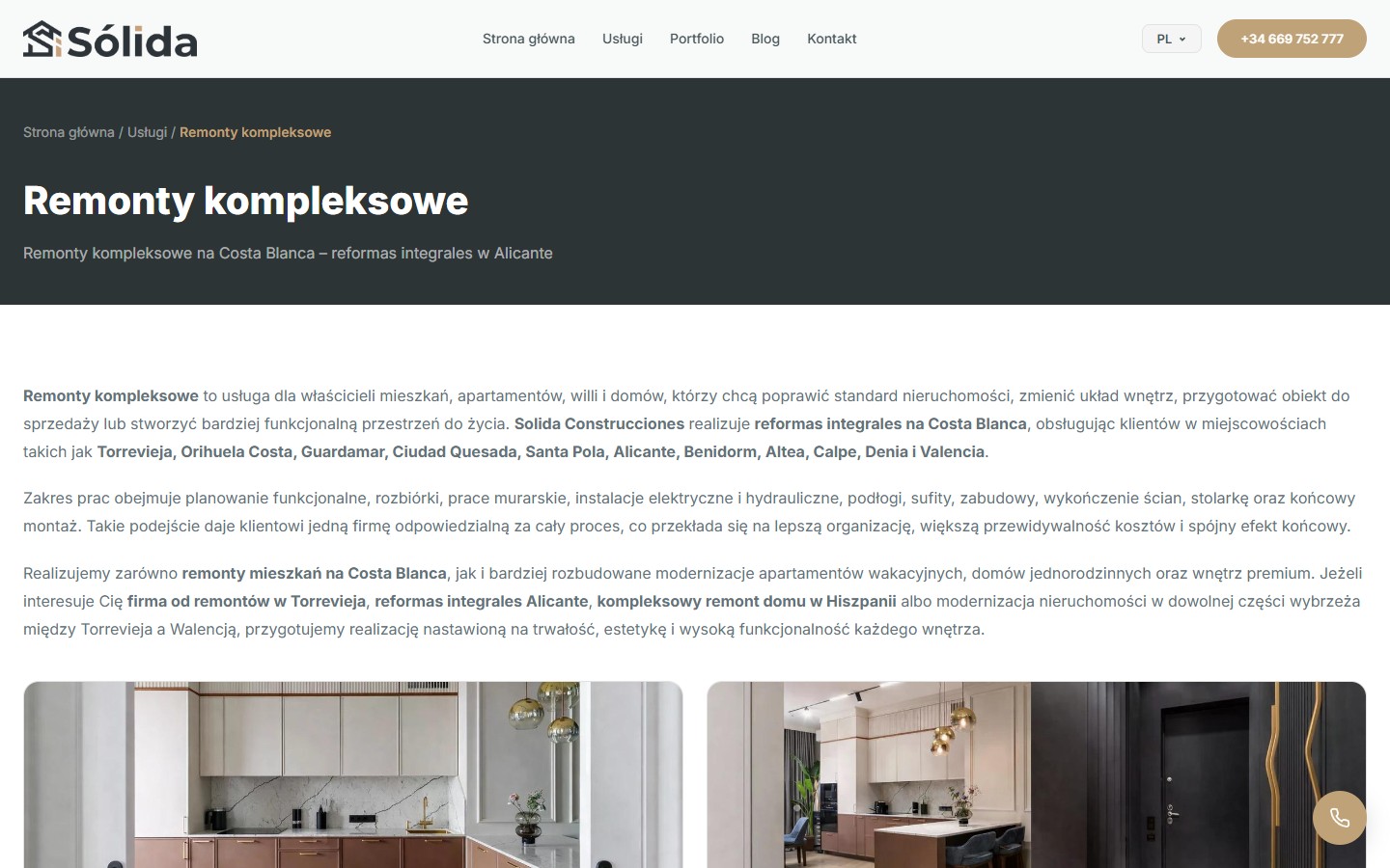
The second major category is comprehensive renovations. Its hub page follows the same pattern: a breadcrumb header, three SEO paragraphs with highlighted keywords (“remonty mieszkań na Costa Blanca”, “reformas integrales Alicante”, “firma od remontów w Torrevieja”), then 4 sub-services (Remont kuchni i łazienek, Remonty premium, Remont salonu, Remont łazienki). Real photos of finished interiors follow — a kitchen with a marble splashback and ceiling lights, a dark-toned lit entrance hall.
The Locales Comerciales and change-of-use hub
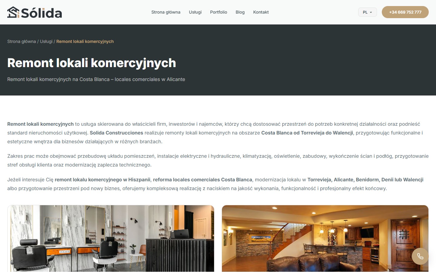
The third category is commercial premises. There are two subpages here: “Remont lokali komercyjnych i usługowych” (shops, offices, restaurants, barber shops) and, key for the Spanish market, “Remont pod zmianę przeznaczenia lokalu” (cambio de uso — converting commercial premises to residential with a licencia de habitabilidad). This is a specific service that people search for separately, so it gets its own URL and copy.
The Piscinas hub
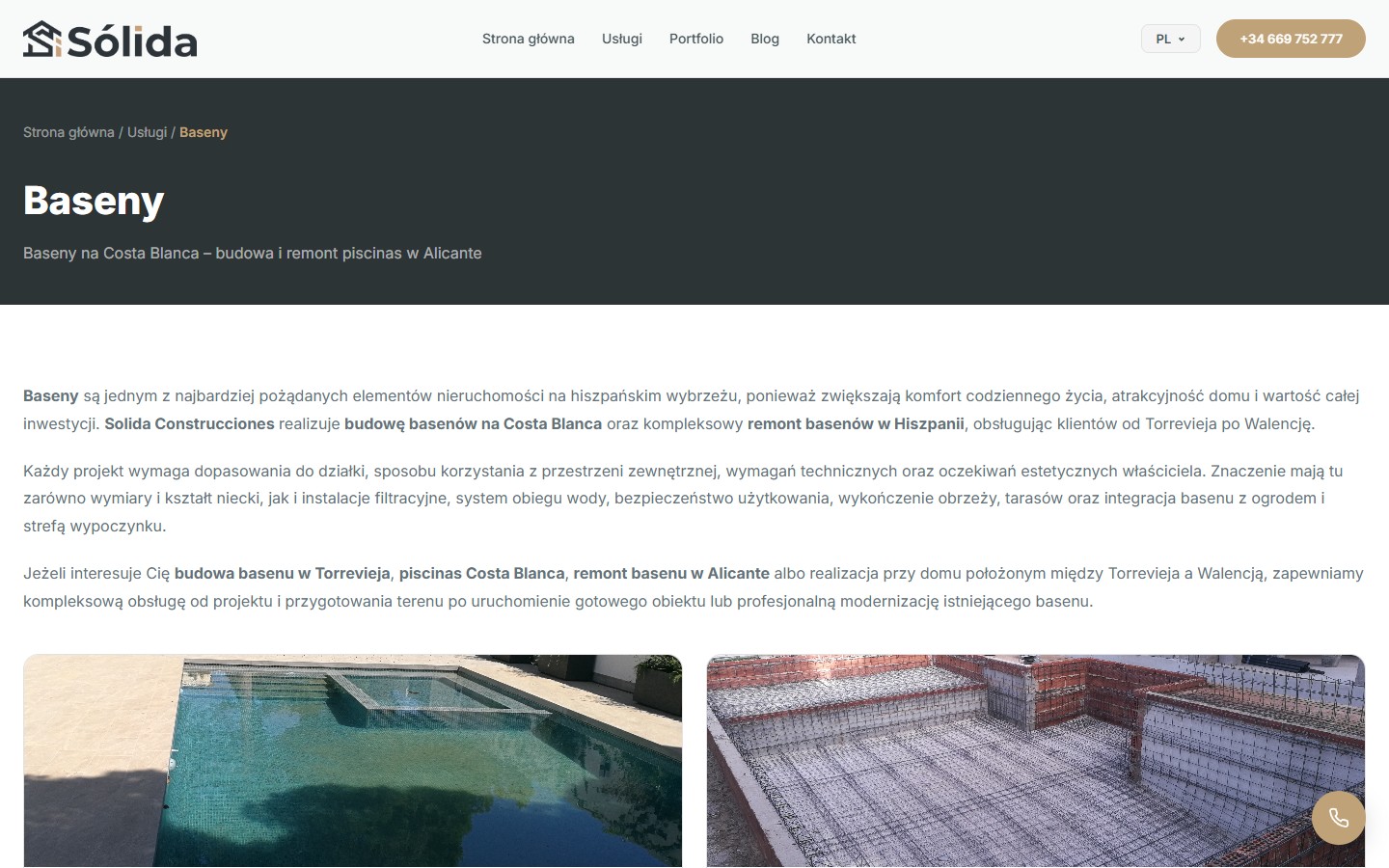
The fourth category is pools. Two sub-services: “Budowa basenów” (design and construction) and “Remont basenów” (modernisation, waterproofing, coping). Real photos show a finished tiled pool with a terrace against a photo of a reinforcement-mesh frame at the construction stage. This “finished vs process” contrast is a deliberate evidence device, showing not just the result but also the technical competence behind it.
The evidence frame: four specialisations
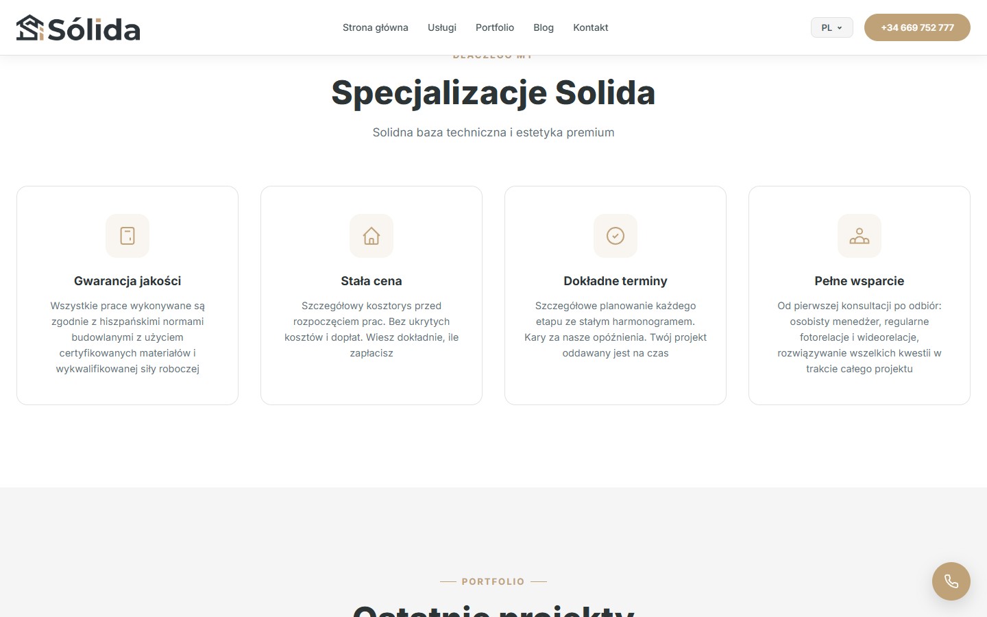
A separate “Dlaczego my” section with 4 cards and pastel icons: Gwarancja jakości (quality guarantee, compliance with Spanish standards), Stała cena (a fixed price with no hidden extras), Dokładne terminy (penalties on the company’s side for missed deadlines), Pełne wsparcie (a personal manager plus photo/video updates). These signals are aimed at a remote client buying property in another country who can’t be on-site.
Portfolio: two levels of presentation
A lightweight version on the home page
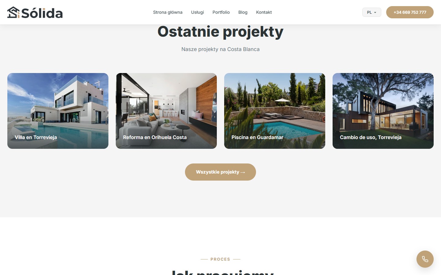
The “Ostatnie projekty” block on the home page shows 4 hero cards with full-width photos and object names on top (Villa en Torrevieja, Reforma en Orihuela Costa, Piscina en Guardamar, Cambio de uso, Torrevieja). The cards aren’t a slick carousel but a static grid of photorealistic objects. Below is a “Wszystkie projekty” CTA leading to the full archive.
An archive page with filters
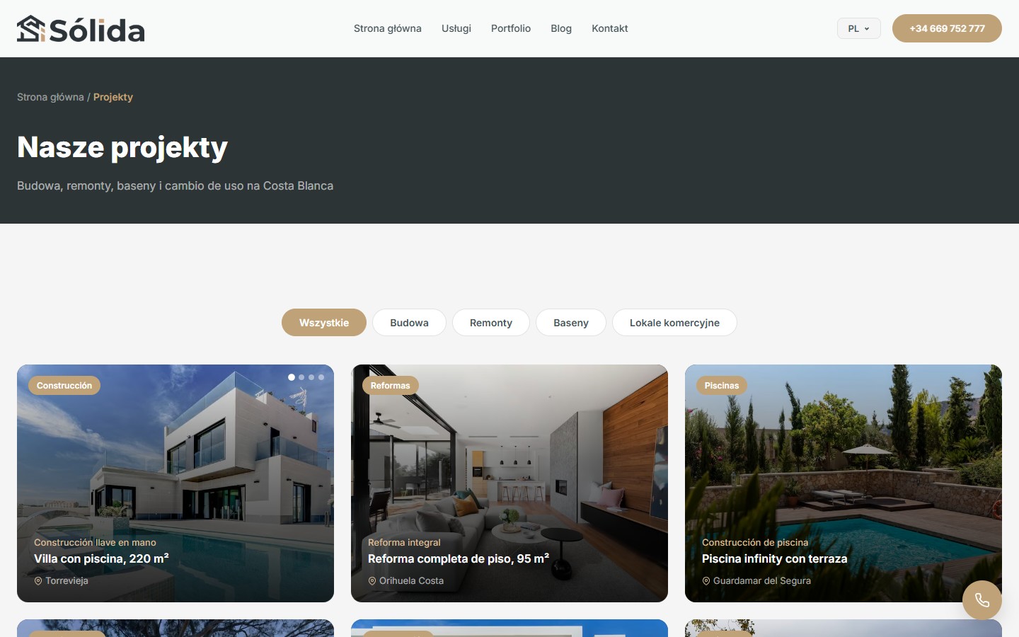
The full “Nasze projekty” archive has pill filters at the top (Wszystkie / Budowa / Remonty / Baseny / Lokale komercyjne) and a three-row grid of 12 cards. Each card carries a category badge in Spanish, a 16:10 photo of the object, the type of work (Construcción / Reformas / Piscinas / Cambio de uso), a title with the floor area in m² and an anchor city. The first card in each category has a slick carousel with several photos.
A 5-step process from request to handover
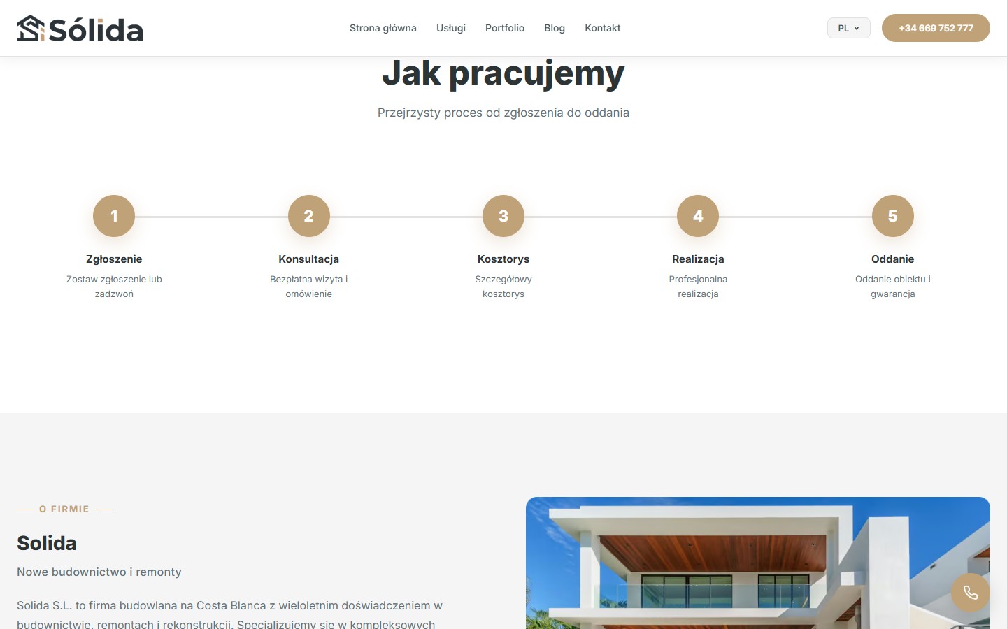
The “Jak pracujemy” section shows 5 numbered circles connected by a horizontal line: Zgłoszenie → Konsultacja → Kosztorys → Realizacja → Oddanie. This connected-steps visual reads at a glance and answers the remote client’s main question — “what happens next if I leave a request”. Each step has 1–2 lines of description, without excessive detail, since the detailed conversation happens at the Konsultacja stage.
About: explaining the team and the region
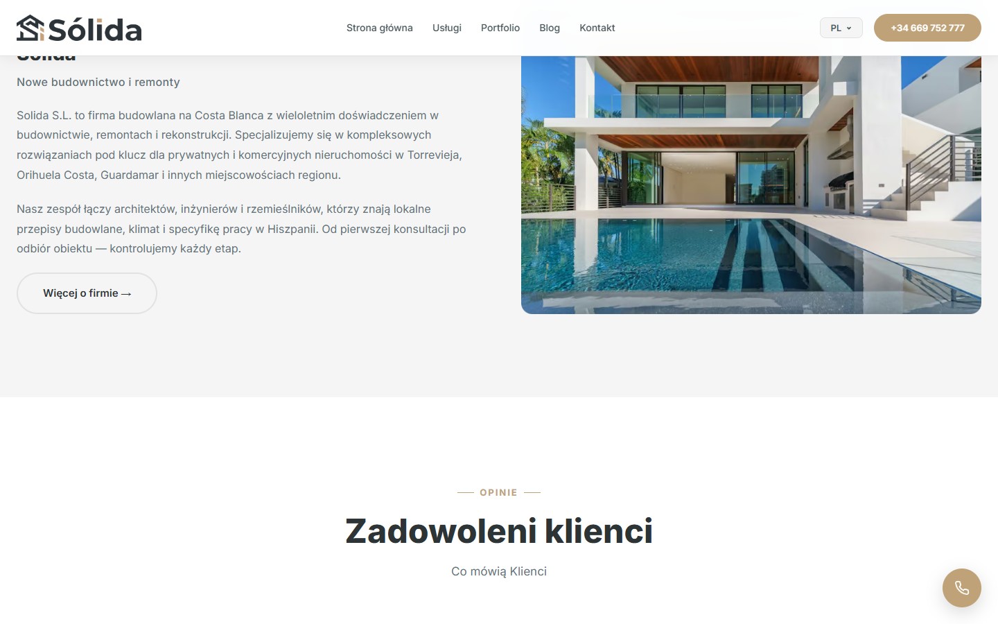
The “O firmie” section is two columns: on the left, a body of text with an “O FIRMIE” tag, an H2 (“Solida — Nowe budownictwo i remonty”) and two paragraphs about the team (architects, engineers, craftsmen who know Spanish regulations) and the region. On the right, a photo of a finished object (an interior with a pool and panoramic glazing). The two-column structure couples the text with the photographic proof rather than letting it sit in a vacuum.
FAQ and geo-targeting
An FAQ accordion
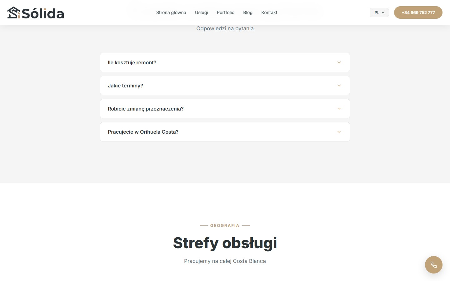
The FAQ section addresses 4 basic objections: “Ile kosztuje remont?”, “Jakie terminy?”, “Robicie zmianę przeznaczenia?”, “Pracujecie w Orihuela Costa?”. A closed-by-default accordion, with the first item hinting at a price “od 400 EUR/m²” — removing the first and biggest uncertainty of the first interaction.
Strefy obsługi as an SEO block
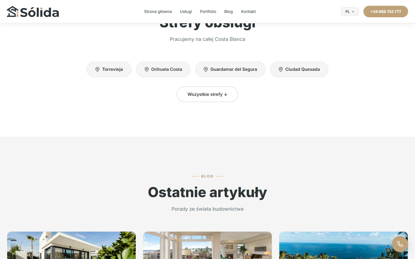
A separate “Strefy obsługi” section shows pills with pin icons: Torrevieja, Orihuela Costa, Guardamar del Segura, Ciudad Quesada, with a “Wszystkie strefy” button leading to the full list. Each tile is clickable and doubles as a seed for future geo-landing pages (“Remont w Torrevieja”, “Budowa domu w Orihuela Costa”). Right now the links point to “#”, but the site tree is already prepared for that expansion.
The blog — long-reads for long-tail keywords
A block of the latest 3 posts on the home page
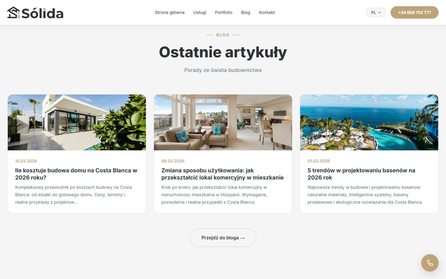
The “Ostatnie artykuły” block on the home page shows 3 cards with 16:9 cover photos, a publication date, an H3 heading and a two-line teaser. Article topics include a 2026 construction cost estimate, cambio de uso step-by-step, and pool design trends. All of it targets long-tail keywords like “ile kosztuje budowa domu Costa Blanca” and “jak przekształcić lokal komercyjny w mieszkanie” — informational, top-of-funnel traffic that isn’t yet looking for a contractor but is already looking for answers about the process.
The blog archive page
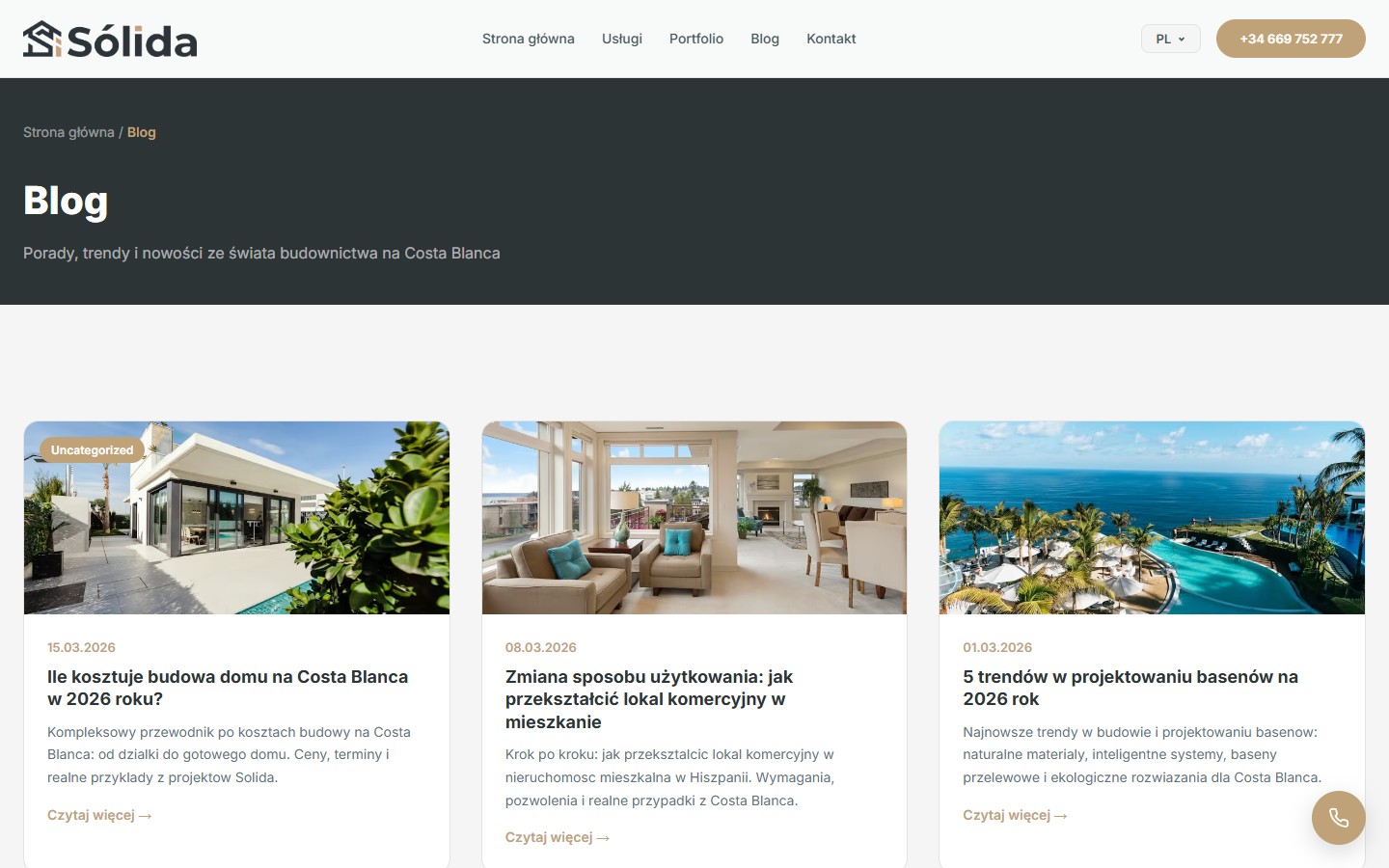
A separate /blog-pl/ page follows the same dark breadcrumb header, a “Blog” heading, a descriptive subheading and a grid of 3 cards (only 3 posts so far — the blog has only just launched). Cards carry a category badge (currently just “Uncategorized”, presumably awaiting proper categorisation).
The single-post style
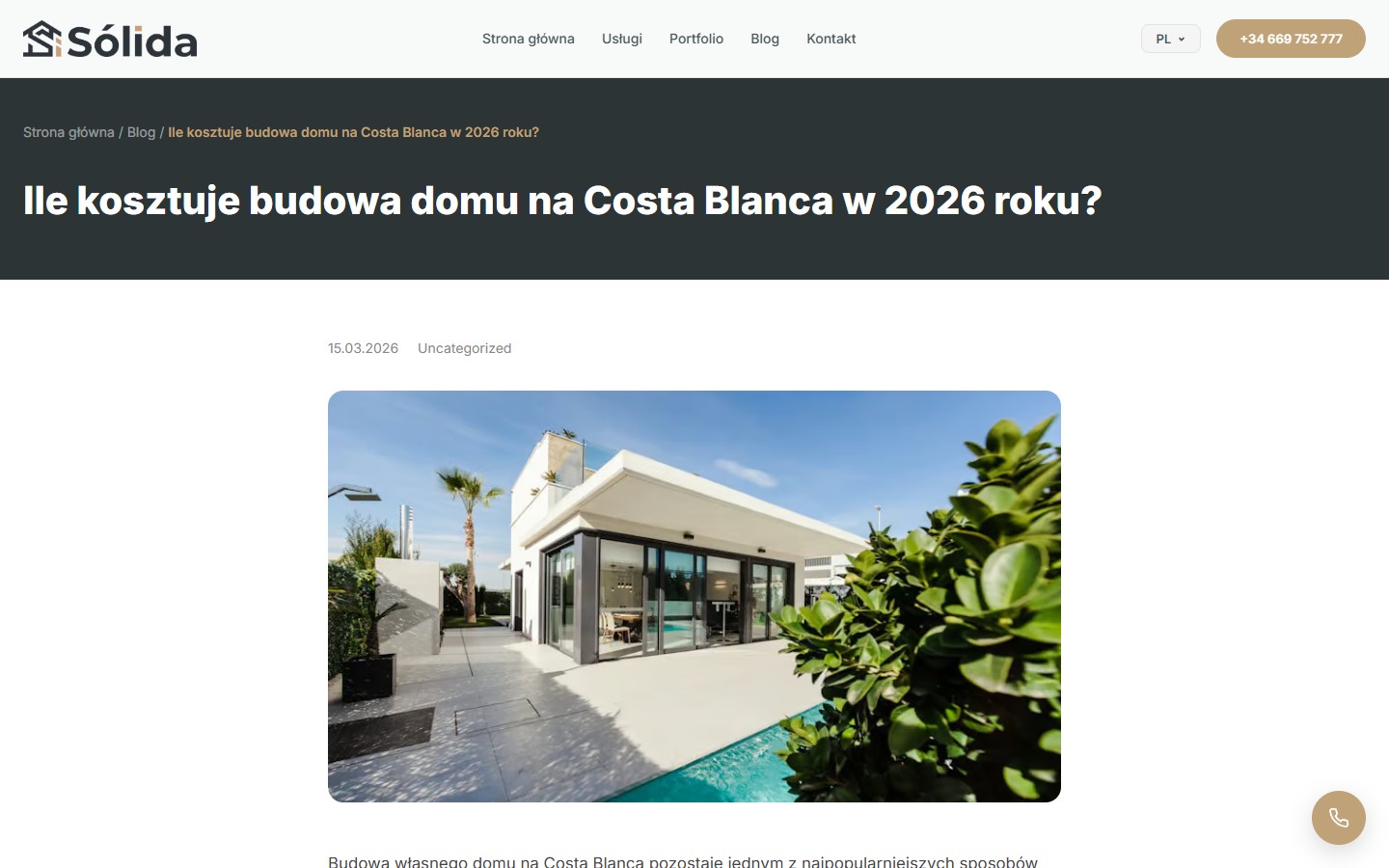
The single-post layout is typographically simple and clean: a breadcrumb, an H1, a date and category, a large hero photo, a lead paragraph, then 4 H2 sections each with its own paragraphs. No sidebar, no related posts — the focus is on reading. It’s a good foundation for future long-reads — the structure can take case studies, checklists and price tables without strain.
Six locales for the property-buyer market
The site exists simultaneously in ES, EN, UK, RU, PL and DE — a realistic cross-section of the audience buying property on the Costa Blanca. Locales live on separate URL segments and switch through a dropdown with flags next to the phone number in the header. The default locale is Polish, since Polish buyers are currently the most active group in the region. EN and ES run in parallel as “neutral” interfaces for the rest of the markets, while UK/RU/DE are targeted localisations for Ukrainian, Russian and German audiences.
A contact pattern with WhatsApp as an equal CTA
Every secondary CTA section repeats the pair “Uzyskaj wycenę” + WhatsApp. On mobile a floating phone button is added in the bottom-right corner — a familiar pattern for the Spanish market (most first-touch requests there go through WhatsApp rather than a form). Email is kept only in the footer, not surfaced on the home page. This is a deliberate choice — WhatsApp gives the client a sense of quick response and lets them attach a photo of their property right away, while a form is seen as “a long process” by comparison.
Responsiveness and mobile
On narrow screens the nav collapses into a burger, the hero becomes a vertical stack with a reduced clamp-sized heading, service cards drop into a single column, and the portfolio becomes a vertical list. The phone CTA in the mobile header’s is replaced by a handset icon in the bottom-right corner, which stays visible through any amount of scrolling. Hero photos adapt to 9:16 without cropping the main subject (the villa with the pool).
Result
- 1 home page + 4 service hub pages + 10+ second-level subpages — a site tree built for SEO clusters, with its own SEO copy on every page
- Unique preview photos on every subpage — no shared image pool, which works both for SEO (unique content) and as an evidence frame
- 12 portfolio projects with 4 category filters and a 16:10 photo on every card; the first card in each category is a slick carousel with several photos
- 6 locales (ES/EN/UK/RU/PL/DE) on separate URLs — correct hreflang for the Spanish property-buyer market
- A WhatsApp CTA repeated in every secondary section — reflects the specifics of the Spanish market, where the main first-touch channel is a messenger app, not a form
- A 5-step process from “Zgłoszenie” to “Oddanie”, 4 “Dlaczego my” cards and an FAQ with local questions (cambio de uso, Orihuela Costa) — removes the typical objections of a remote client
- A blog with 3 launch long-reads for long-tail keywords (construction cost estimates, cambio de uso, pool design trends) — top-of-funnel informational traffic




